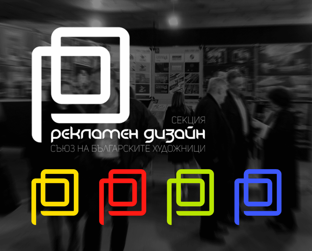
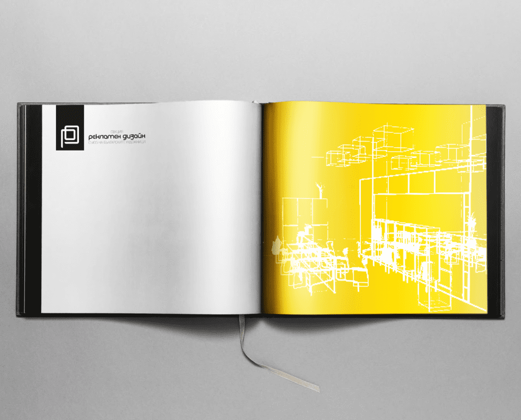
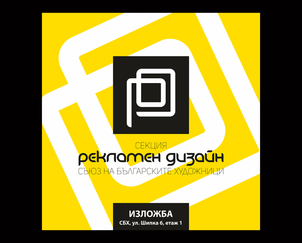
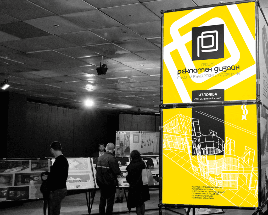
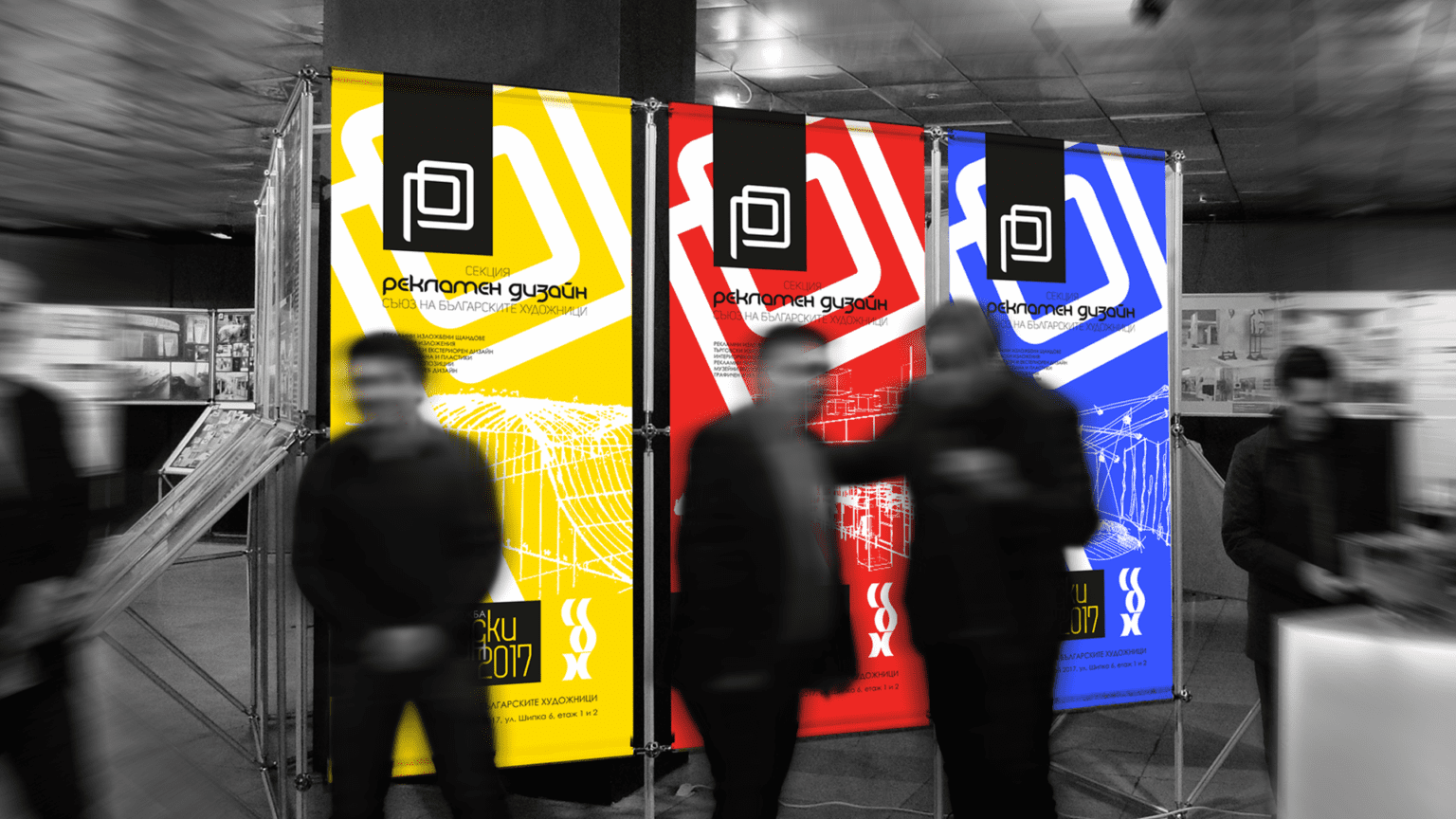
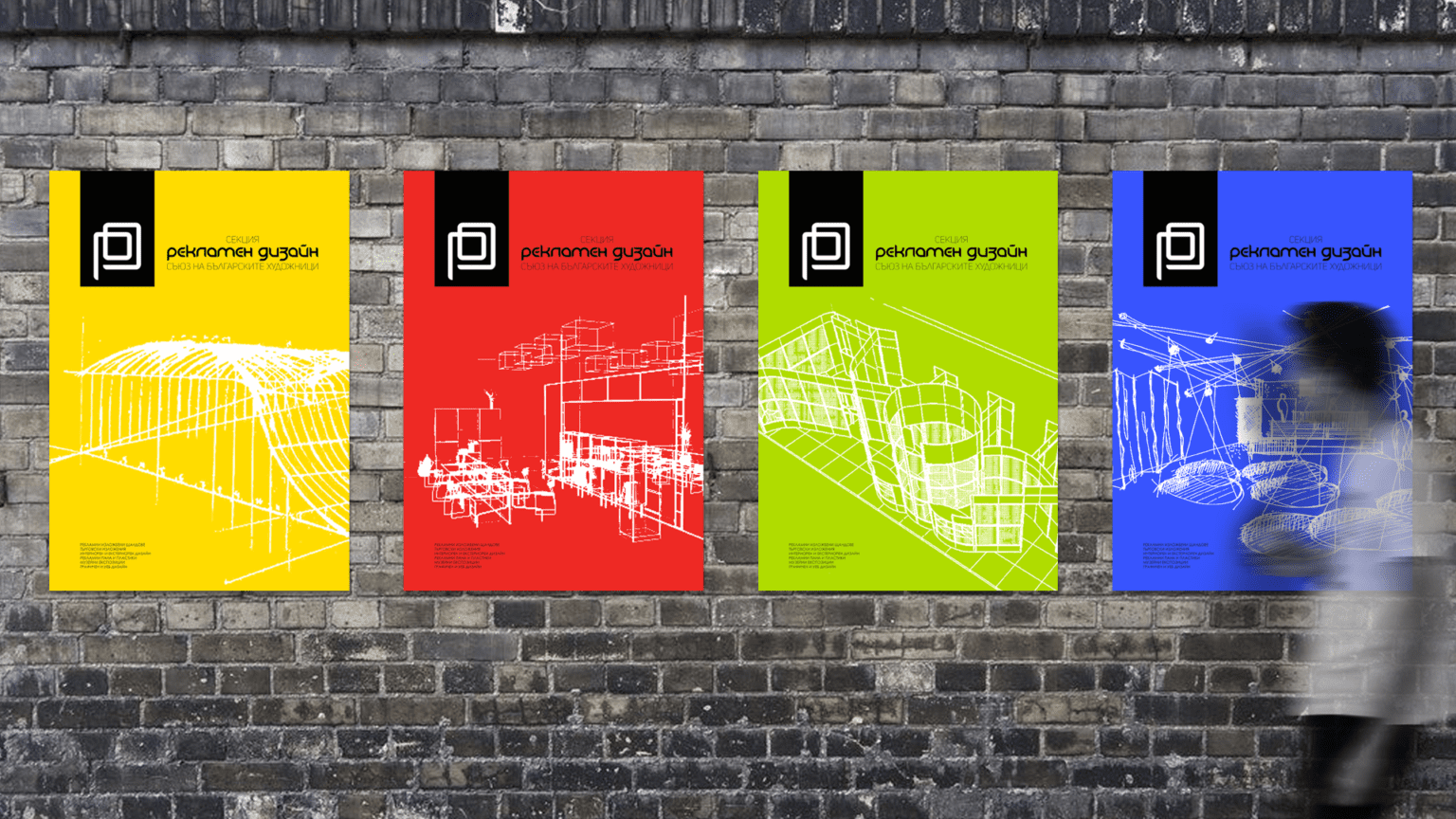
ADVERTISING DESIGN SECTION, UBA
The Section ADVERTISING DESIGN at the Union of Bulgarian Artists brings together professionals in visual communications, graphic and exhibition design. To design an original identity for our colleagues was extremely challenging.
The brand design is a line drawing representing simplicity as it is transformed into a two-dimensional, spatial structure. The idea and shape support the organization’s mission to preserve connections throughout the professional community.
The designers love the graphic simplicity and contrast of black and white, so we left the sign monochromatic but developed very bright coloured variations for its various applications.

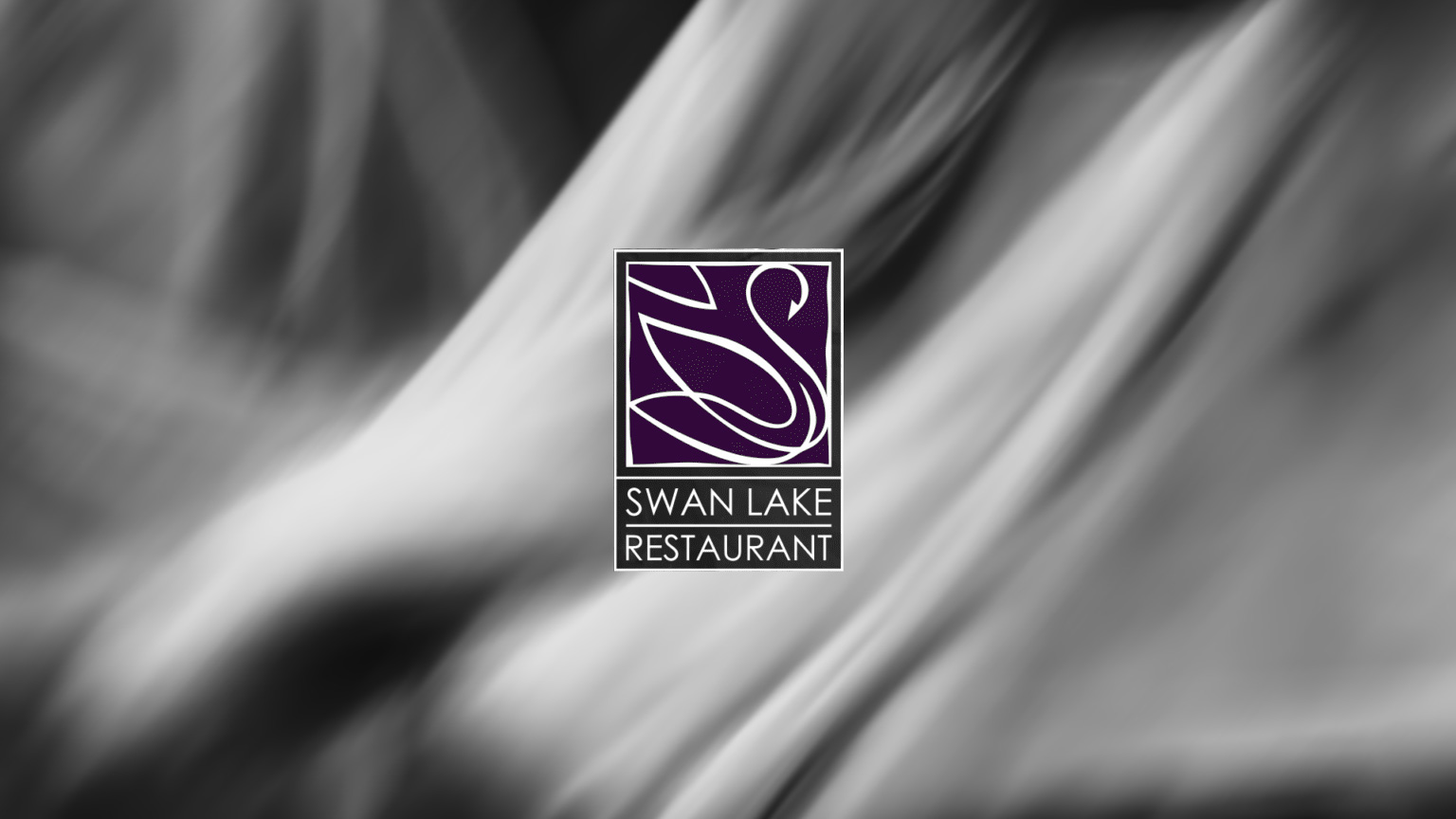
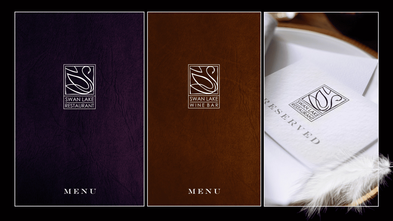
SWAN LAKE RESTAURANT
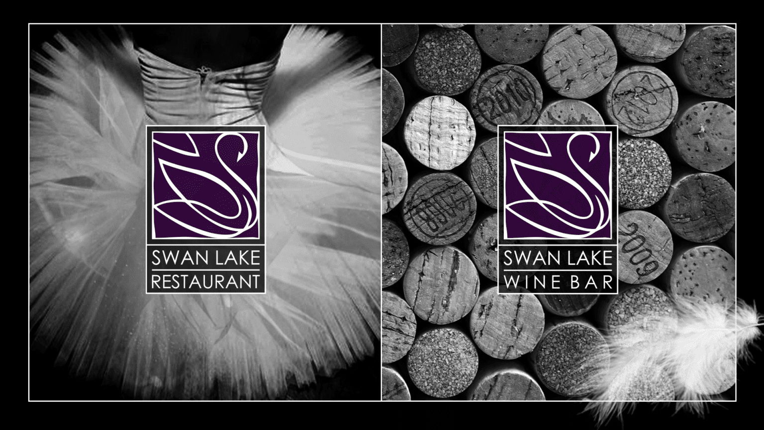
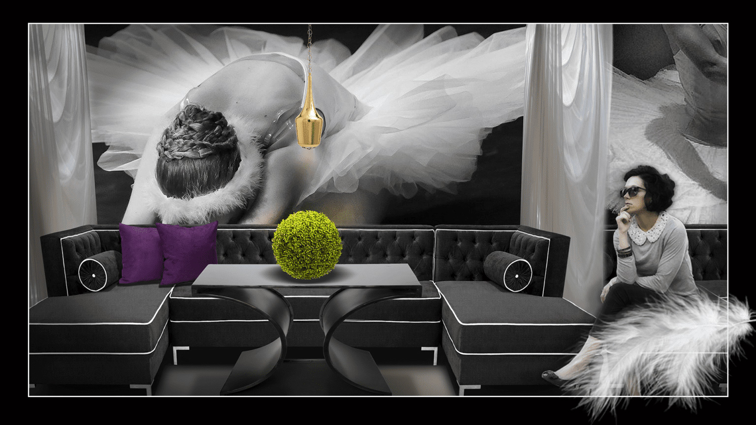
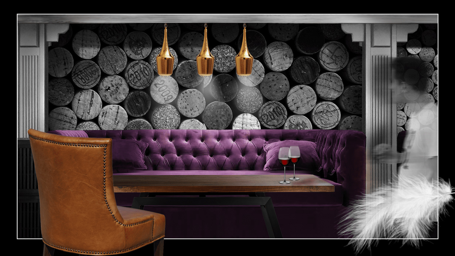
Graphic and Interior Design Project for Swan Lake Restaurant
Odette and Odile…, white and black in the night forest by the lake…
The classic combination of tradition and modernity in the design aims to attract both old and new customers of the restaurant. The design of the brand is traditional, calligraphic. Combined with the simple font, the logo radiates elegance.
In the interior, we opted for black and white, but added modern decorative elements in a discreet tonality that is repeated in the printed materials.
PULVIS ART URNS
Pulvis Art Urns is a start-up company. A group of artists, ceramicists and sculptors create models that are far more than traditional urns. With а great attention to the detail, the cremation urns are entirely handcrafted from high quality ceramics, with respect and reverence for the customers.
The specific profile of the company required a particularly careful selection of the means of expression. The extremely precise choice of colors and shapes had to inspire confidence and serenity.
We created a simple typeface logo for Pulvis Art Urns with the idea to promote the name of this start-up company. Elegant and serious, the logo perfectly suits the brand's core values.The concept for the exhibition stand includes a modular design and the ability to multi-use the stand at different exhibitions around the world. One of the challenges included a requirement for the wall structure to convert into cassettes to carry the ceramic exhibits. We designed modular cases with built-in led lighting to expose and store the products.
The color scheme with a dark floor and shading from grey to white tones provides a calm background and visually increases height. The materials, colors and subdued light help the exhibits to live a life of their own and highlight their dramatic aesthetic.
HYDE ILLUSIONS
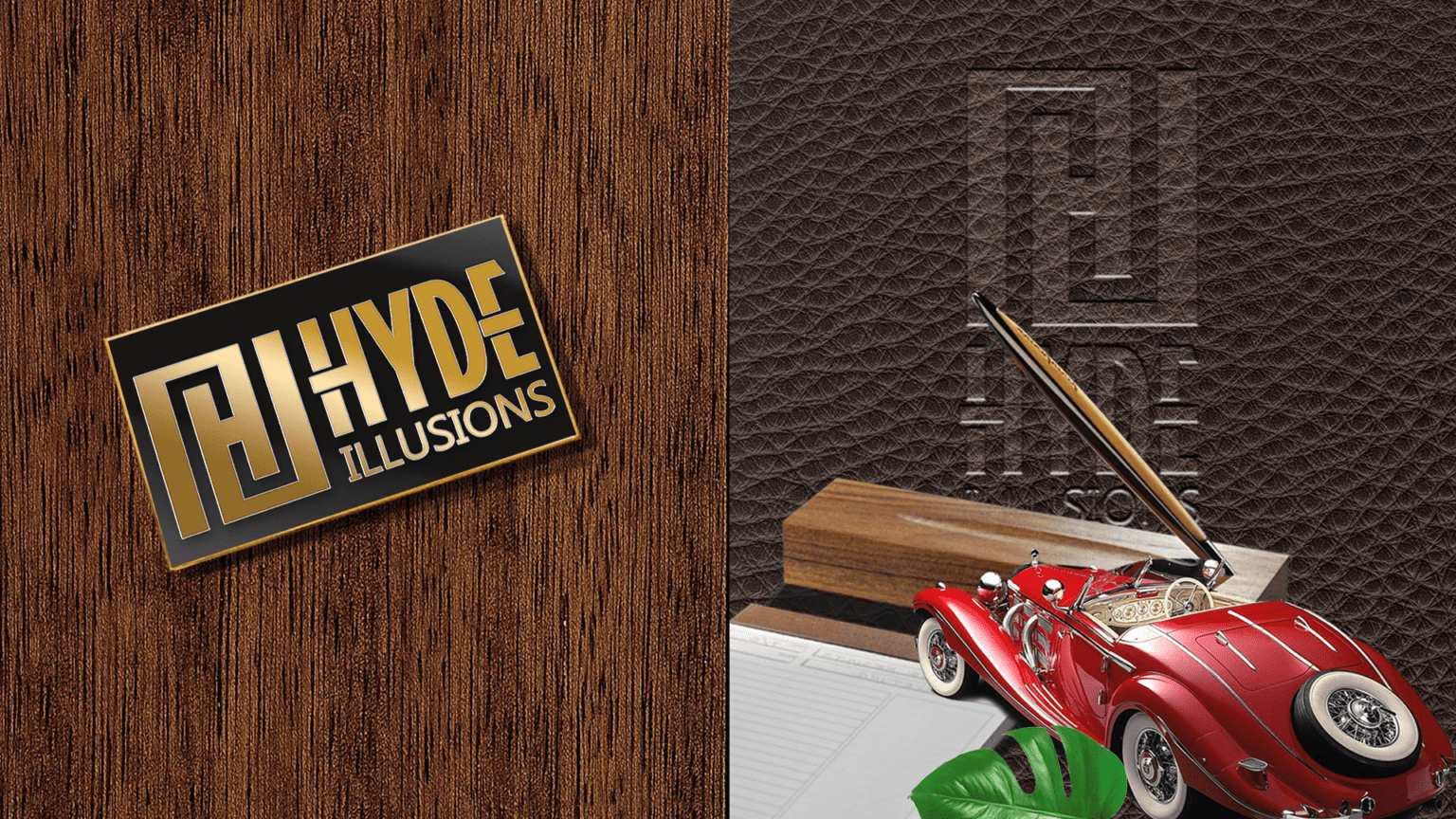
We created this logo for a company making the intricate and heavy gear that helps illusionists perform their tricks with such ease.
The logo had to be compact, confidence inspiring, yet hint at the world of illusions the company works for. The other main requirement was that the basic component of the logo could be used as a separate element that could be easily appliqued onto the gear.
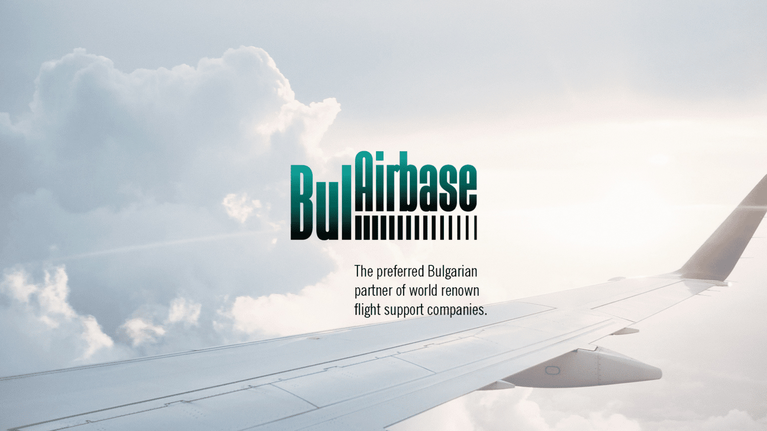
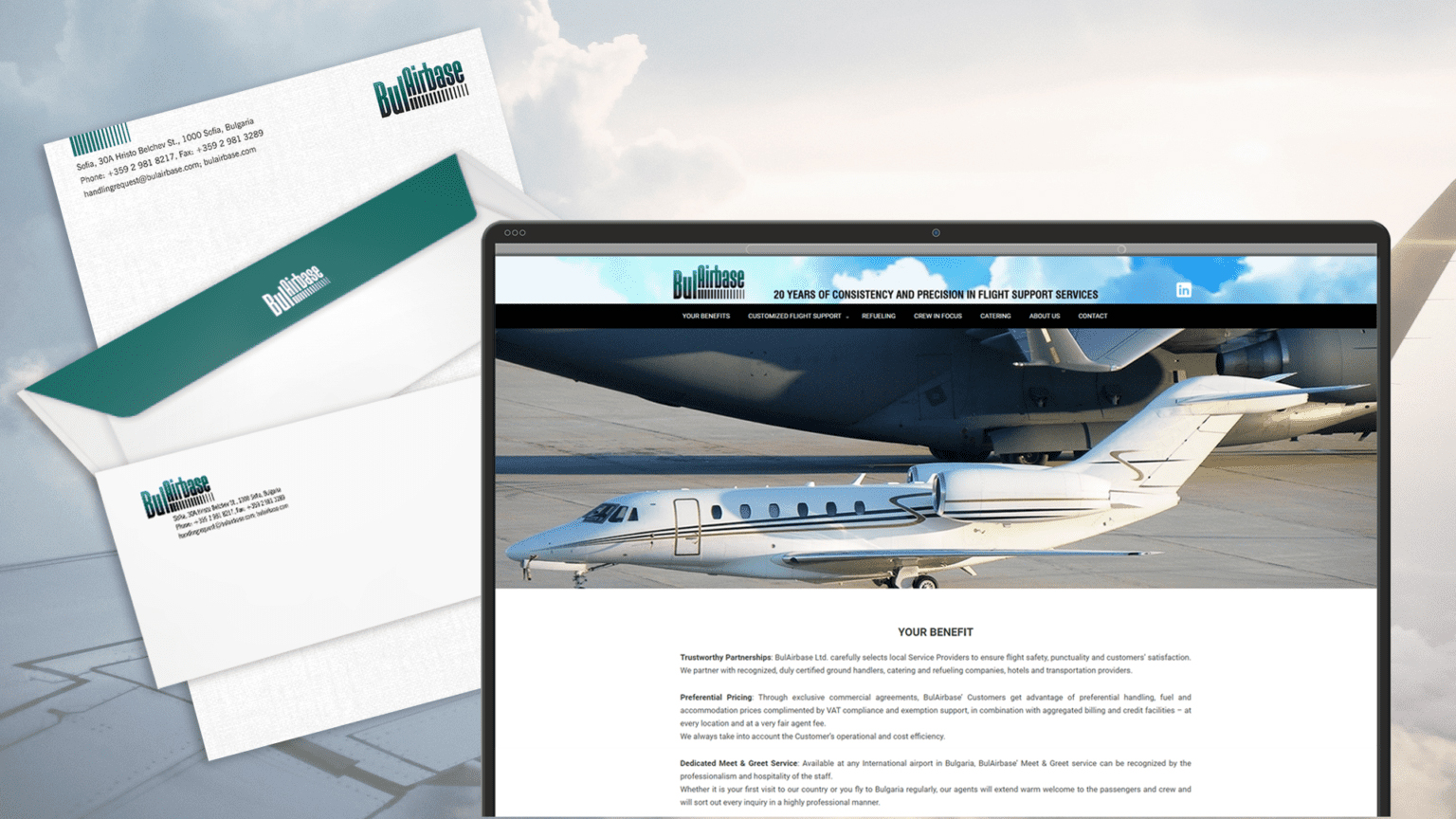
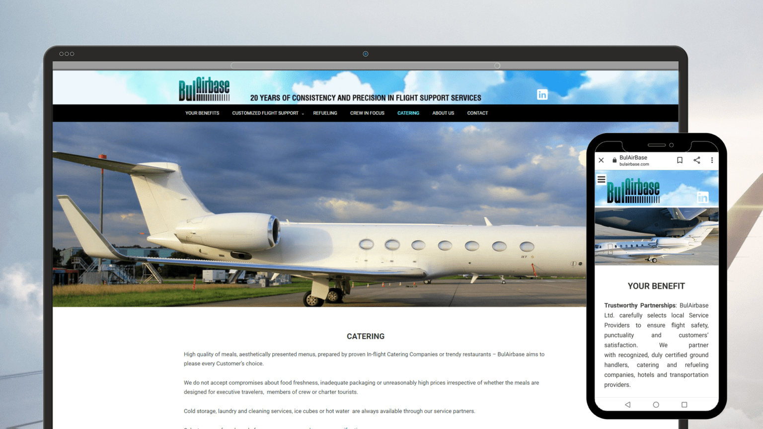
BULAIRBASE

BulAirBase Ltd. is the preferred Bulgarian partner for world well-known flight support companies. For more than 20 years, the company has offered business and commercial aviation services, facilitating thousands of flights and providing consistency and quality service to operators at all 5 international airports in Bulgaria.
The visual identity we have created fully reflects the company's principles - stability, consistency and reliability.
The logo is both restrained and aiming for the sky, our goal was to communicate a sense of stability and constant movement forward and upward.
The color scheme is calm and serious, the black base grounds the composition and the blue-green suggests the infinity of the sky. This concept continues in the website (https://bulairbase.com/), which with its simple structure and design provides clear information about the services and ensures a quick connection with the BulAirBase team.

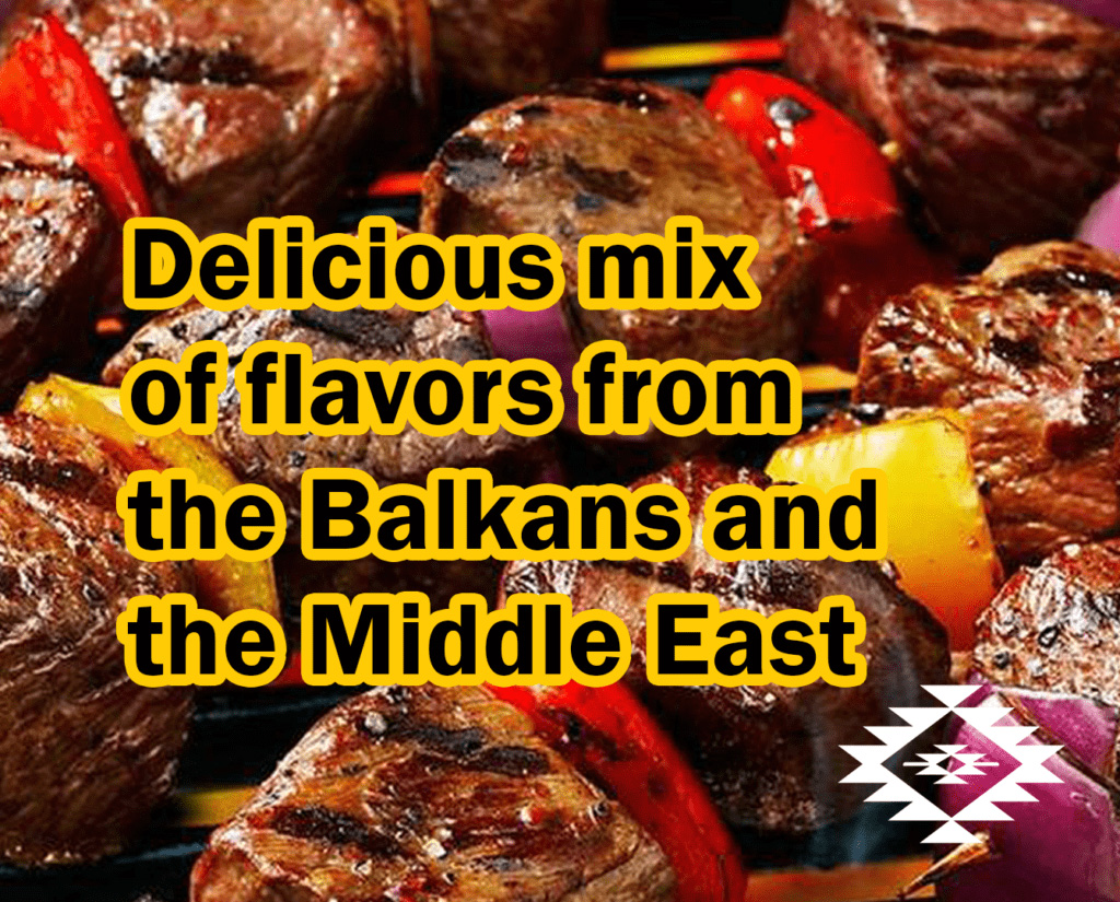
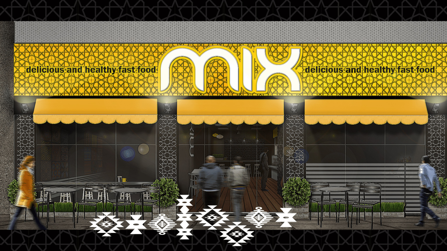
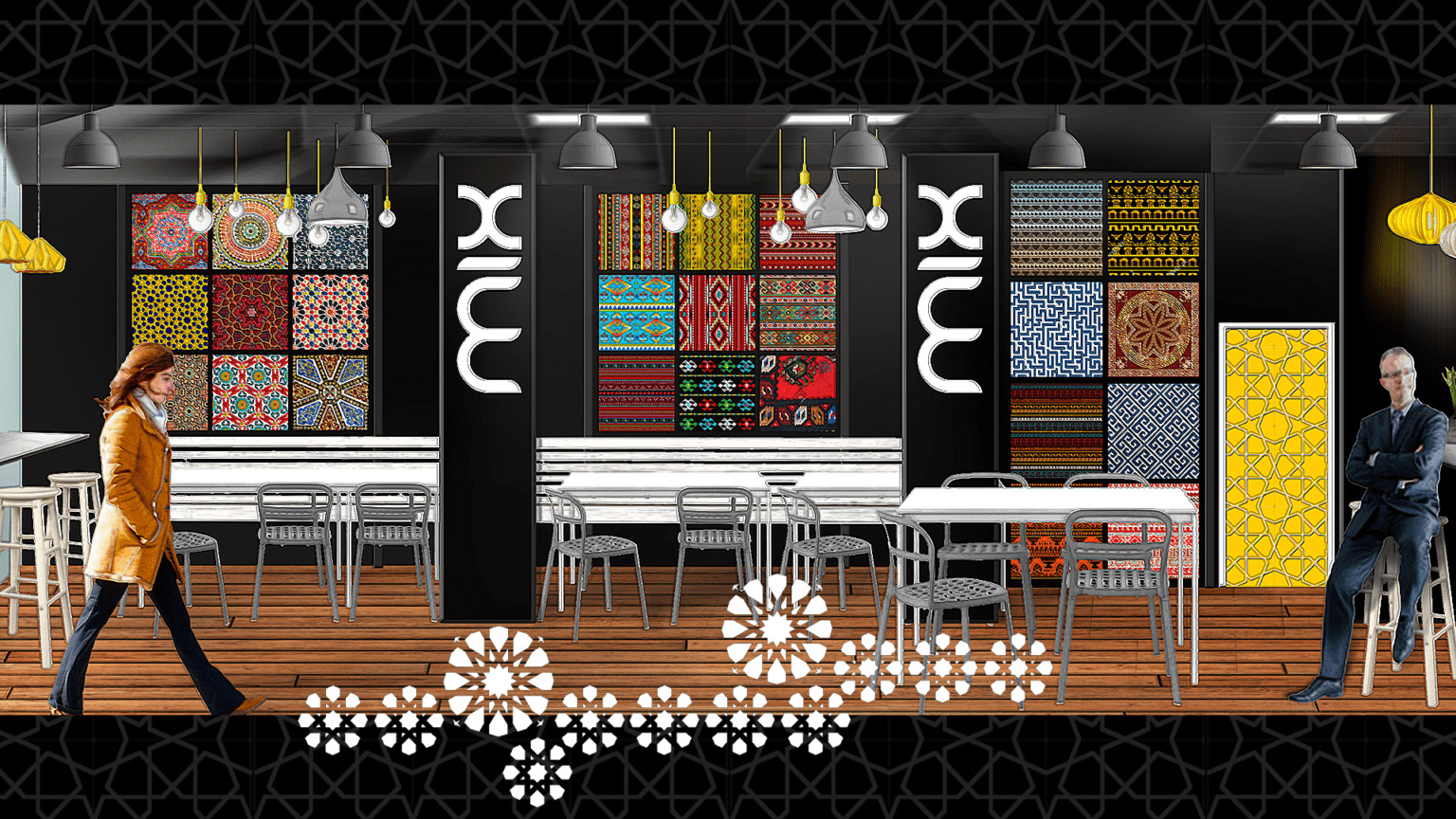
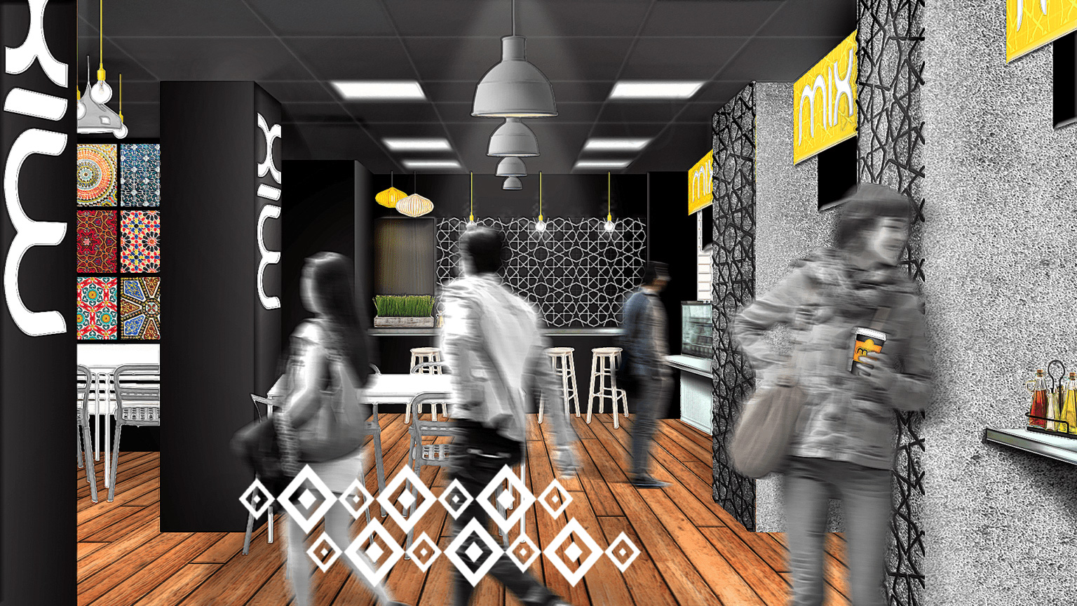
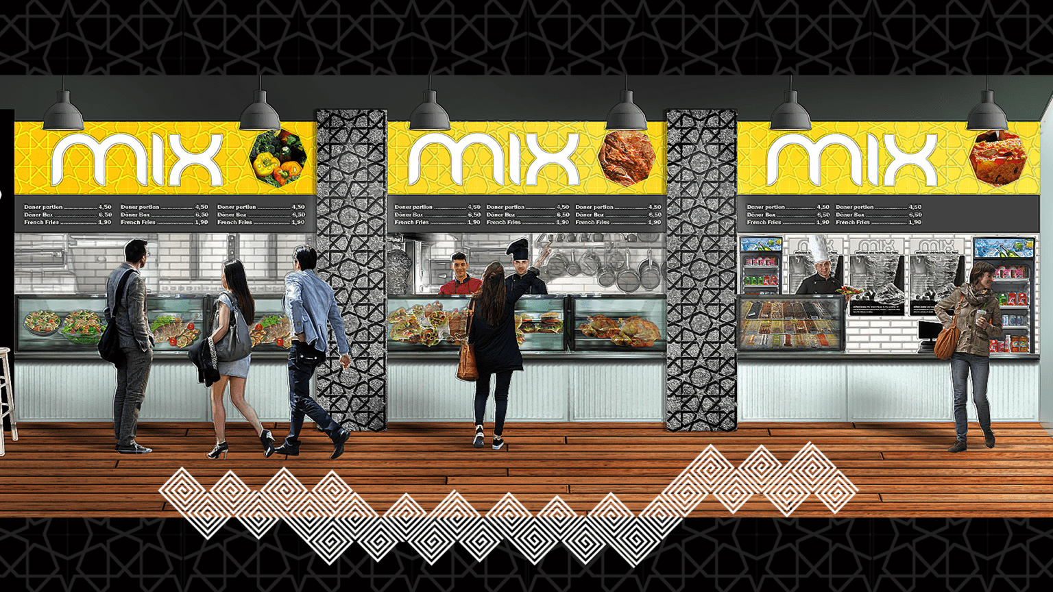
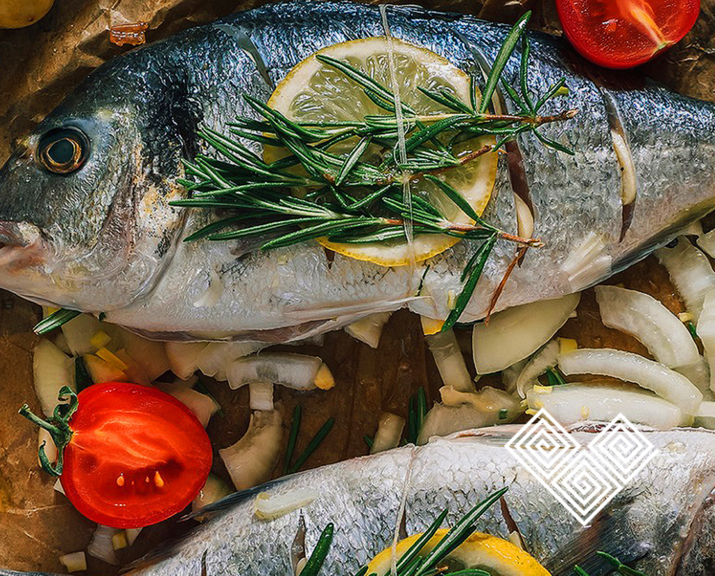
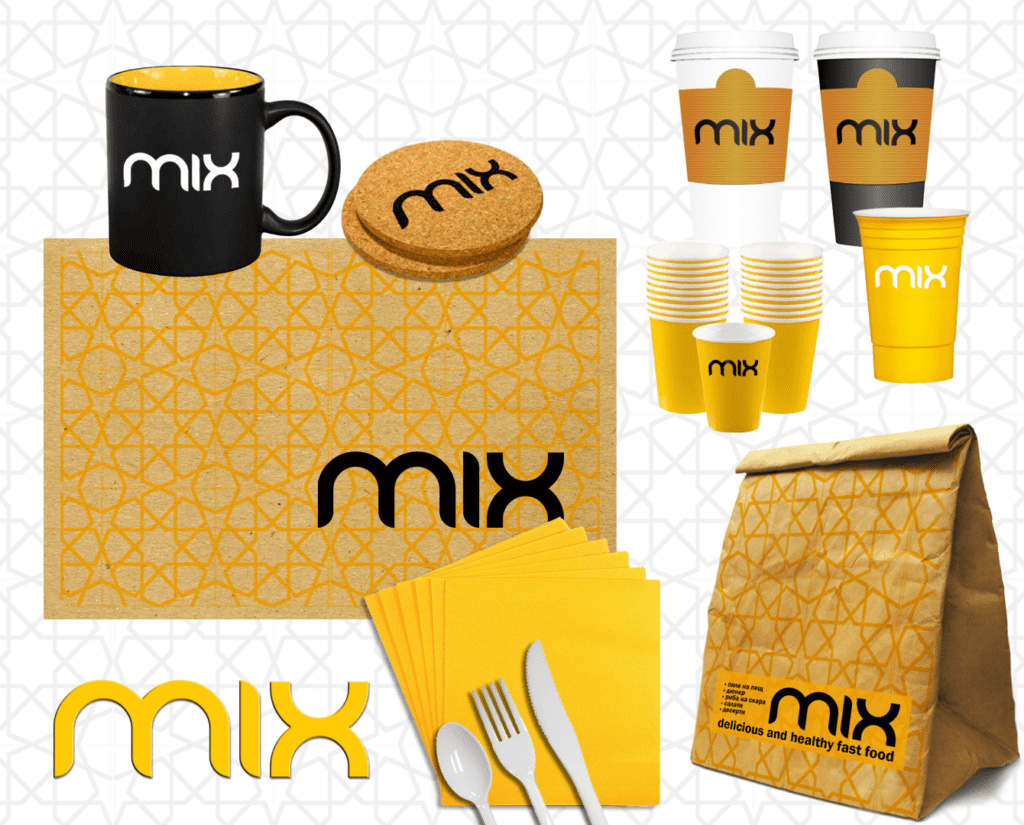
MIX BRAND IDENTITY

Балканите са регион с богата смесена култура, а множеството влияния от The Balkans is a region with a rich mixed culture. The influence of Oriental, Middle Eastern, Mediterranean and other traditions make Balkan cuisine one of the most diverse and multi-colored cuisines worldwide.This new MIX restaurant needed a bold name and identity to fill the niche between the familiar fast-food chains and other restaurants in the city, offering a stylish but casual place for healthy dining for the working young professionals.
We developed a Brand Identity named MIX, designed to capture the attention of the target audience. The design for MIX reflects the blend of different and complementary flavors of Balkan and Middle Eastern cuisine. The visual identity is simple and the color palette is reduced to one bright vibrant color, like a hot, temperamental symbol that synthesizes the hallmarks of the diversity of traditions and tastes.
We used details and textures in the restaurant's design that illustrate the origins of the meals - a grid typical of the Orient, details of Bulgarian embroidery and rugs, Greek decorative elements, etc.

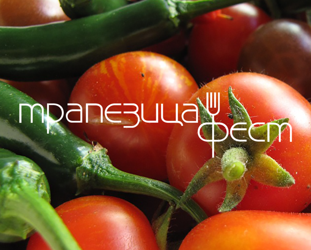
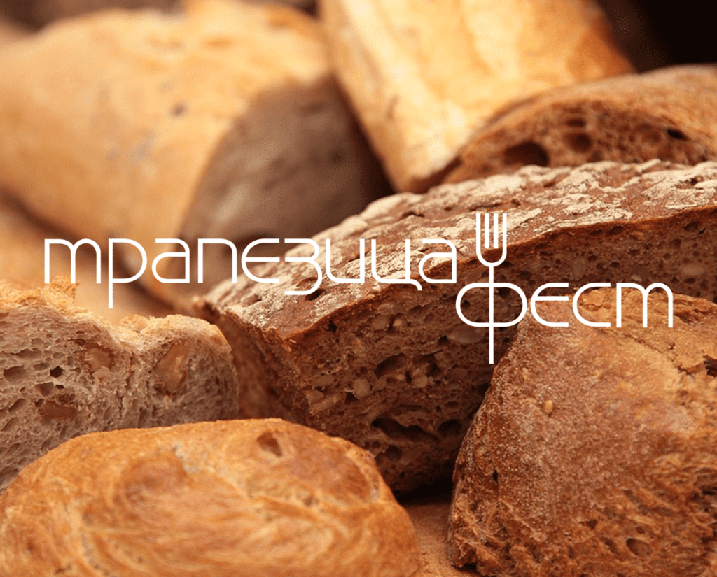
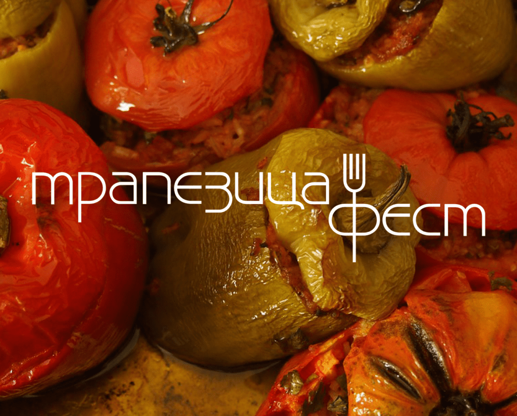
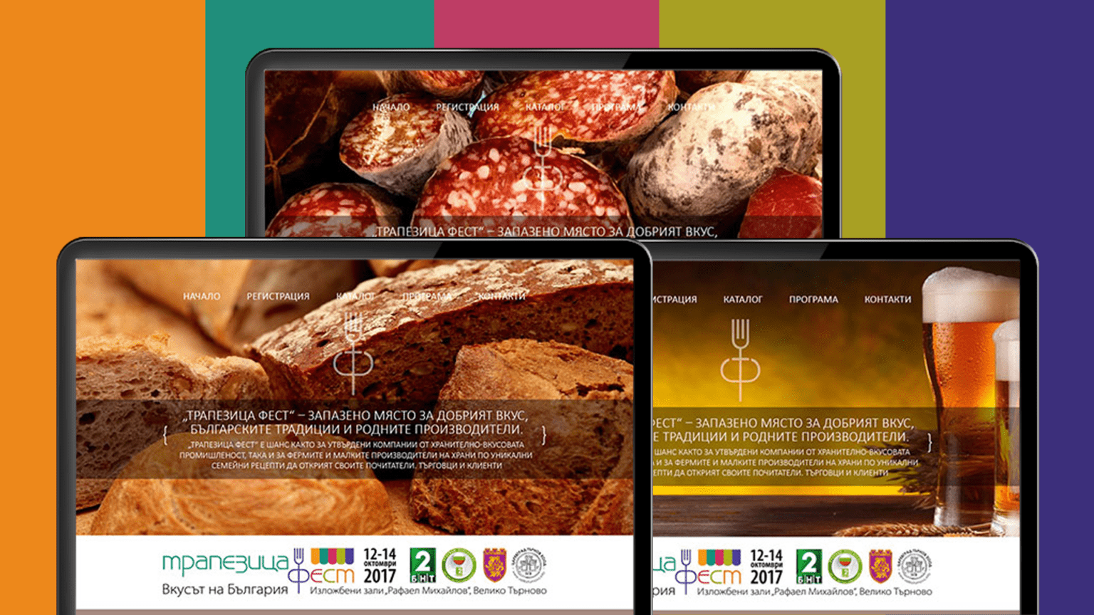
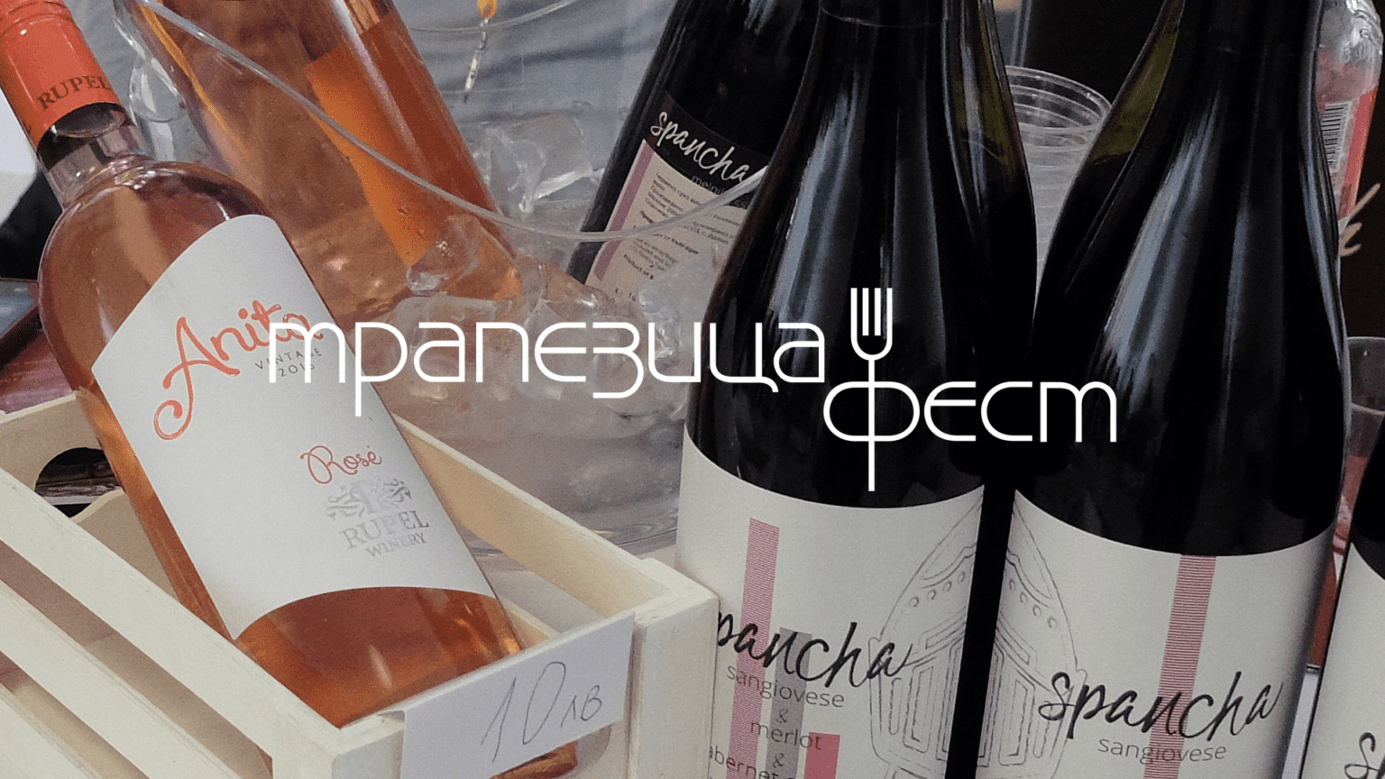
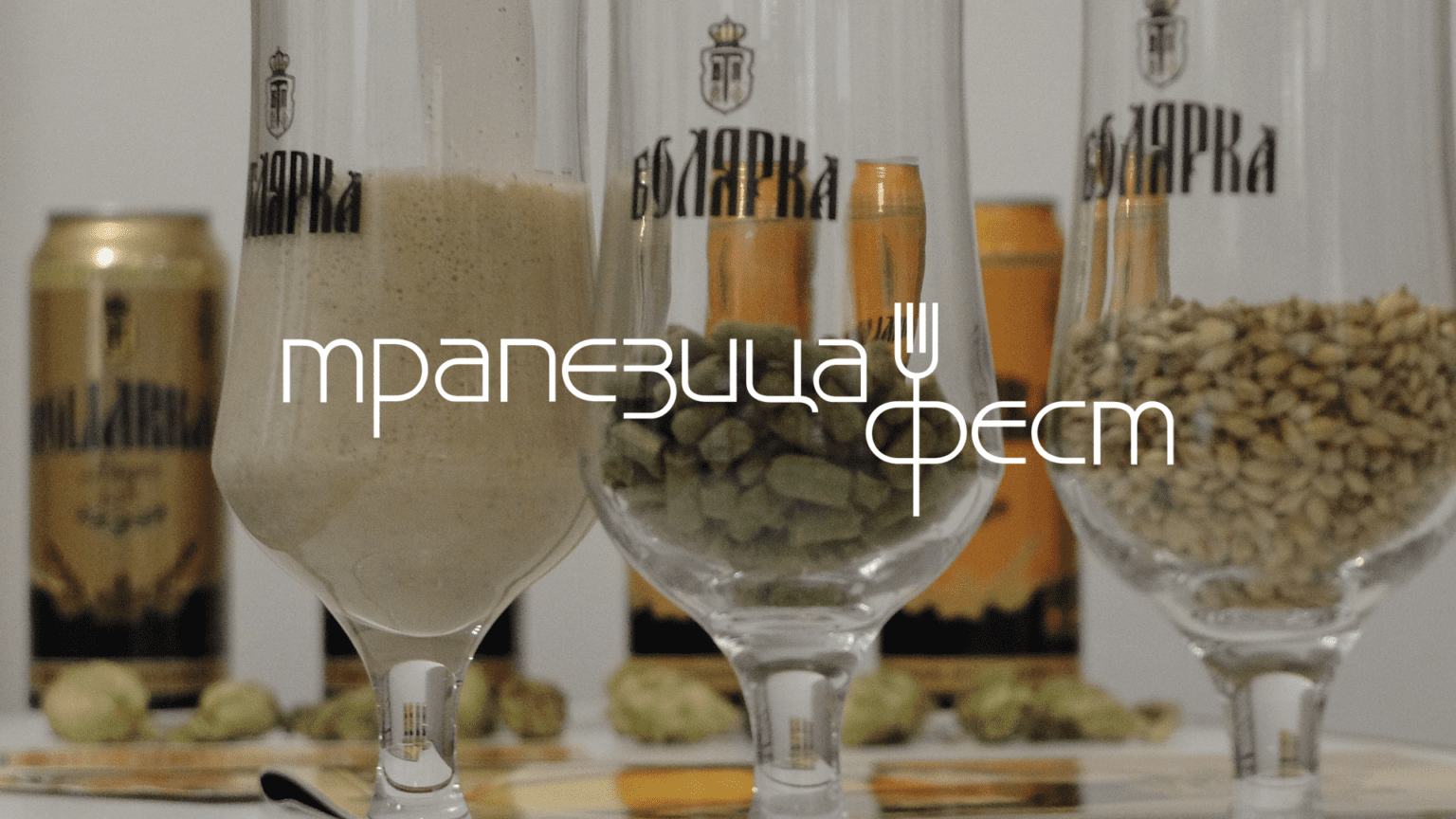
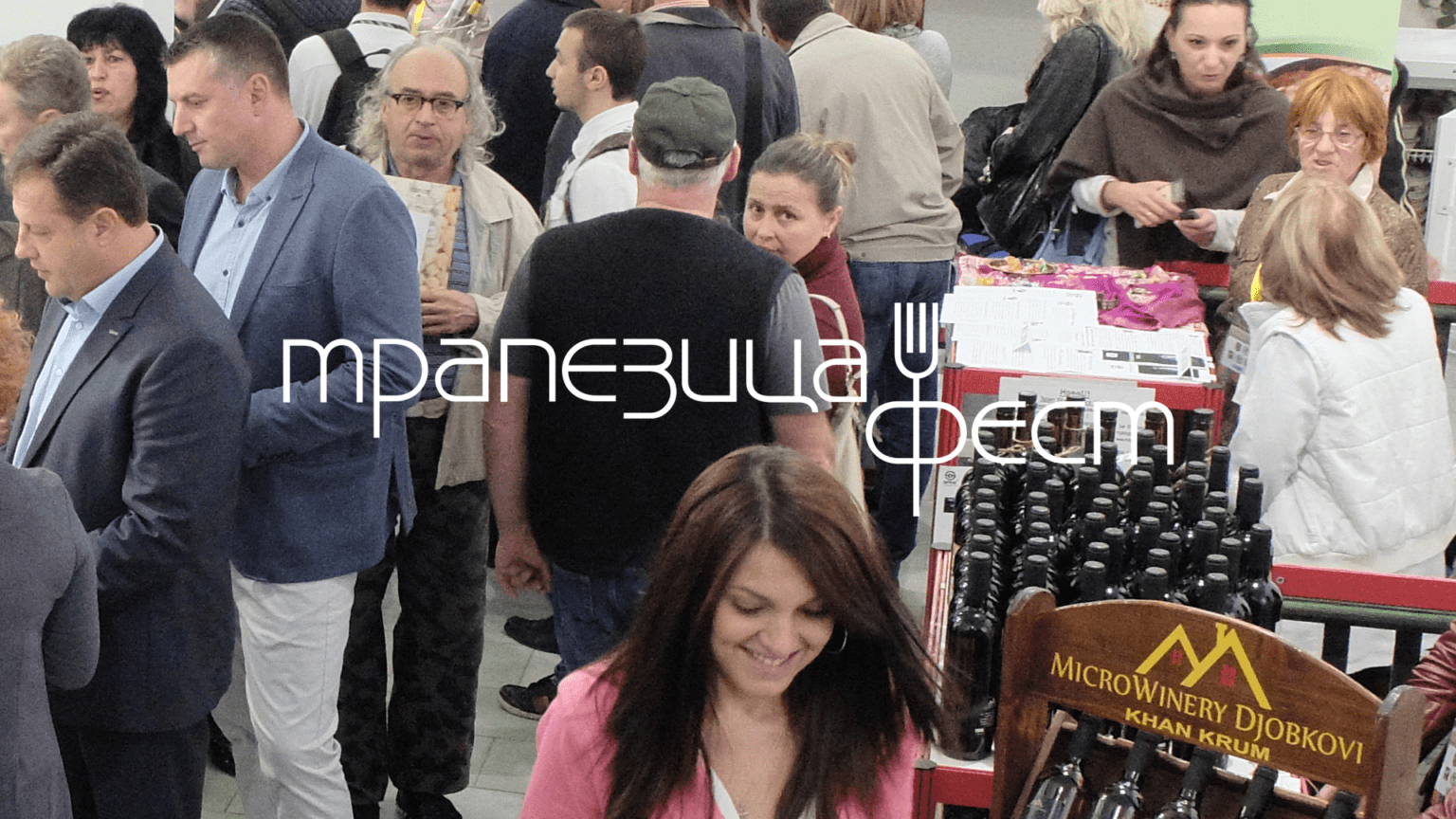
TRAPEZITSA FEST
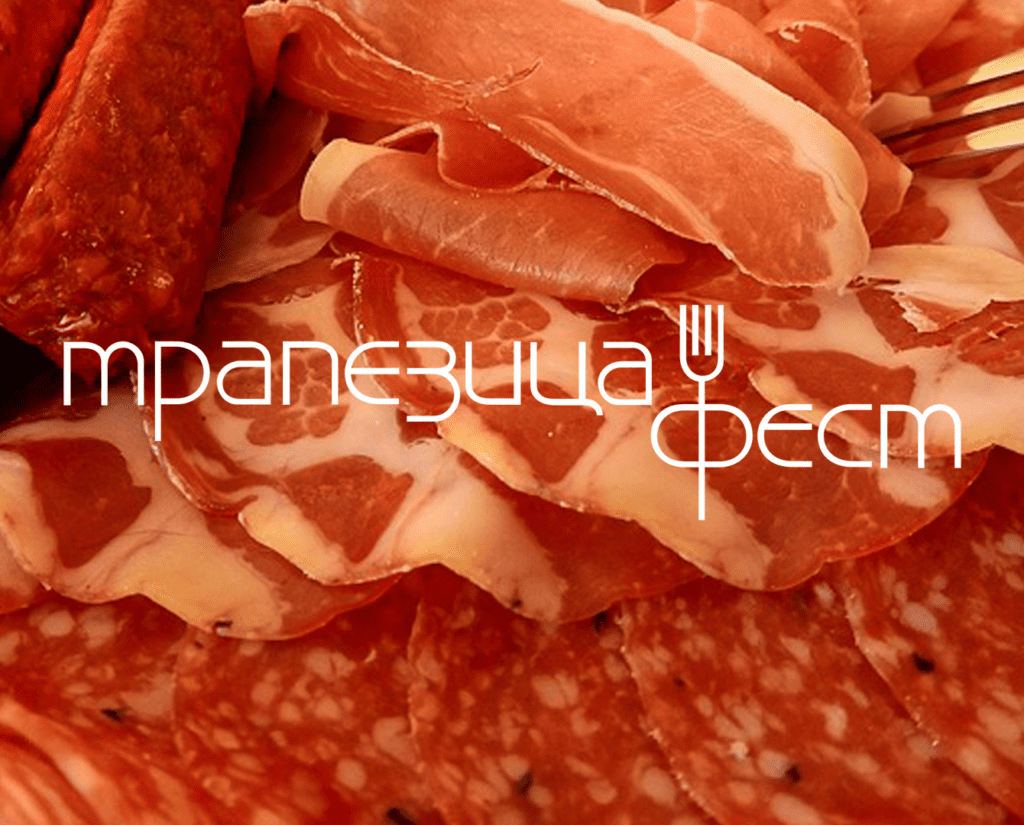
The concept of Trapezitsa Fest is to demonstrate and promote regional cuisine with its typical products and specialties from all over the country.
Tastings of regional recipes prepared by locals attract the public, and producers present their products to major food chains, hoteliers and restaurateurs.
The name of Trapezitsa Fest is a reference to the historic Trapezitsa hill in Veliko Tarnovo, as well as to an emblematic delicacy of the region - 'Rolle Trapezitsa', which recently became a Bulgarian trademark within the European Union.
At the same time, the word Trapezitsa also carries the meaning of table, table, feast. In addition to its function as a social regulator in relationships, the table has the specificity of a kind of magic for health, family harmony, general well-being and fertility.
The visual identity combines a juicy colour palette with earthy and warm tones that make “Trapezitsa” a fun place for shopping, sharing recipes and delicious food. The logo is part of the fun – slightly chatty, with intertwined words and cutlery. The system with coloured sections extends to the website of the festival, where it organizes the event in sections and helps you find your way around while shopping.
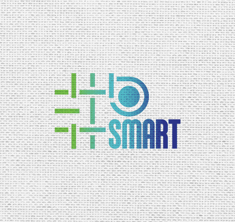
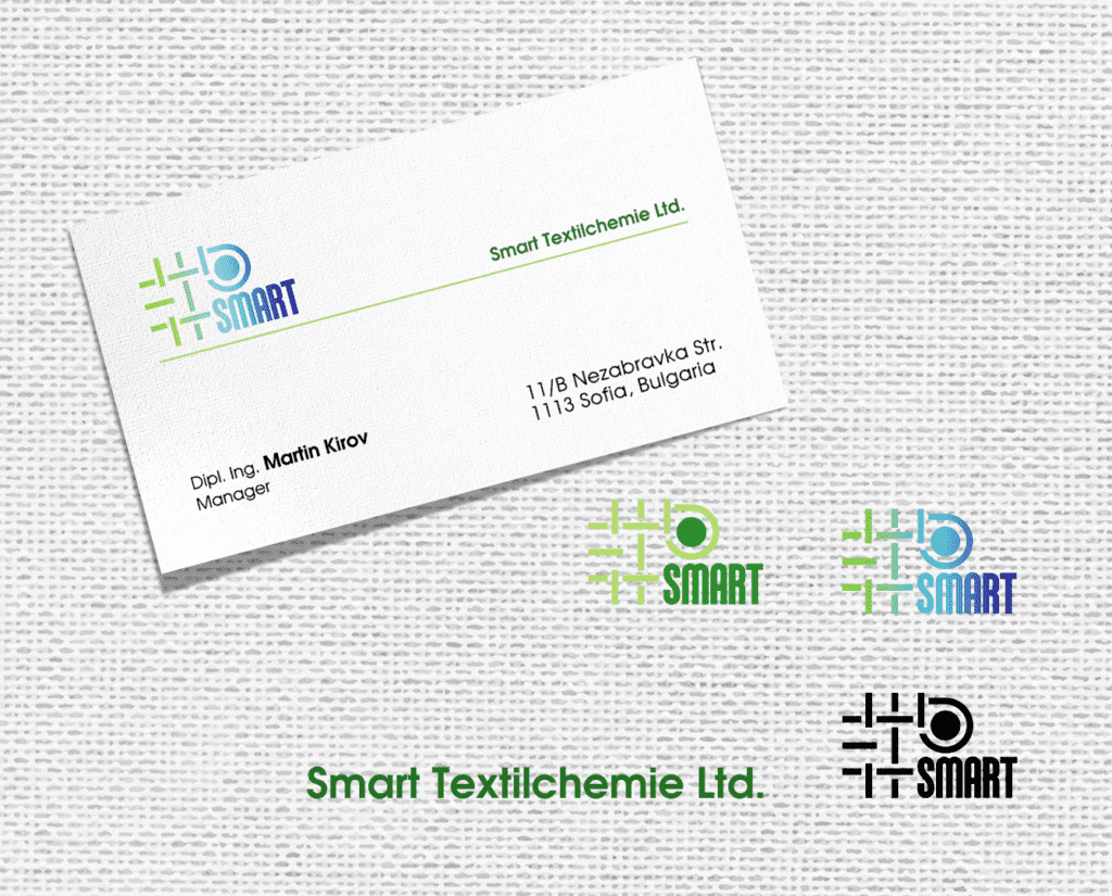
SMART TEXTILCHEMIE
Smart Textilchemie Ltd. is the largest company for machines, chemicals, spare parts for the textile industry, official distributor for Bulgaria for over 25 leading companies. (Germany), Trützschler Group (Germany), Groz-Beckert (Germany), Zschimmer&Schwarz (Germany), COGNETEX (Italy), UNITECH (Italy), Durst (Italy), Corino Macchine (Italy), Schelling 1867 (Italy), Welker (Germany), Textape (Italy), Dante Bertoni (Italy), Rosink (Germany), Hansa Mixer (Germany).
The logo we created is based on one of the main weaves in textiles “litho”. The graphic of Smart Textilchemie is built around the concept of a connection between all the components necessary for the textile industry to work – machinery and chemicals. The color scheme is fresh, creates a positive vision and speaks of the pursuit towards more and more nature-friendly industries.
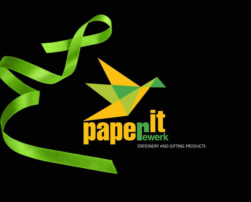
PAPER IT LOGO DESIGN
PAPER IT Bulgaria is a part of Reverk Holding and offers a wide range of luxury packaging materials, paper bags, greeting cards, ribbons, gift labels, gift wrap and much more.
The colorful origami bird, as one of the most beautiful symbols of paper artwork. It has turned into a sparkling and eye-catching logo for this company that precisely selects beautifully crafted products for the Bulgarian market.
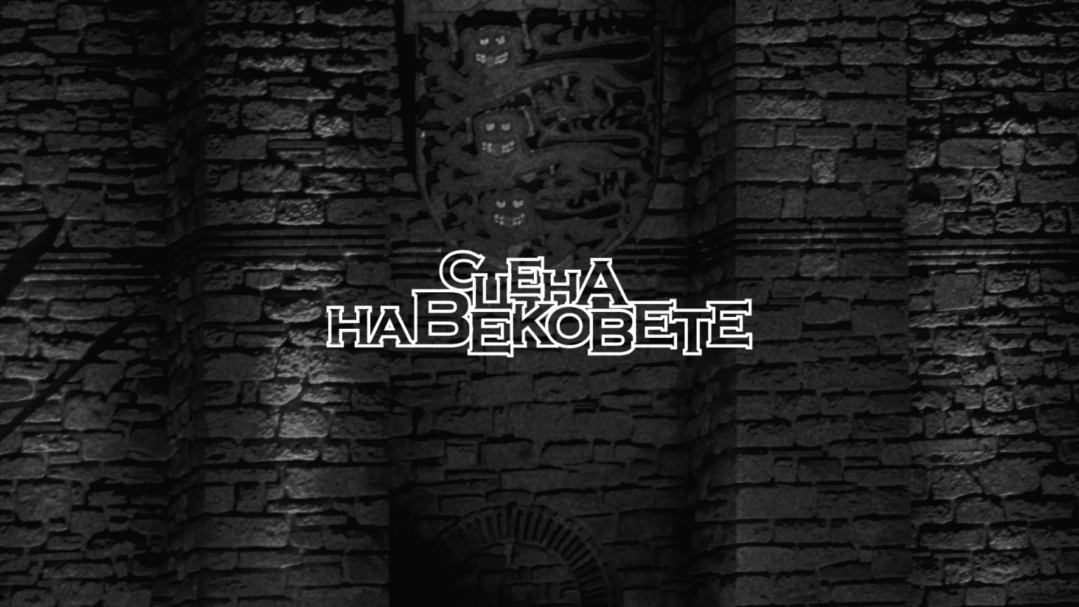
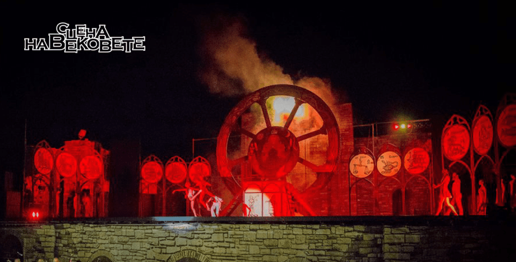
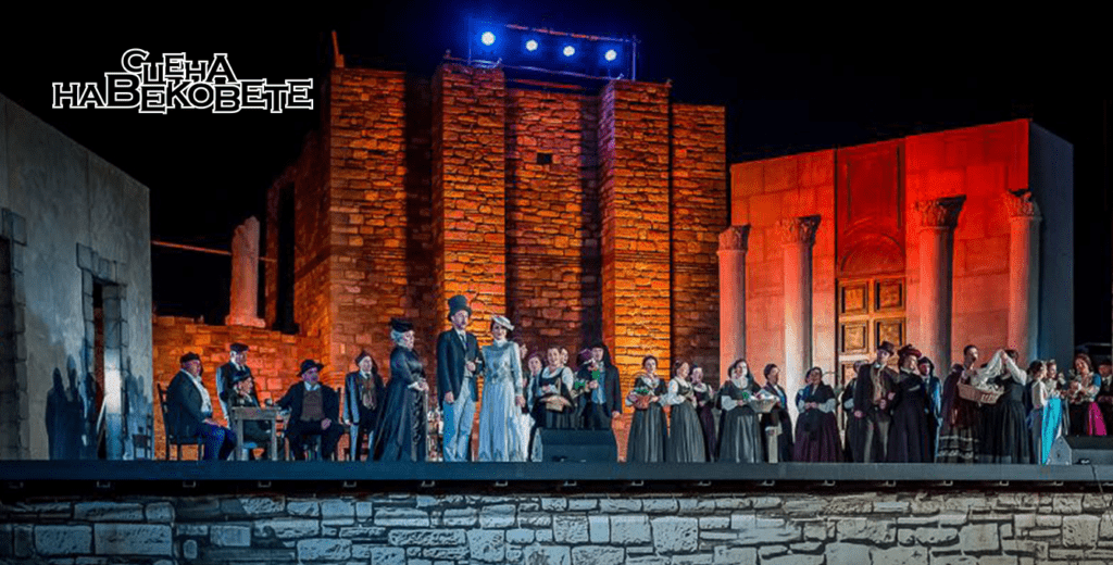
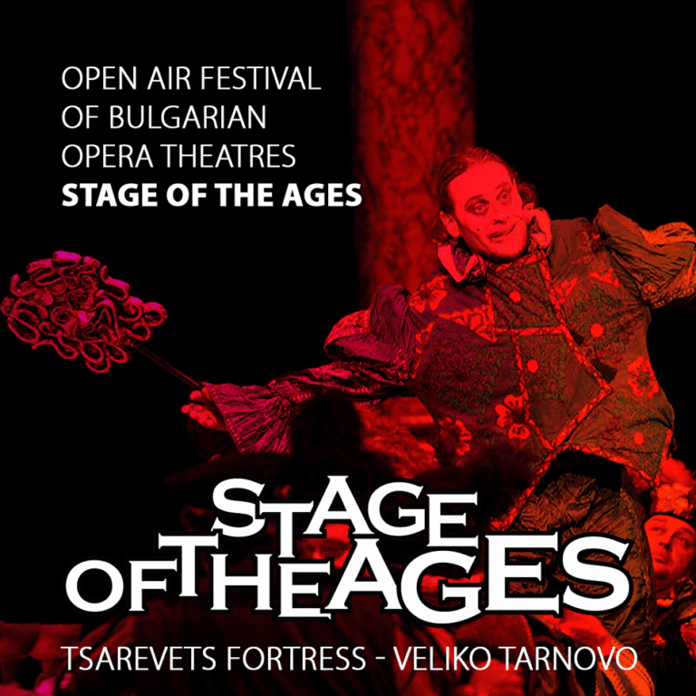
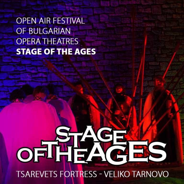
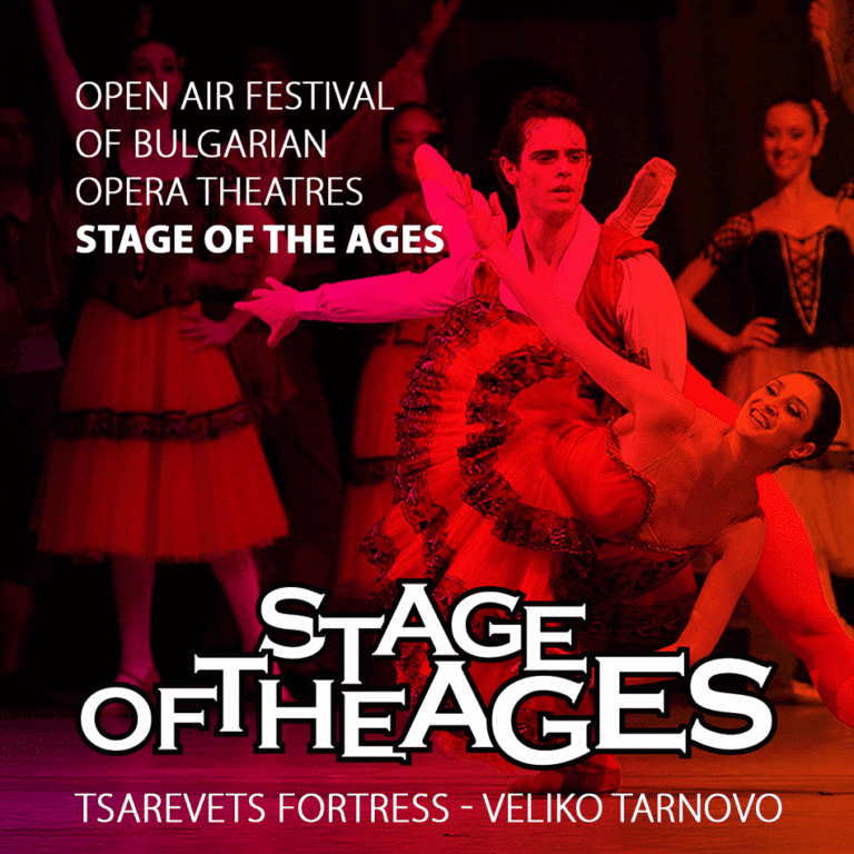
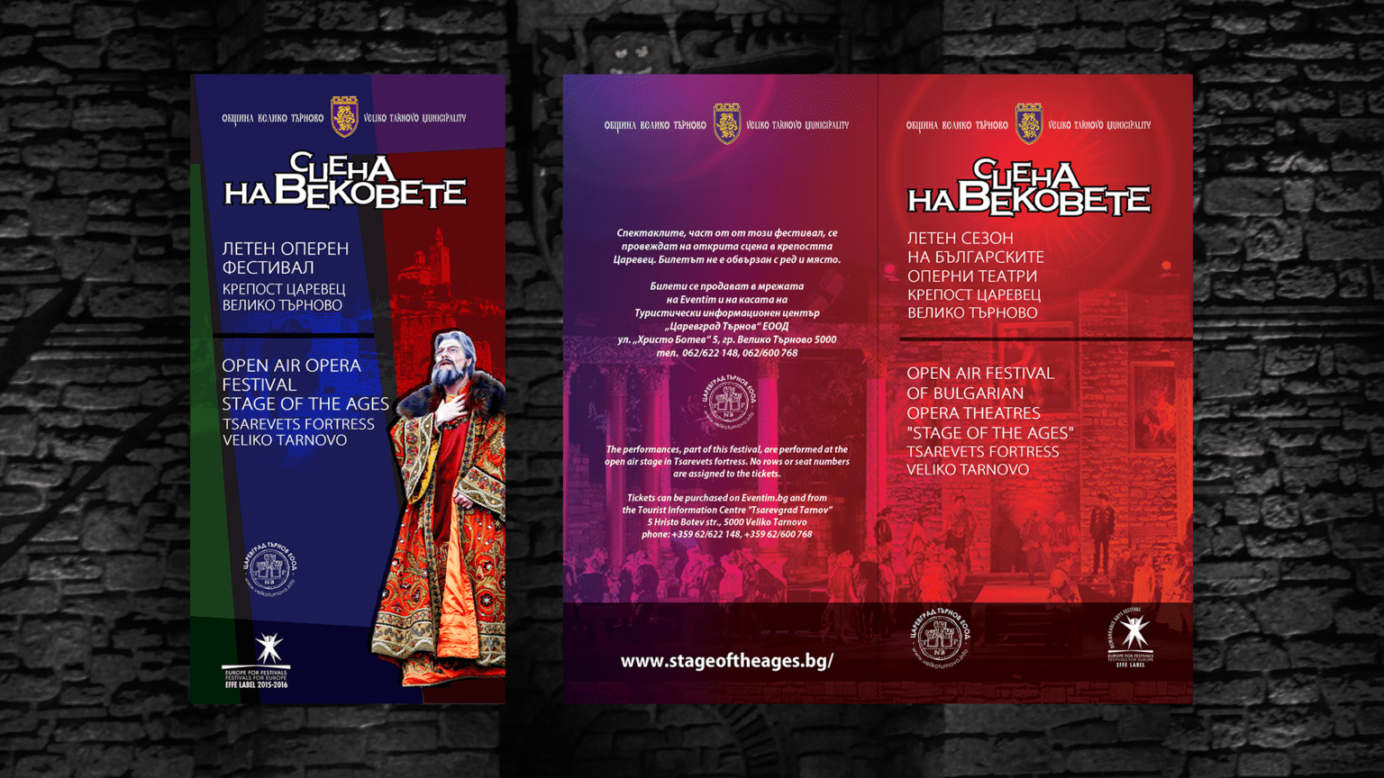
STAGE OT THE AGES
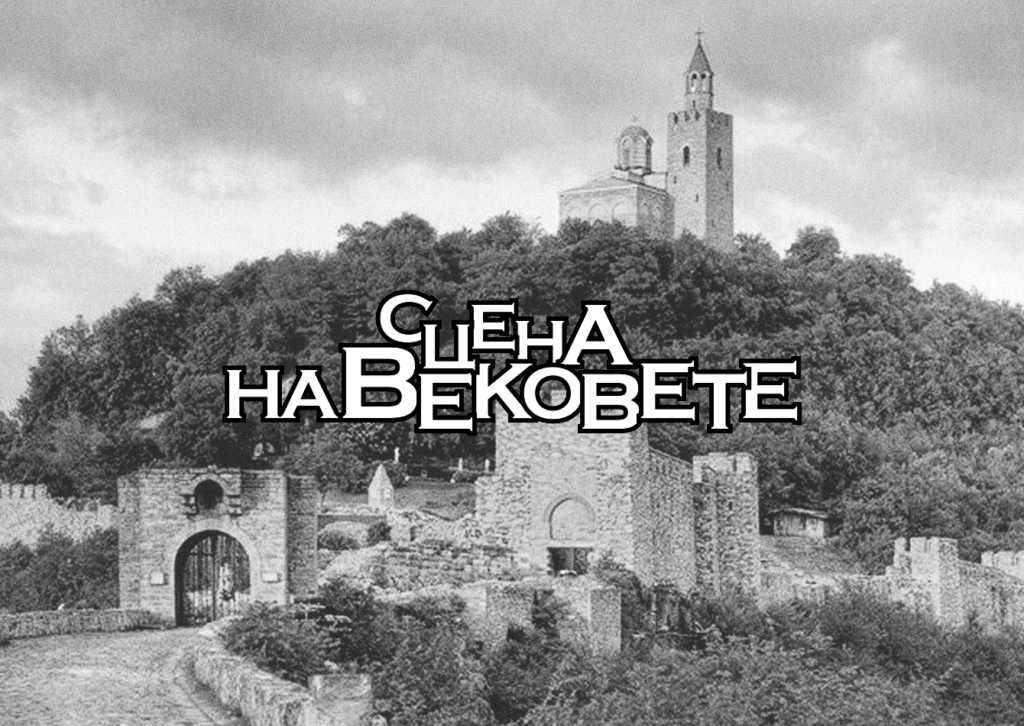
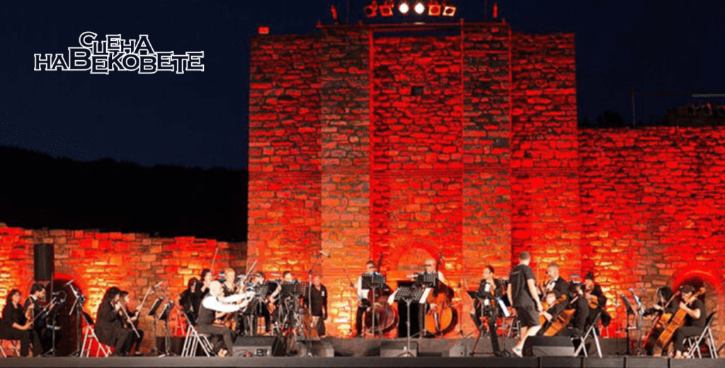
We designed the trademark of the Opera Festival "Stage of the Ages" commissioned by the Municipality of Veliko Tarnovo, as well as posters, brochures and other promotional materials for the event. The arrangement of the inscription follows the silhouette of the hill and the emblematic fortress Tsarevets - the medieval palace of the Bulgarian kings and home of the festival.
"Stage of the Ages" is the first open-air opera festival in Bulgaria, which takes place in the medieval Fortress Tsarevets in Veliko Tarnovo. Through the years it has become one of the most significant cultural events in Bulgaria and every summer it presenting the best operas, ballets and musicals.
The festival is organized by Veliko Tarnovo Municipality with the support of the Municipal Tourist Agency “Tsarevgrad Tarnov” and since 2016 it has been developed as a summer season venue of all Bulgarian opera theatres and rebranded as Open Air Festival of Bulgarian Opera Theatres “Stage of the Ages”, featuring the state operas in Varna, Ruse, Burgas, Stara Zagora and Plovdiv, Arabesque Ballet Company, Veliko Tarnovo Music and Drama Theatre and others.