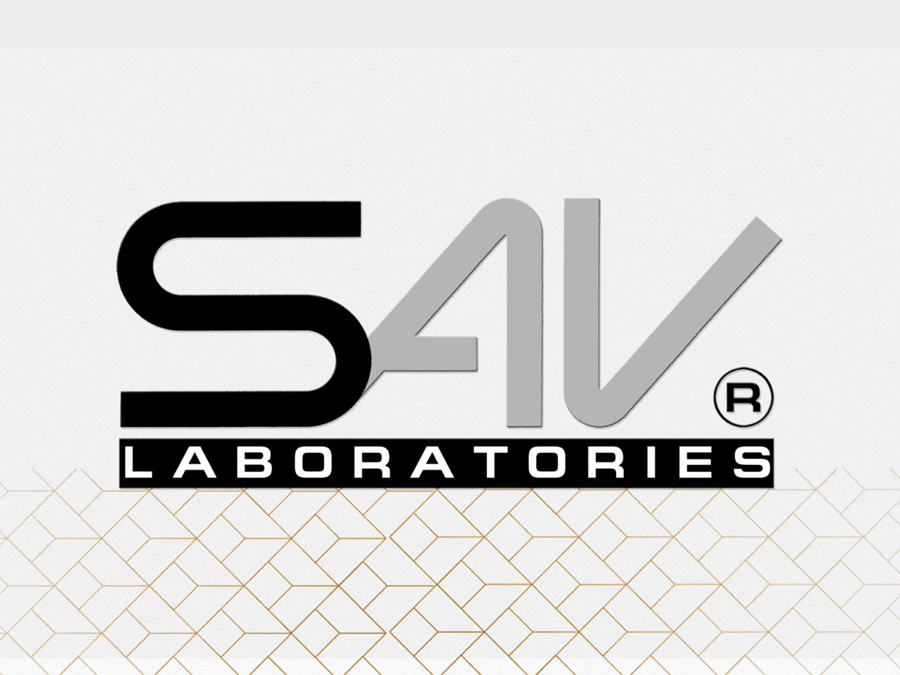
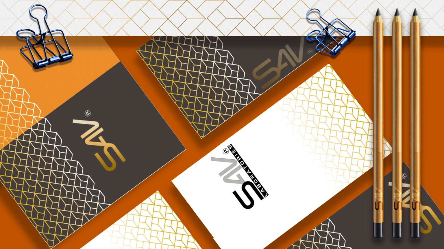
SAV LABORATORIES
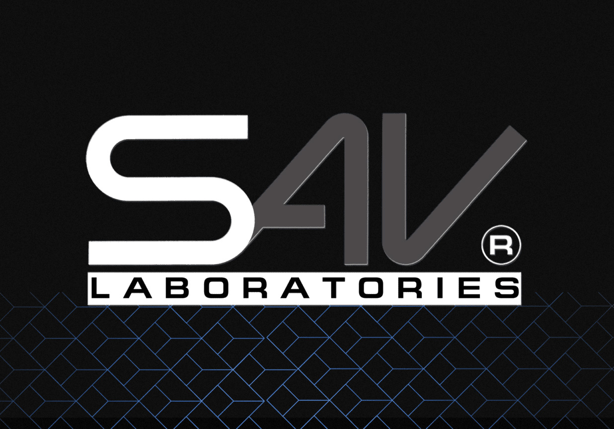
SAV is a Trademark for a Canadian research company working in the development of innovative engineering solutions and materials.
We designed a memorable, clear and functional logo considering the company's wide range of activities. The various elements have been reduced to the purest graphic form. The lines of the logo form the letters SAV highlighting the sustainable structure of the company's diverse portfolio, but also alluding to the company's innovative spirit.
The colors used are also consistent with this concept and kept to a minimum. Black, white and grey are the main colors and enable using an additional color for accent where necessary.
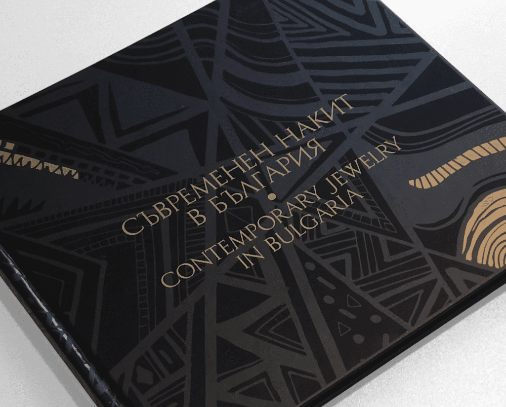
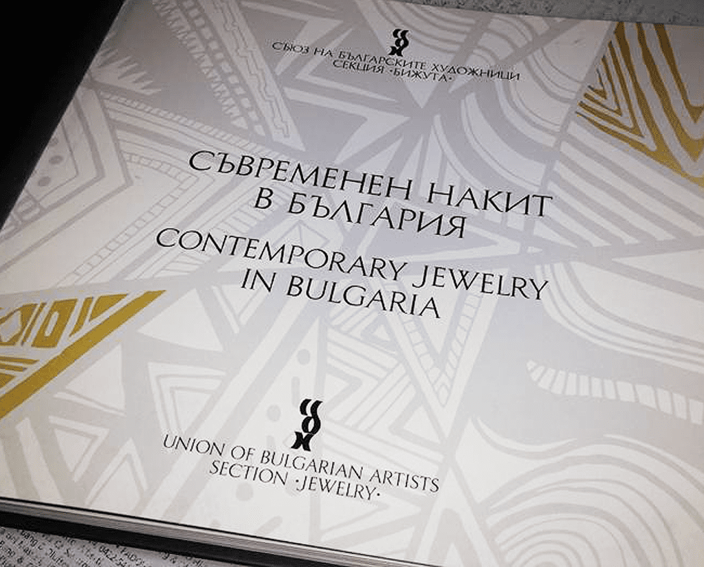
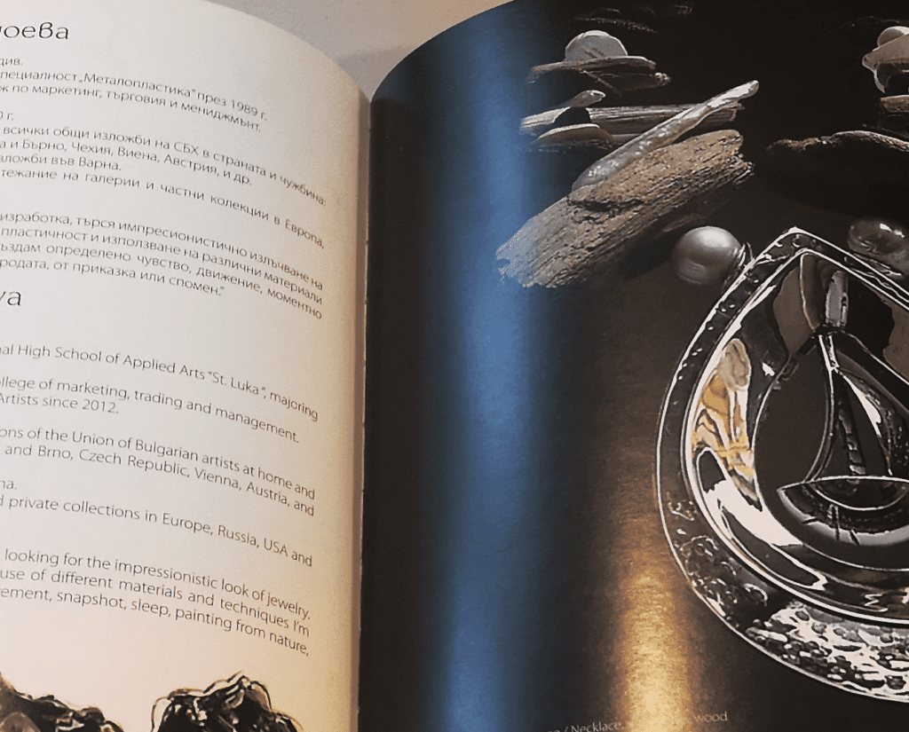
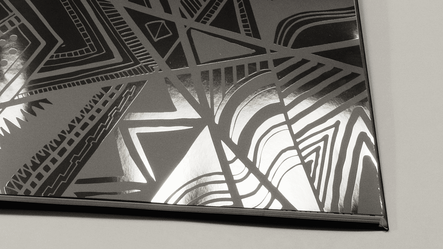
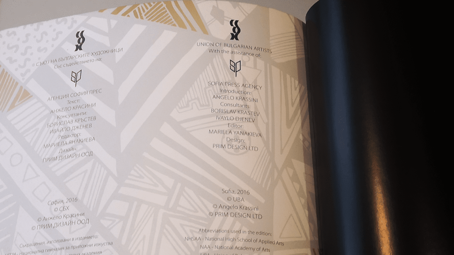
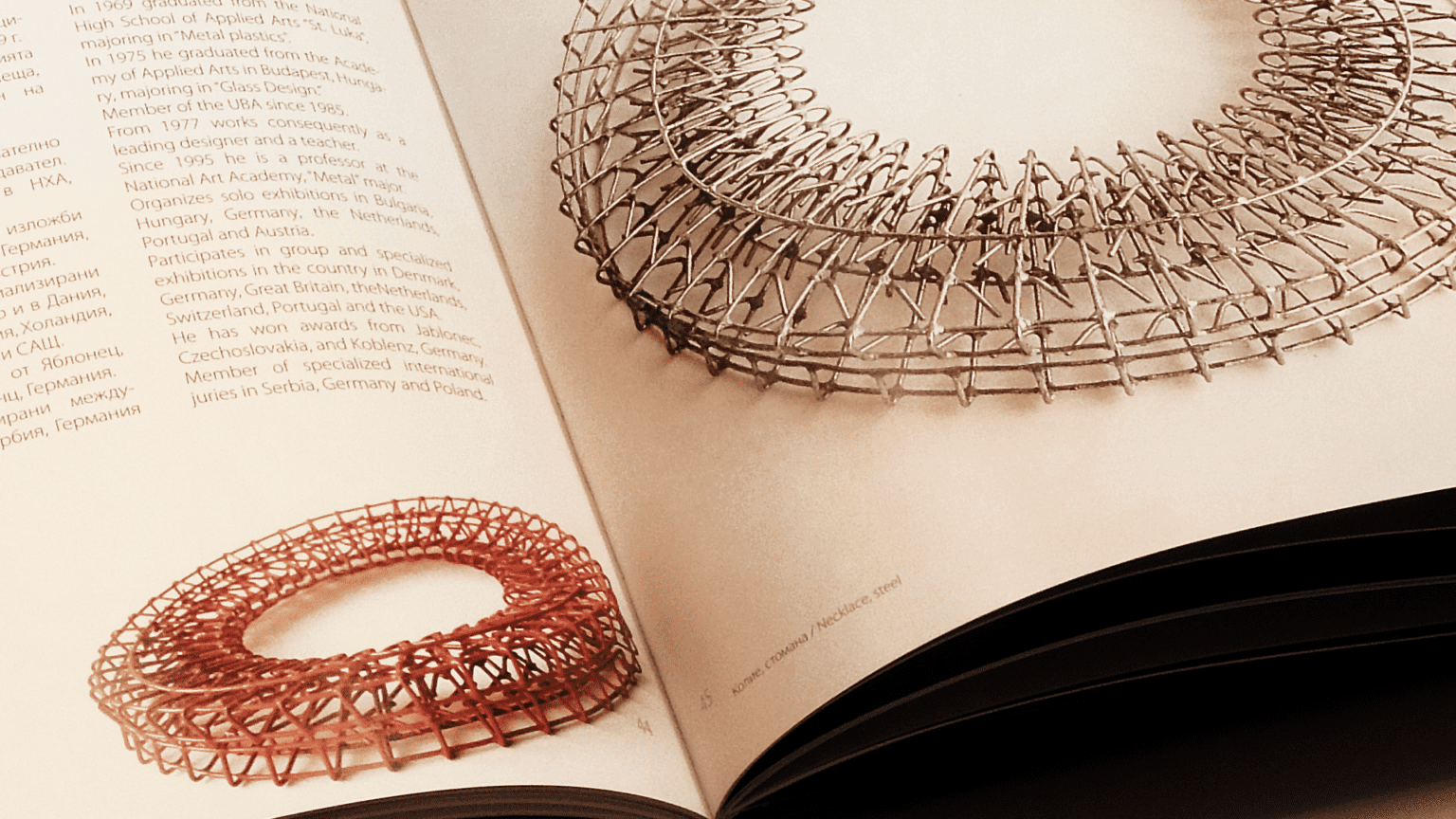
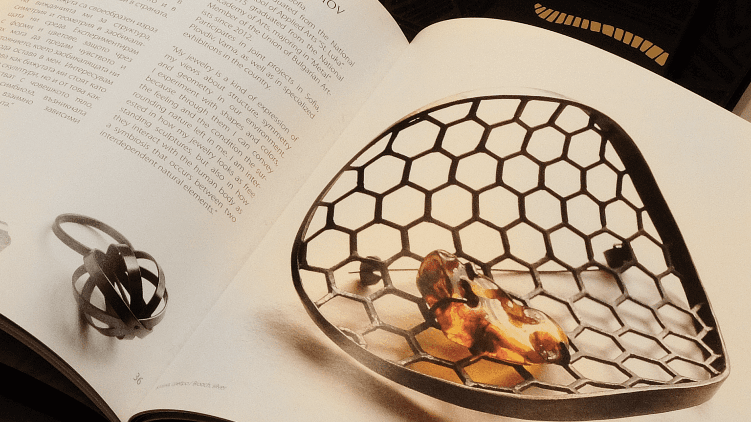
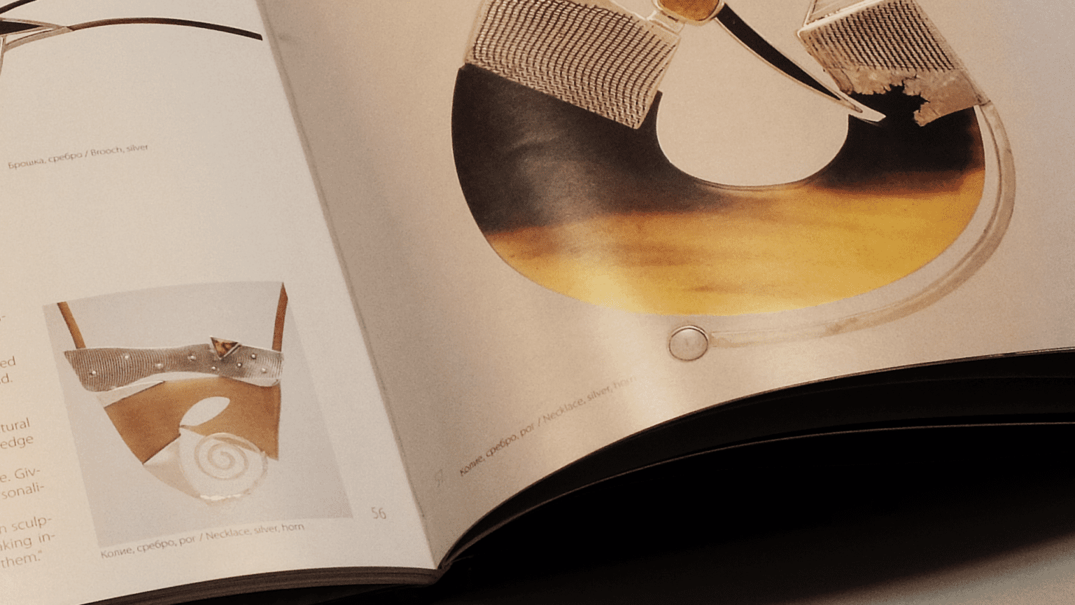
CONTEMPORARY JEWELRY IN BULGARIA
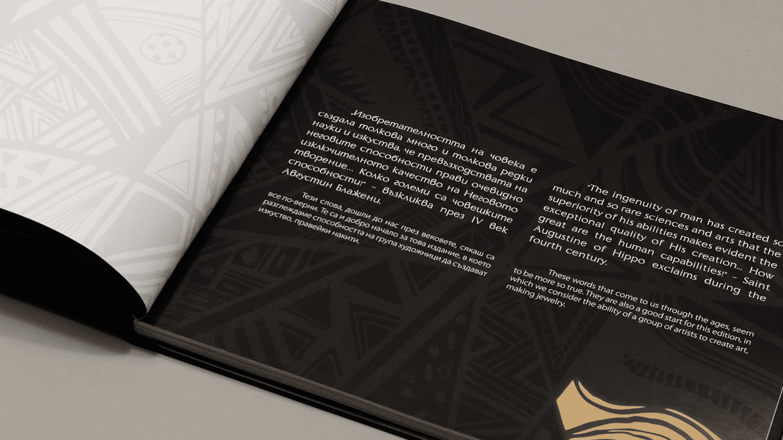
We have been commissioned by the Union of Bulgarian Artists, Jewelry Section, to produce this luxury edition which presents the art of contemporary Bulgarian jewelry artists.
The hardcover catalogue features with sophisticated black on black printing, with partial lacquer and gold on parts of the graphics.
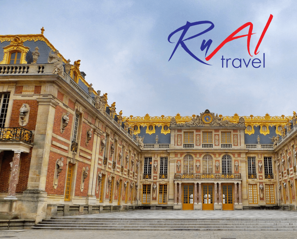
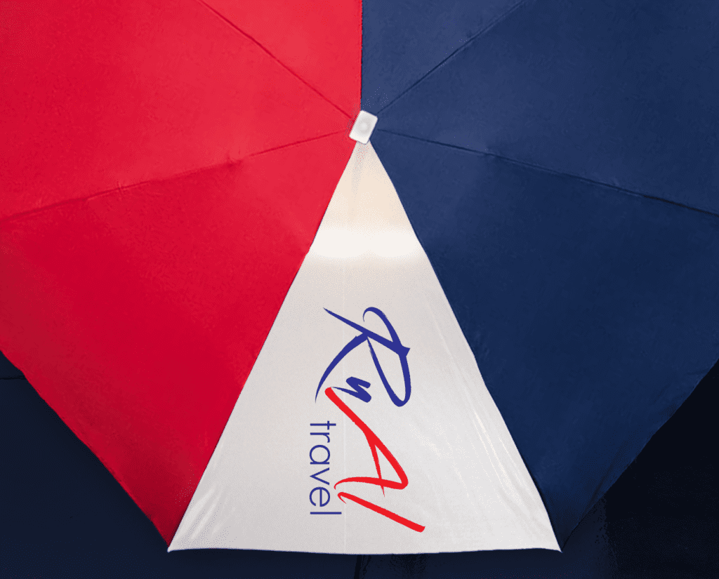
RUAL TRAVEL LOGO RE:DESIGN
The challenges of the commercial world and the rising customers’ expectations were at the heart of the redesign of the visual identity of Rual Travel Agency. We created an elegant simple logo that appeals to a very wide range of people. A logo that helps clients to understand the company's core message - we are classic, yet contemporary. A logo that can be used across a wide range of media, whether it's a small icon on a mobile app, a large billboard, office branding or exhibition stands.We chose French Kiss as the main typeface because it reflects the spirit and philosophy of the agency - it's elegant, dynamic and communicates a sense of momentum and journey. The colors used of Rual travel agency are contrasting and emphasize the emotional connections the agency is looking to make with its clients.
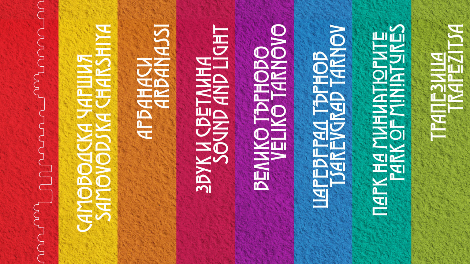
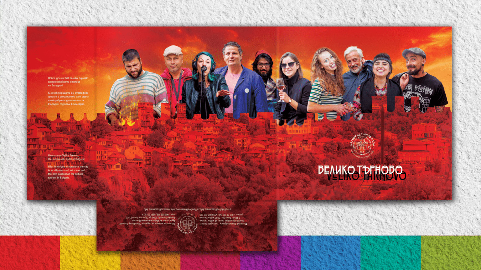
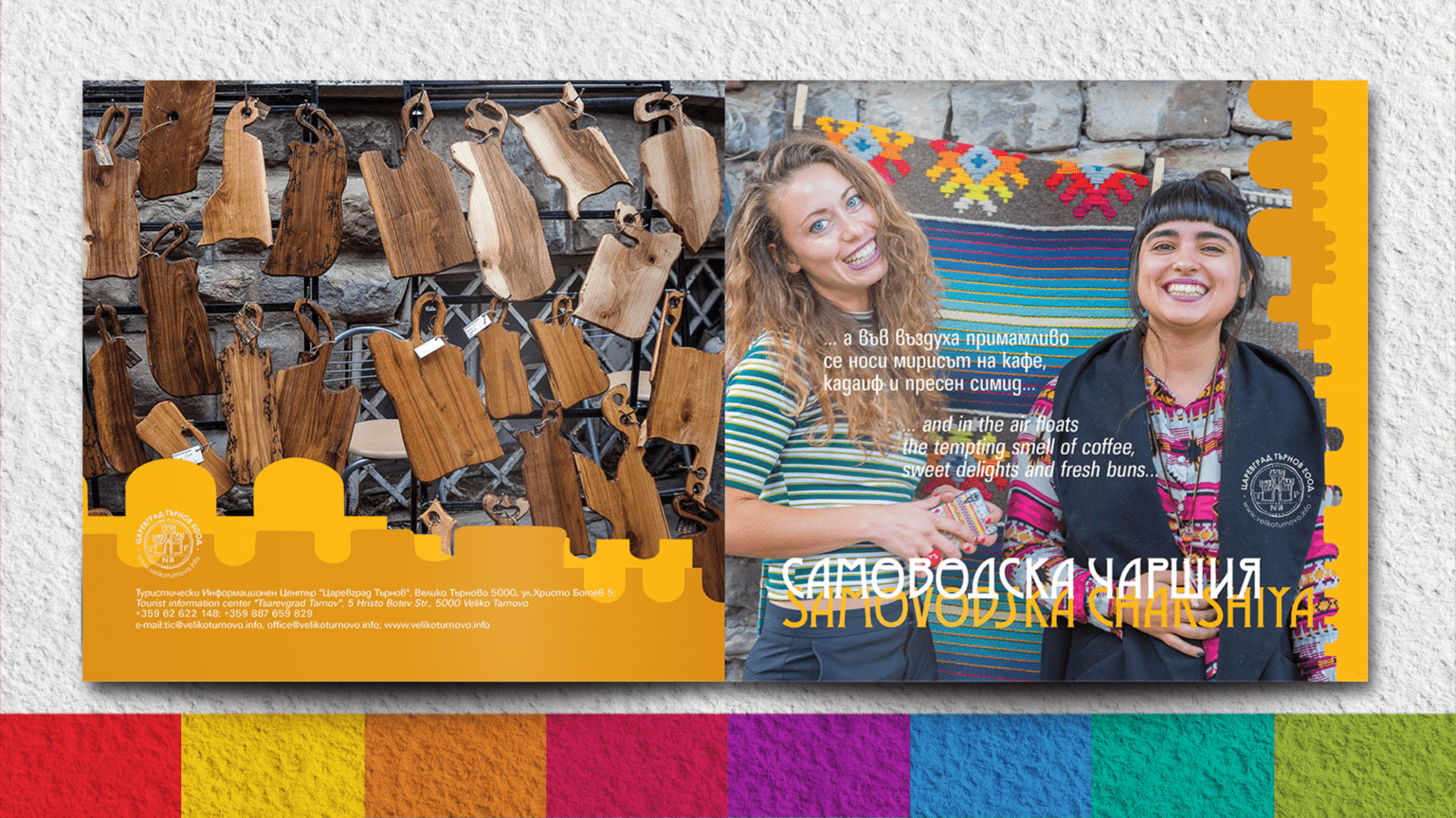
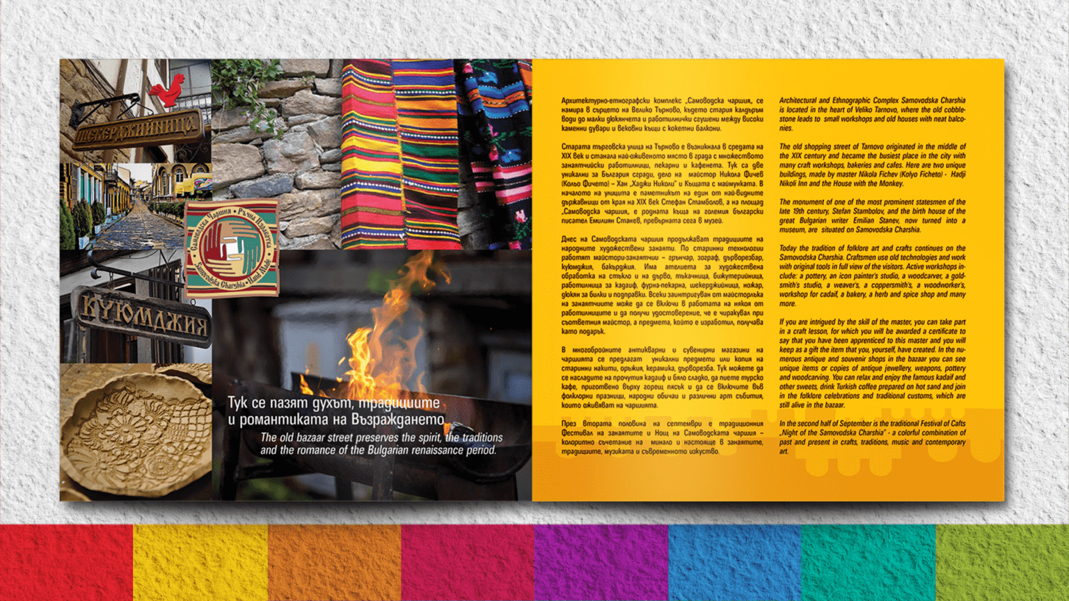
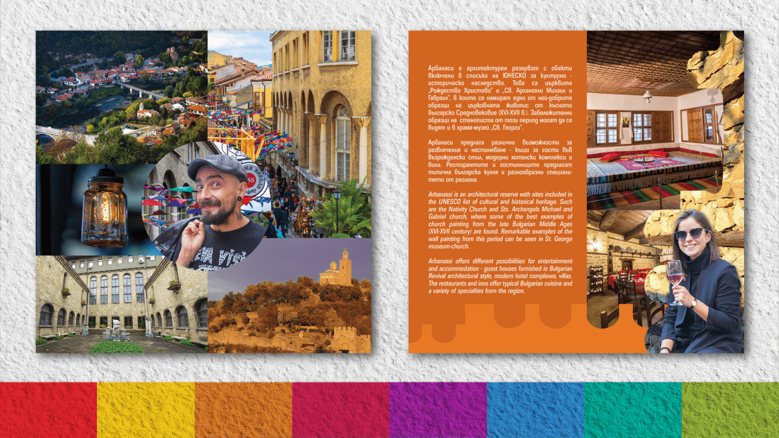
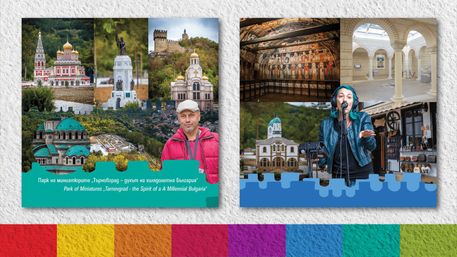
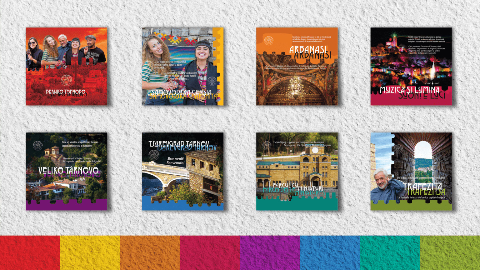
VELIKO TARNOVO BROCHURES
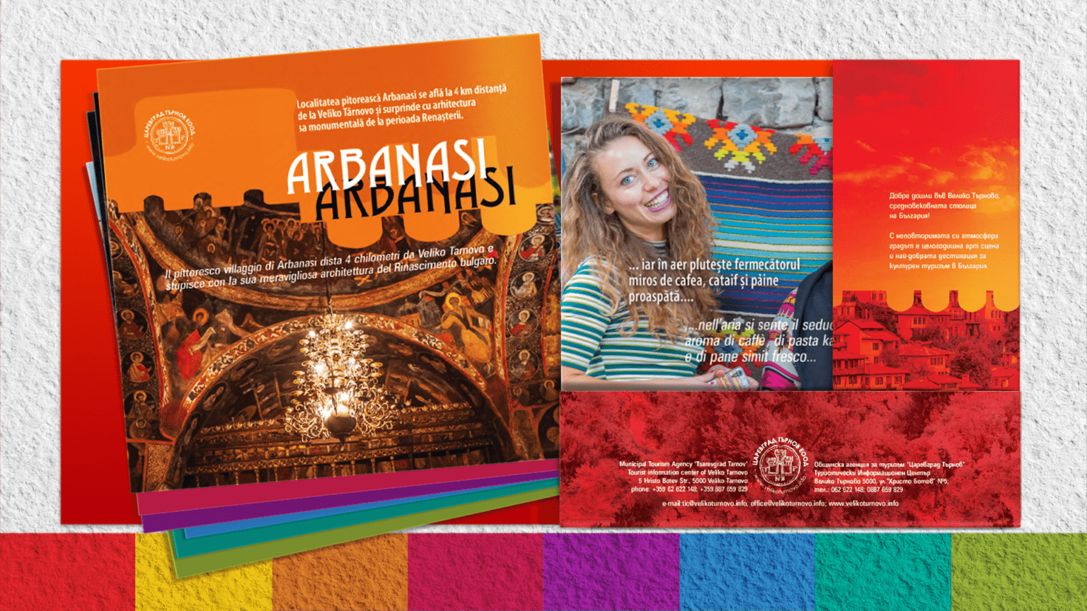
Considering the rich historical heritage of Veliko Tarnovo, the prestige of local artists and craftsmen and the scientific and academic potential, we have created a series of promotional materials to present the unique attractions and traditions of the region.
The design is colorful, fiery and cheerful, inspired by Veliko Tarnovo's ancient cultural heritage, the beautiful artworks of the craftsmen and mainly by the people of Veliko Tarnovo!
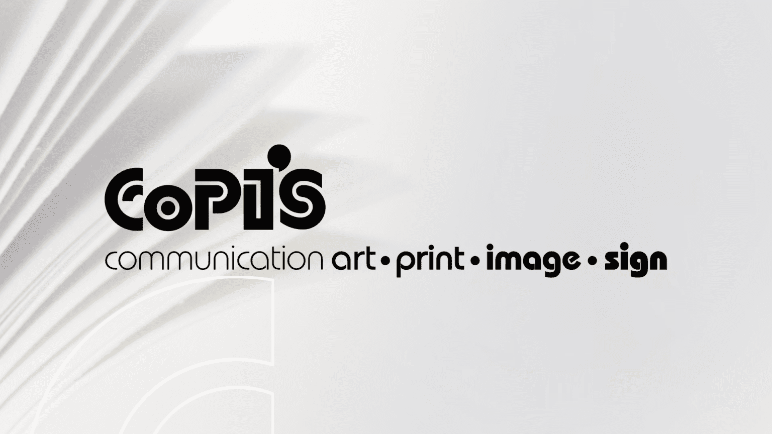
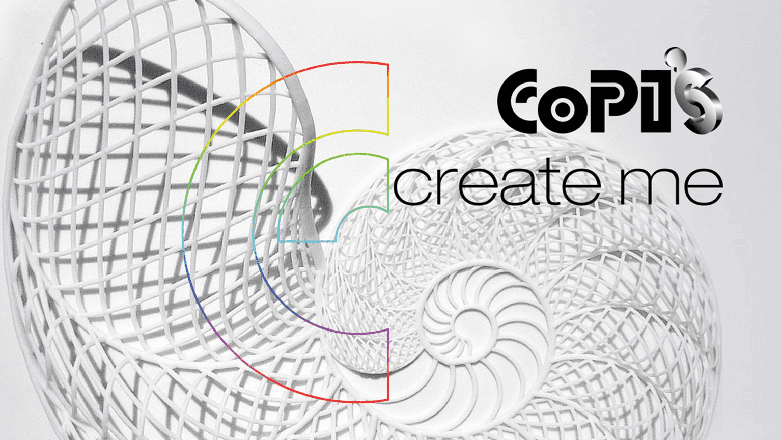
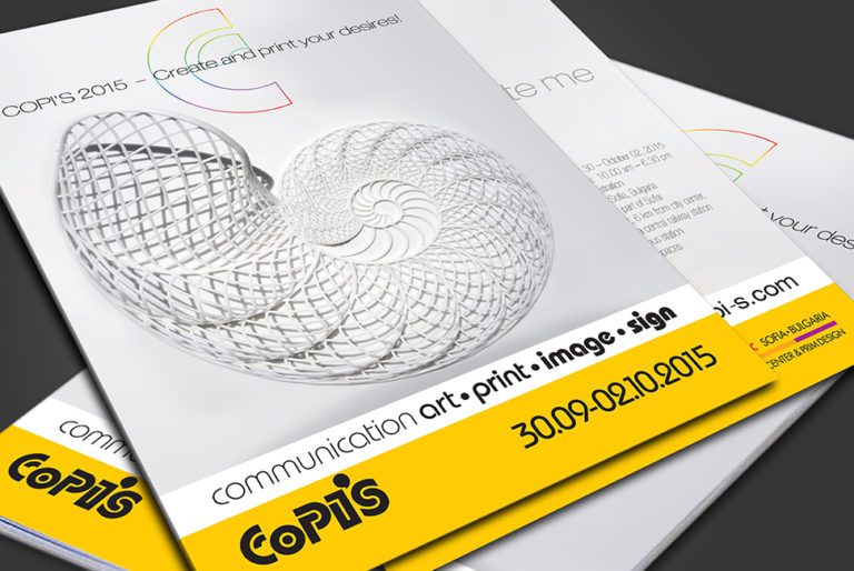
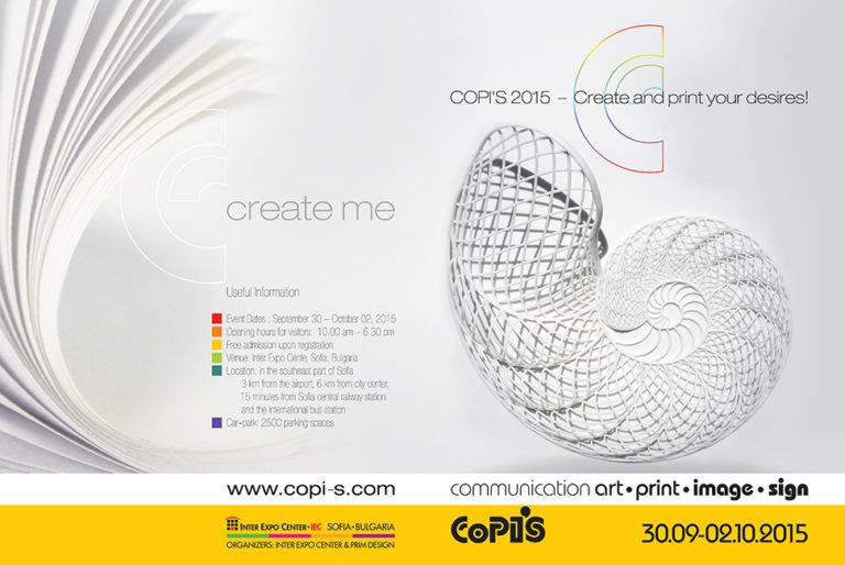
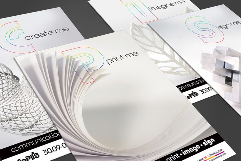
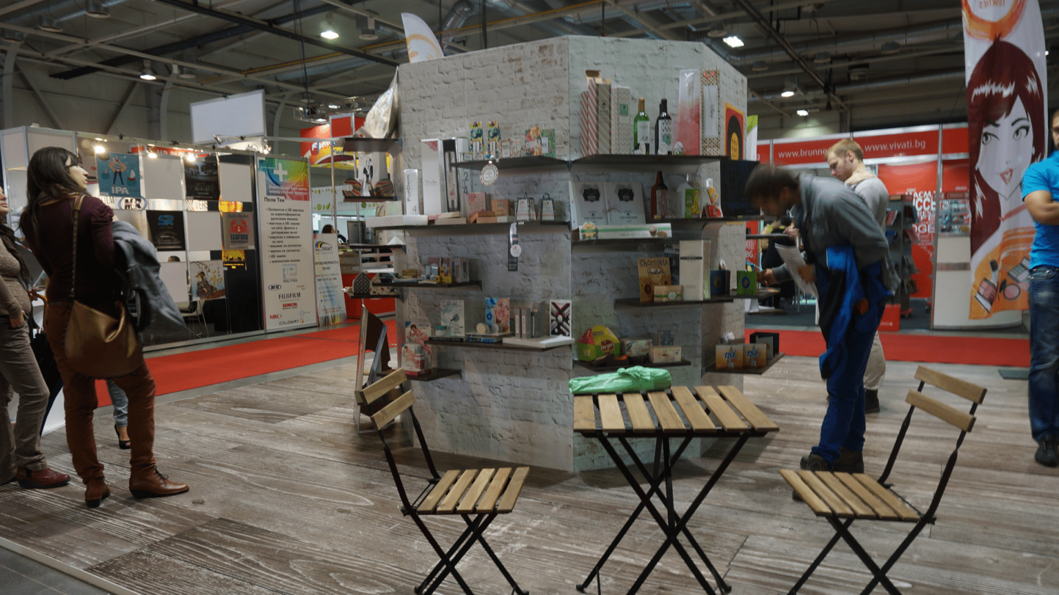
COPI'S
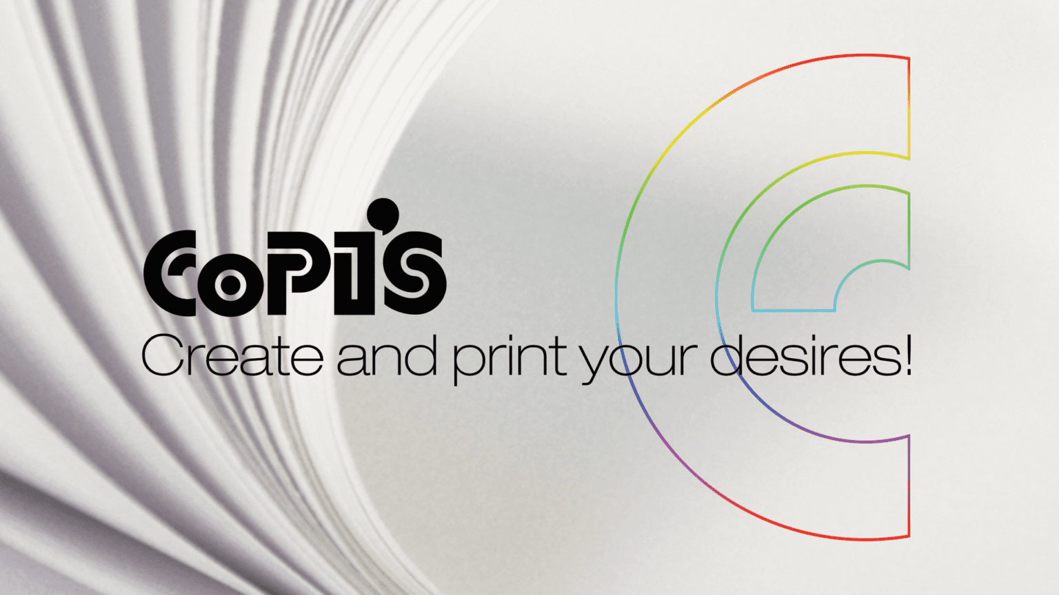
"COPI`S | Communication Art | Print | Image | Sign" is another event that is based on our idea. In 2012 we joined efforts with Inter Expo Center Sofia and created the COPI`S Advertising Art, Print and Communication Forum, as a successor to the former Advertising Expo and Print Imaging and Sign Expo.
COPI`S has become a place for the exchange of ideas, experience and information about latest trends in the field of advertising, printing and communication, a place for free and creative people, marketing and advertising professionals, industry organizations, companies producing advertising and advertising media.
We created the brand identity of the event - concept, name, logo, visualizations. For several years we worked with pleasure and inspiration on the design, organization and implementation of COPI`S, before transferring our share to our partners to take on new projects and new challenges.


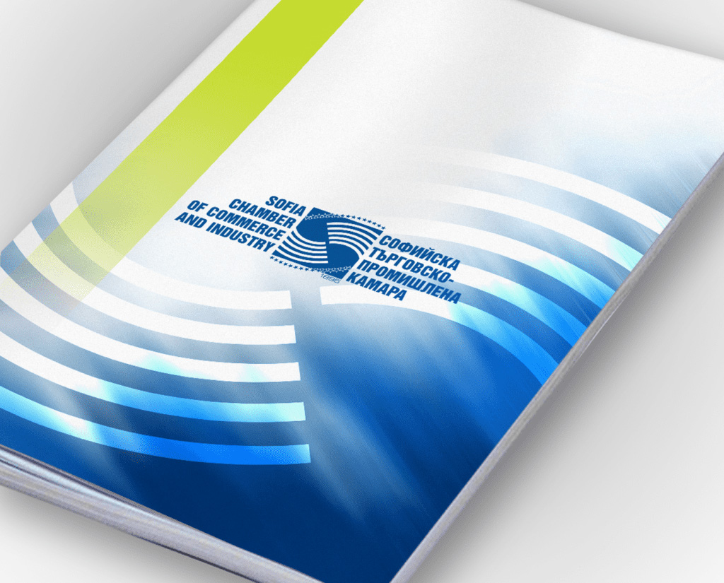
SOFIA CHAMBER OF COMMERCE AND INDUSTRY
We created the new logo of the Sofia Chamber of Commerce and Industry, which is among the oldest and largest business institutions in Bulgaria.
Established 112 years ago and re-established after a 55-year interruption, the Chamber's main mission is to protect the interests of its members, who today number over 100 and among them are representatives of the largest companies in Bulgaria, to establish business contacts, and to conduct professional training and seminars.
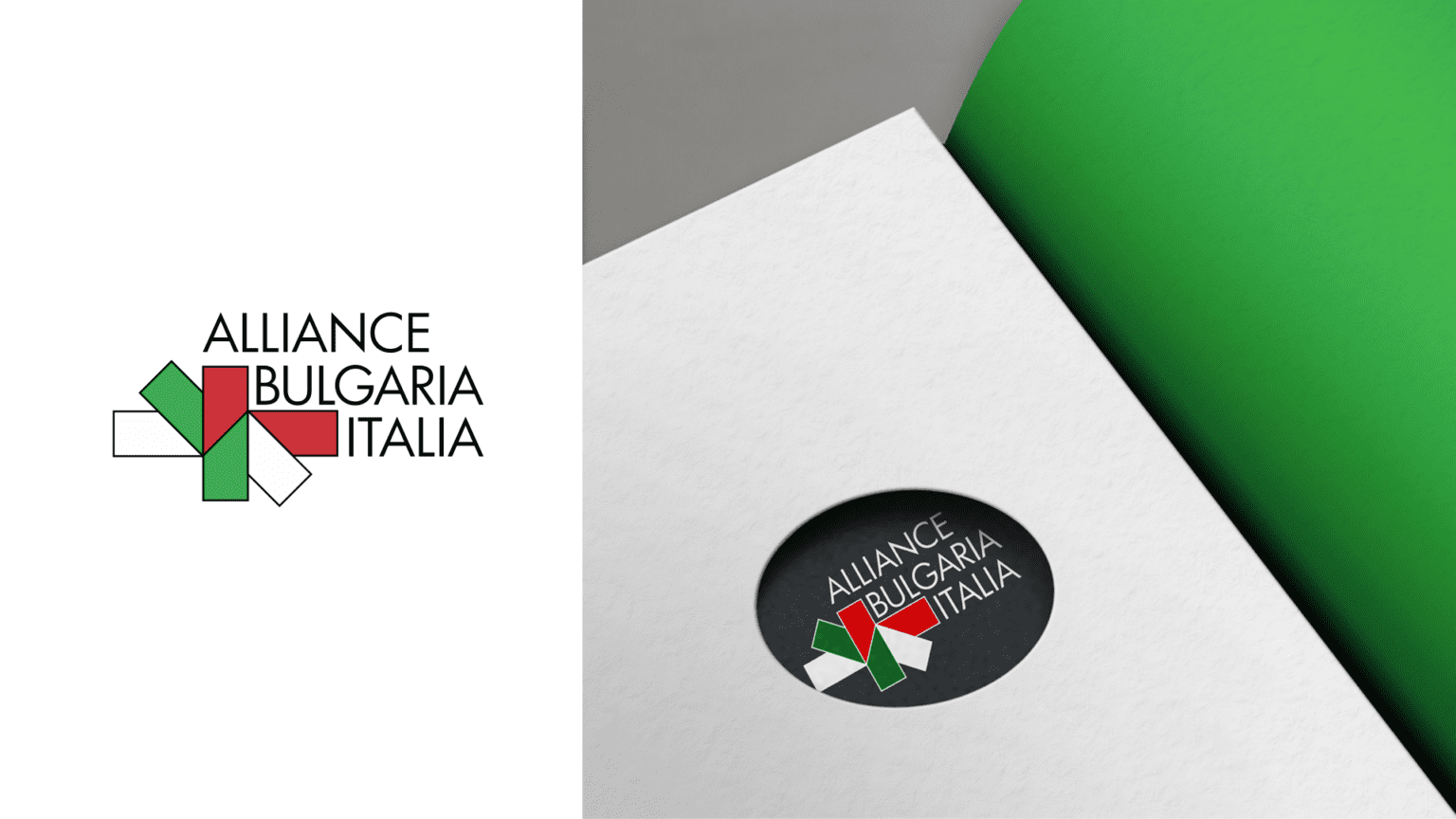
ALIANCE BULGARIA-ITALY
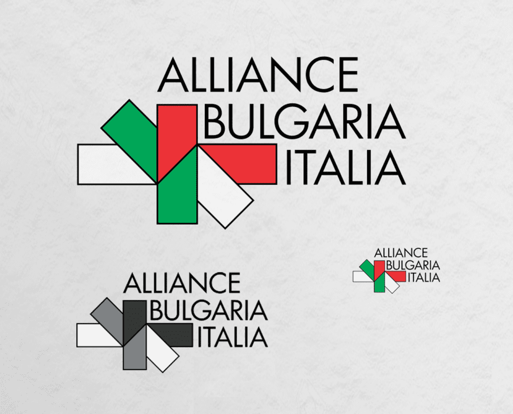
The challenge in this project was to weave the two almost identical flags of both countries into one harmonious whole. Geometric logos are suitable for such organizations like Aliance Bulgaria-Italy, not only because of their legibility, but also because of the great range of emotions they evoke. Rectangles and squares speak of solidity and stability.To underline these ideas, the font was chosen to further emphasize the effectiveness and functionality of the Alliance.
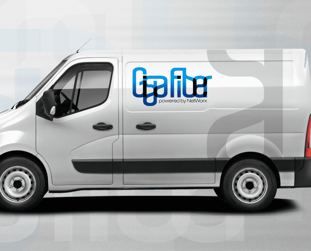
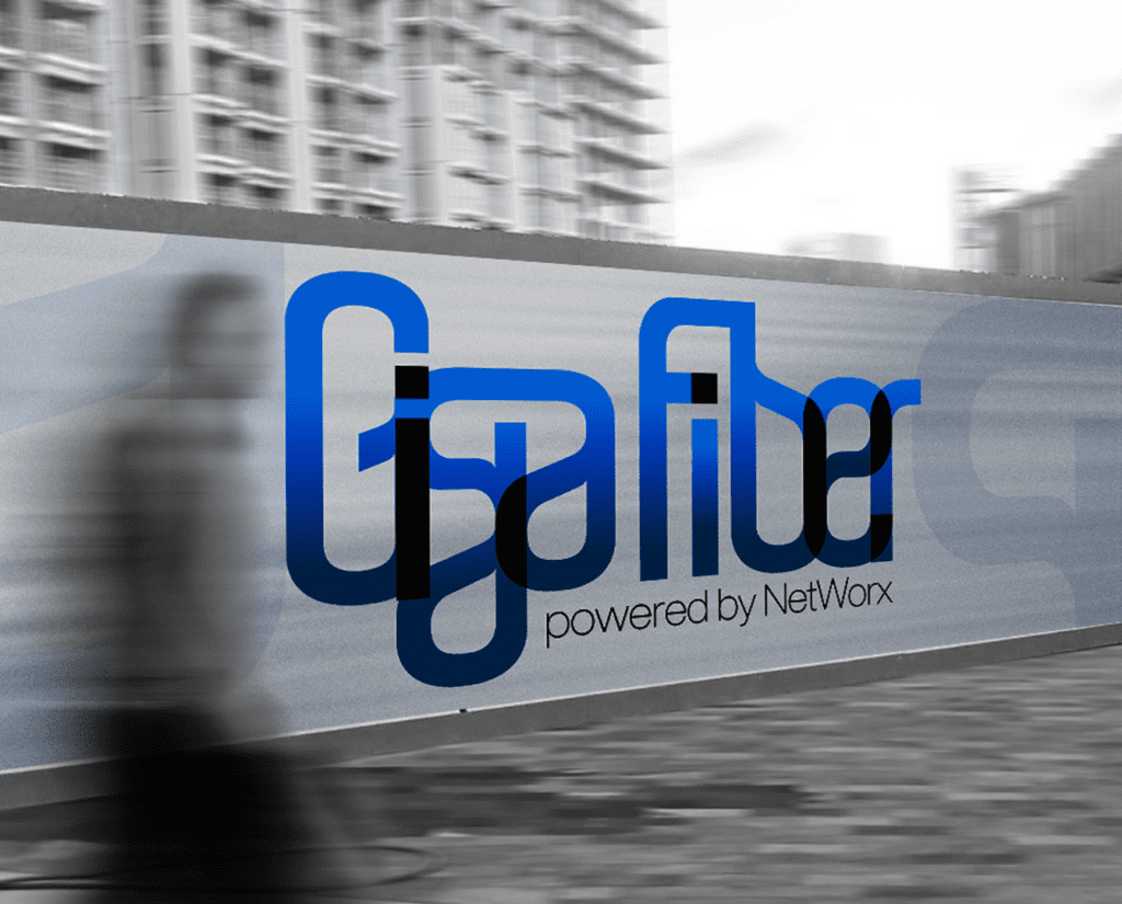
GIGAFIBER
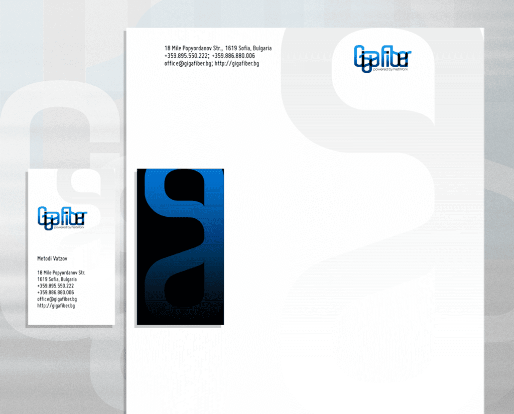
GigaFiber provides high-speed Internet connection enabled by NetWorks Bulgaria over a 10G/40G optical backbone.
We created a logo that reflects the idea of connectivity that fully characterizes the service. The brand brings a sense of speed, motion, and transformation.
A strong colour palette flowing from bright blue to black helps the brand stand out, capturing the constant evolution, responsiveness and optimisation in this industry.
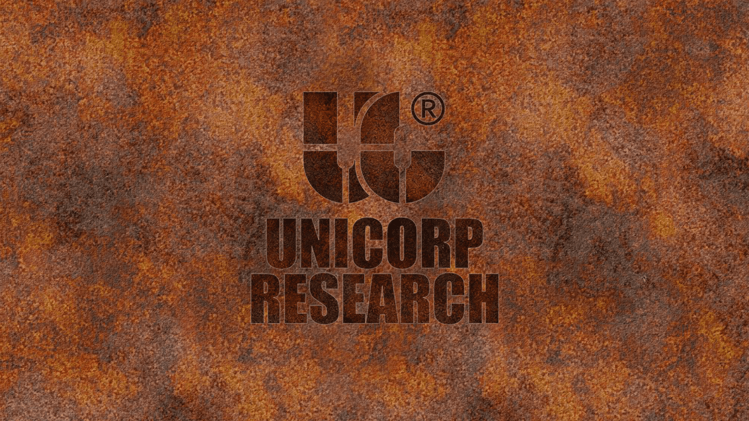
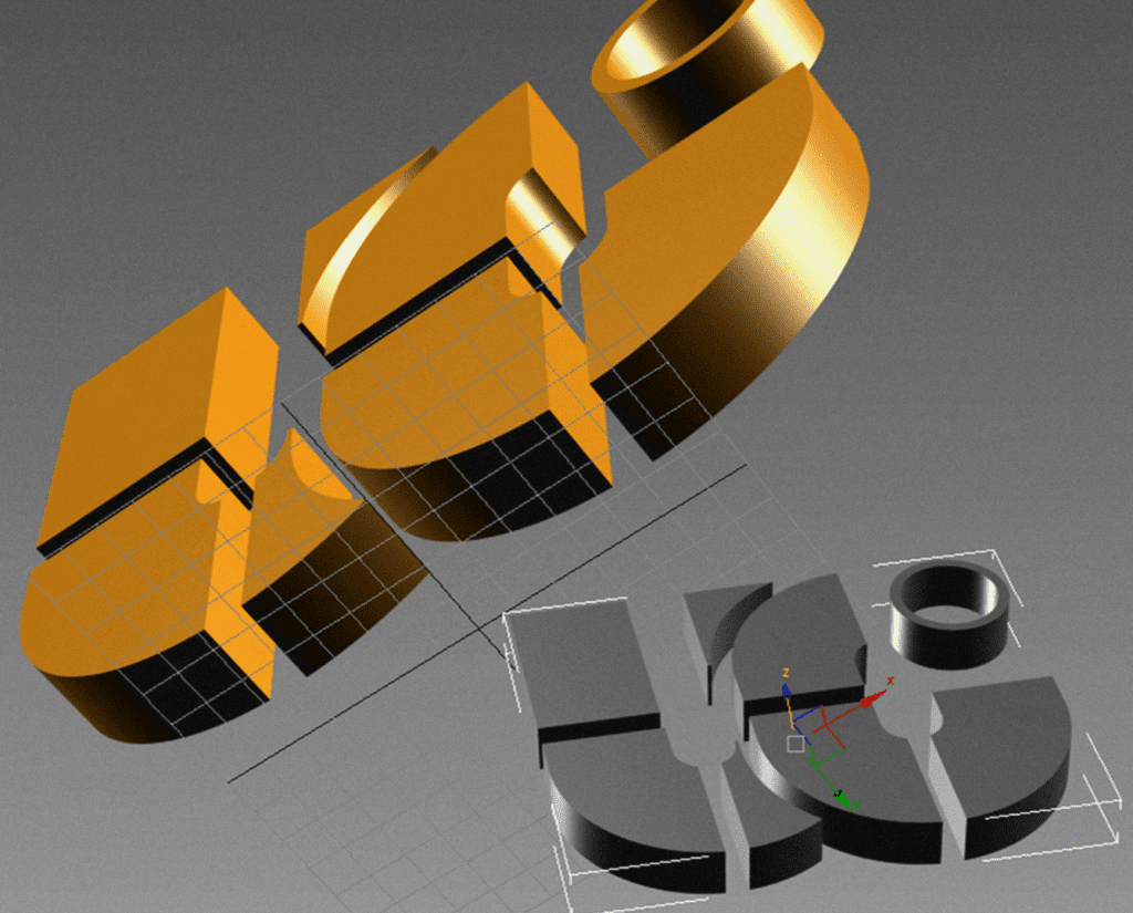
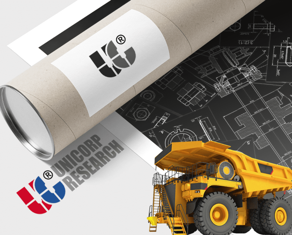
UNICORP RESEARCH
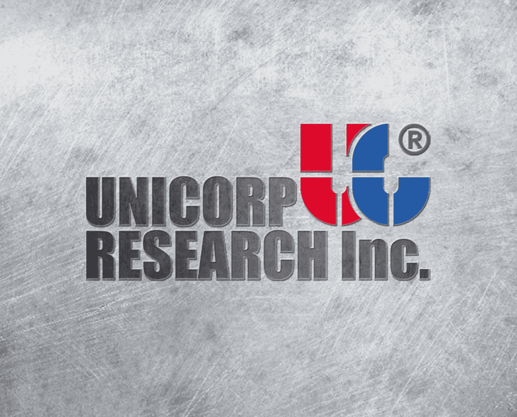
Logo design for UNICORB Research, a start-up German consulting company specialized in the integration of geodesy and IT.
The brand reflects the company's focus and its relationship with science and technology.
The simple design of the logo makes it easily recognizable, versatile and memorable. The clean geometry and simplicity of the typography are the core of the logo and all corporate materials.
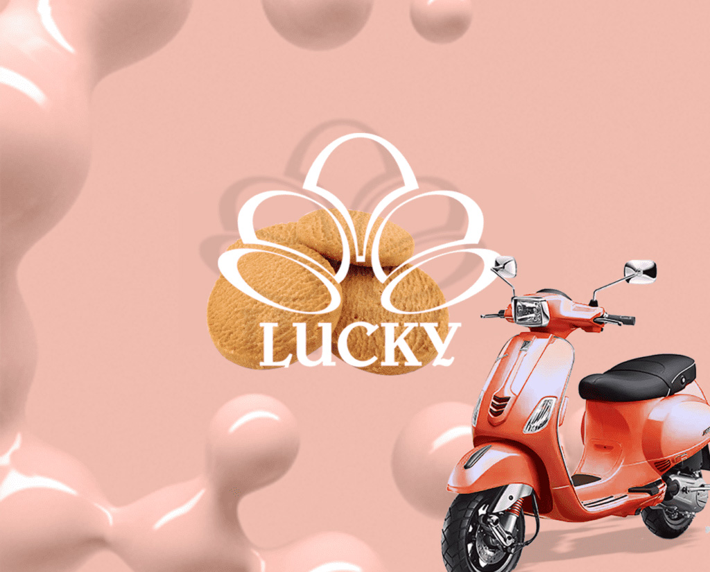
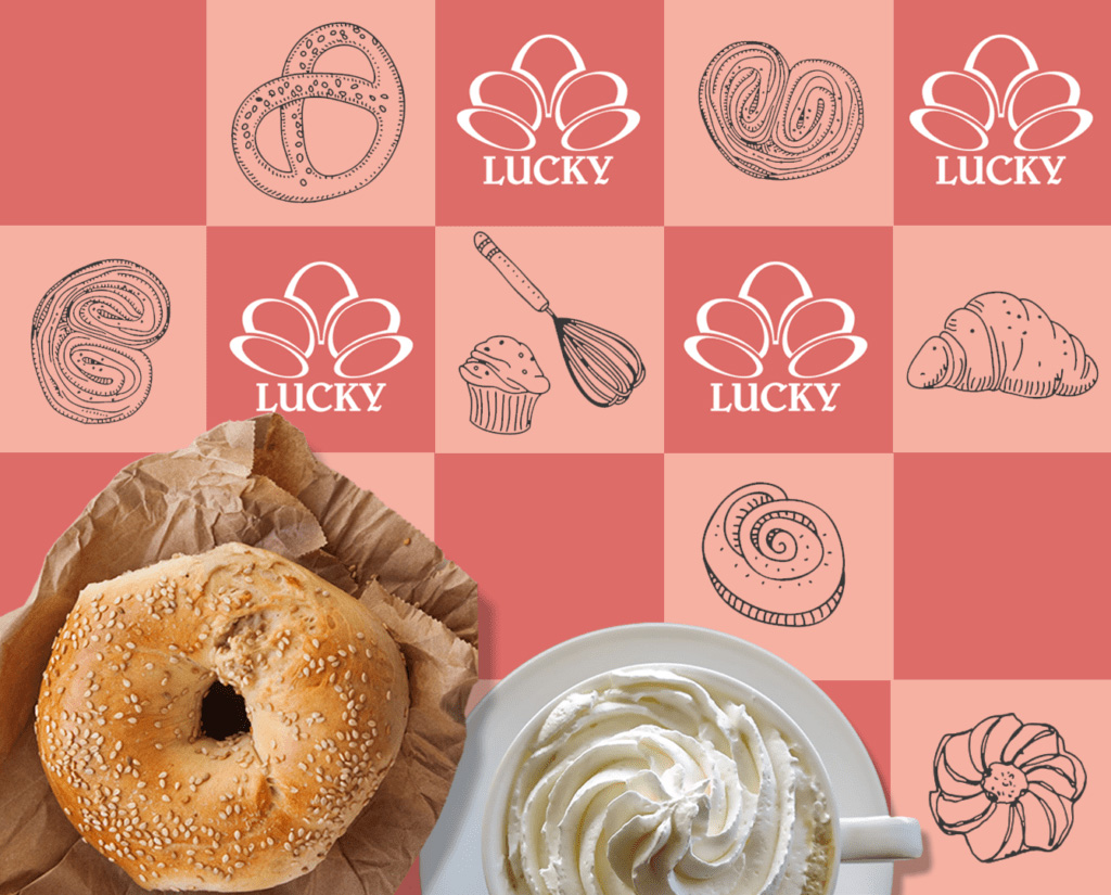
WIENER PATISSERIE LUCKY
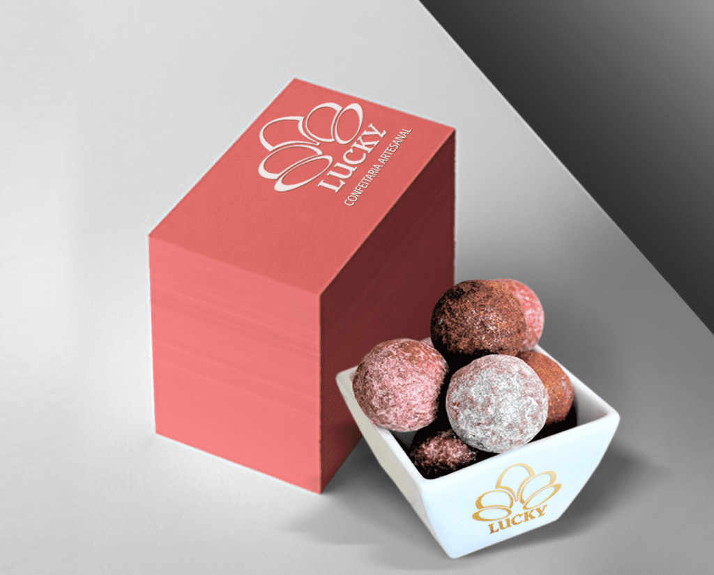
The logo of one of Sofia's cult pastry shops Wiener Patisserie LUCKY compares playful aesthetics with Art Deco elegance.
The challenge was to combine the refined identity of the logo, inspired by Secession Vienna, with a clean and modern style that would attract the eye and give the brand a classy feel.