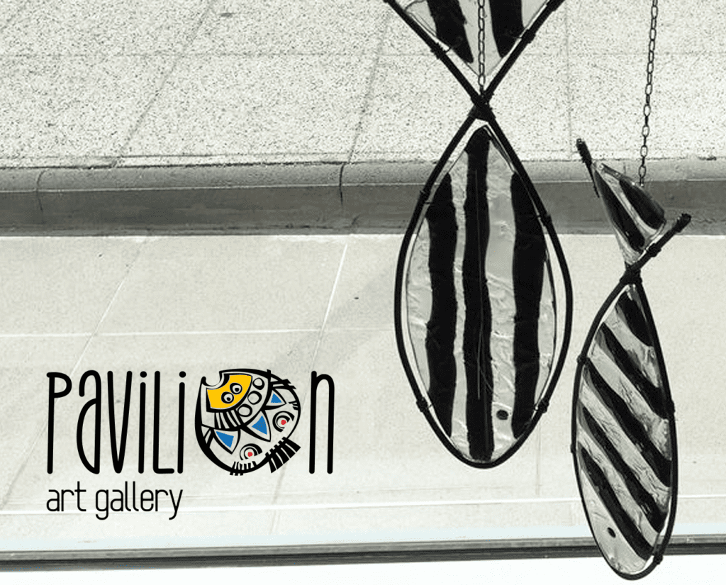
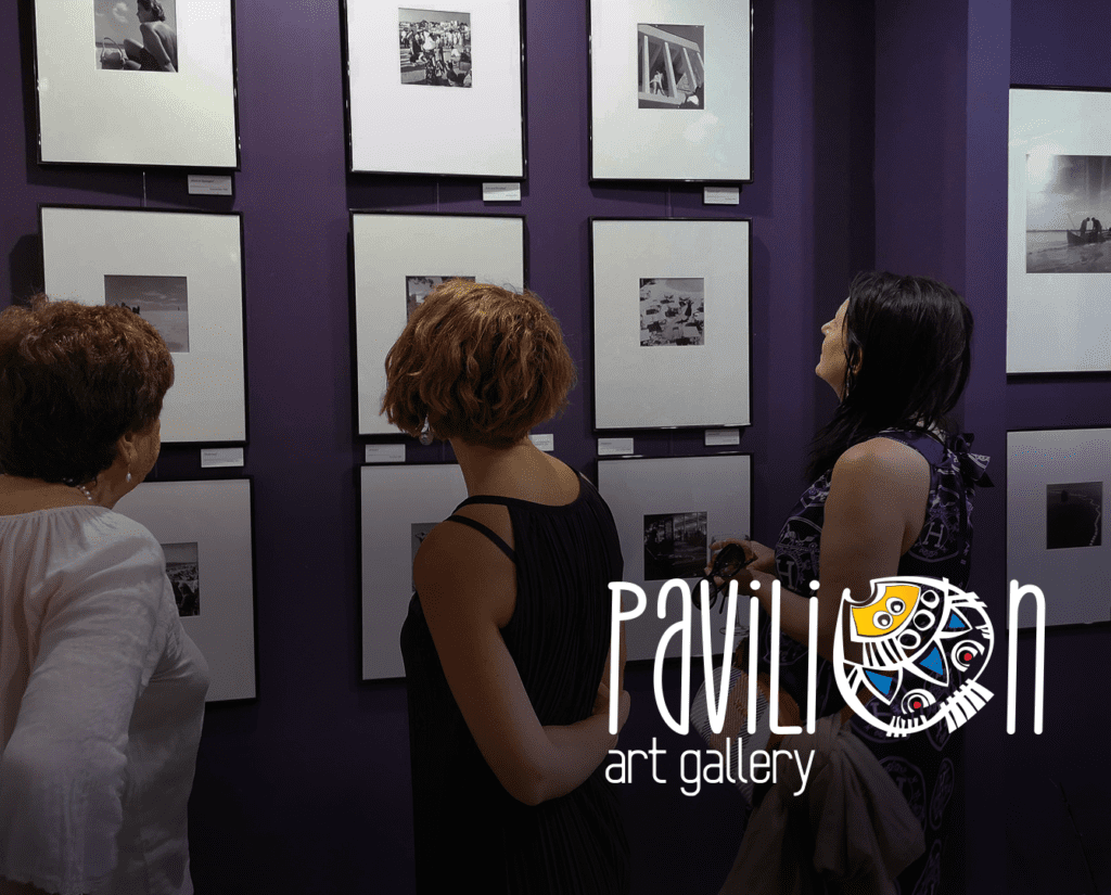
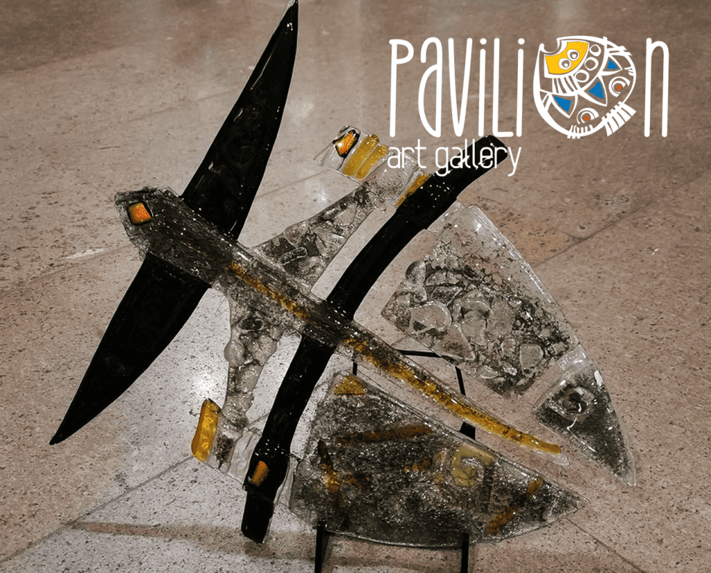
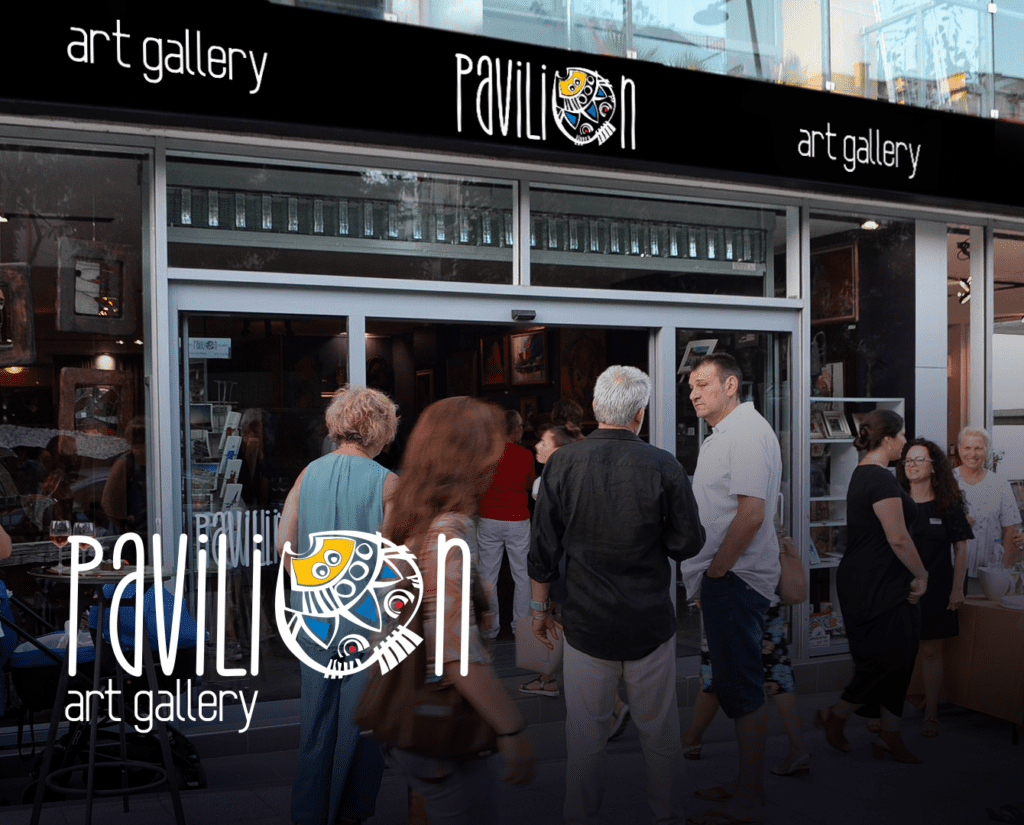
PAVILION ART GALLERY
Visual identity of Pavilion Art Gallery - a new artistic space founded in 2019 in Nessebar. The Pavilion Gallery is that magical and special meeting place where you can meet known and unknown artists – painters, sculptors, applied-arts creatives, wordsmiths, and musicians. There you can enjoy photography and painting exhibitions, wine tastings, chamber concerts, masterclasses, and art workshops.
The logo is bright, colorful and optimistic, reflecting the gallery’s concept. The main graphic element of the logo is a stylized drawing of a turbot inspired by a famous local artist sketch combined with the font BROUGHT THE STYLE in an artistic composition. We developed the logo in color and black and white to be used on its own for gallery positioning as well as with any artwork.

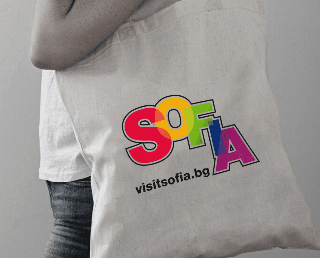
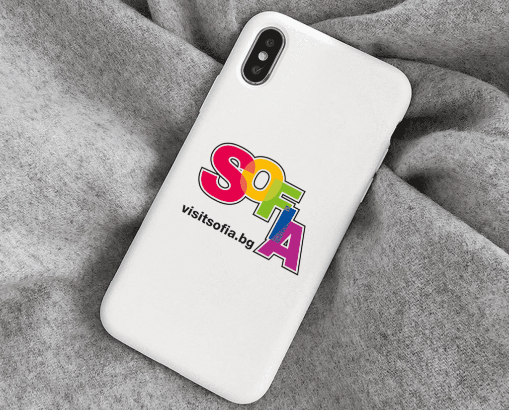
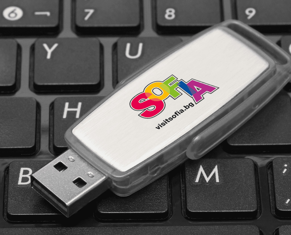
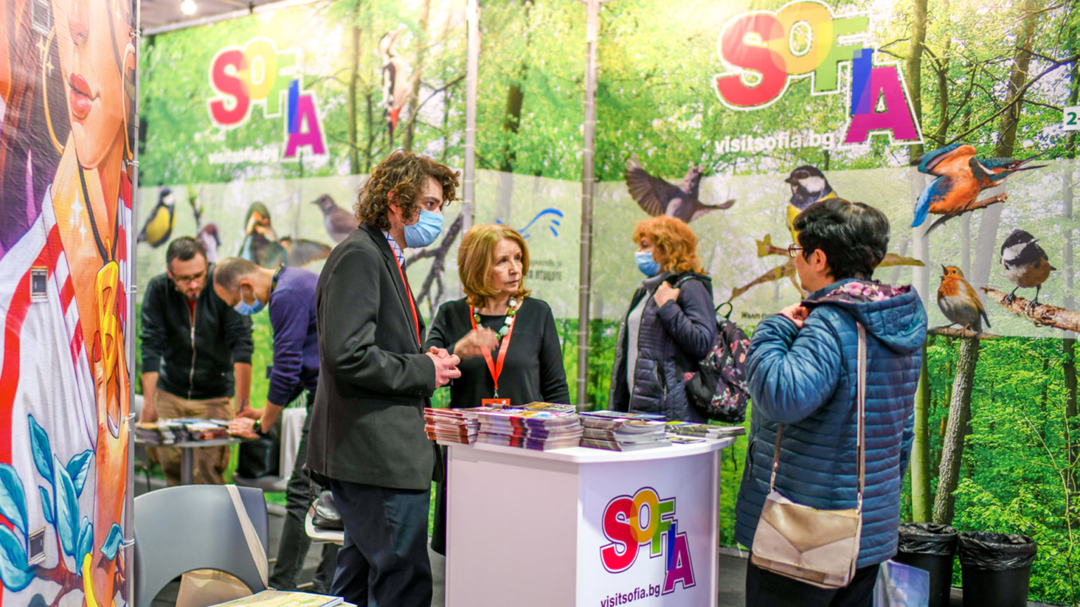
SOFIA TOURISM BRAND
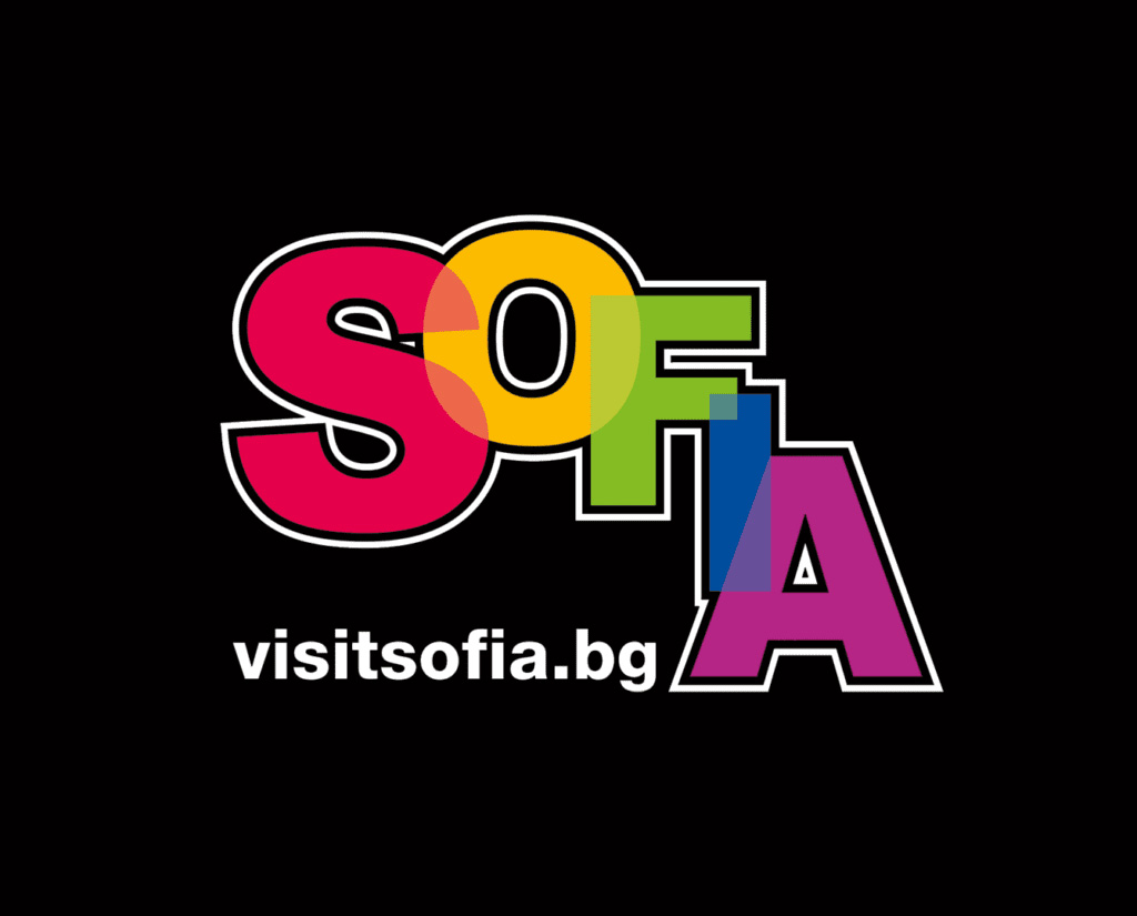
We created a logo for Sofia, as a tourist destination, by order of the Sofia Tourism Administration – Sofia Municipality.
The graphic sign symbolizes the multifaceted and colorful Sofia, with its endless opportunities for tourism and entertainment and is an integral part of printed advertising materials, information and promotional media, participation of Sofia Municipality in tourist events and exhibitions, souvenirs and albums, website, online advertising.
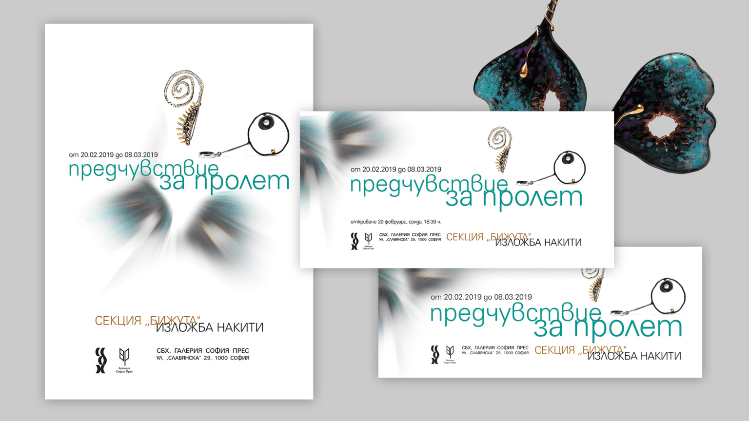
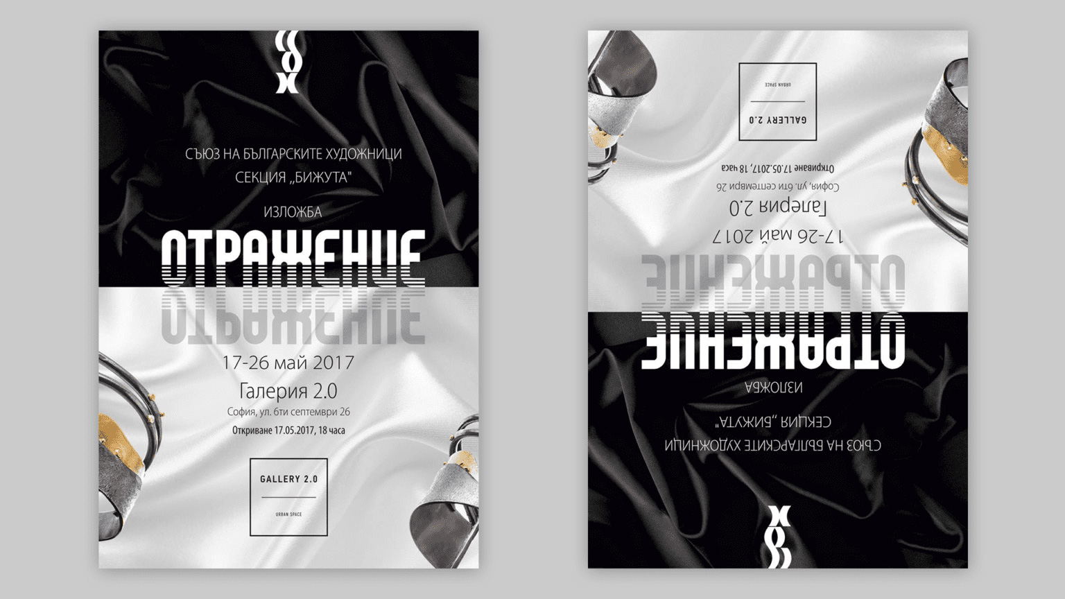
JEWELLRY SECTION. UBA, EXHIBITION POSTERS
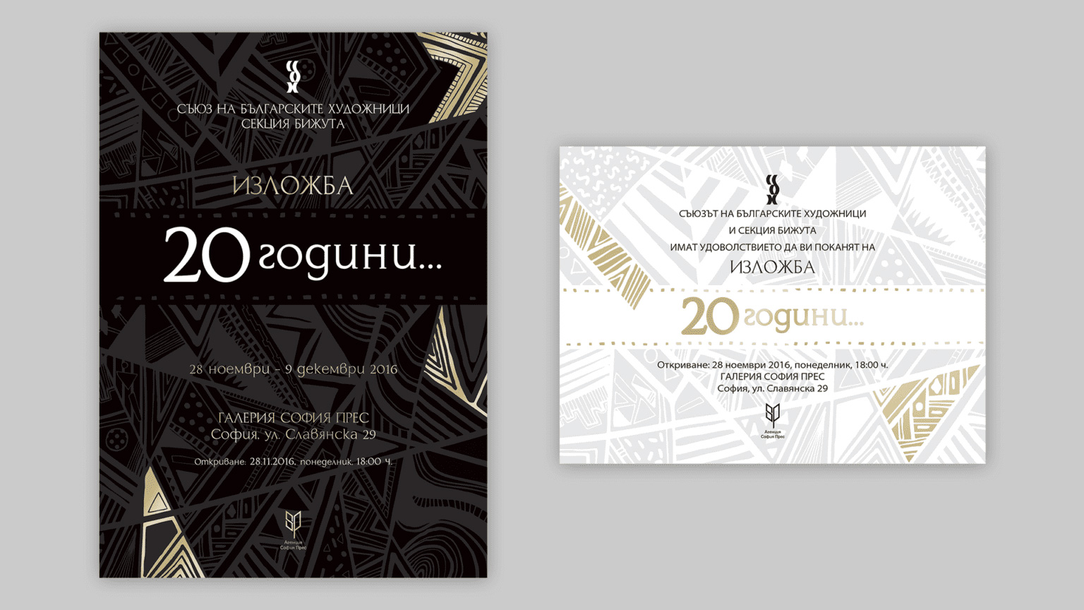
The Jewelry Section at the Union of Bulgarian Artists contains more than 30 masters of the art. It is with great pleasure that we create the posters and invitations for the annual exhibitions of our colleagues. The work of jewelry artists is a never-ending source of inspiration for us, and pictures of their beautiful work are enough in themselves for the striking design.
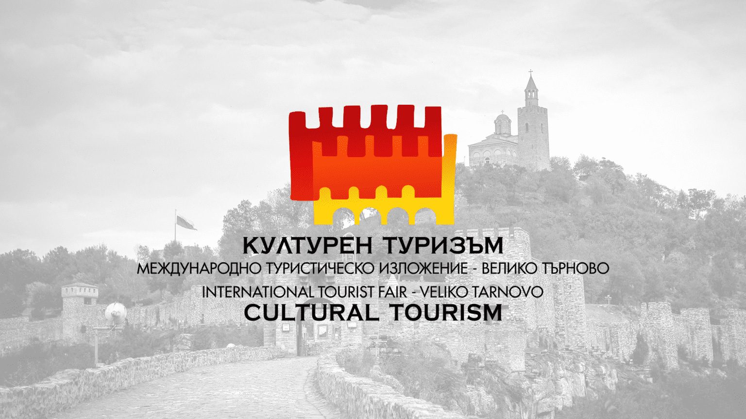
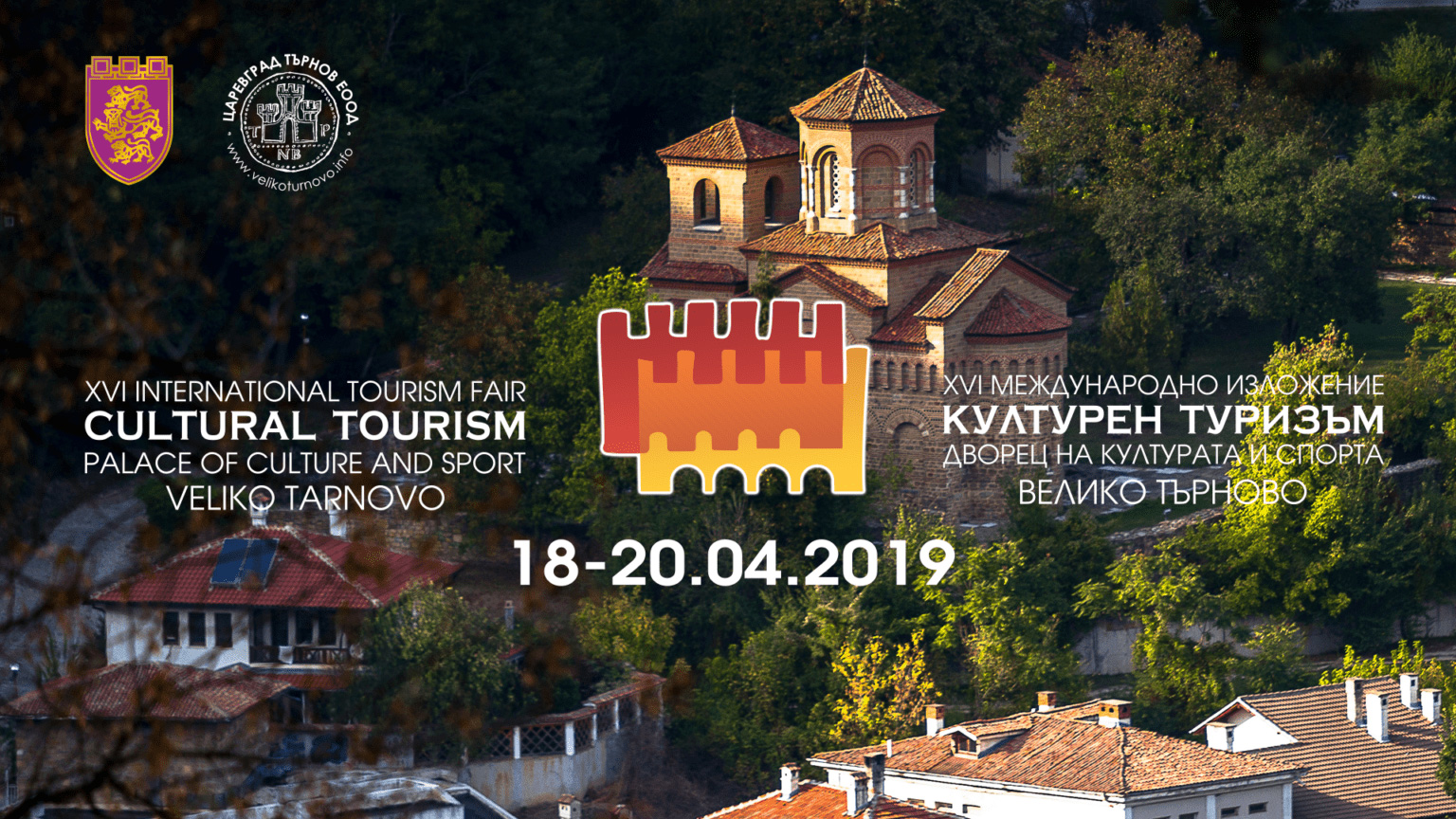
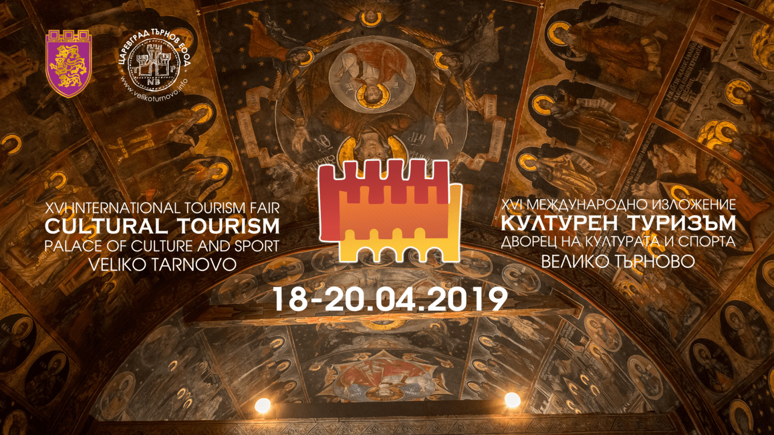
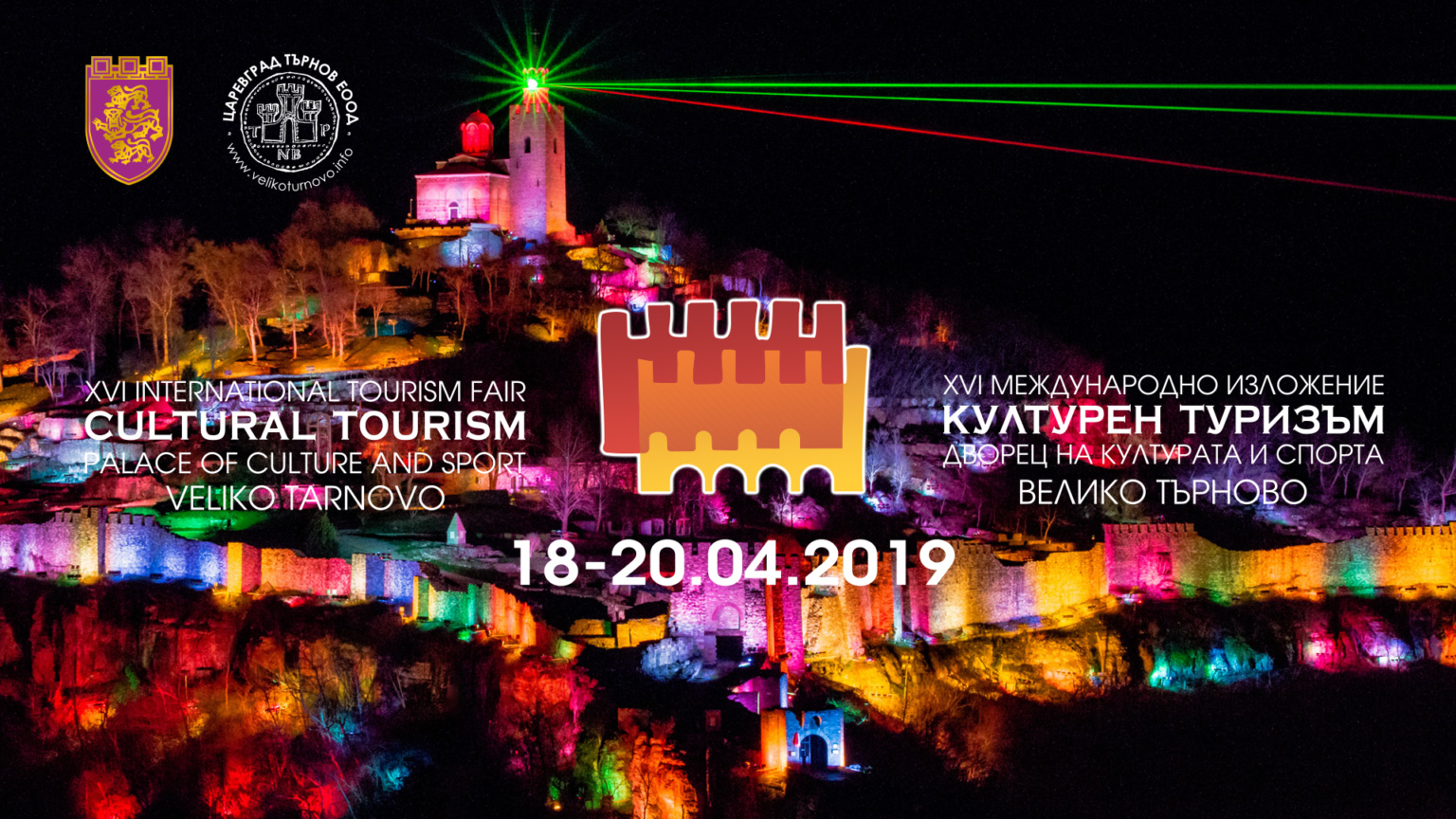
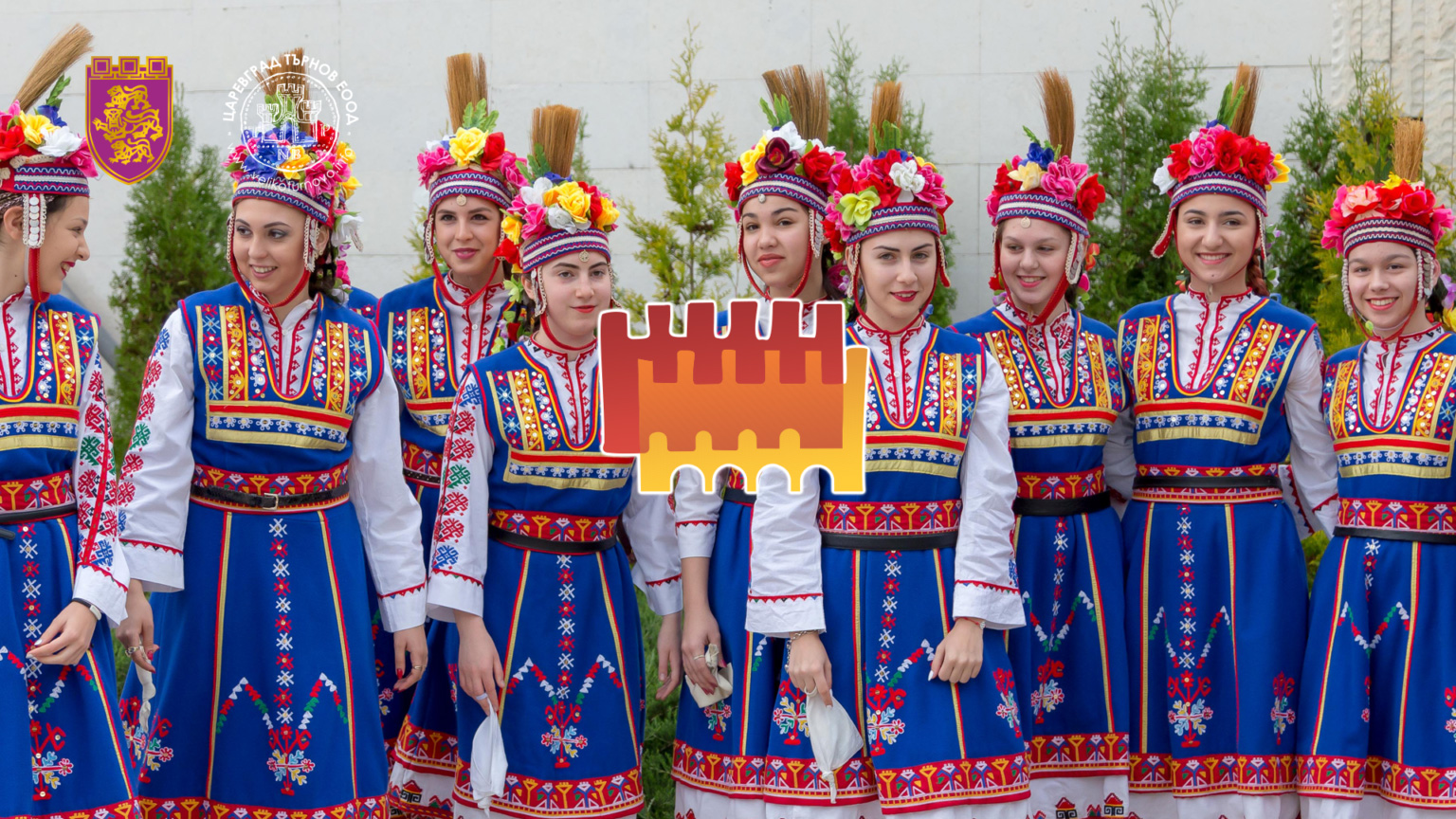
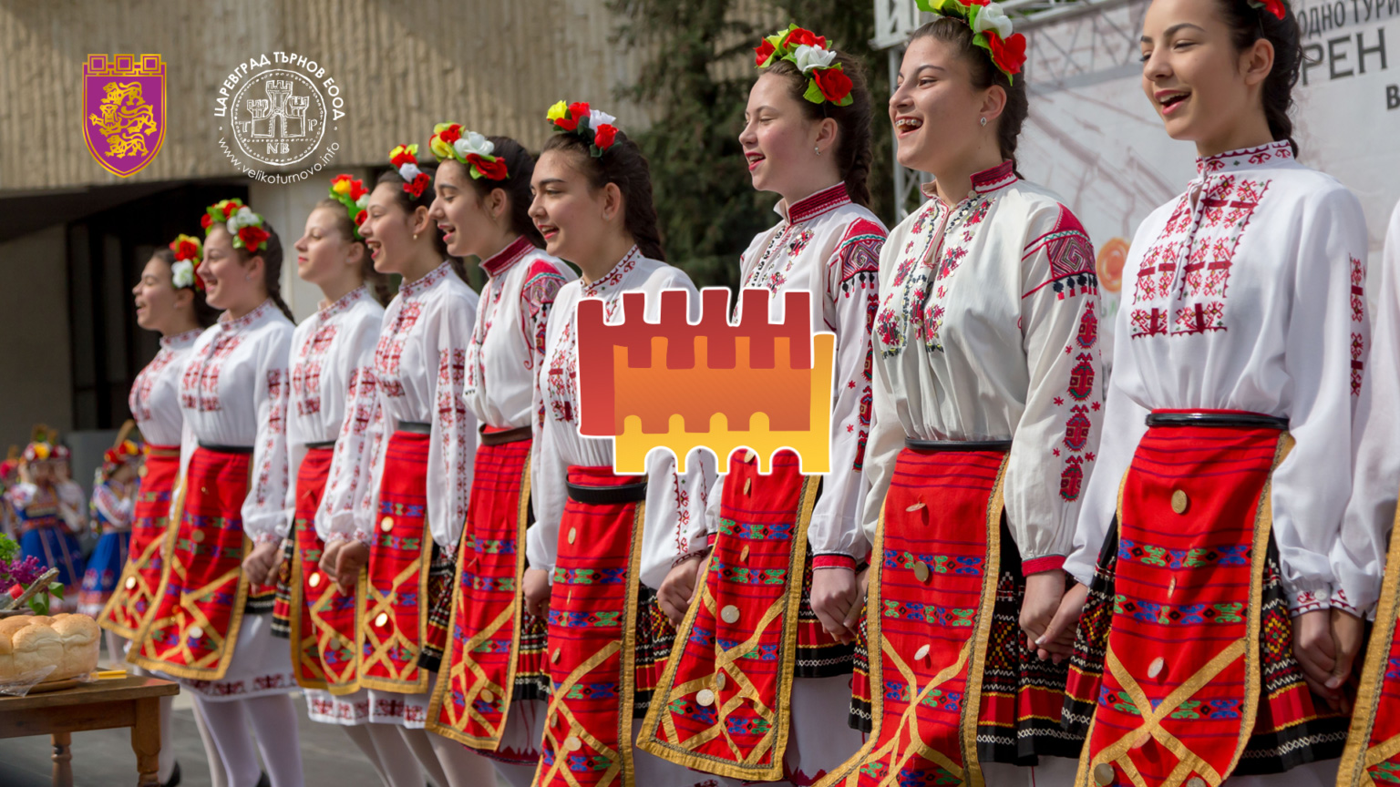
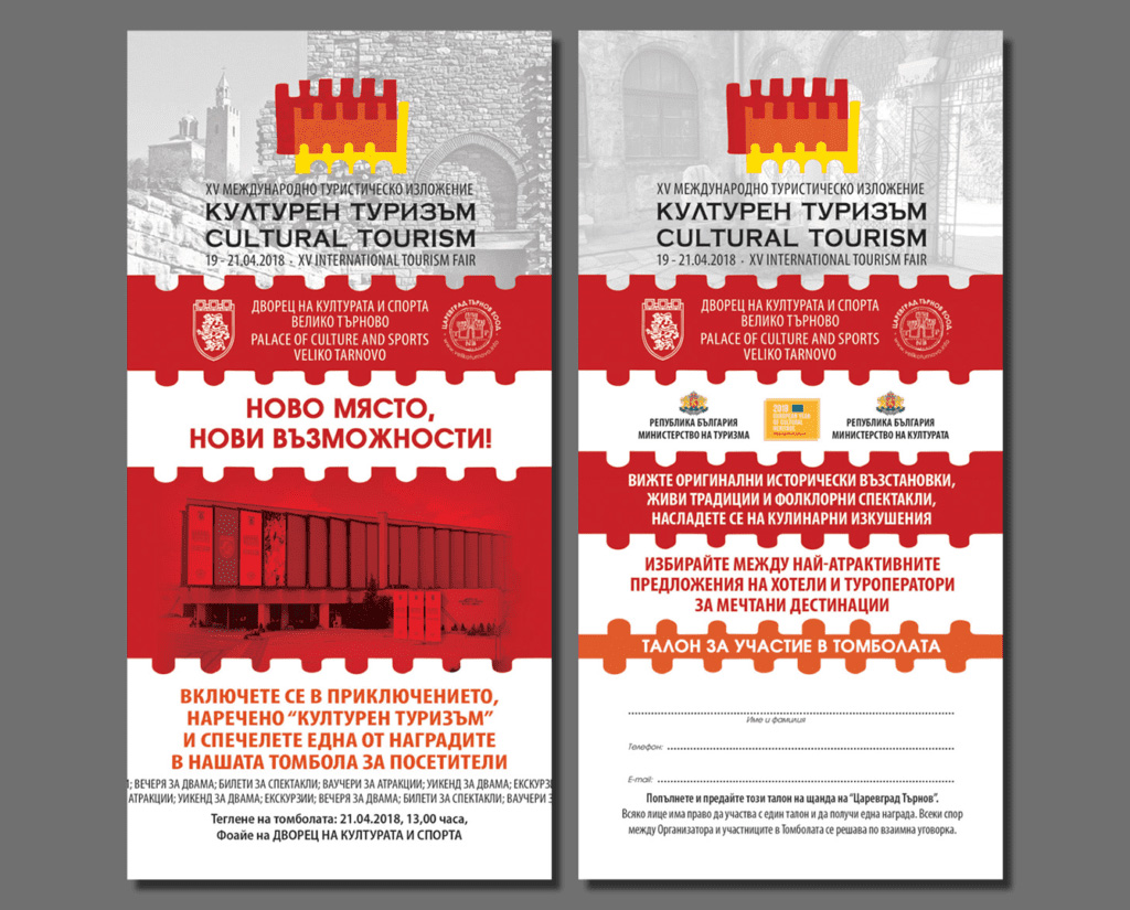
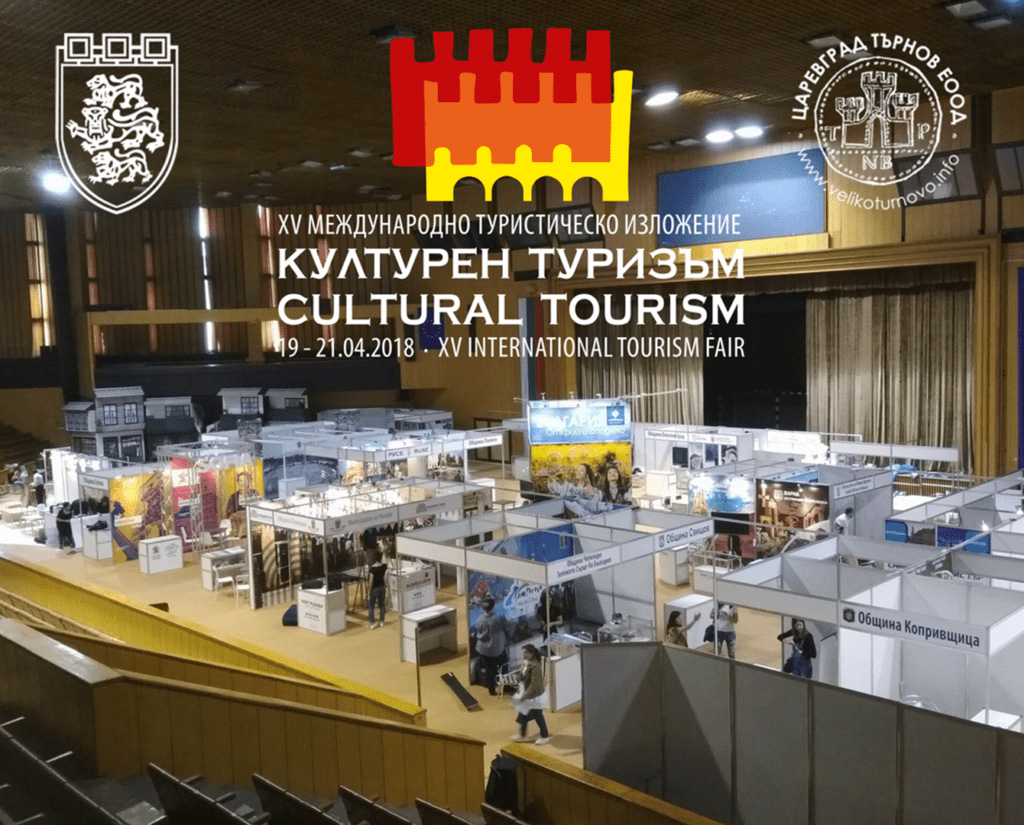
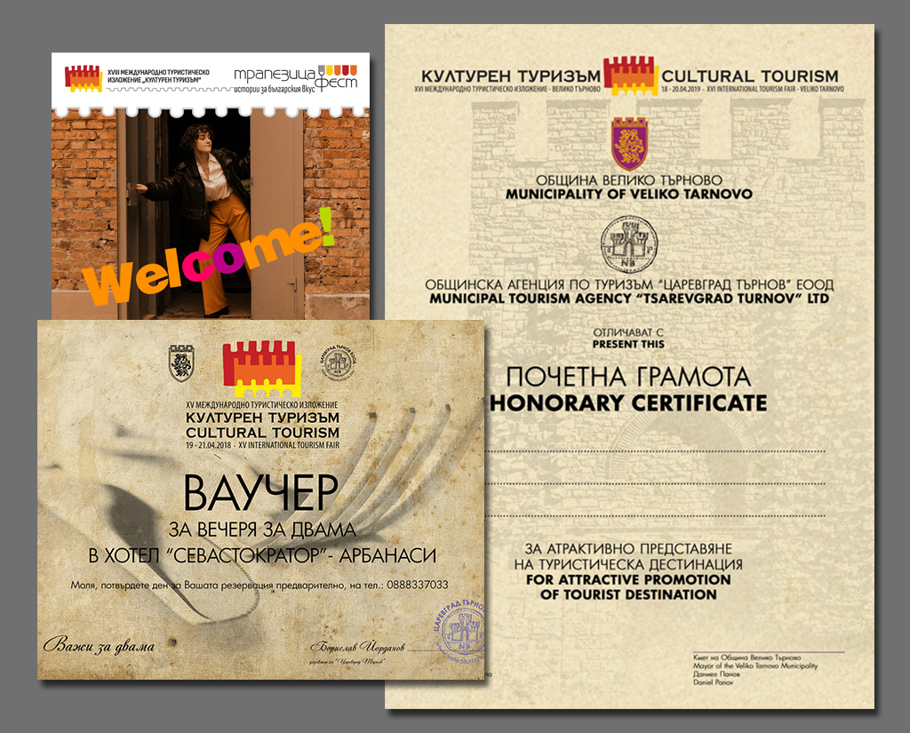
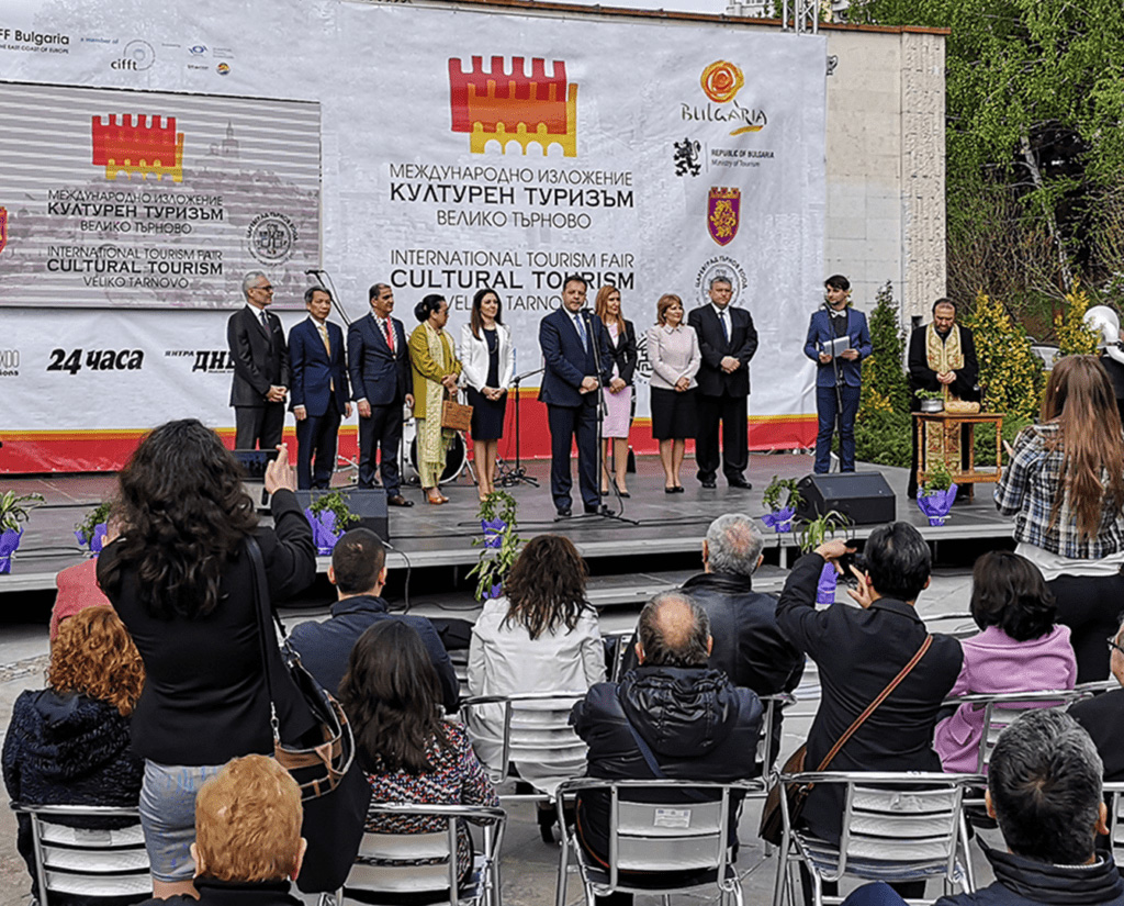
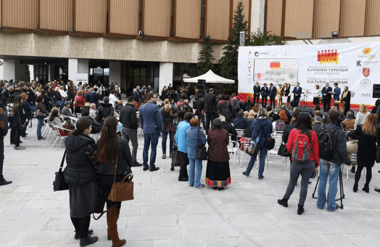
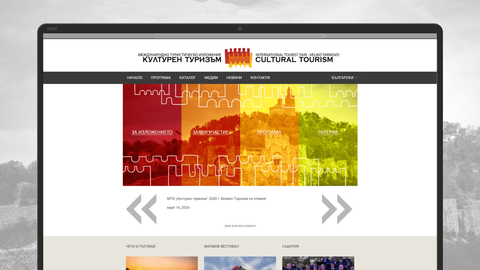
CULTURAL TOURISM, VELIKO TARNOVO
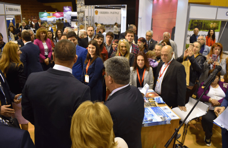
The International Tourism Exhibition “Cultural Tourism” – Veliko Tarnovo is the first specialized forum for the promotion of cultural tourism and its importance for Bulgaria as a tourist destination.The state and non-governmental organizations, municipalities and museums, the scientific circles and the business present in Veliko Tarnovo their activities, best practices and events that change the attitude in our country towards one of the most interesting and non-standard types of tourism.
Veliko Tarnovo Municipality and Tsarevgrad Tarnovo have relied on us for the design, advertising, digital marketing, stand construction and event organisation for more than 15 years.

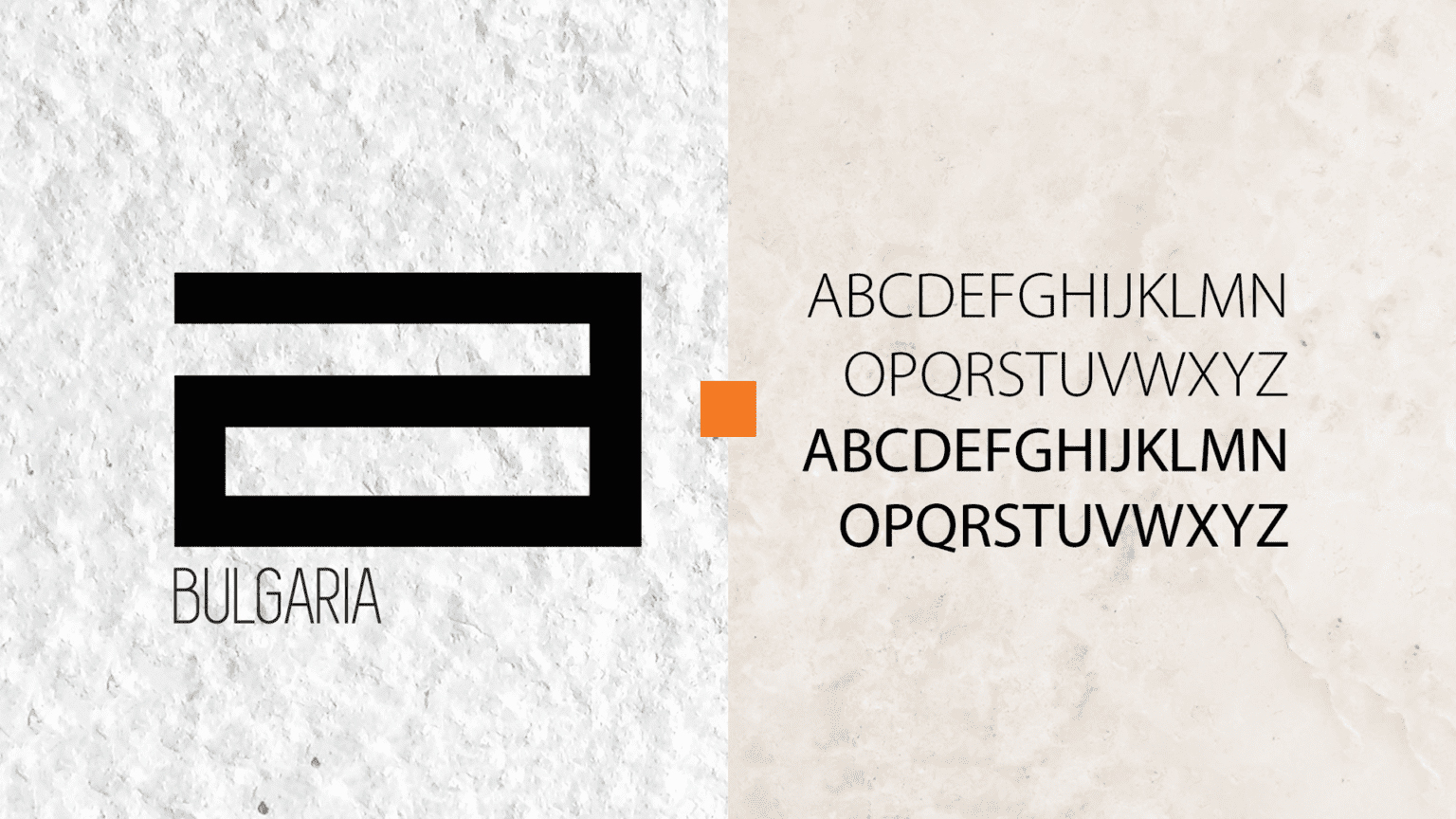
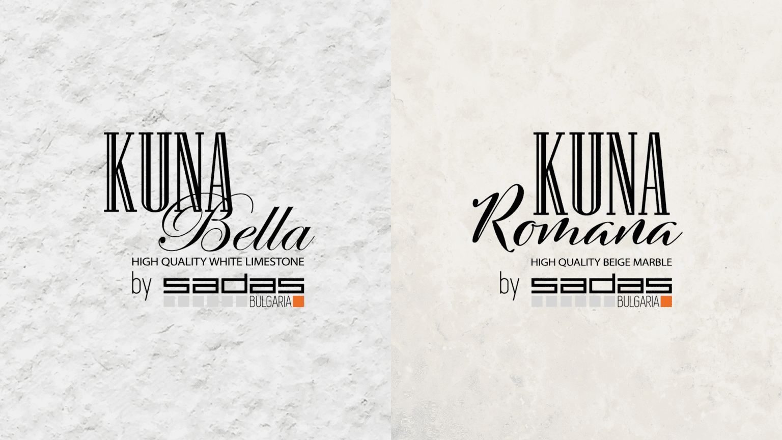
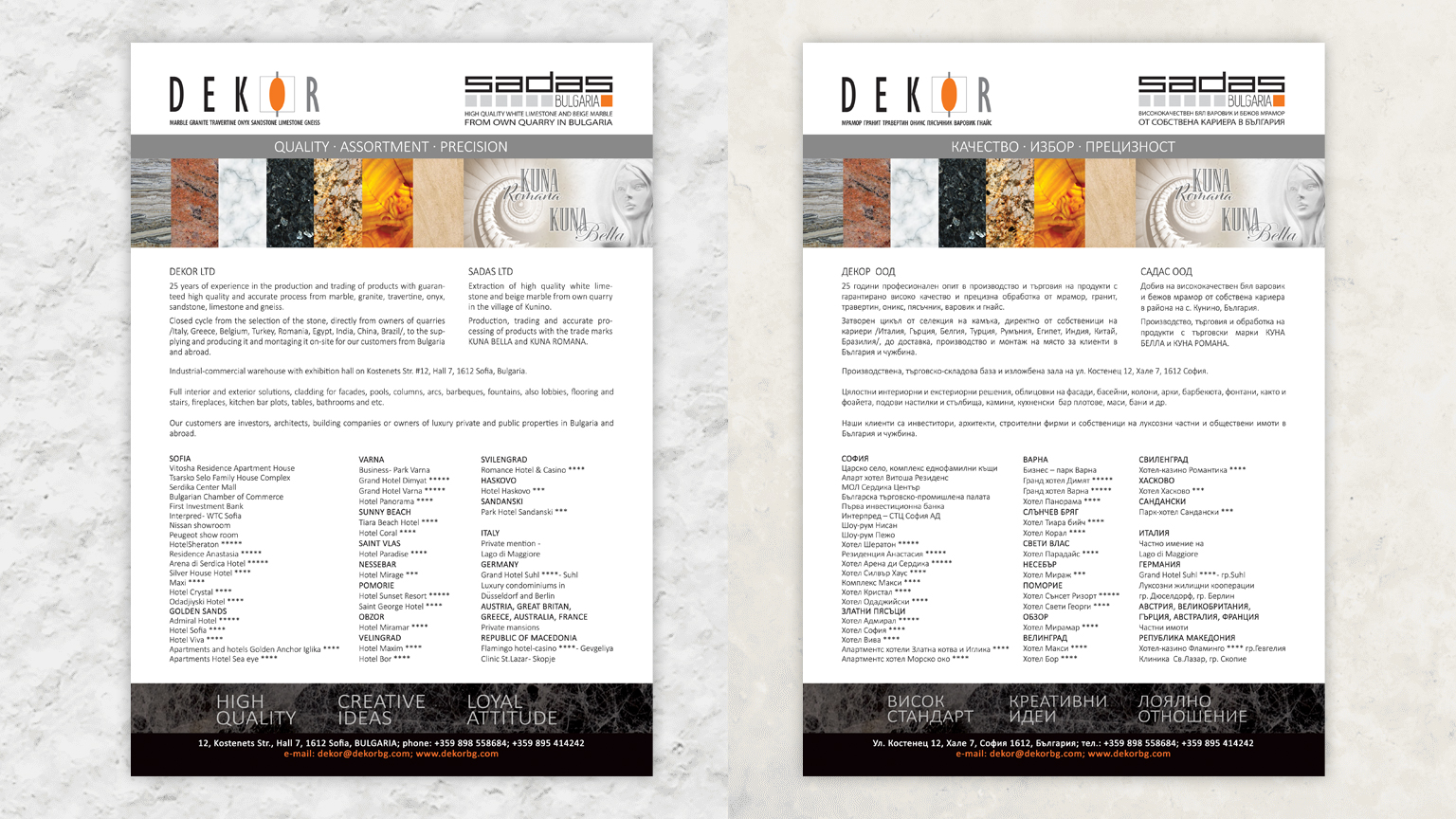
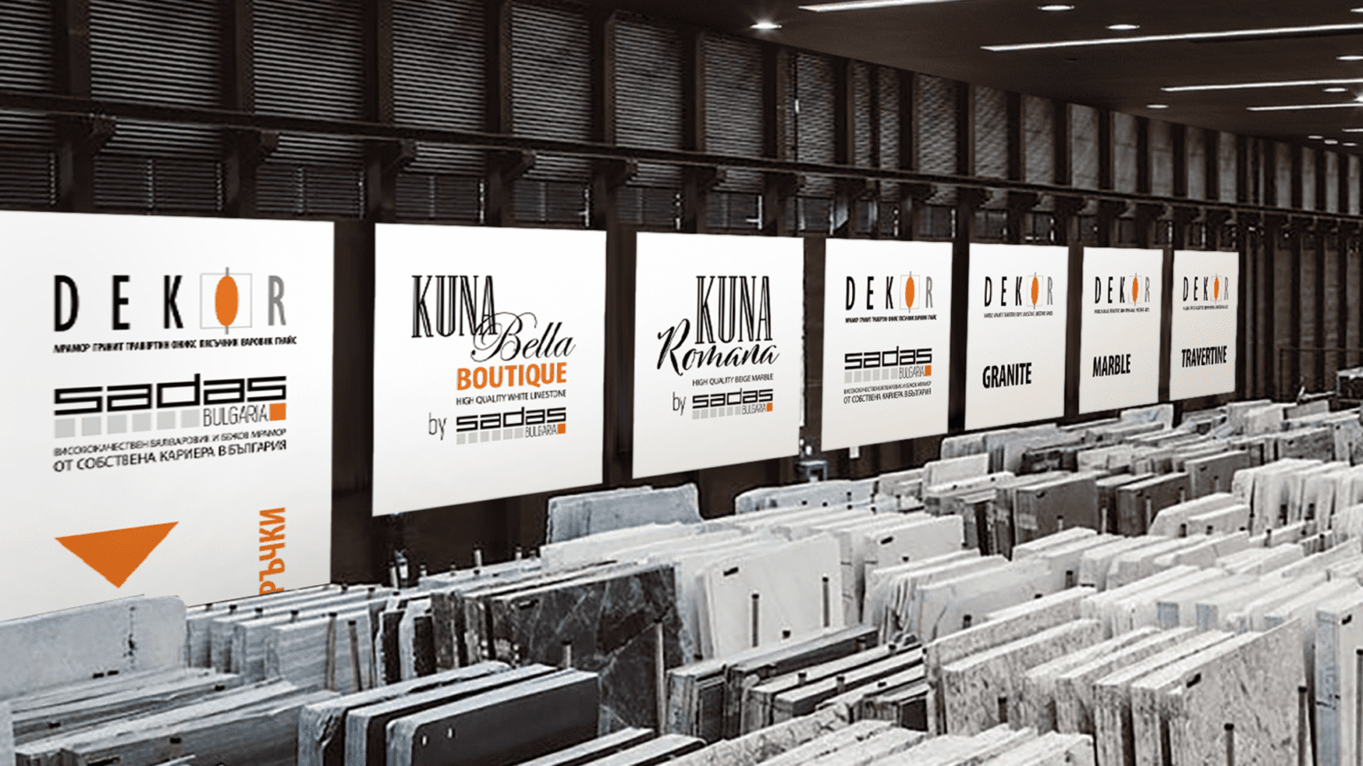
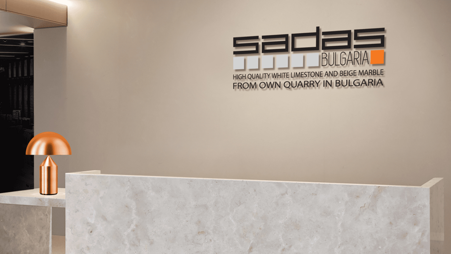
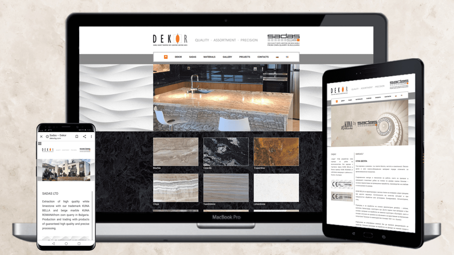
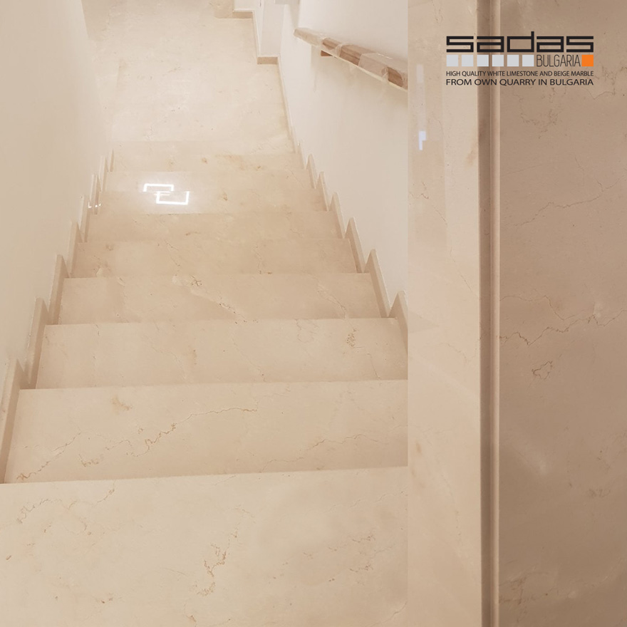
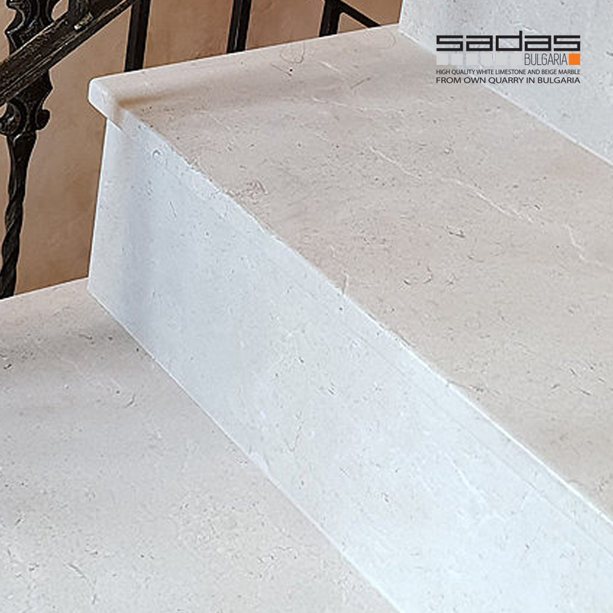
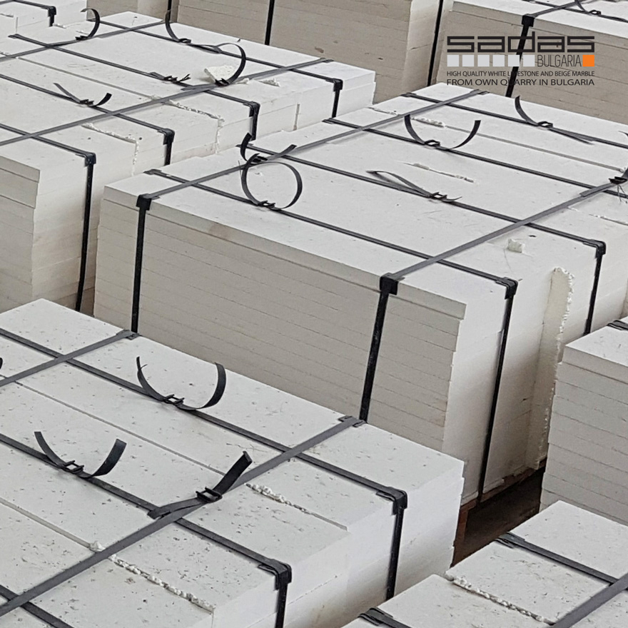
SADAS | DEKOR
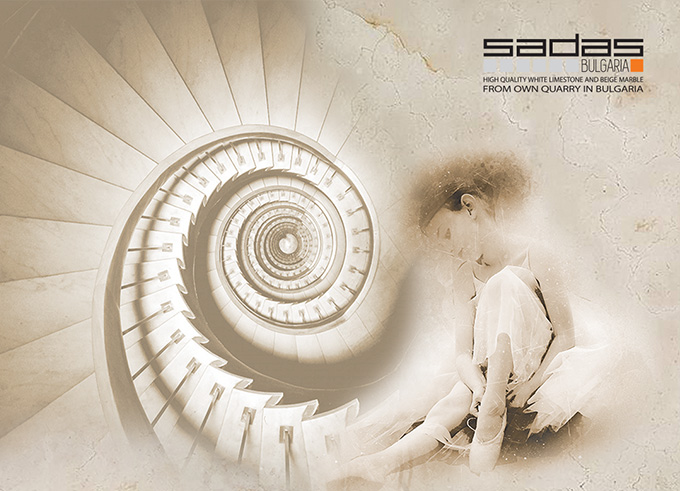
After many years dedicated to the supply and precise processing of natural stone products, the owners of Decor Ltd. embarked on a new adventure and established the company Sadas Ltd. to develop a new quarry from its own deposit in the village of Kunino, Bulgaria. They quarried high quality white limestone under the brand name KUNA BELLA and beige marble KUNA ROMANA.
Our work began with designing the visual identity for Sadas and the new trademarks. Our partnership continues today with the design of all office and promotional materials, website, company positioning, exhibition stands, office branding, showroom and production facility.
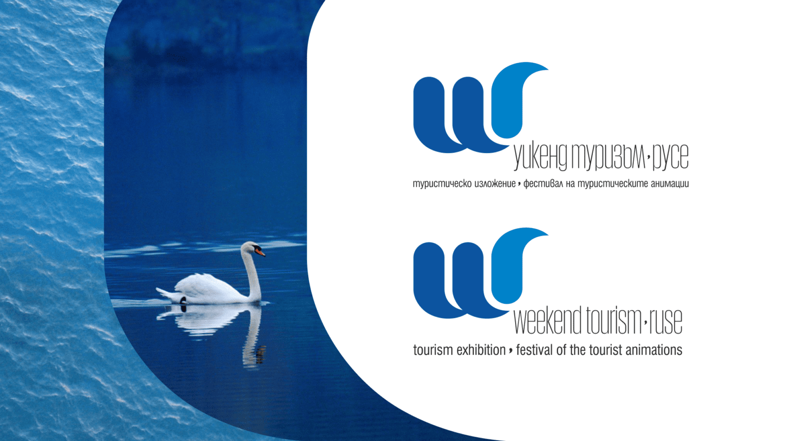
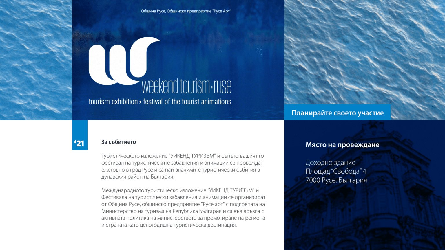
WEEKEND TOURISM, RUSE
Ruse is the largest Danube port city in Bulgaria. Because of its beautiful architecture the city is often called "Little Vienna". Near Ruse is the Natural Park "Rusenski Lom", through the area passes the "Via Pontica" - one of the main bird migration routes.
Annually Ruse holds the tourism exhibition "Weekend Tourism" with the Festival of Tourist Entertainment and Animation being a significant part of its program.
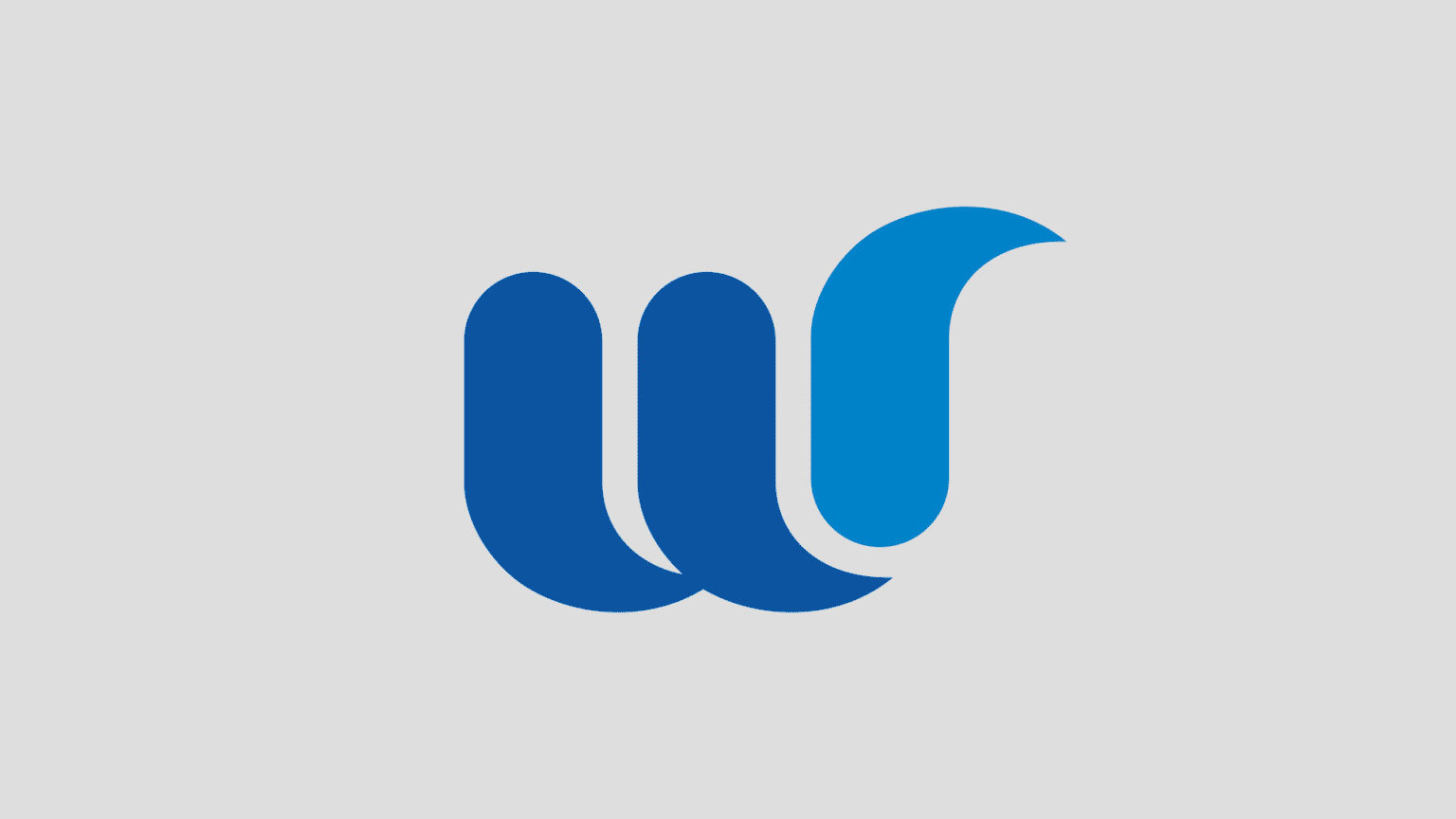
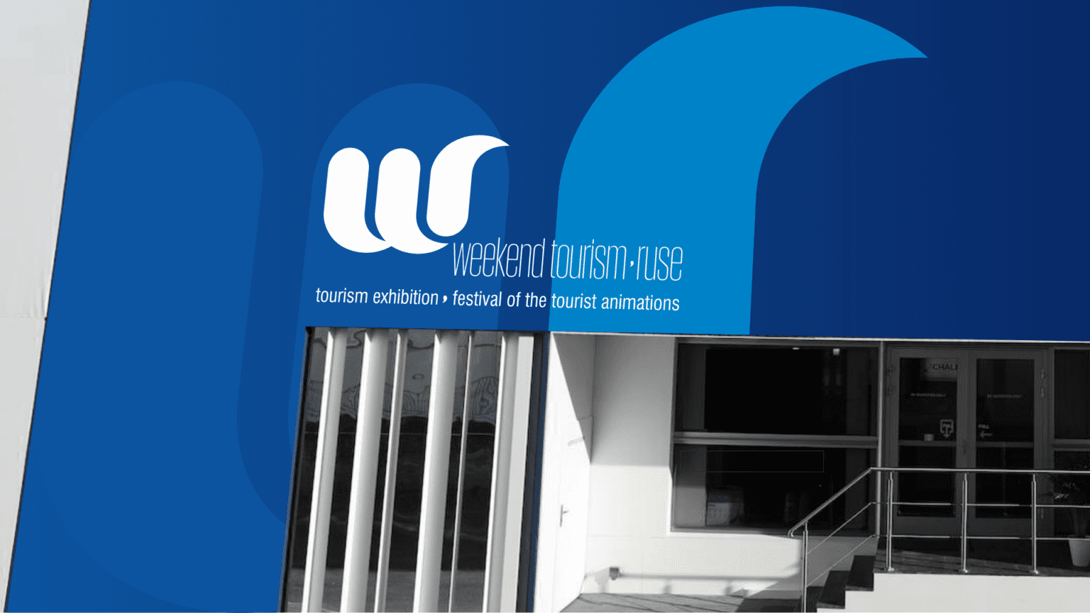
It is the location of the city on the banks of the Danube and the diverse aquatic inhabitants in the area that inspired the logo created by our team for the festival.
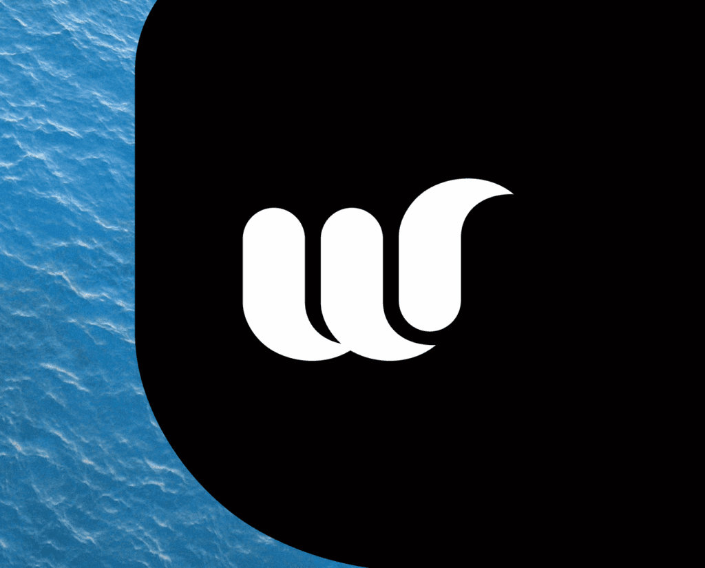
We designed a memorable and easy-to-use symbol that can have a wide range of applications. The abstract letter "W" is reminiscent of both the movement of water and an elegant water bird, and the minimalist design and color combination correspond to the beauty of the Danube city.
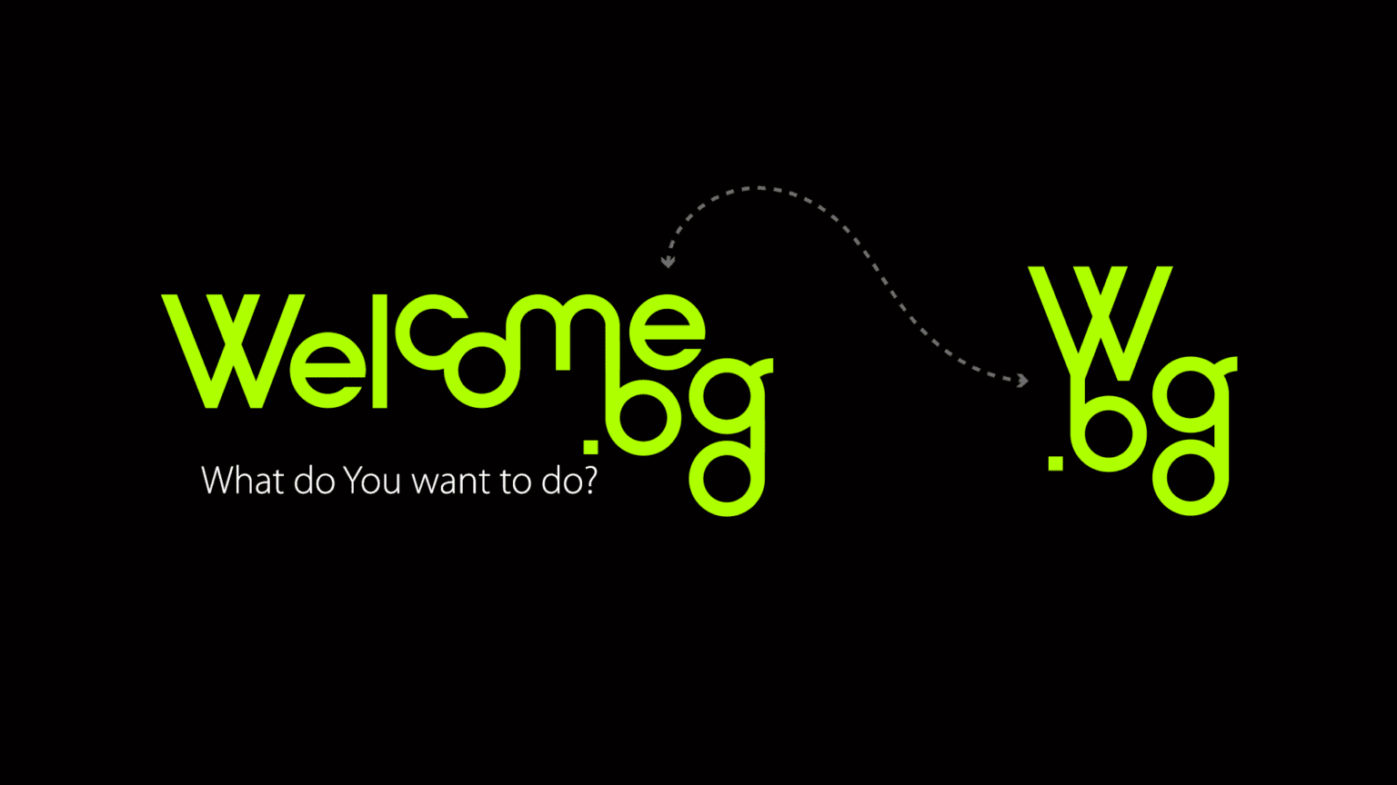
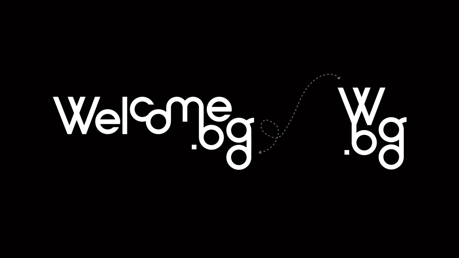
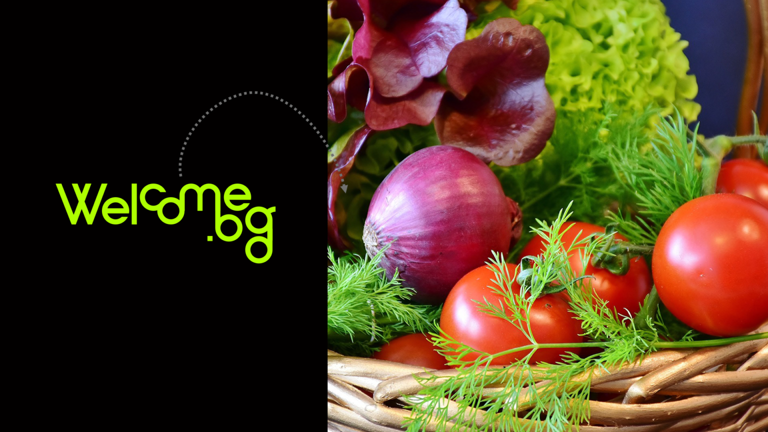
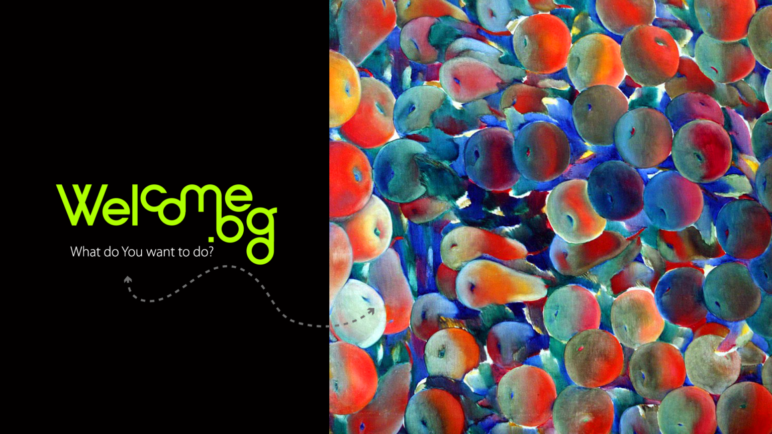
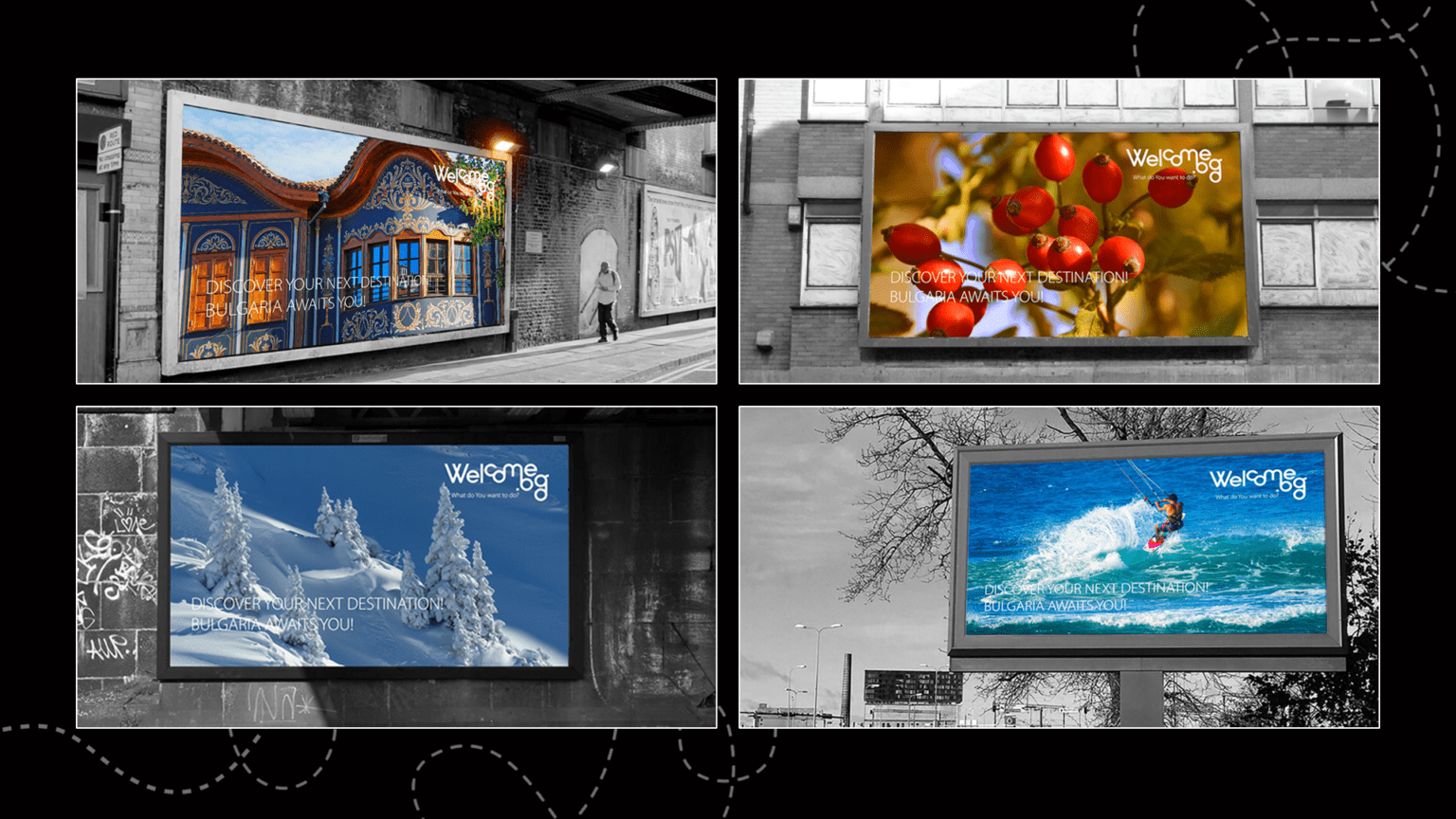
WELCOME.BG
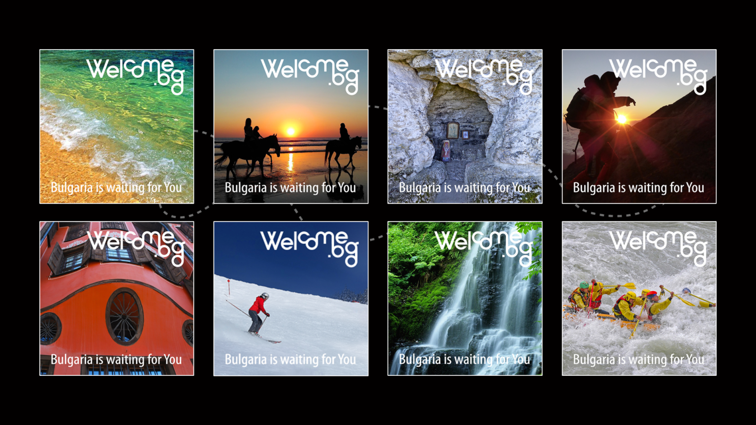
Welcome.bg is an online system for promoting Bulgaria as a tourist destination, Bulgarian tourist and transport services, sites, places of accommodation, attractions, restaurants, activities. The platform answers the question "What do you want to do?" by offering destinations and leisure activities, as well as suitable accommodation nearby.
Our goal was to create a perfectly clear graphic vision for the services offered by the website. The name and logo express the essence of Welcome.bg - hospitality and movement.
The word mark becomes a monogram when necessary. The modern and laconic sign of Welcome.bg brings various visual suggestions. We took the green color from the spring forests and fields, the smooth overflow of the letters symbolizes the constant development, the sea waves and the rounded ridges of the Rhodopes, and the intertwined geometric shapes in the short logo refer to the signs of the ancient Glagolitic alphabet.
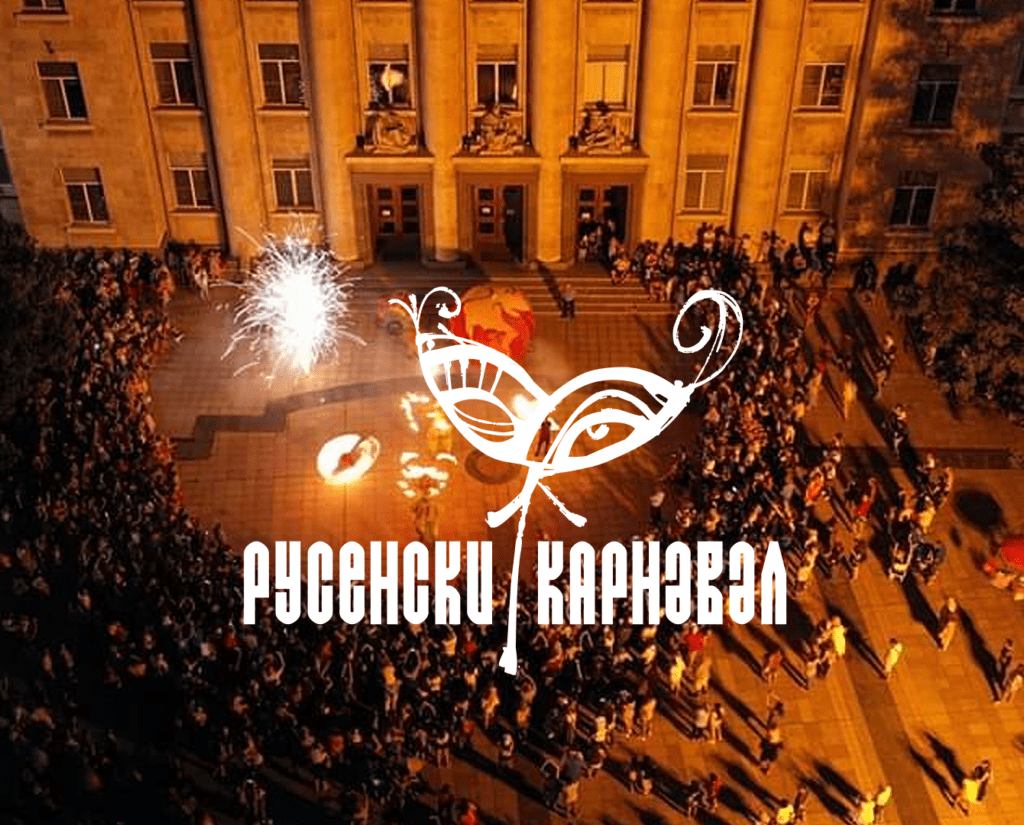
RUSE CARNIVAL
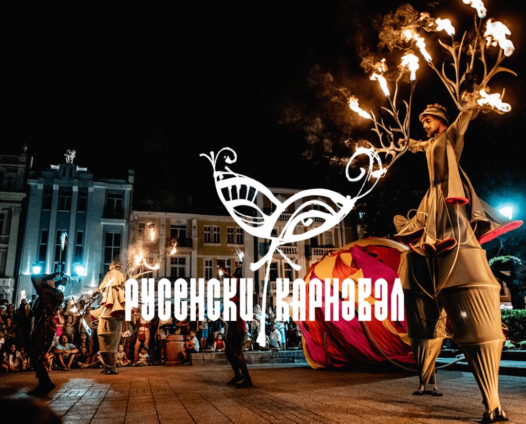
The Ruse Carnival is one of the most colorful events in the city's cultural calendar. On the eve of Midsummer, Ruse, known in Bulgaria as "Little Vienna" for its beautiful architecture, becomes a stage for street performance - dances, processions, games, competitions, unusual renditions and unexpected improvisations.
Our design team created the new brand, highlighting the sense of celebration created by the hand-painted domino - the most popular symbol of the masquerade. As additional elements, we used textures and images of decorative feathers and costume parts in bright colors which immerse the viewer in a rich, fairy-tale atmosphere.
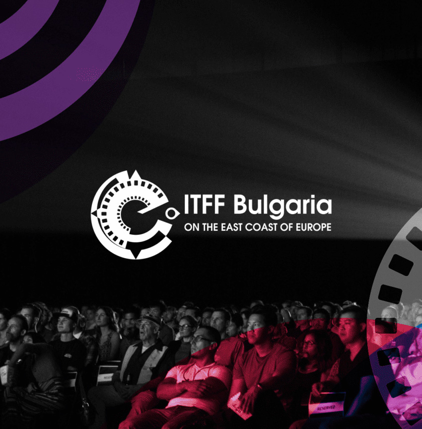
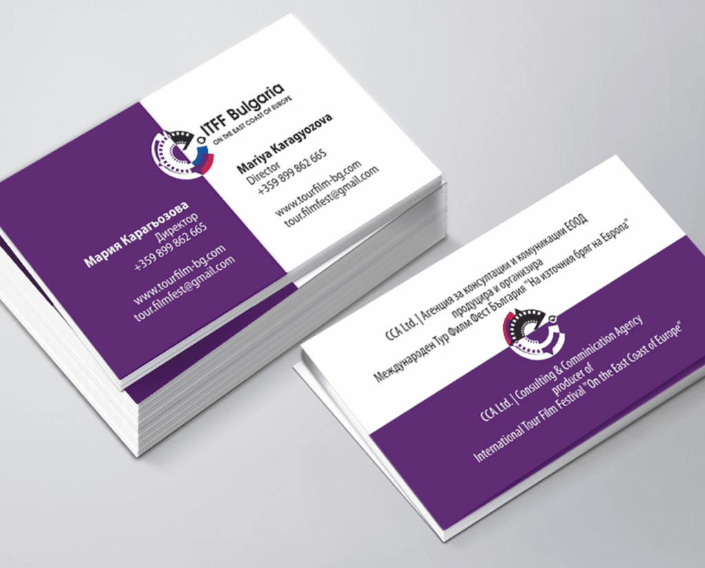
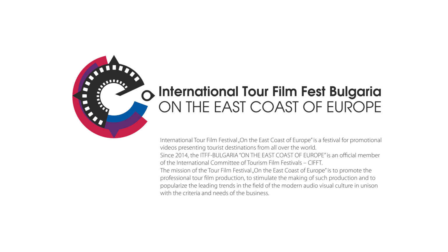
ON THE EAST COAST OF EUROPE FILM FEST
International Tourist Film Festival “On the East Coast of Europe” is a festival for promotional TRAVEL & TOURISM Video Production from around the world, and official member of the International Committee of Tourism Film Festivals – CIFFT. The themes of the productions shown cover all types of tourism: events, sports, rural, religious, recreational and spa tourism, cultural and historical, fishing and hunting, extreme, mountain and sea, ecotourism, etc.
The mission of the Tourism Film Festival “On the Eastern Coast of Europe” is to promote professional film tourism production, to stimulate the creation of such production and to popularize the leading trends in the field of modern audiovisual culture, in unison with the criteria and needs of the business.
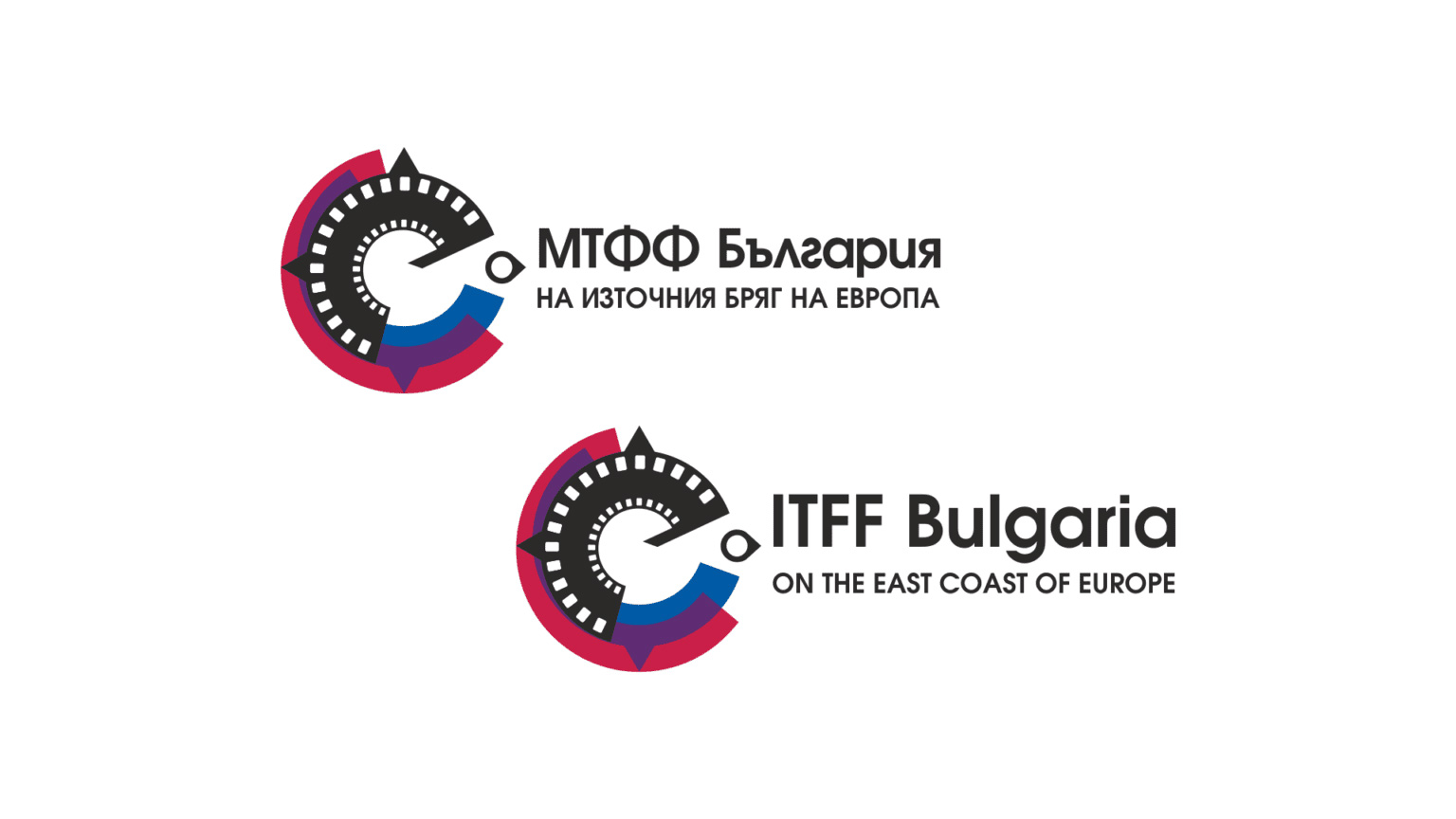
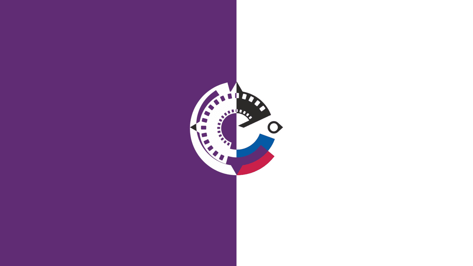
The logo of the festival, is a part of a projection apparatus and a multi-layered graphic, symbolizing the idea of a developing film strip. Alongside with elements typical of classic film technology, we put ‘pin’ icon – a location marker typical of modern navigation systems that points east. The rich color scheme illustrates the abundance of themes, destinations and visual challenges that characterize the festival.
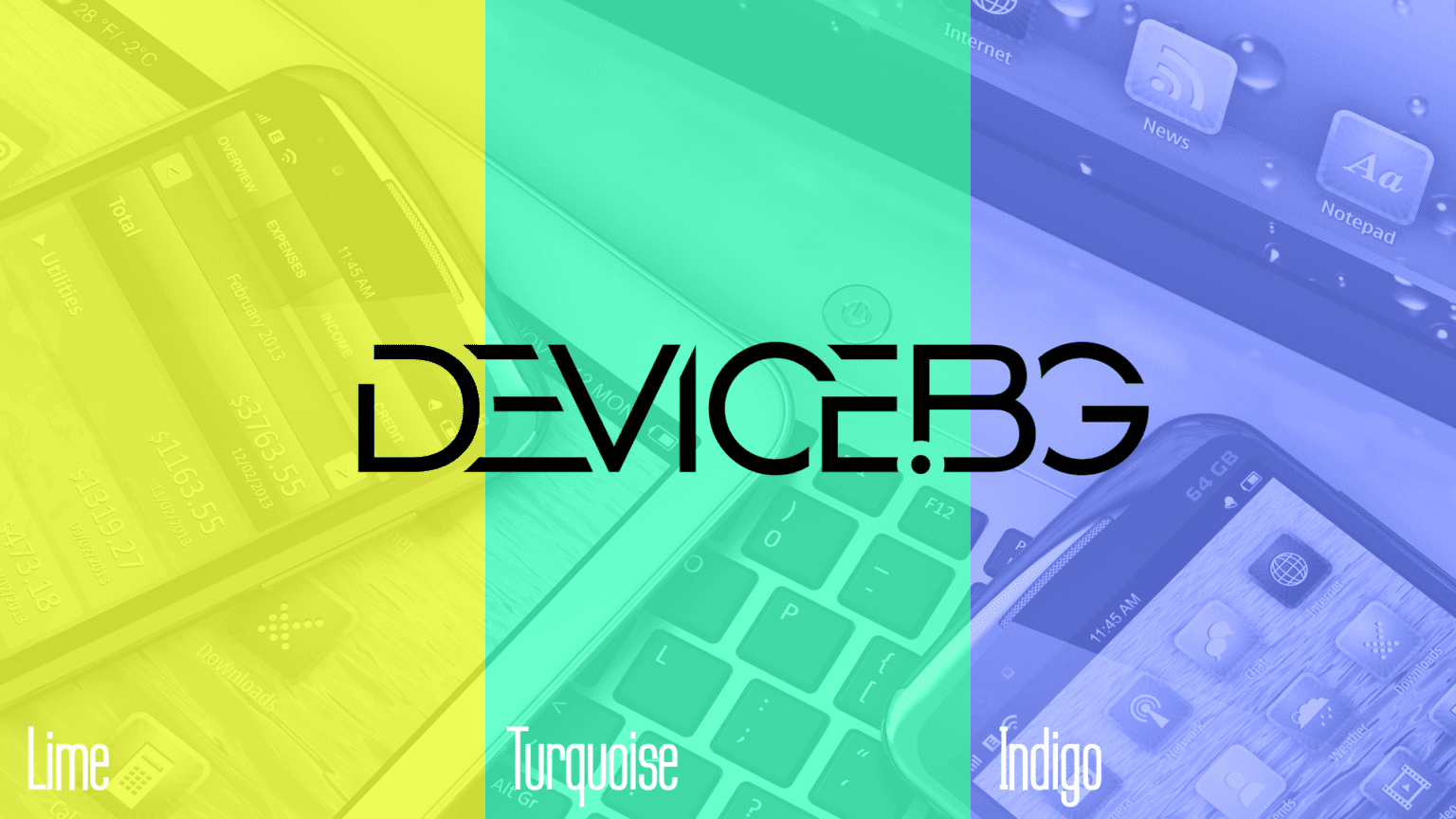
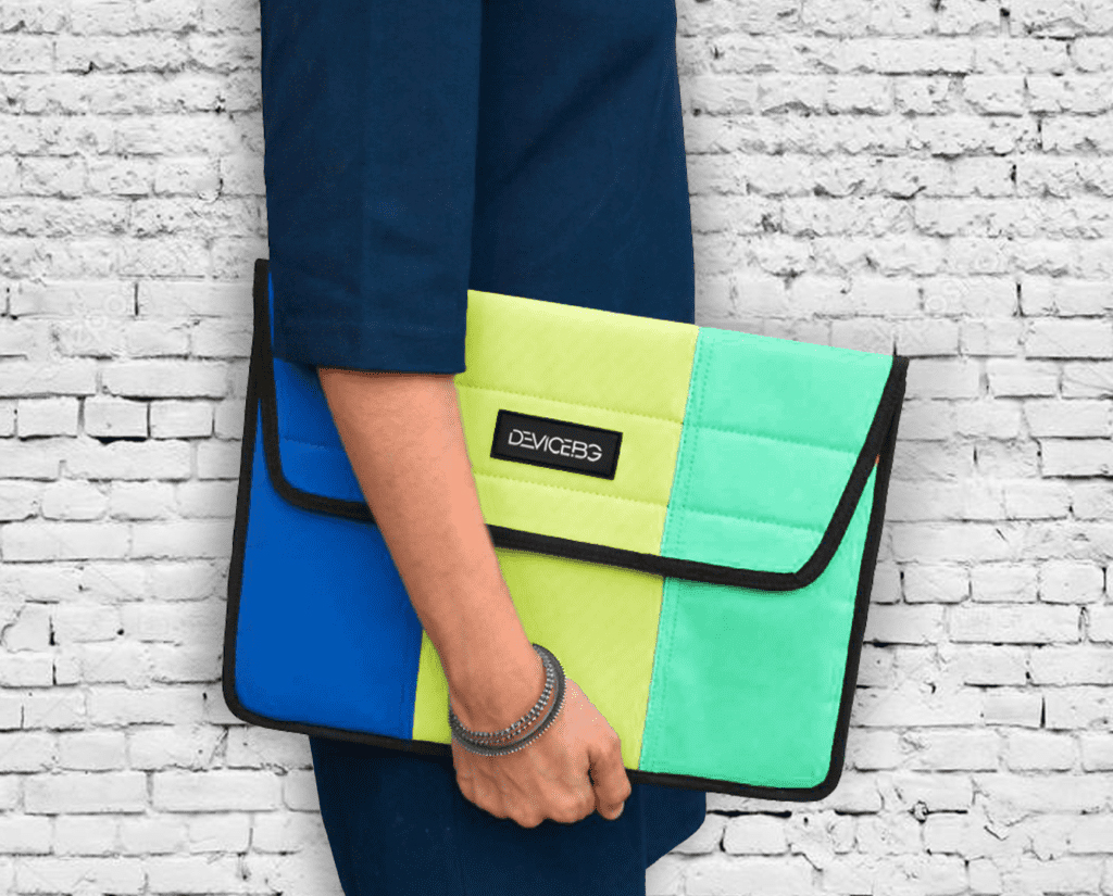
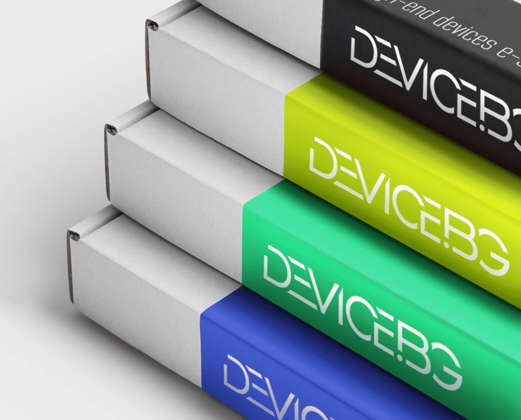
DEVICE.BG
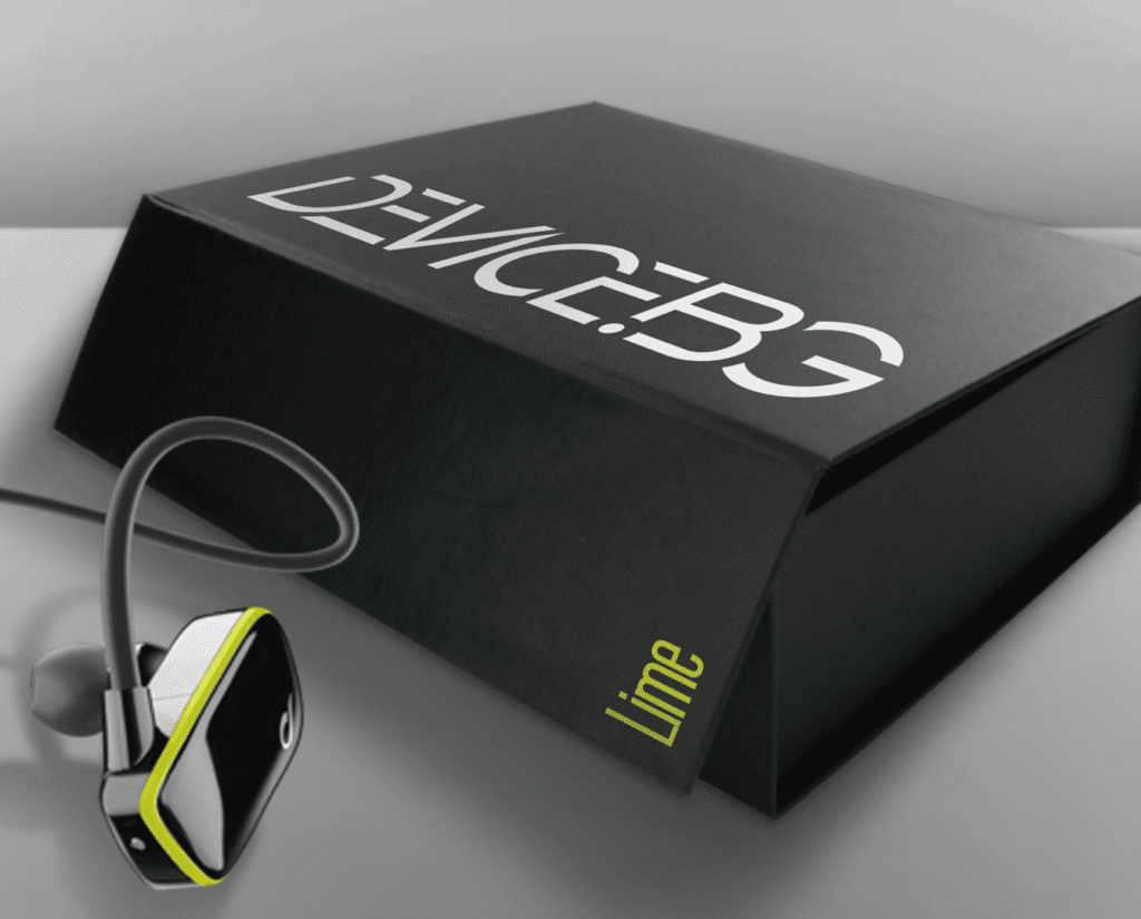
Device.bg - Fresh, youthful and funny is the Visual Identity we designed for a start-up online store for high-end tech devices.
The dynamic spirit is reflected in the color scheme and the clean geometry of the logo, where the characters are partially deconstructed and the elements are used as freestanding graphics. The logo is designed in black or white to suit different applications, and the alluring colors appear in complementary elements and backgrounds to mark different sections in the store, in packaging and promotional materials.