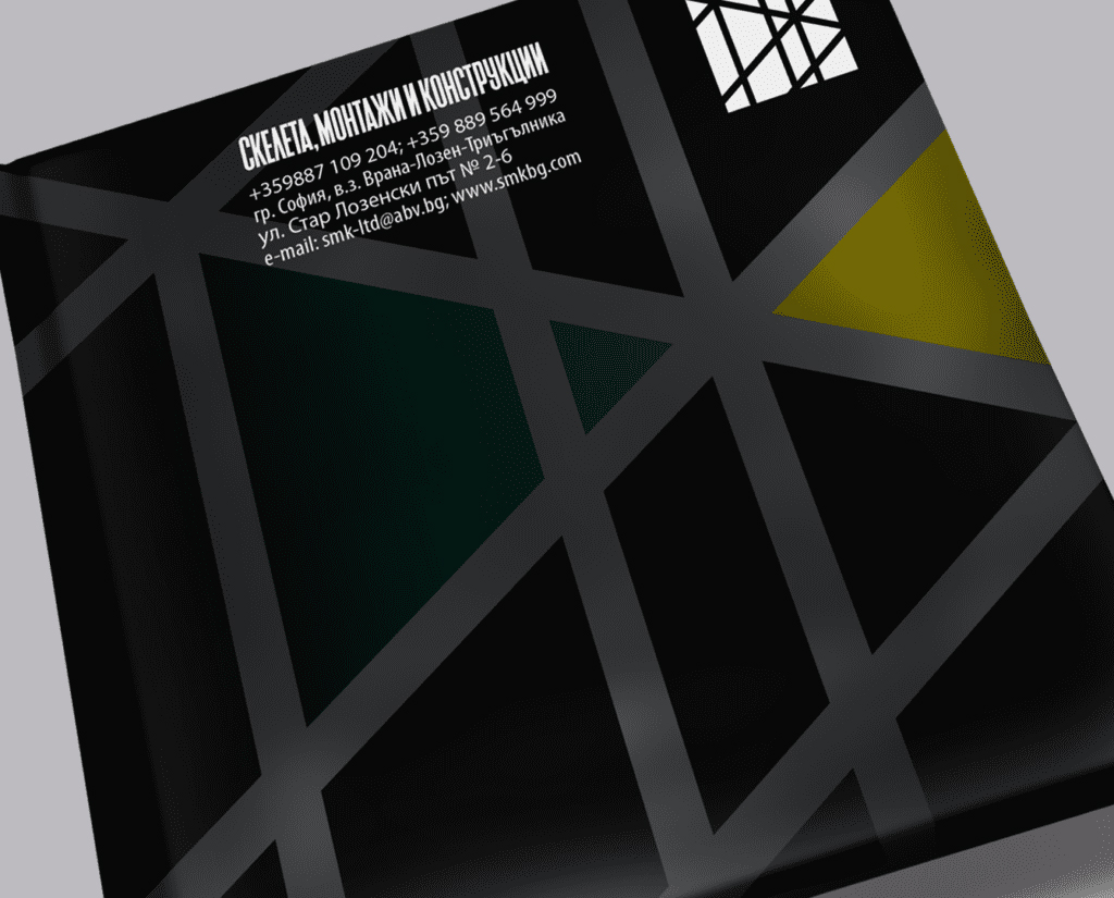
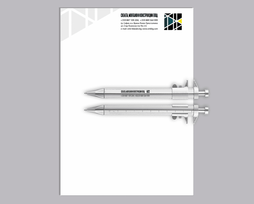
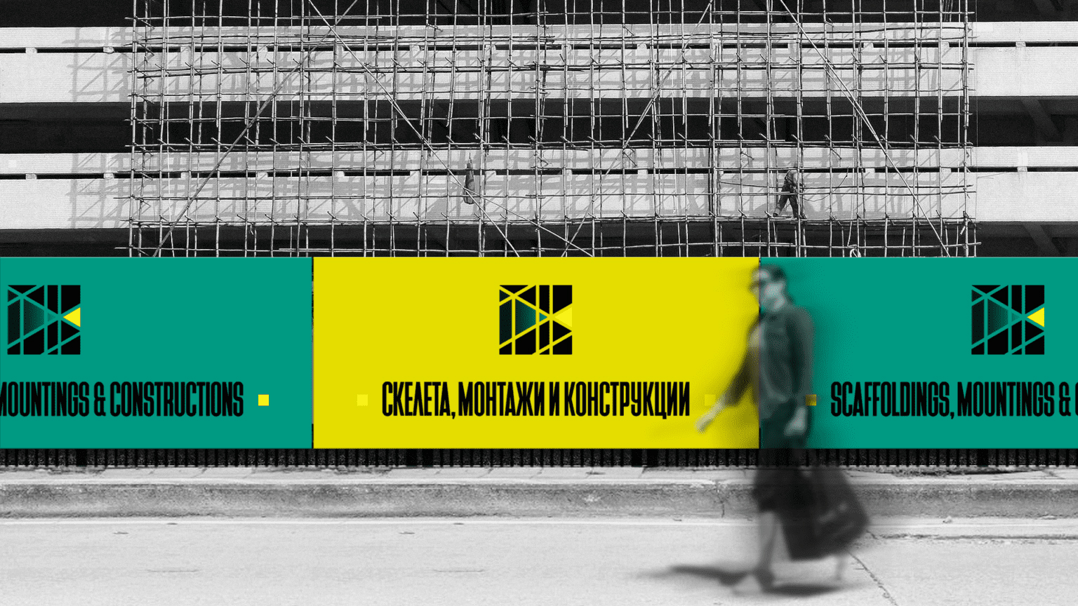
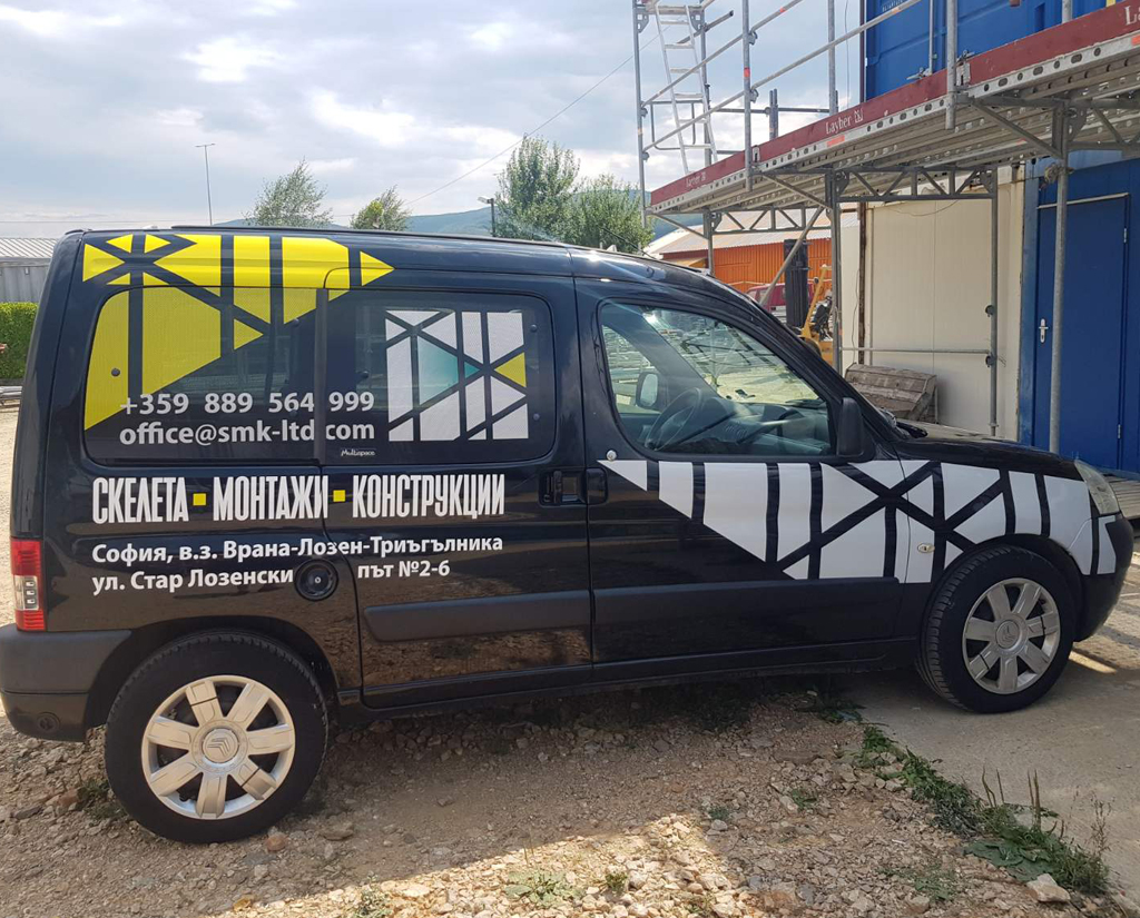
SMC

SMC Ltd is an established construction and installation services company who approached us for their new corporate identity.
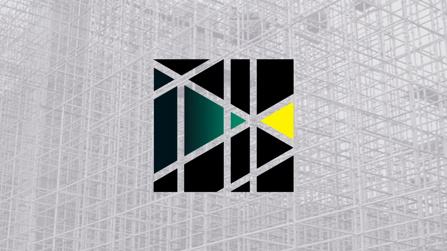
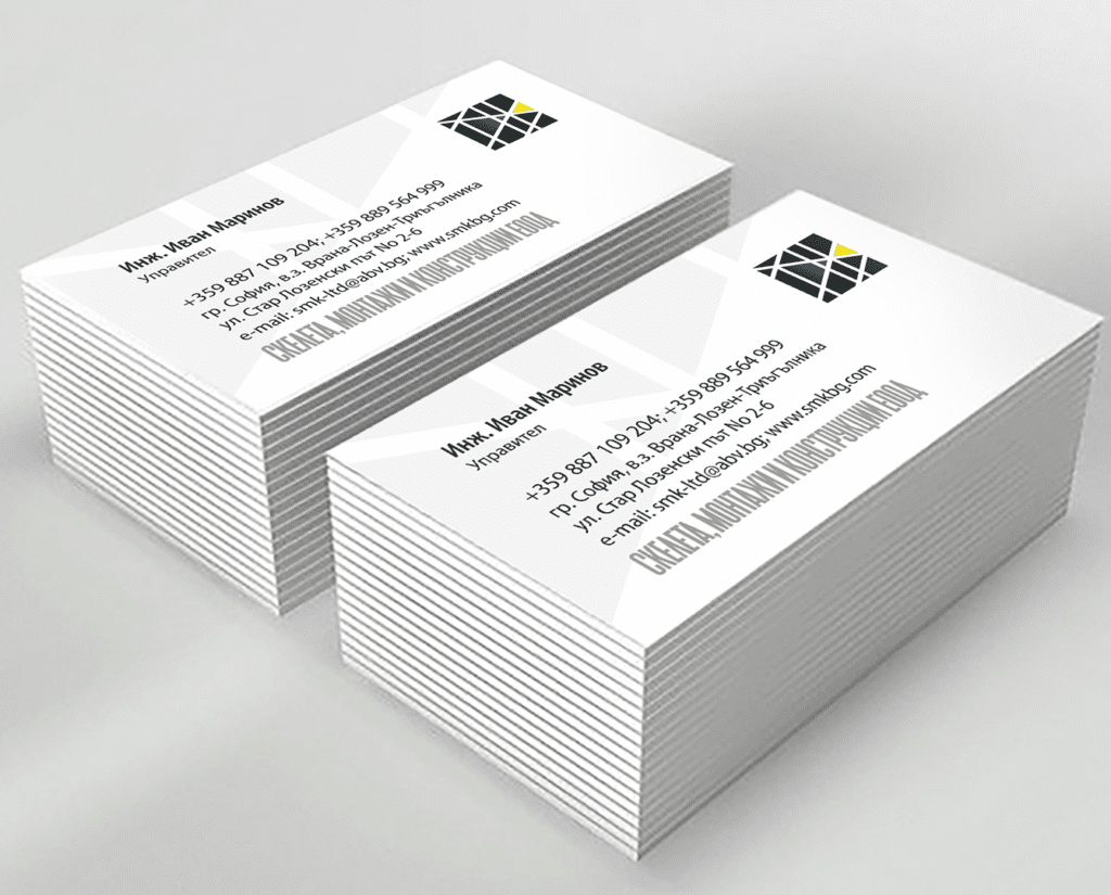
We developed a new company logo, full brand usage system and graphic standards. We set the foundation for the project with the distinctive raster of scaffolding, brought to an abstract graphic, with unexpected, bright, contrasting colors. The specific color scheme catches the eye and sets the company’s materials apart.
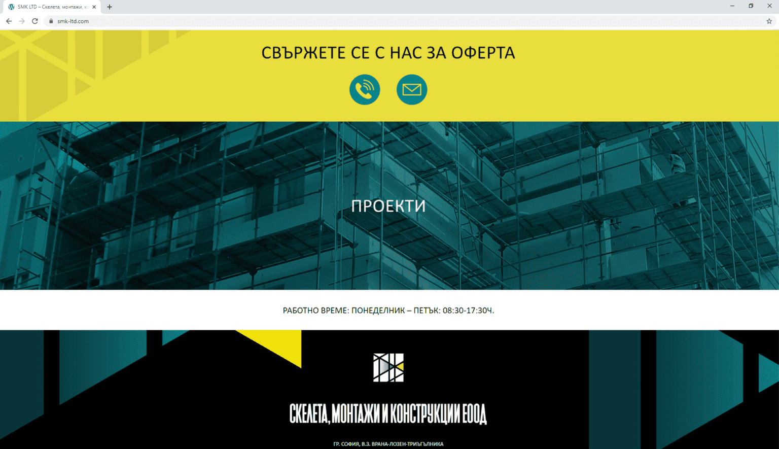
SMC Ltd website retains and highlights the vibrant identity, combined with a simple and clear structure to present the company’s products and services to potential customers.


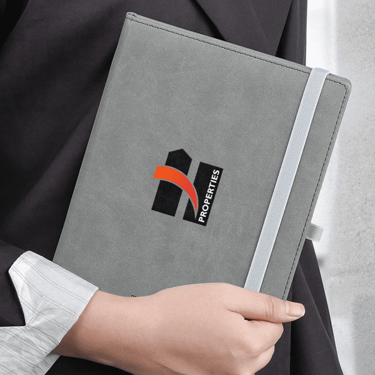
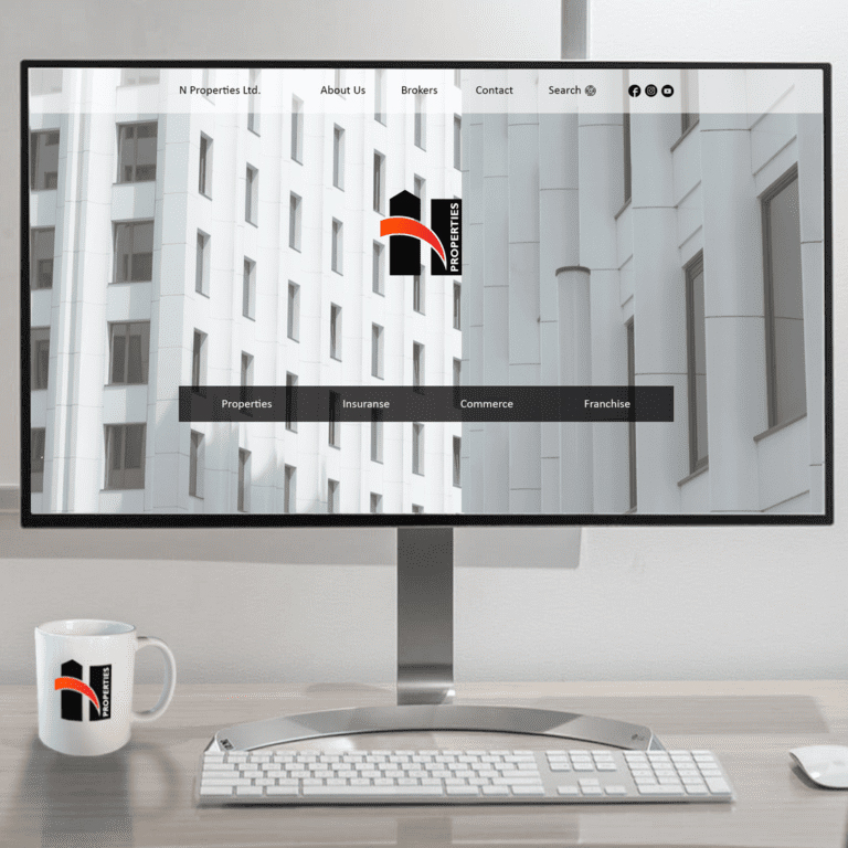
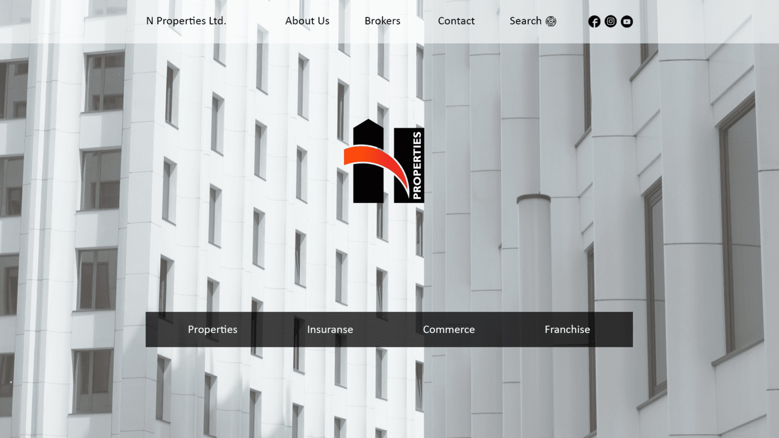
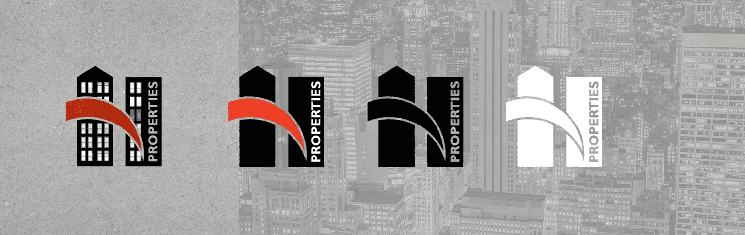
N PROPERTIES
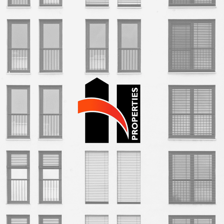
N PROPERTIES is a start-up property management company that approached us for its corporate identity. The company provides expert assistance when buying, selling, renting or searching for properties.
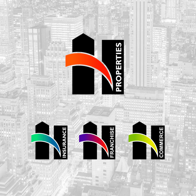
The visual identity of N Properties was developed with a perspective to serve the company's complementary activities - insurance, sales representation, etc.
The stylized letter "N" is massive and stable, with an idea of growth and upward movement. The main color is black, which allows us to develop variations in complementary colors for each different area of activity.
The website brings together the whole range of businesses, each developed in detail on a separate sub-page.
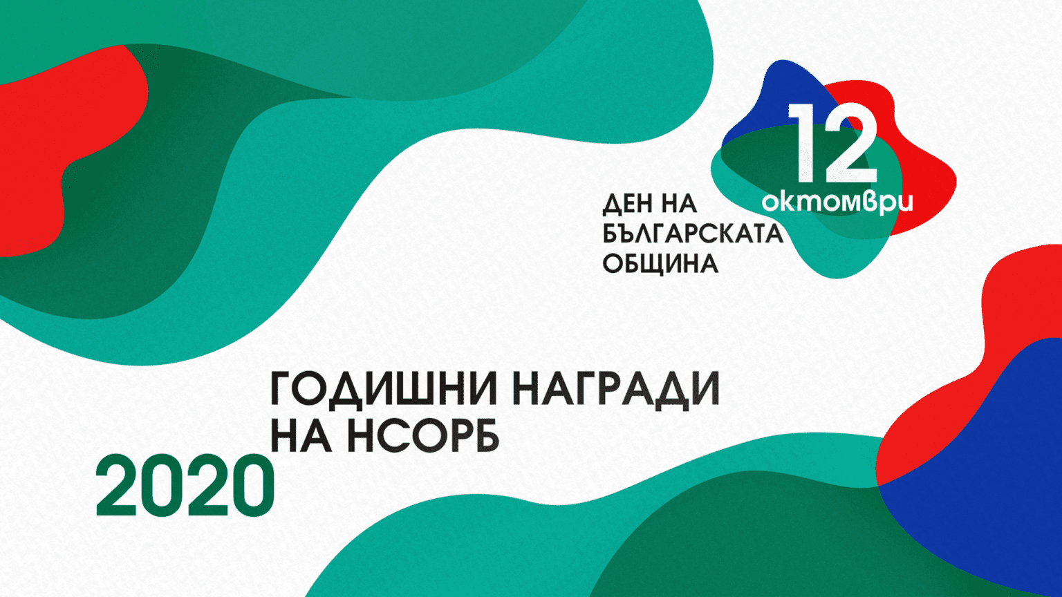
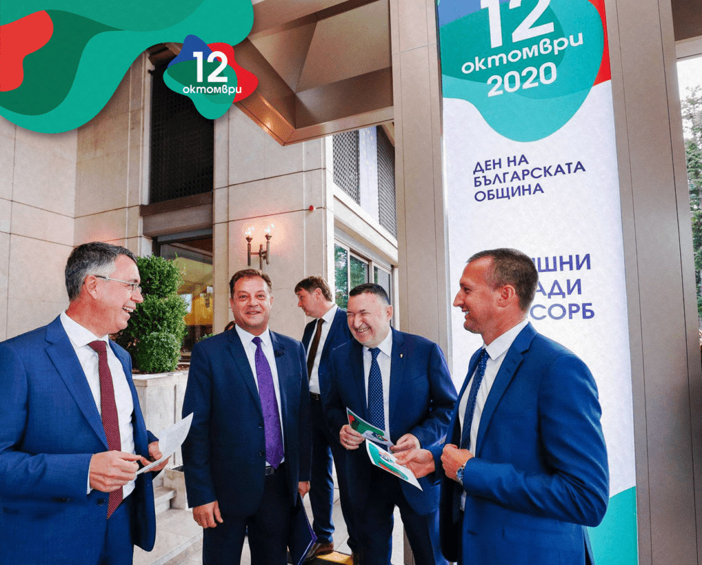
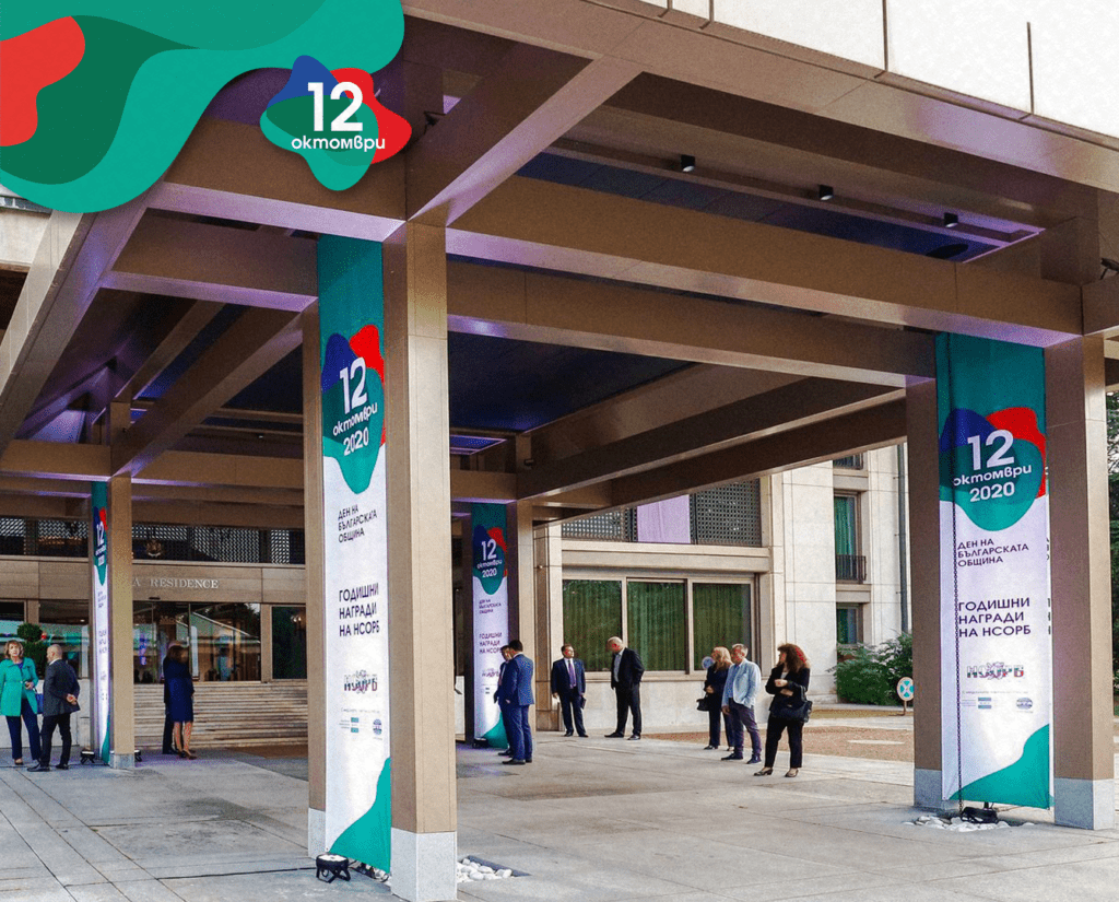
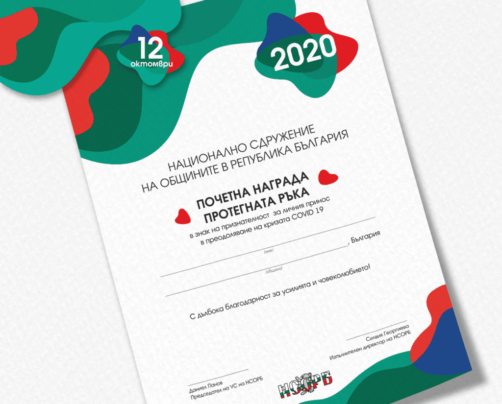
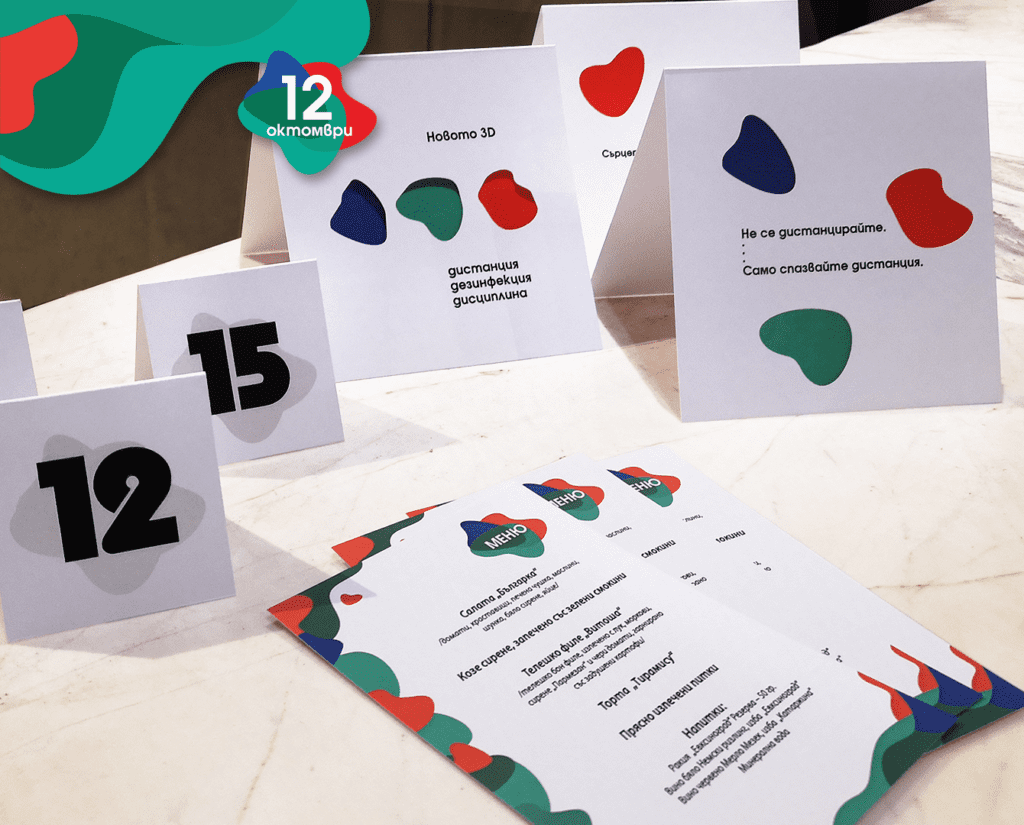
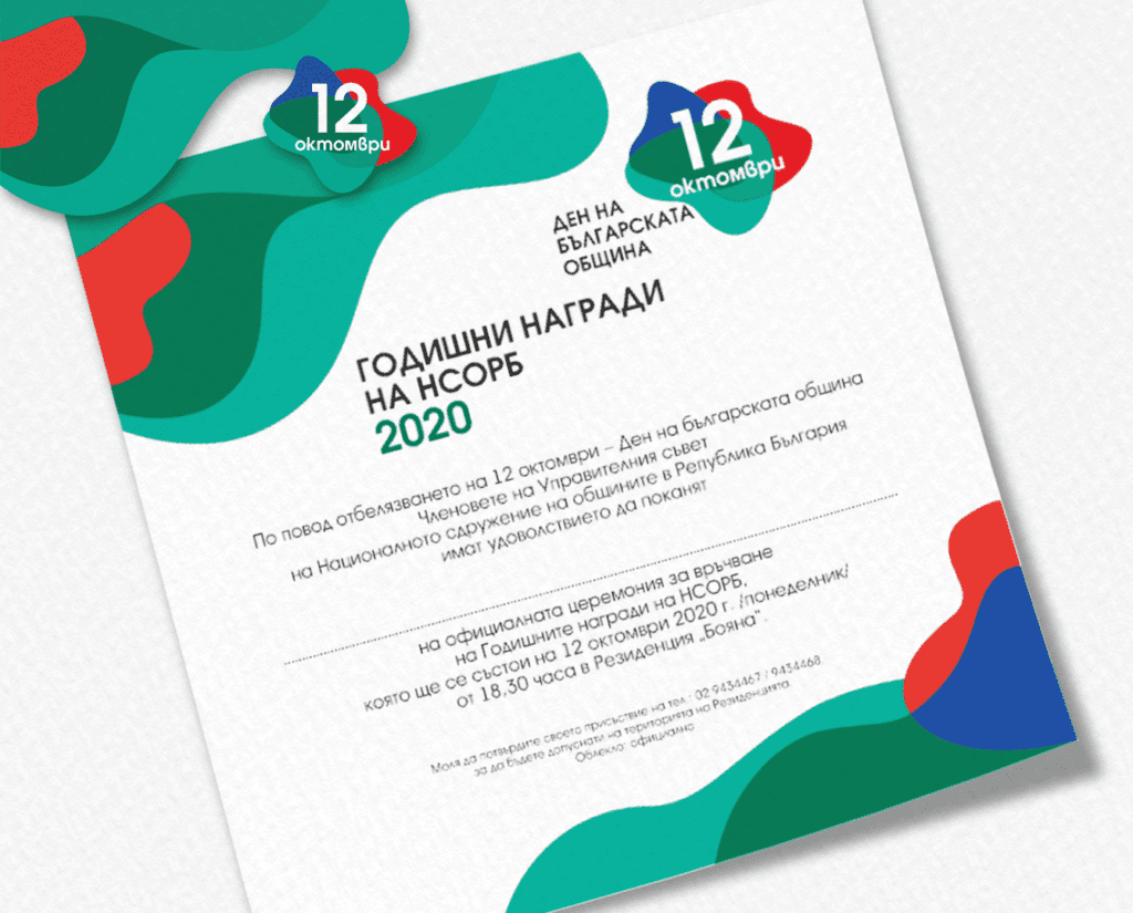
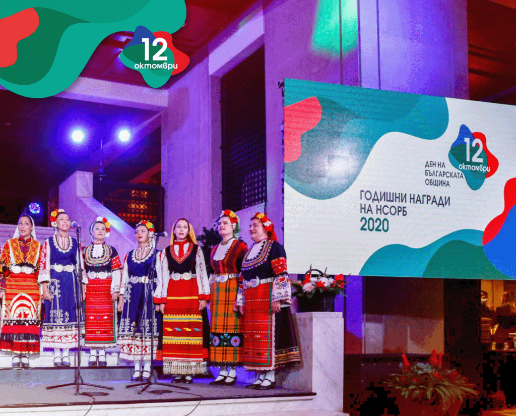
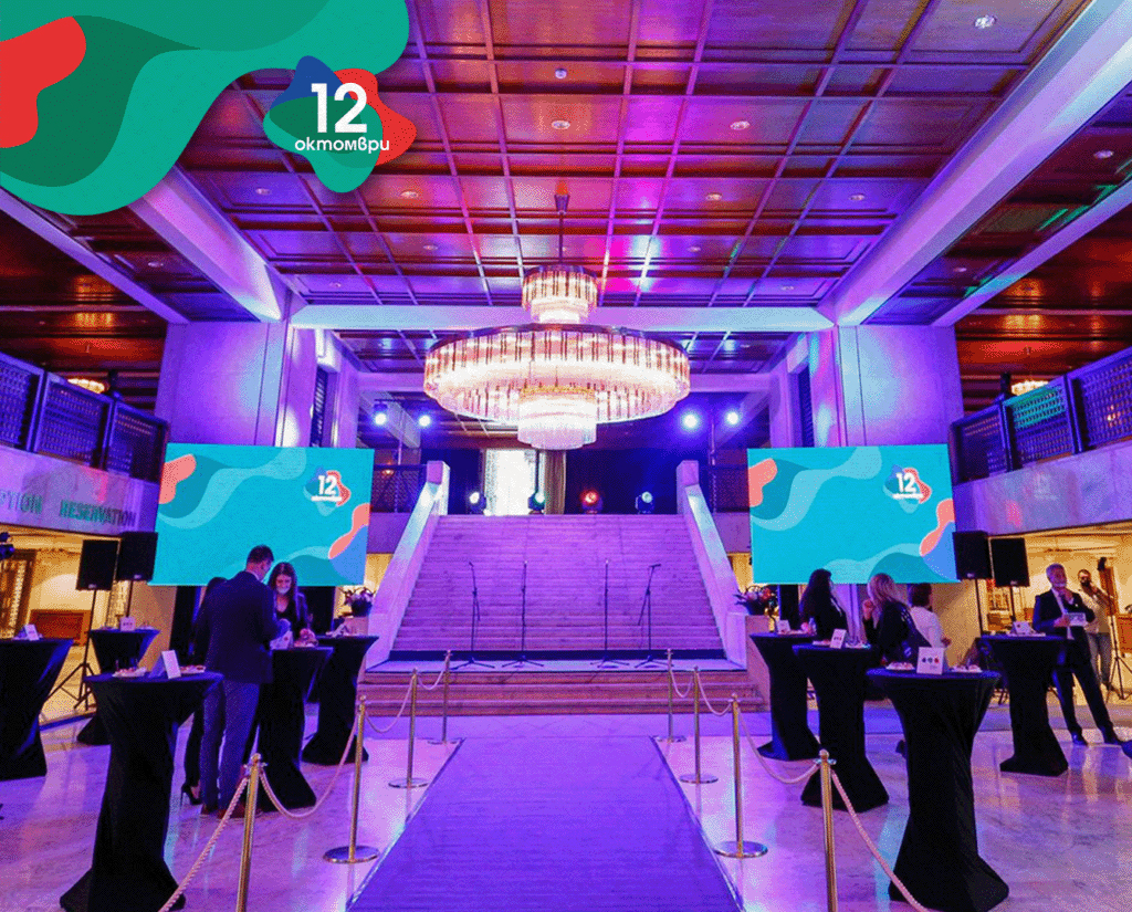
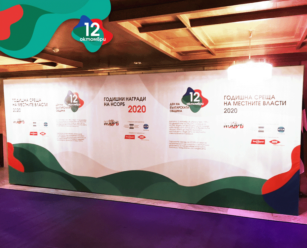
ANNUAL MEETING NAMRB 2020
Every year 12 October is celebrated as the Day of the Bulgarian Municipality. On the eve of the holiday, the National Association of the Municipalities in Republic Of Bulgaria traditionally presents its annual awards, in an official ceremony, to the municipalities that have been crucial in the activities of the organization - mayors, municipal councilors, media representatives, donors and organizations supporting local communities.
In 2020, by decision of the Board of the NAMRB, a special award "Extended Hand" was also granted - an expression of appreciation to individuals who have contributed to the municipalities' response to the coronavirus crisis.
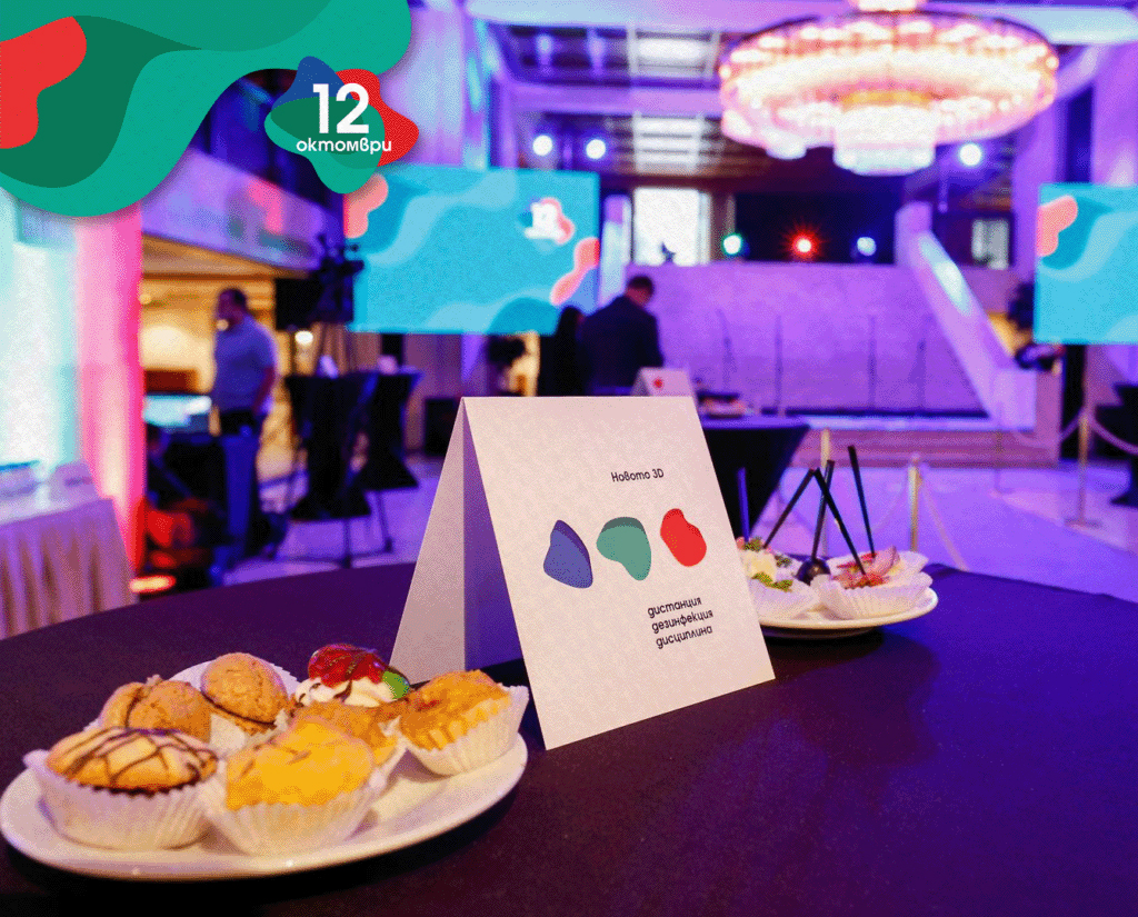
Our work included the overall vision of the event, design of invitations, certificates, promotional materials, online media and presentation visuals, branding of the hall, the stage and an exhibition by BTA photo reporters under the title "Life without mask".
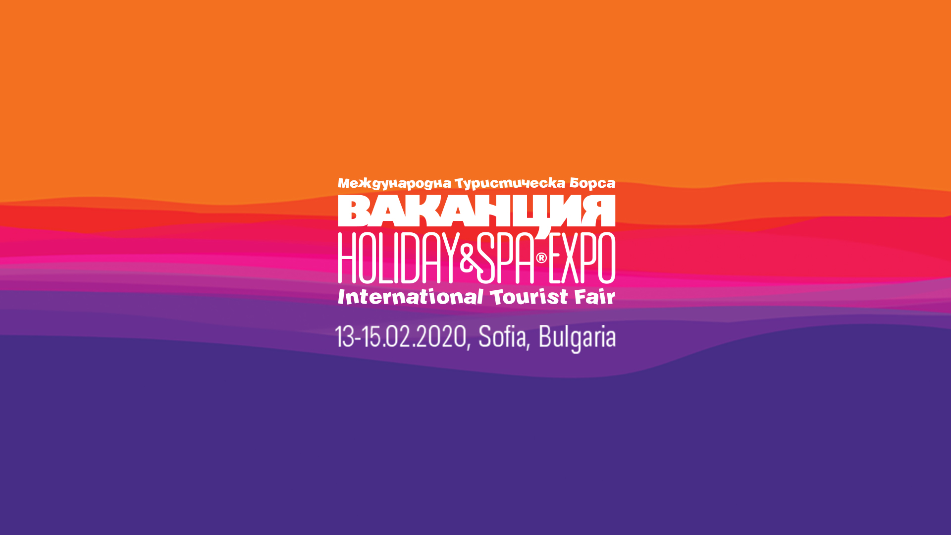
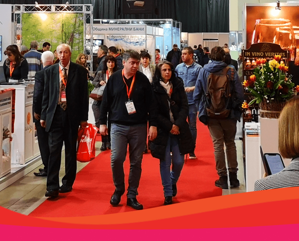
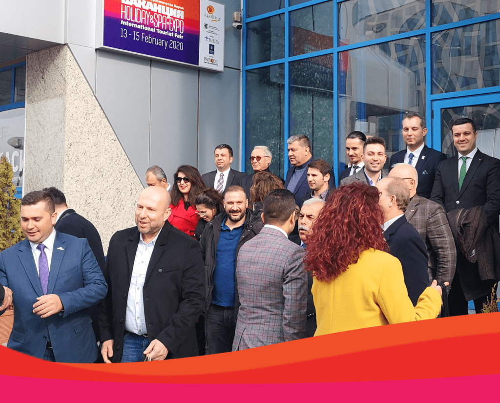
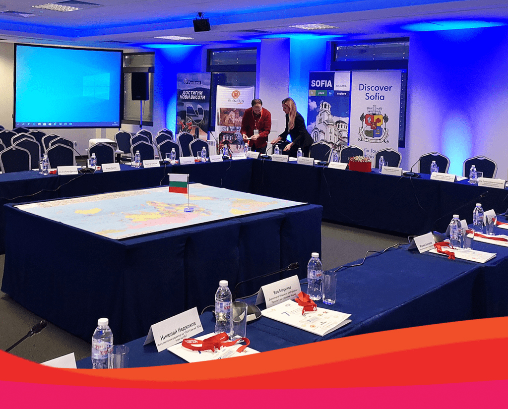
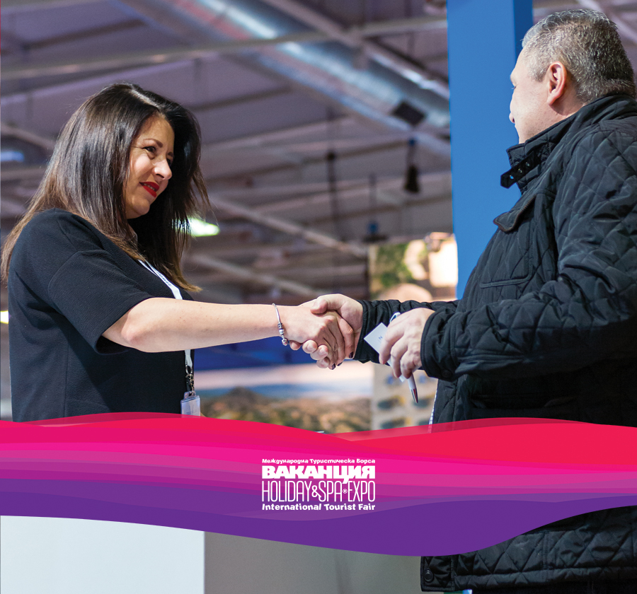
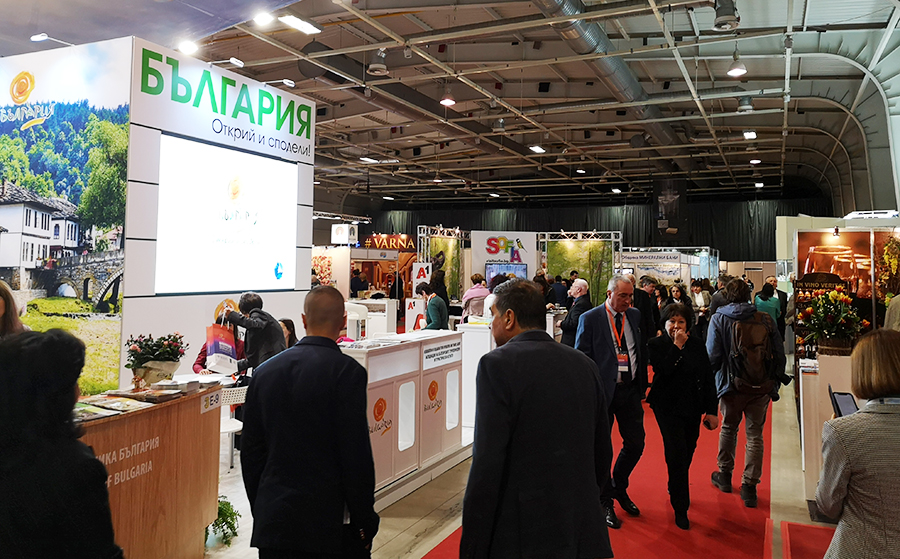
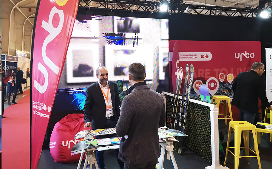
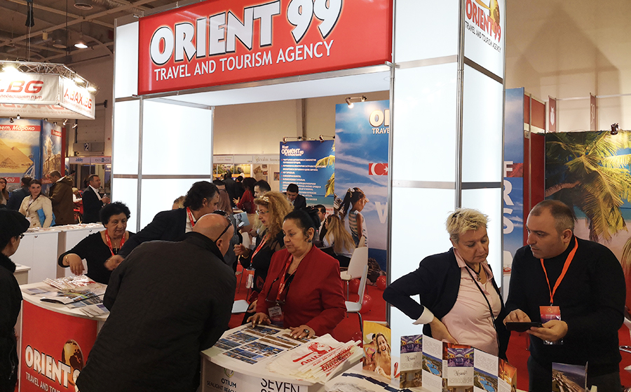
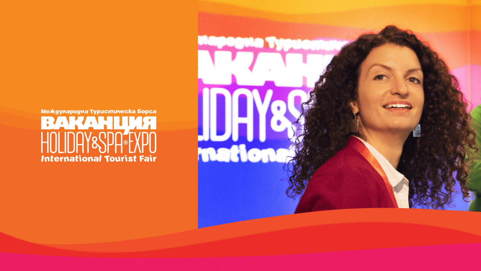
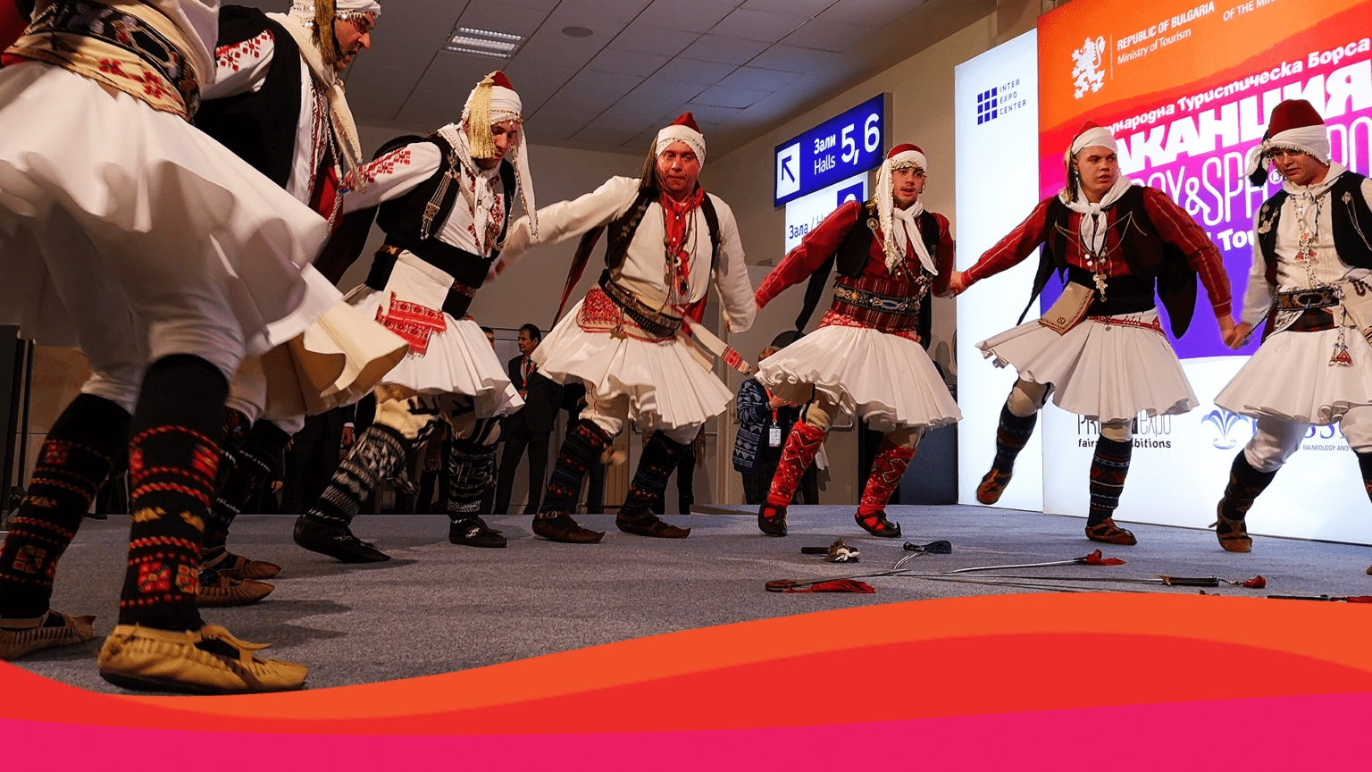
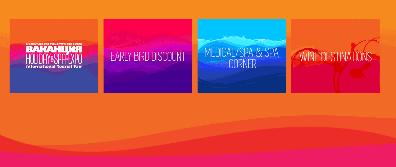
HOLIDAY & SPA EXPO 2020
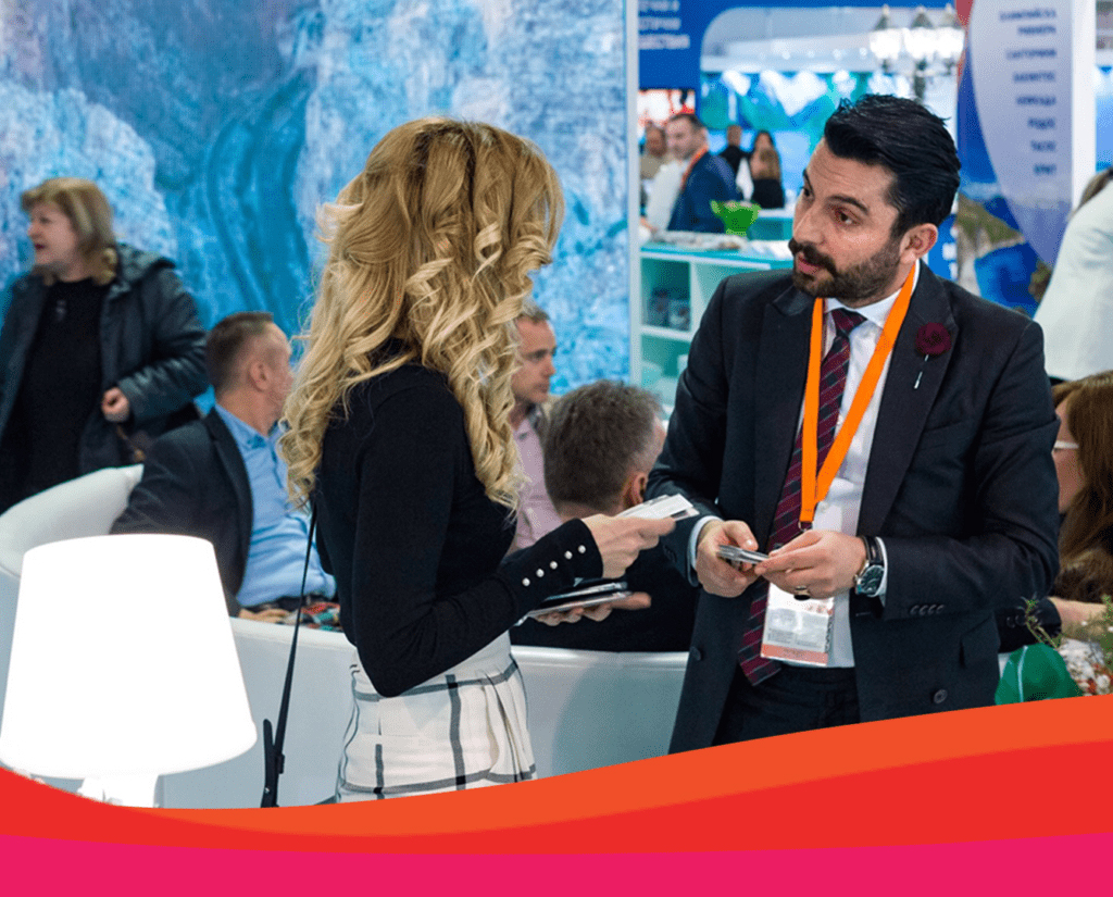
HOLIDAY & SPA EXPO is the most important event in the calendar of the tourism industry in Bulgaria, which every year attracts leading companies from the country and around the world.
The organizer and owner of the HOLIDAY & SPA EXPO is PRIM EXPO. In addition to the overall organization, we are involved in the design and construction of most of the exhibition stands, as well as the general design and identity of the event.
Each year our team creates an excellent, clean, clear, and engaging presentation for the exhibition, as well as the conferences, external presentations, and all other side activities.
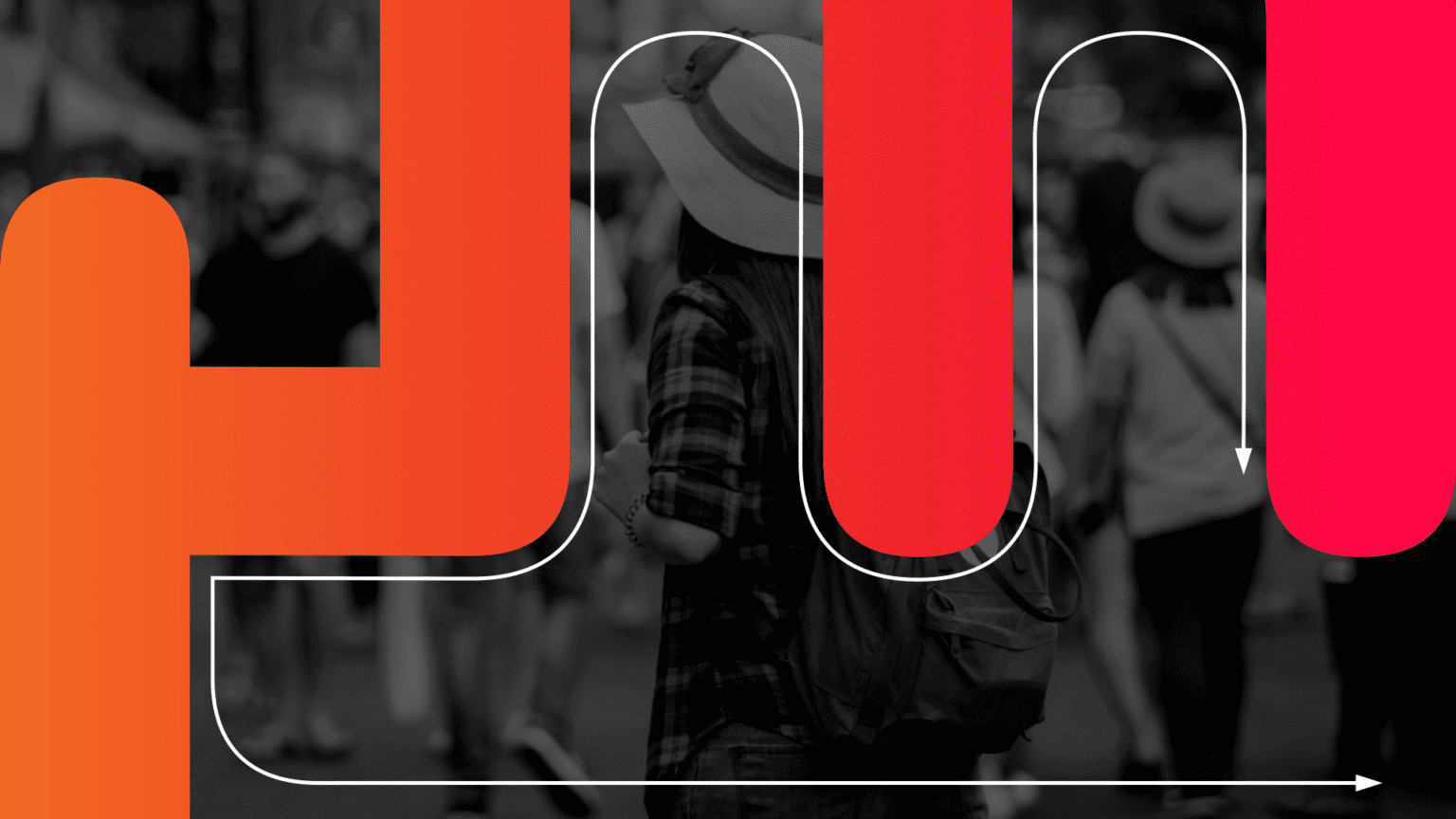
The HOLIDAY & SPA EXPO branding focuses on providing clear information about the event. The graphics and images are designed in bright and vibrant colors, capturing the diversity and abundance of the destinations and services showcased at the expo.Organizing an event of this magnitude is a serious challenge that requires skillful planning and implementation, tracking the dynamics of consumer attitudes and preferences to achieve the desired results.
In recent years, we have transformed HOLIDAY & SPA EXPO from a national exhibition into a prestigious international event. The International Tourism Exhibition HOLIDAY & SPA EXPO has established its leading position in the Balkans and is constantly incorporating new initiatives, providing greater business opportunities for companies in the sector, and is continuously expanding the profile of participants.
Among the exhibitors promoting their destinations and tourist products at HOLIDAY & SPA EXPO, you can meet national and regional tourism boards, representative branch organizations, tour operators and travel agencies, hotels and resorts, spa & wellness centres, agencies developing eco and rural, golf, wine & gourmet, children and youth tourism.
The fair attracts also manufacturers and suppliers of hotel, spa and fitness equipment, and specialized software; transport companies, attractions sites, art and sporting clubs as well as professional training centres, foreign language schools, publishers and media with travel industry focus.

SCRAPING POINT
Scraping Point is a startup platform that offers an enterprise web scraping service and provides high quality web-based data to improve business results, and for intelligent decision making.
We created a modern-looking and trustworthy visual identity for the company. The flexible line symbolizes the conversion of unstructured to structured data, the movement and speed of the software that extracts data from thousands of pages per second. At the same time, the shape functions as a monogram "SP", a memorable symbol that graphically illustrates the platform's name.


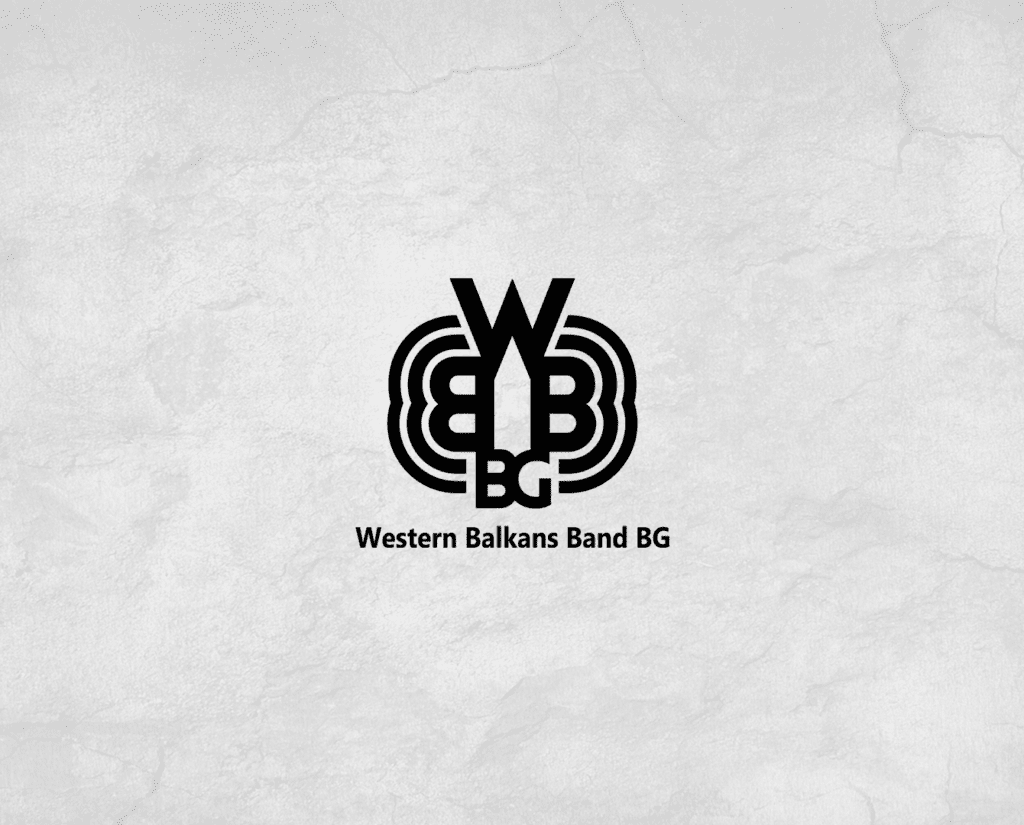
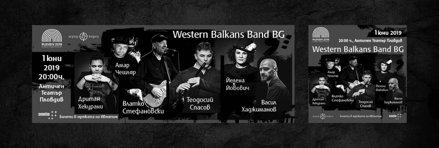
WESTERN BALKANS BAND BG
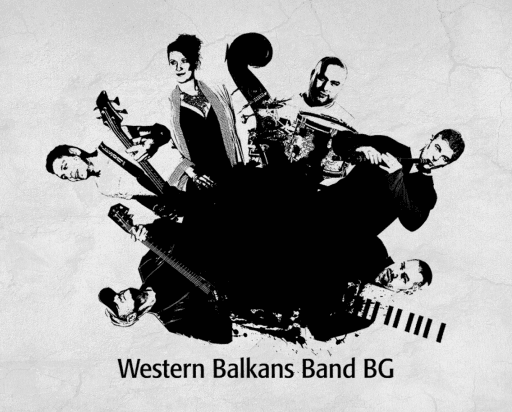
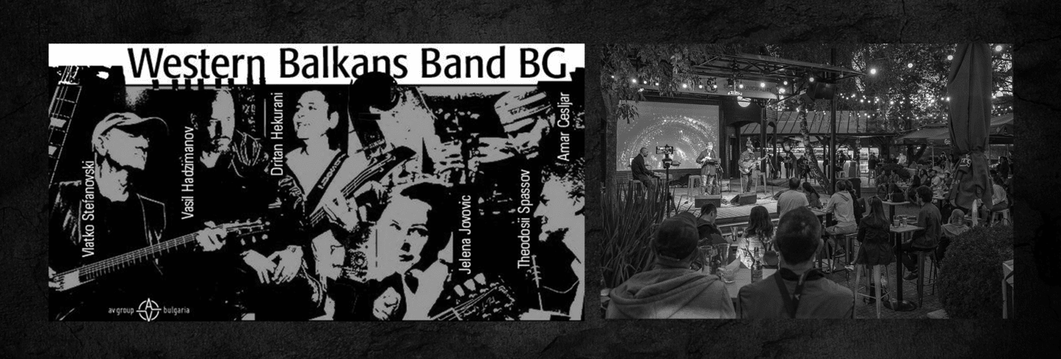
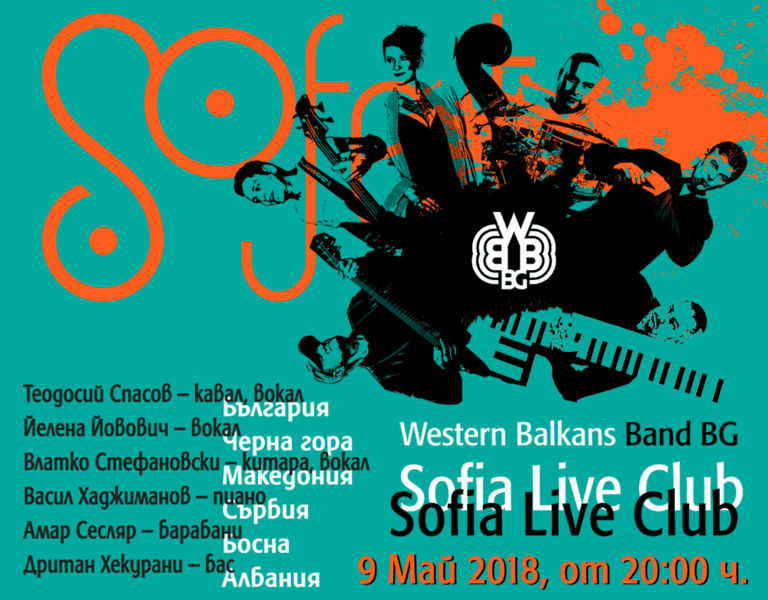
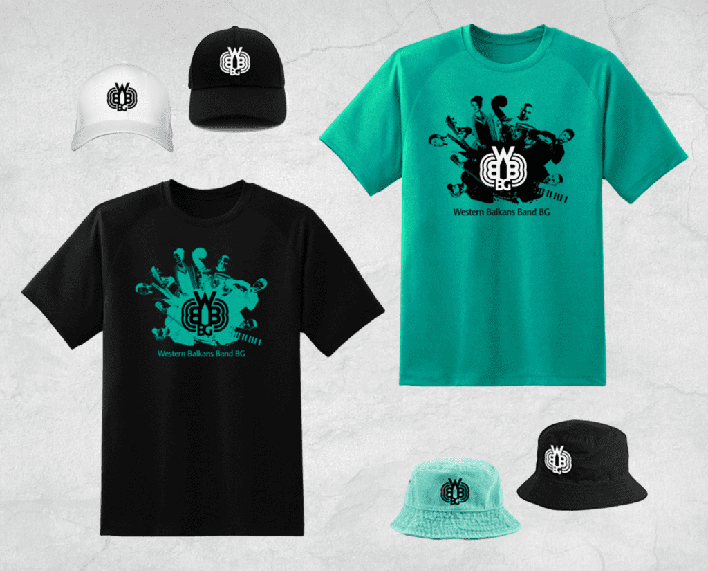
Logo design for Western Balkans Band BG - a musical formation for ethnic jazz, Balkan folklore, blues and rock, created by Teodosii Spasov together with Vladko Stefanovski, Dritan Hekurani, Amar Cesljar, Vasil Hadjimanov and Jelena Jovovic.
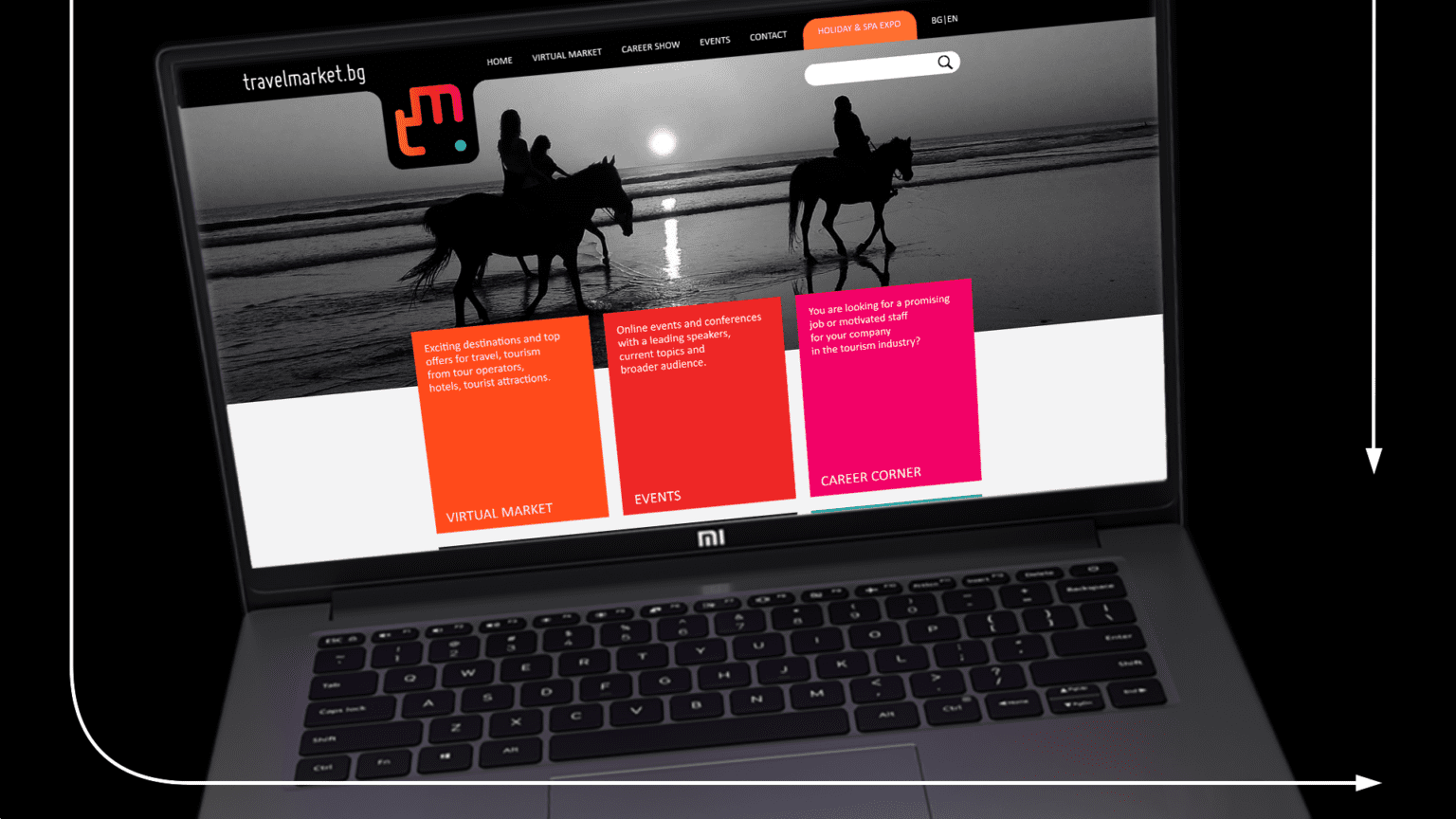
TRAVELMARKET
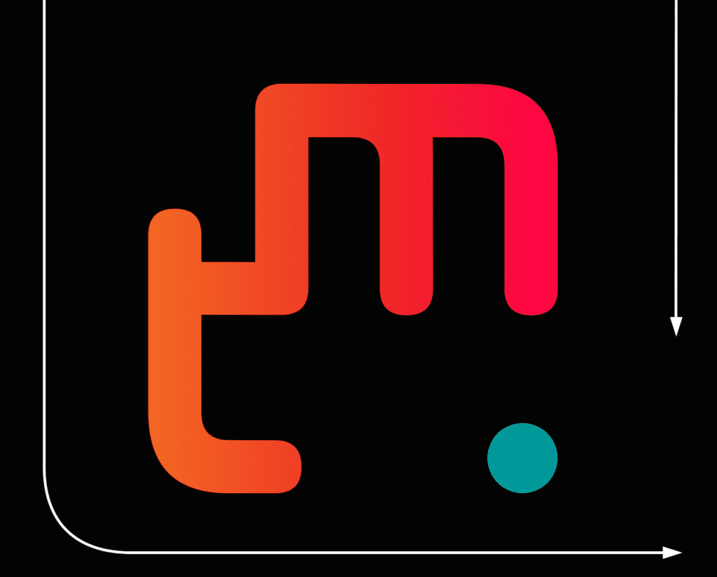
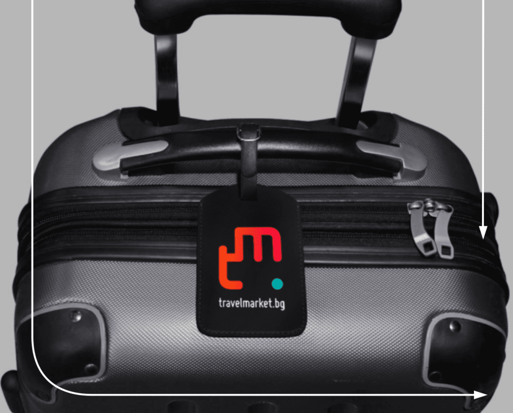
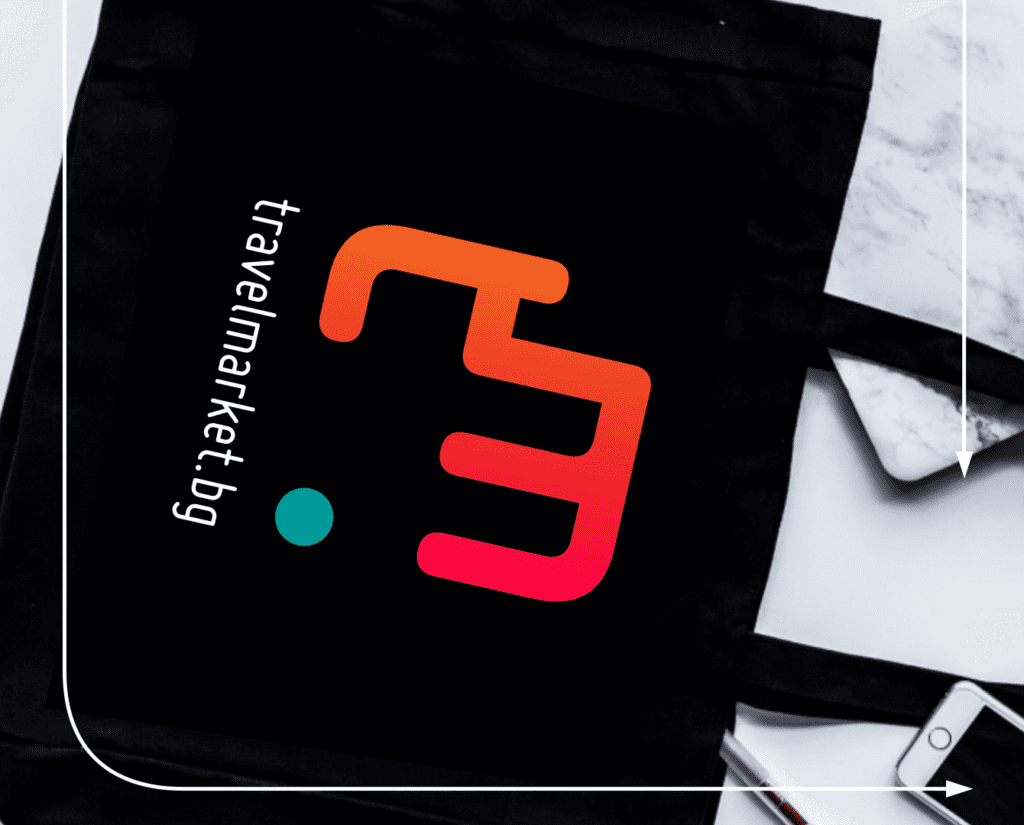
Logo design for Travelmarket.bg - a platform for virtual exhibitions and online events in the field of tourism, a place for up-to-date offers, programs, destinations and services - around the clock, from anywhere in the world, in a safe environment.
We focused on the duality in the changing nature of tourism: safety versus freedom, complexity versus simplicity, virtual versus actual. This identity balances the contrasts in a logotype that combines cool and warm colors, moves along the wandering line of a complex route, and puts a period on arrival.
BULGARIAN TOURISM CHARTER 2020
During this difficult year, the Bulgarian tourism industry signed the Charter of Bulgarian Tourism 2020. The document declares the industry-wide commitment to meet the expectations, of both domestic and international tourists, to take measures and create a safe environment, in the context of the pandemic Covid-19, across accommodation, food and entertainment venues.
The point of the Charter is to outline a clear methodology for restarting the sector in a timely, responsible, and successful manner.
Effective visual communication is essential in addressing public audiences today. In a world as interconnected and dynamic as ours, visual design assists in the attraction and retention of an increasingly erratic public eye. We believe that this is even more crucial in the case of important public relations documents.
This is the reason why we have created a logo that synthesizes the ideas of the proposed Charter of Bulgarian Tourism.
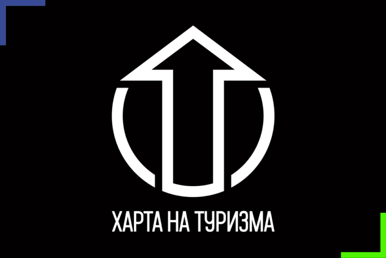
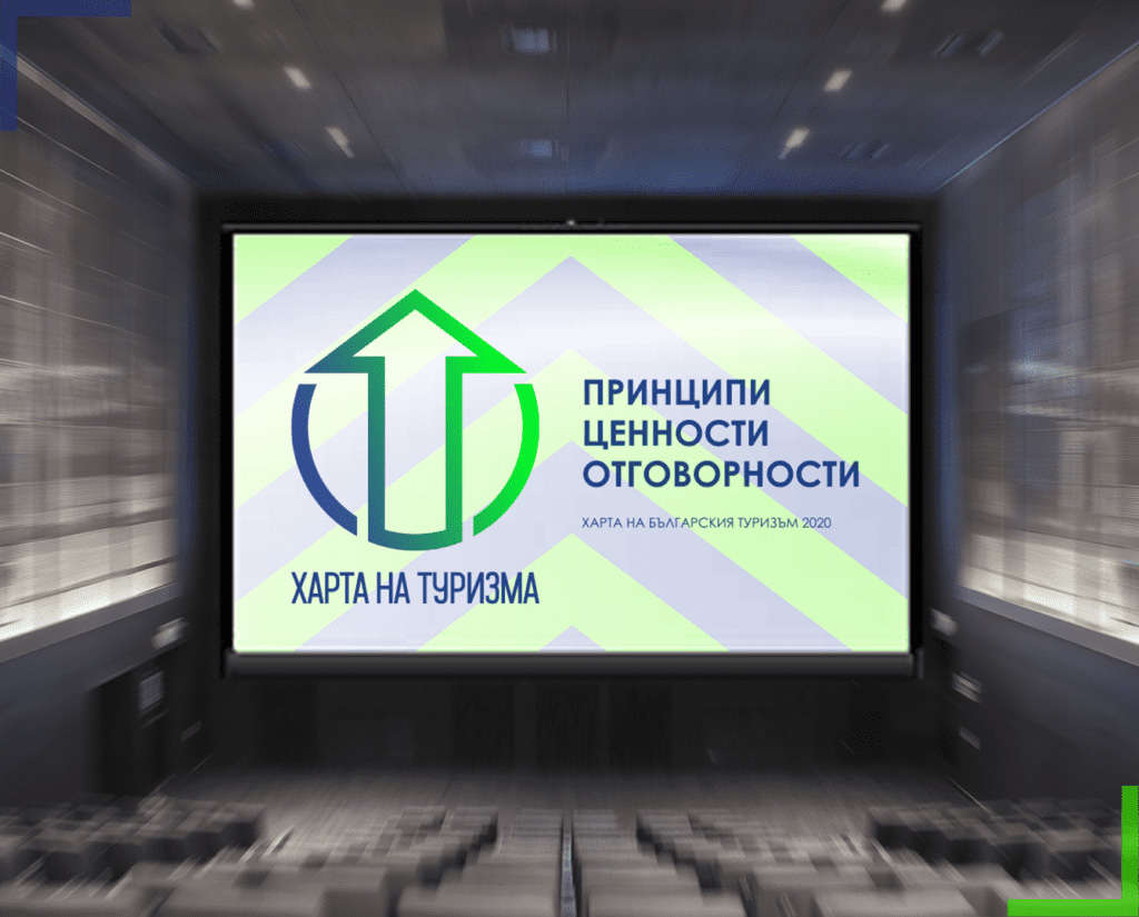
The sign symbolizes dynamism, progress, breaking the boundaries and upward movement. Together with the colors of spring and rebirth, of nature and purity, the associations help accurately communicate the principles of the Charter.
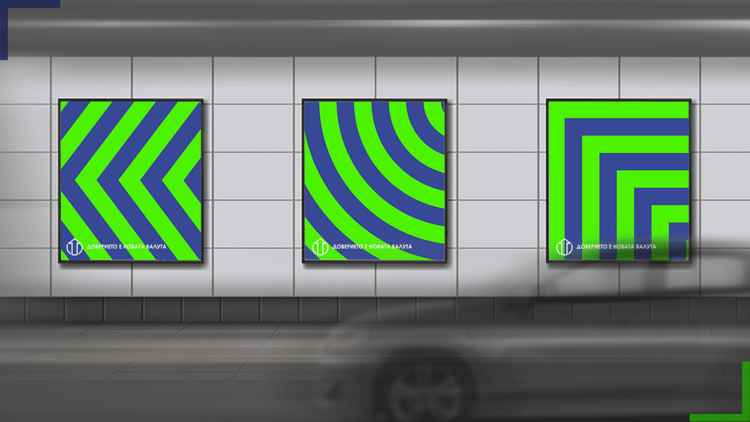
The logo will be the basis of the information campaign and we will know at a glance that an object accepts and applies these principles.
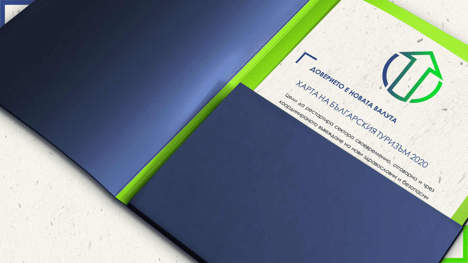
The tourist companies supporting the CHARTER OF TOURISM will receive both the written document with all the recommendations and steps for their implementation, and a sticker that will send a message to the client that he is in a place that is committed to comply with it and fulfill its obligations. with care for the health and comfort of the user, in an environmentally friendly and safe environment.

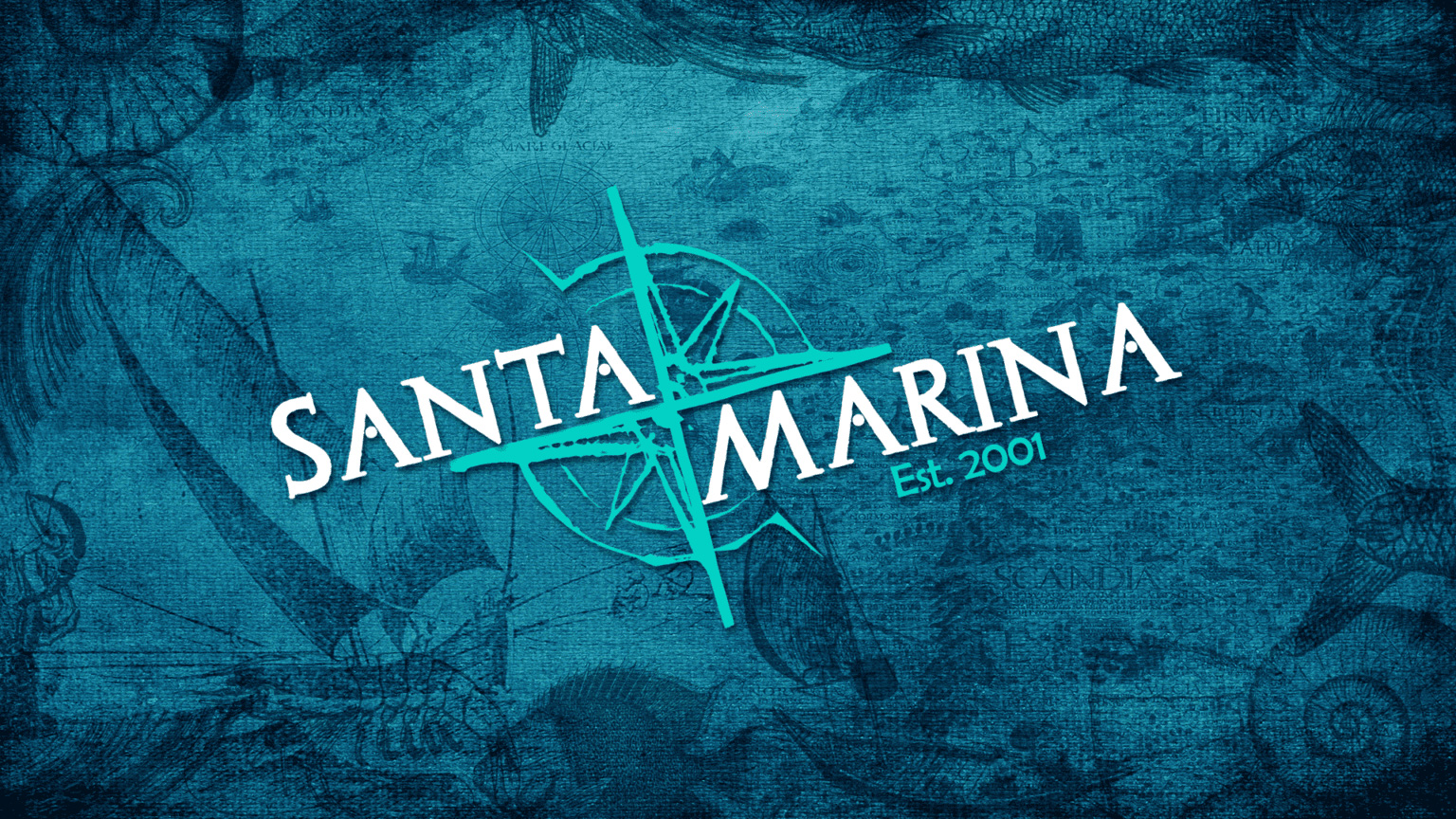
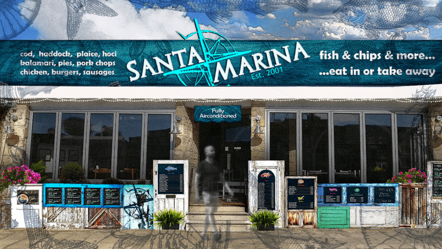
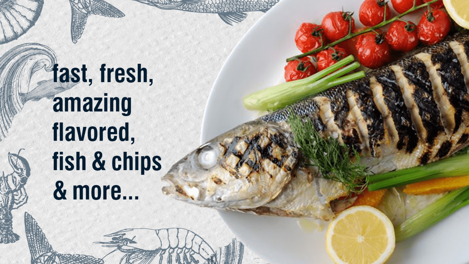
SANTA MARINA RESTAURANT
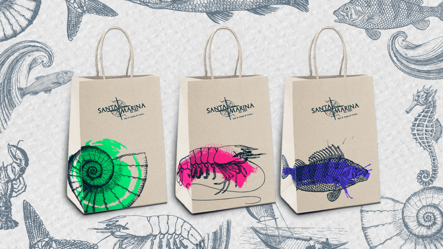
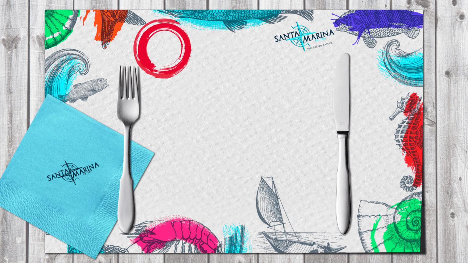
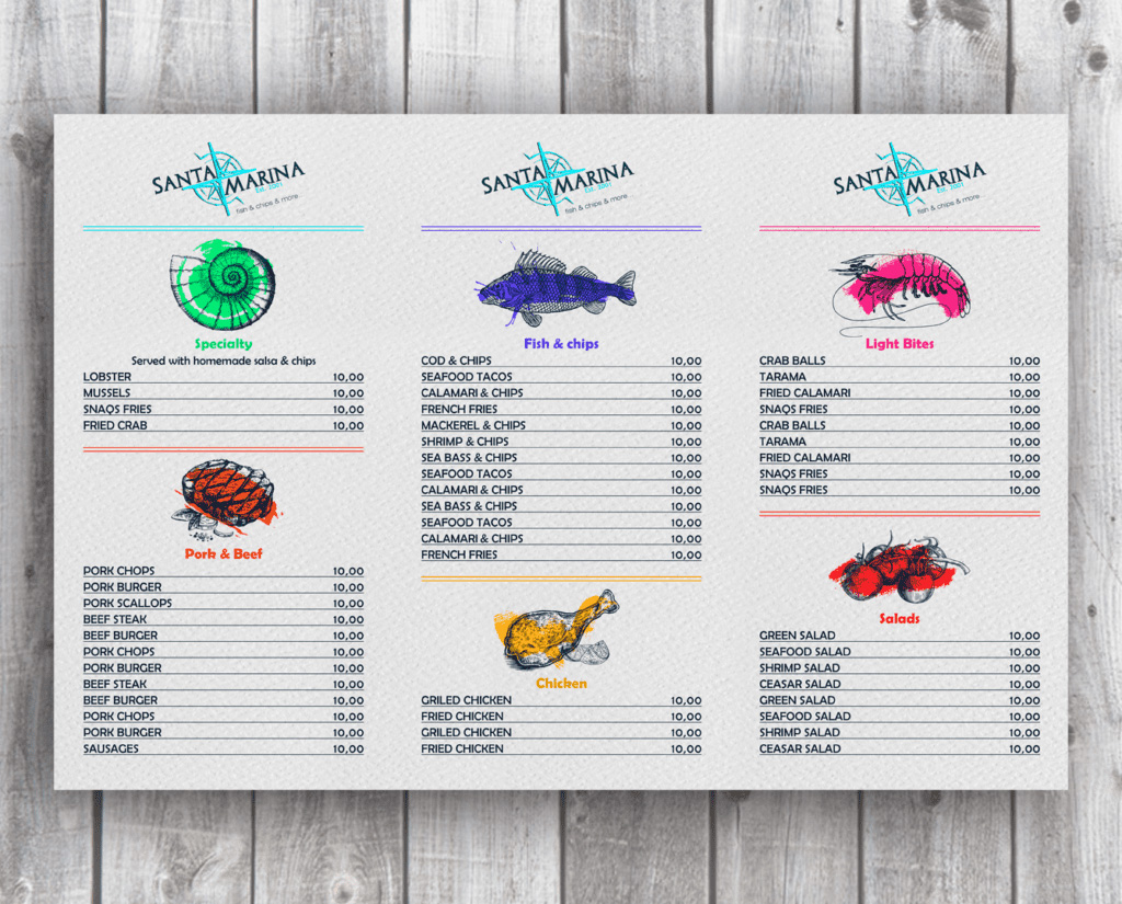
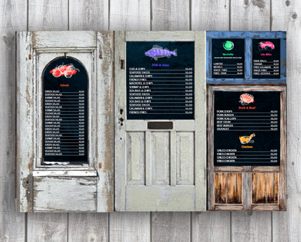
Fresh, cheerful, casual, and very nautical, a favorite stop for tourists and locals alike, Santa Marina - the iconic restaurant in the coastal town of Paphos was in need of a makeover.
In a classic combination of blue and white, and restored elements from old houses, we transformed the doors of Santa Marina into a Mediterranean-style dream.
We used a compass to make it easier to find your way around and added a cheerful gallery of sea dwellers with bright colorful accents to make it even more enjoyable to sit down with friends or grab a delicious takeaway.

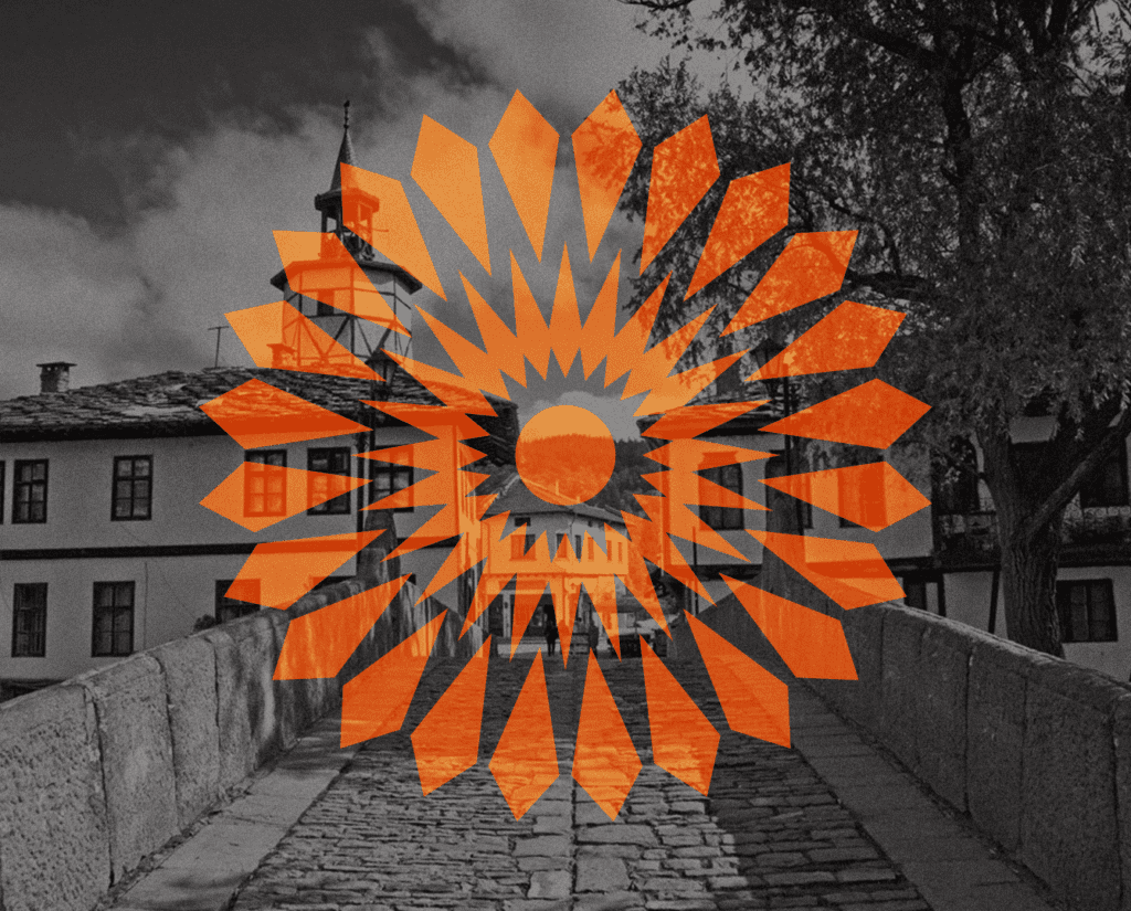
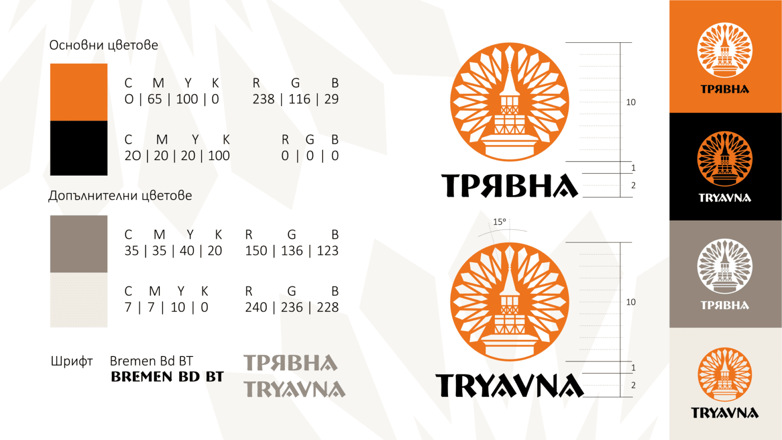
TRYAVNA
The unique look of Tryavna is due to its generations of master builders who built churches, bridges, schools. Generations which created the original and beautiful Tryavna houses. Tryavna is home of the oldest Renaissance schools of art - the Tryavna school, which includes three main directions: icon painting, wood carving and construction. Combined with the region’s beautiful natural landmarks, Tryavna has been an exciting tourism destination from as early as the start of the 20th century.
The main idea of the project is to present Tryavna’s rich centuries-old culture, in combination with its youthful, modern, welcoming and sunny atmosphere.
Taking into account the extremely diverse profile of the target audience, we opted for a graphic system based on clearly recognizable symbols:The Clock Tower - the most prominent symbol of the city, part of the only preserved Renaissance architectural ensemble in the country;
The Sun-carved Ceilings - exquisite examples of the oldest Bulgarian school of art, which still light up the Tryavna home today.
The font (Bremen Bd BT) integrated into this style, is clear, legible, with definite forms and the same phonetic structure in both Cyrillic and Latin versions.
The graphic holds the idea of direction, a compass, as a symbol of travel. The combination of symbols allows us the develop new design elements.
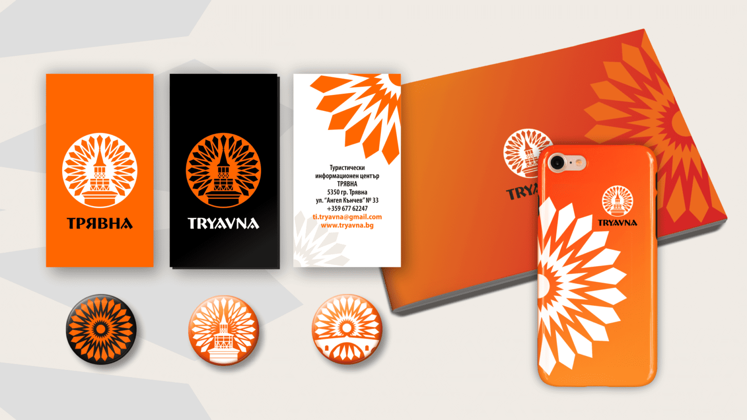
The whole sign or individual parts of it can be transformed into elements for different applications, while remaining clearly recognizable as part of the motif. All of elements we have used exemplify the diversity of today's Tryavna - a city with a thousand-year history and unique cultural monuments.
The colour scheme has saturated, bright tones reduced to their graphic equivalents:
Orange, which symbolizes the warm colours of wood, the sun, hospitality.
Black, which creates contrast, emphasizes, and enhances the brightness of the main colour.
The two additional colours can be used in different layouts, as a background for the logo or to soften the palette.