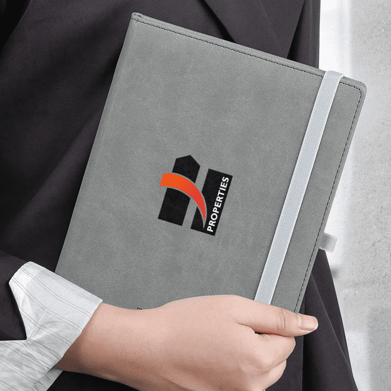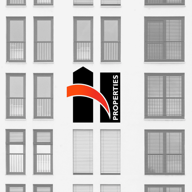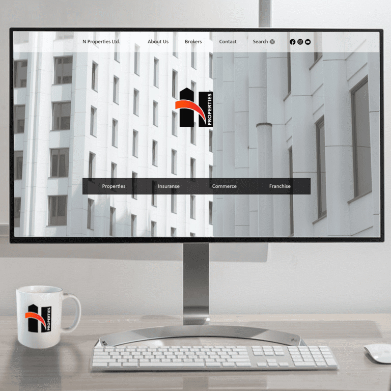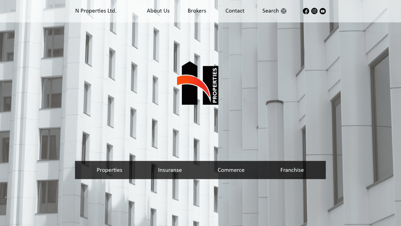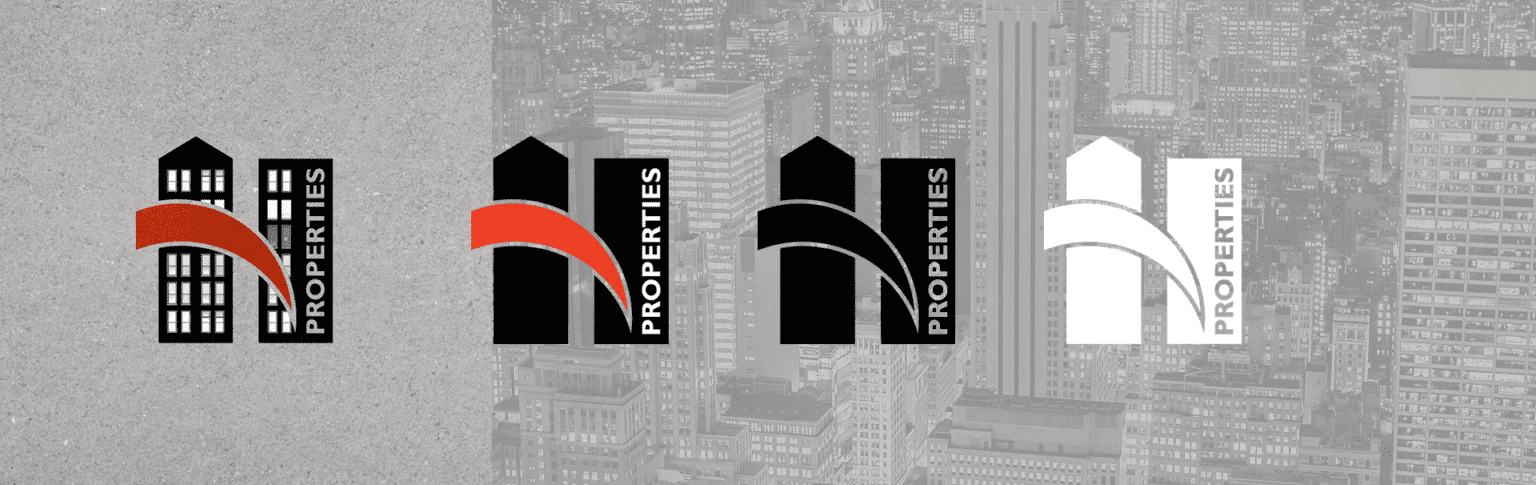
N PROPERTIES is a start-up property management company that approached us for its corporate identity. The company provides expert assistance when buying, selling, renting or searching for properties.
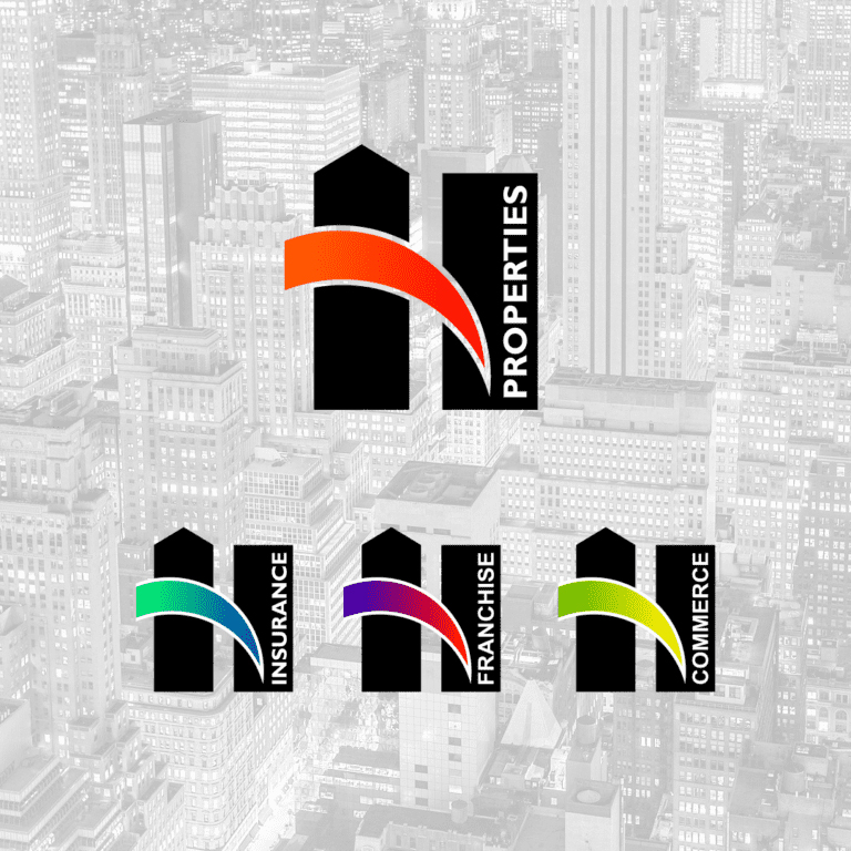
The visual identity of N Properties was developed with a perspective to serve the company's complementary activities - insurance, sales representation, etc. The stylized letter "N" is massive and stable, with an idea of growth and upward movement. The main color is black, which allows us to develop variations in complementary colors for each different area of activity. The website brings together the whole range of businesses, each developed in detail on a separate sub-page.