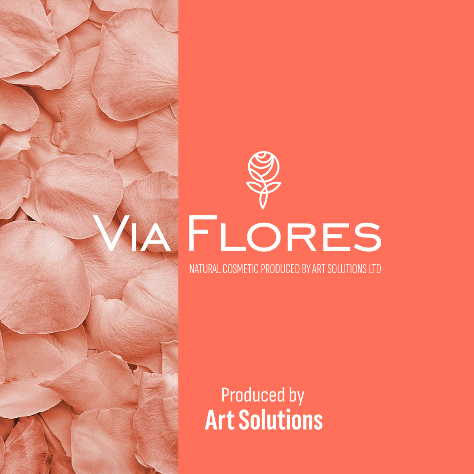
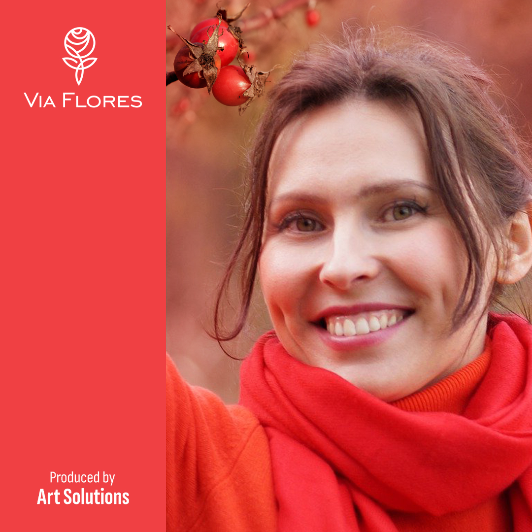
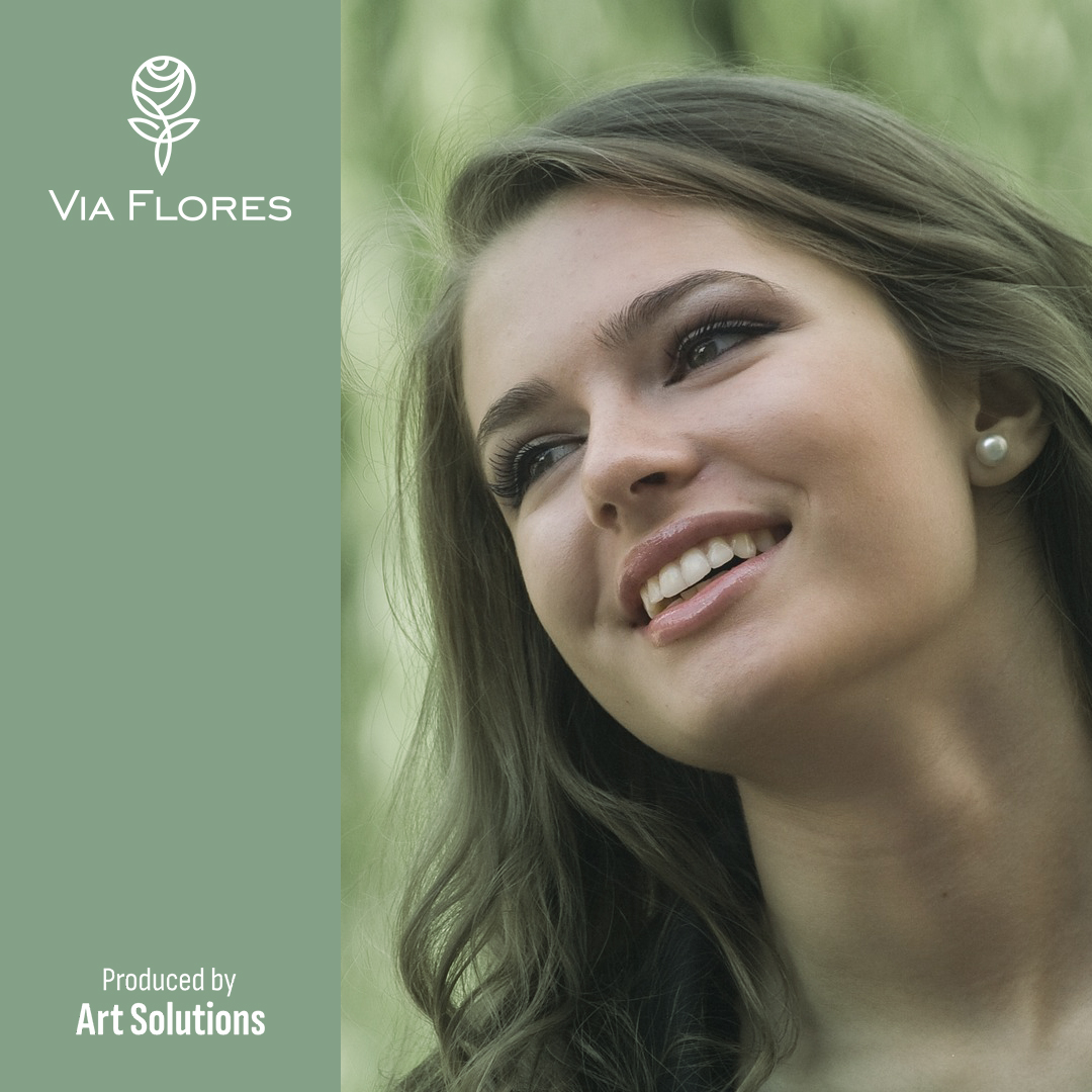
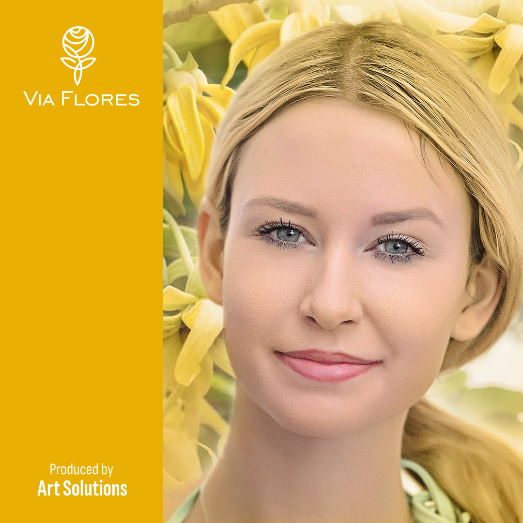
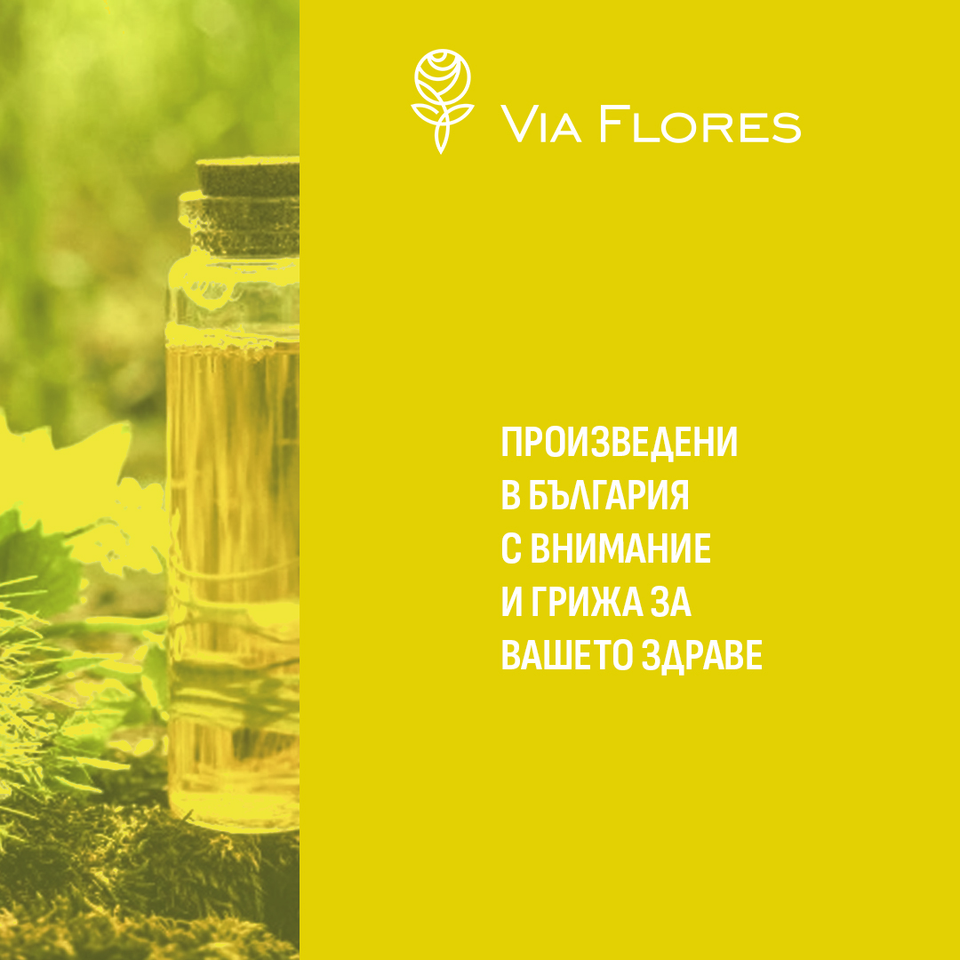
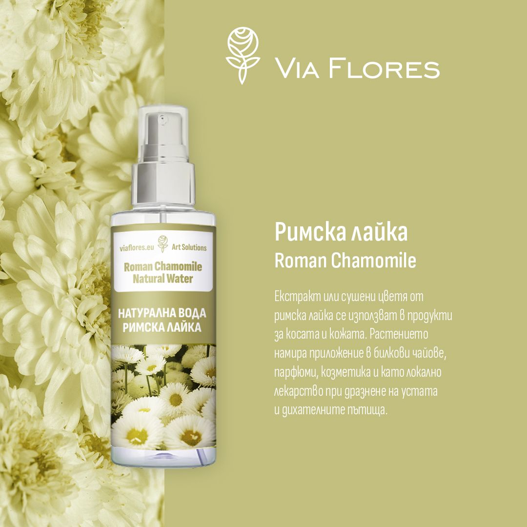
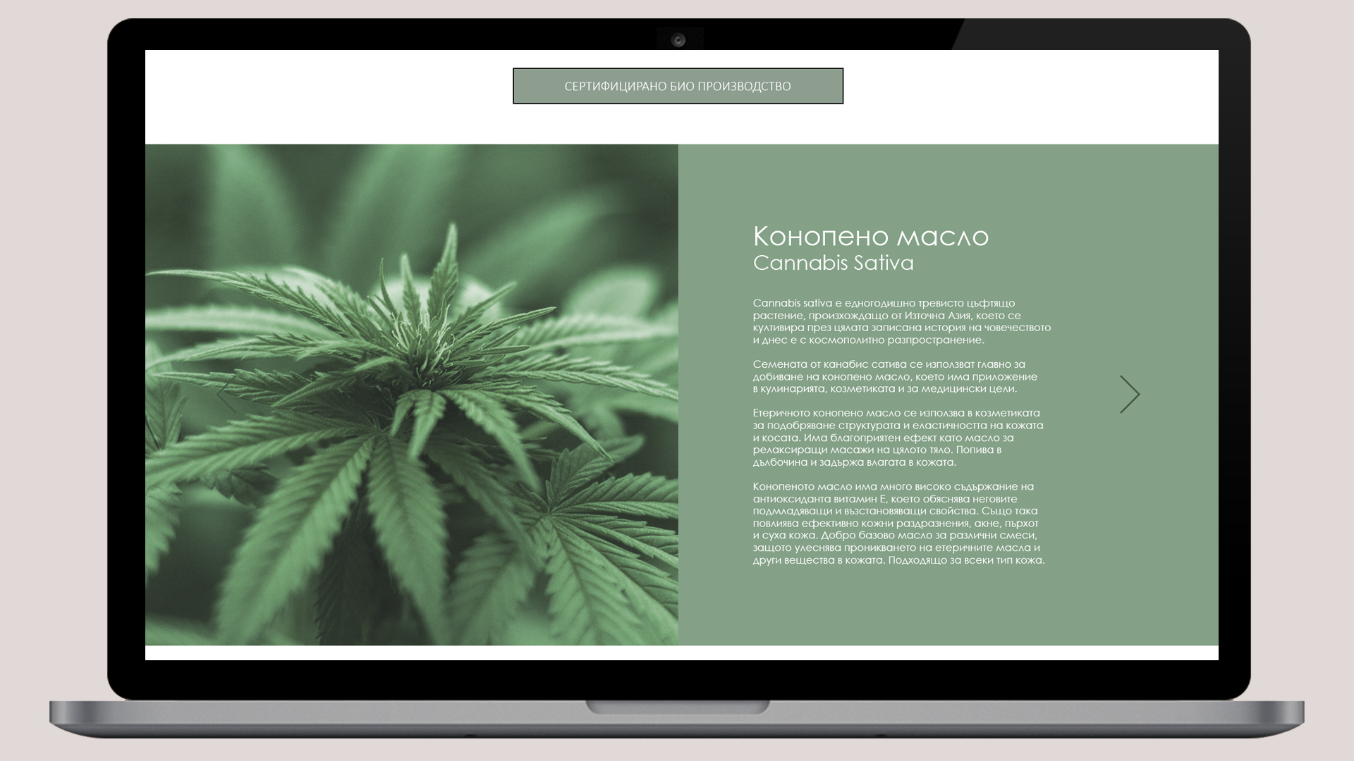
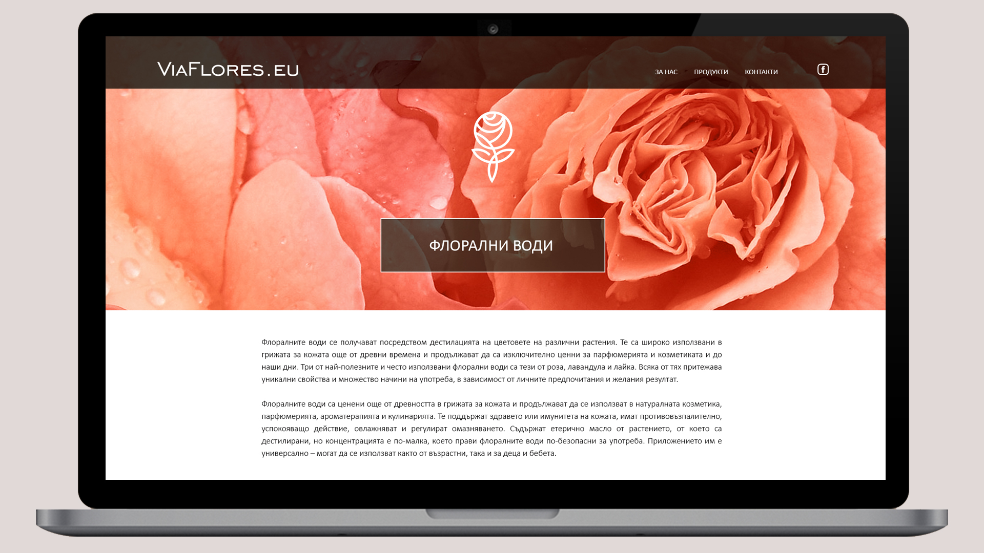
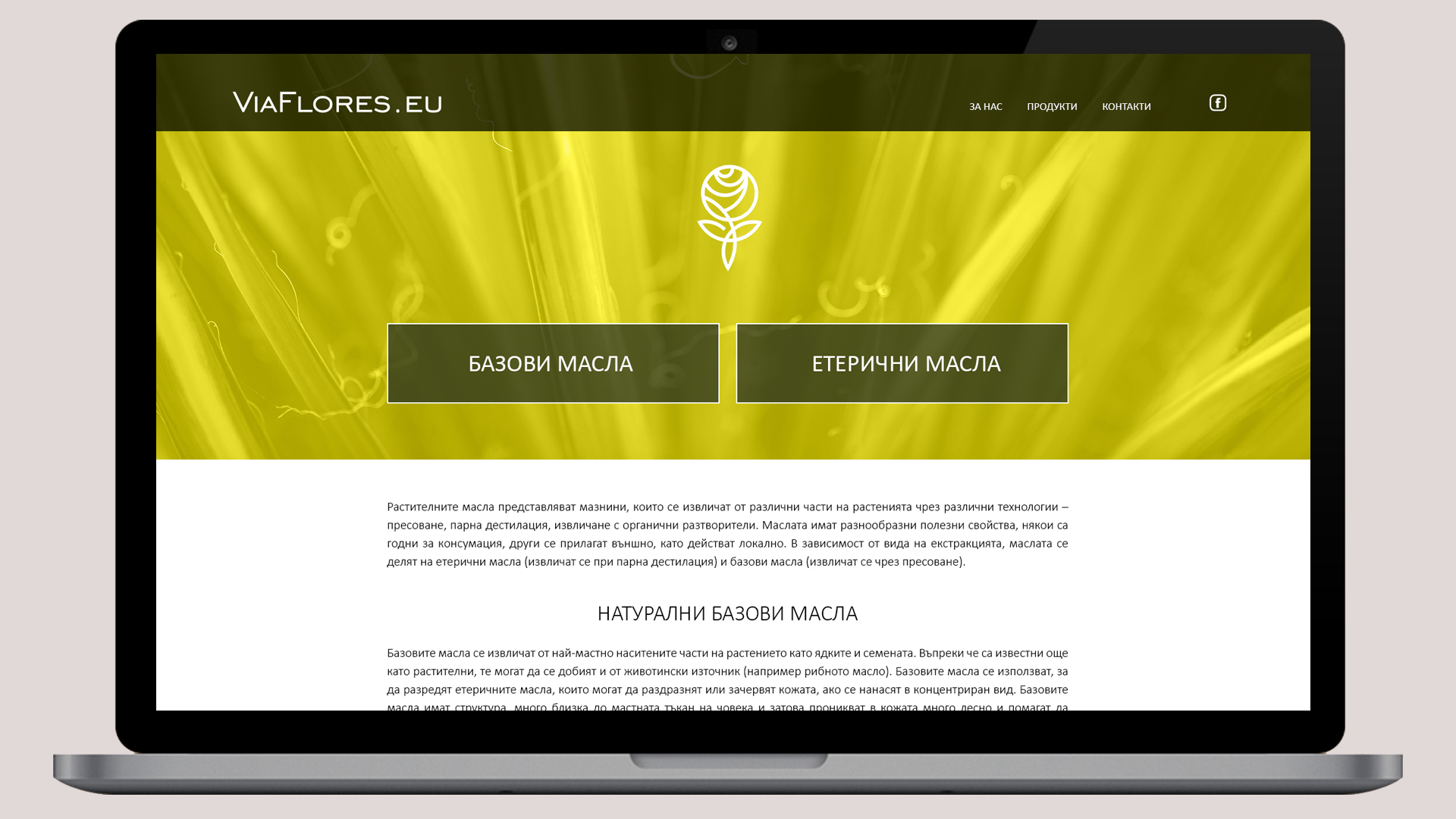
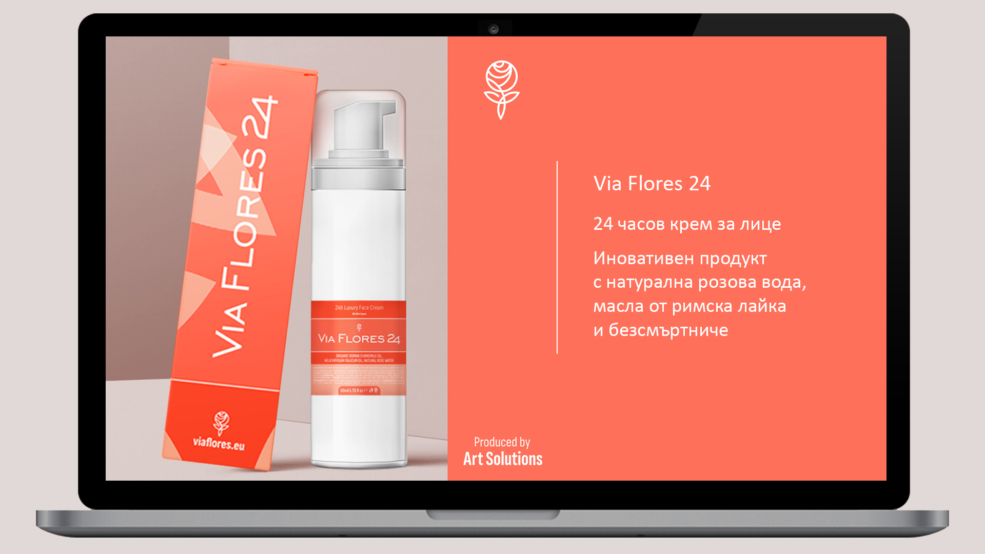
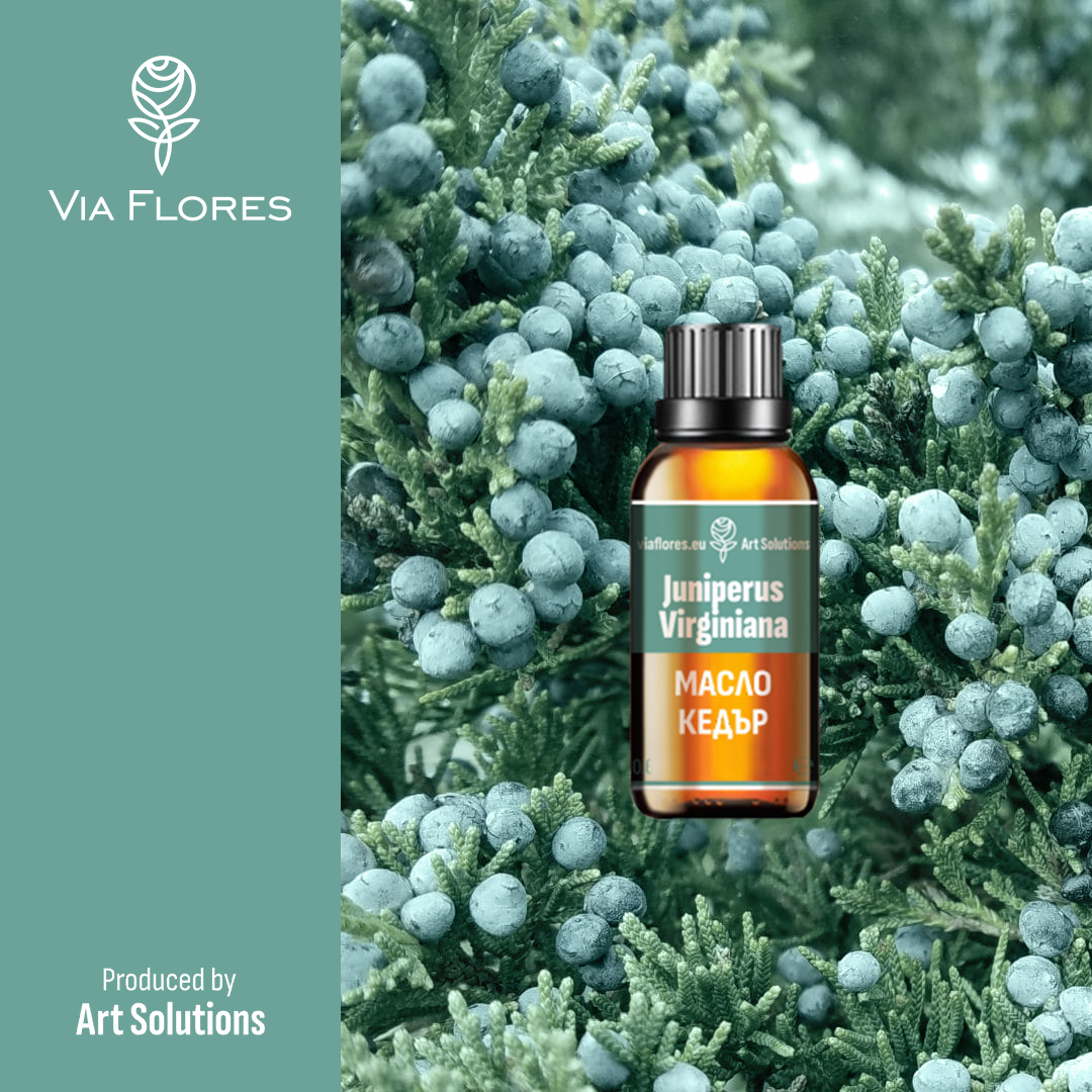
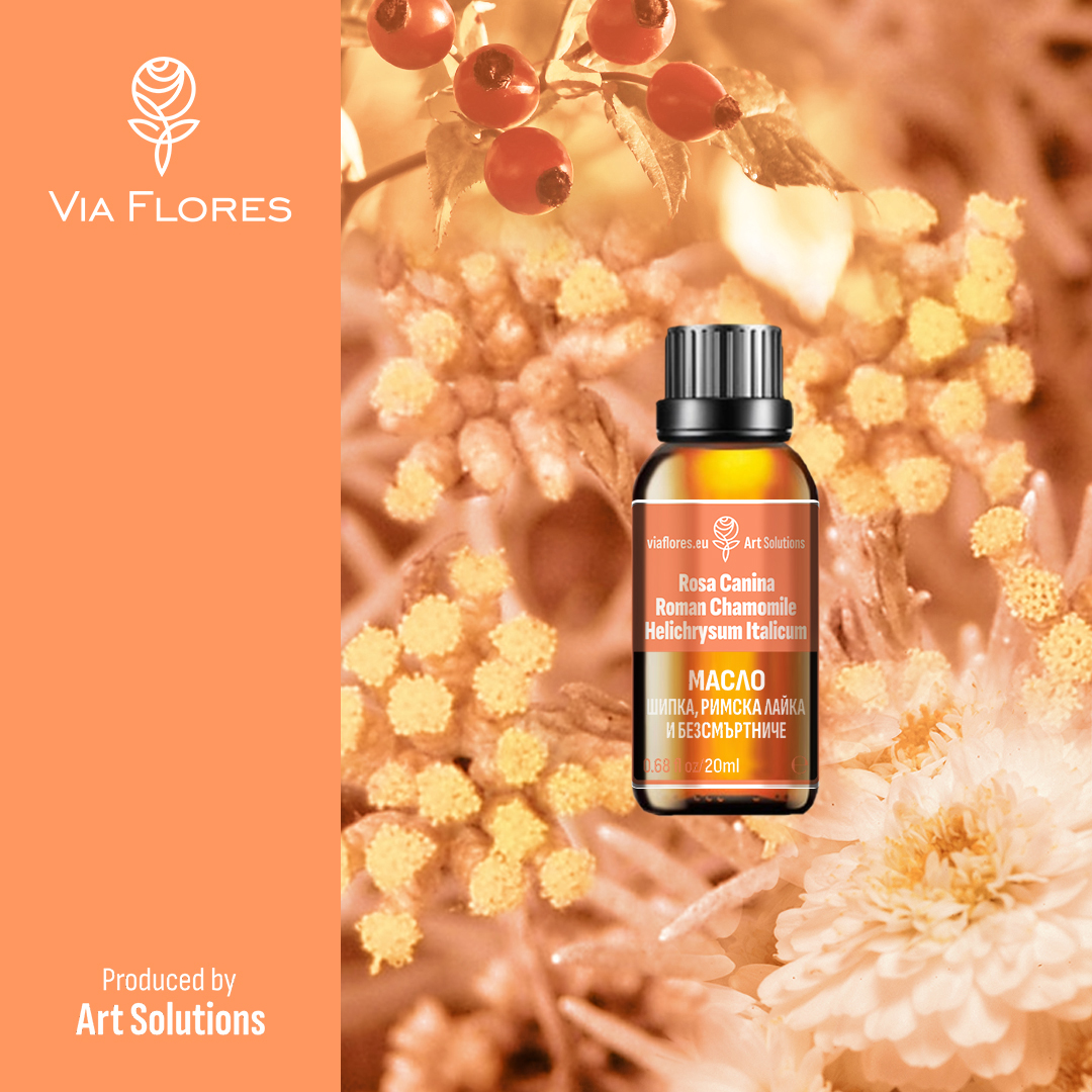
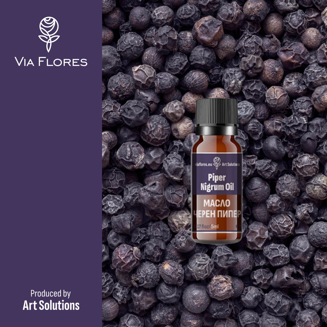
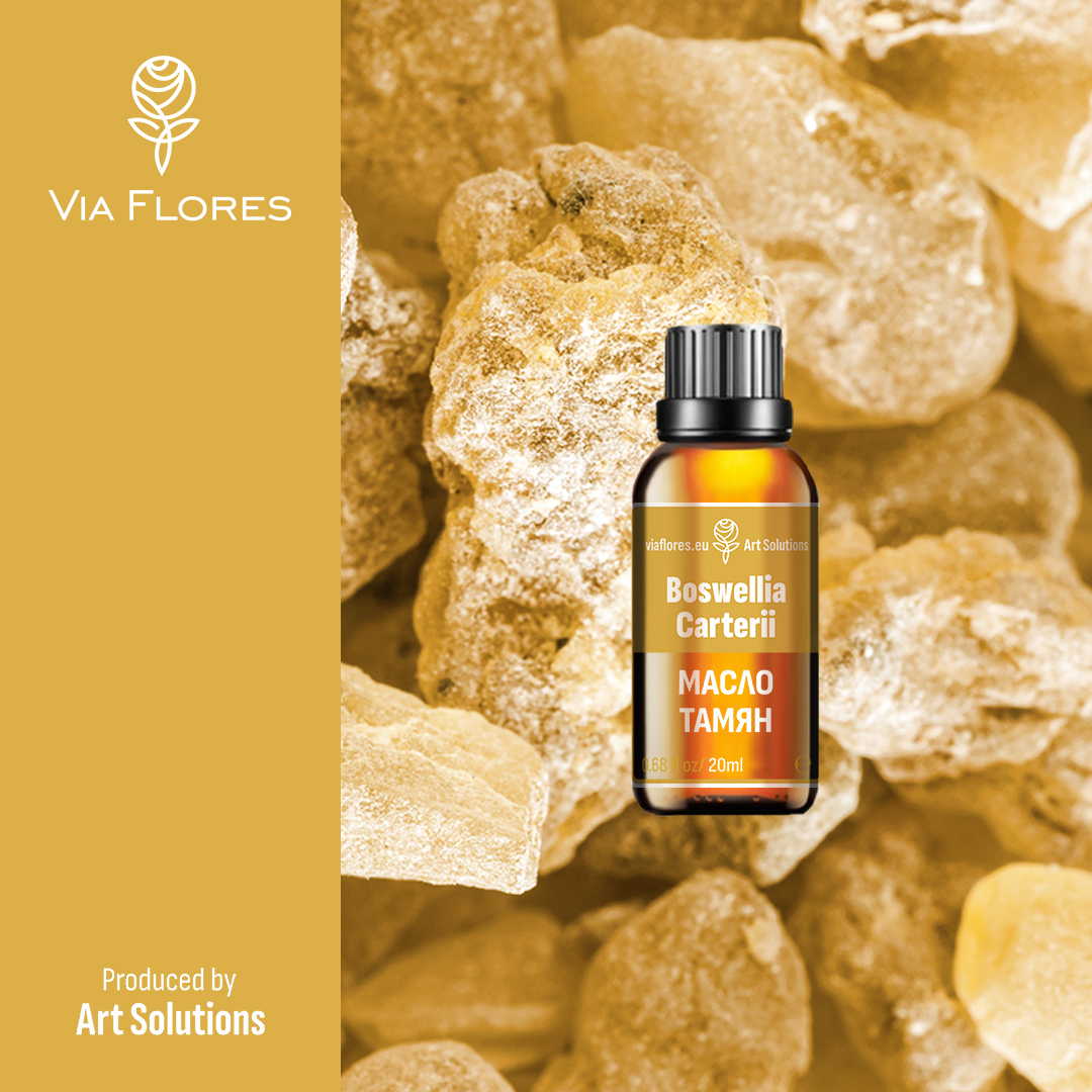
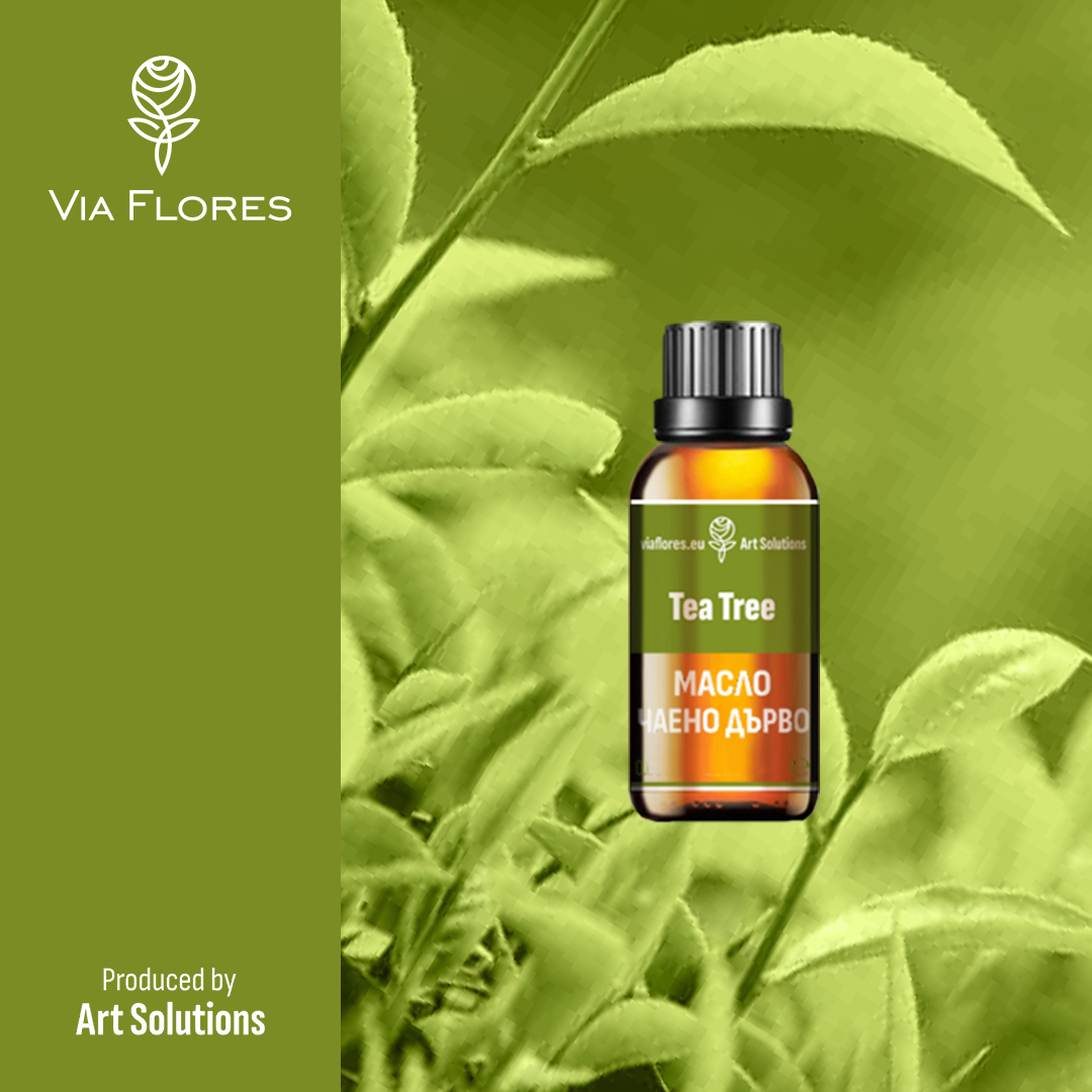
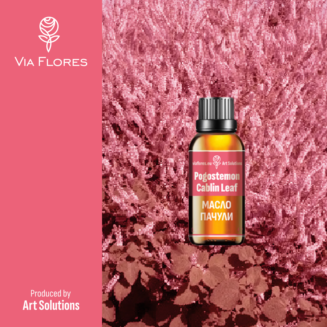
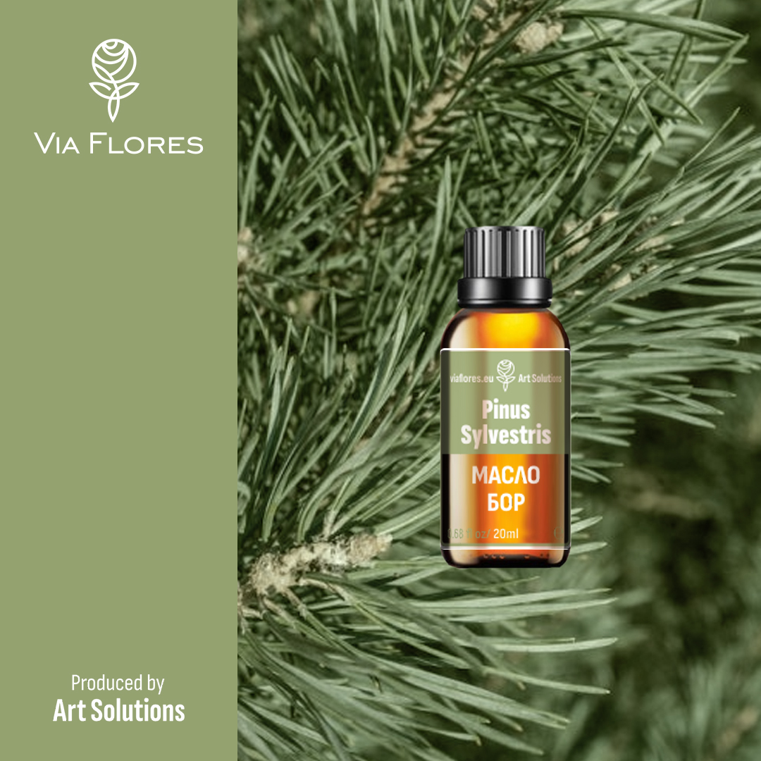
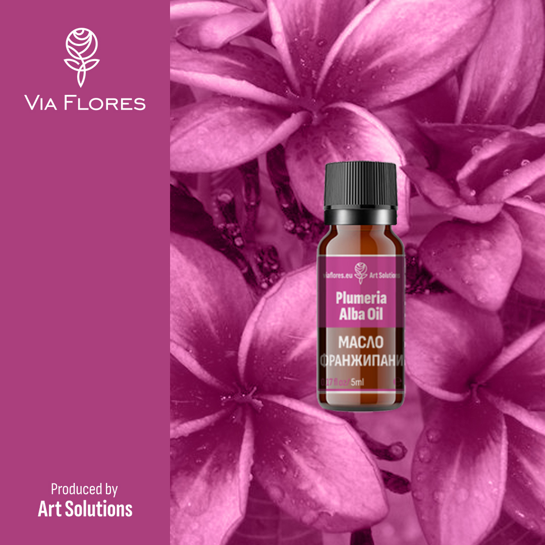
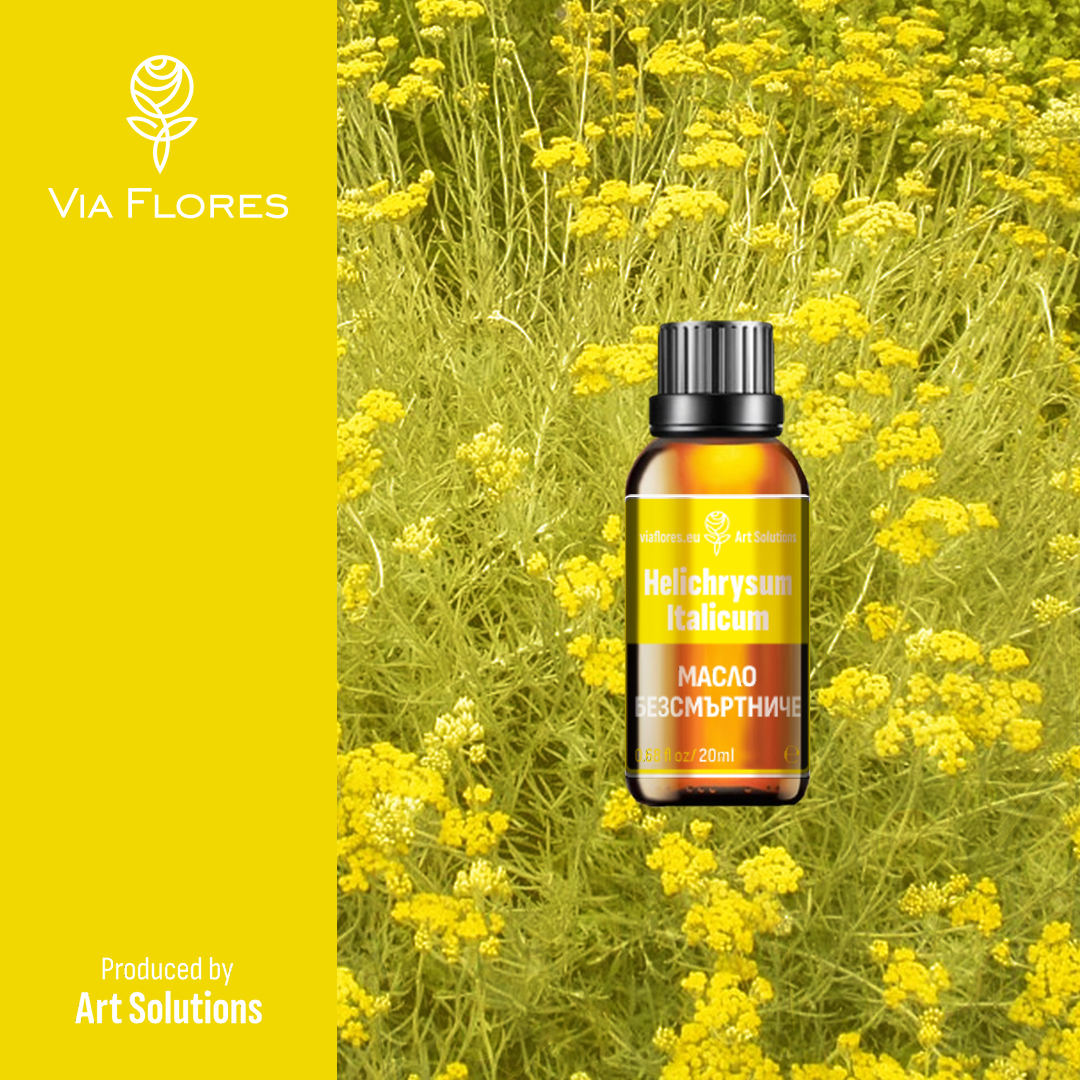
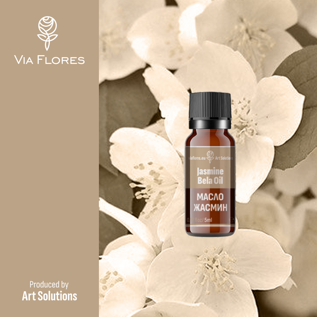
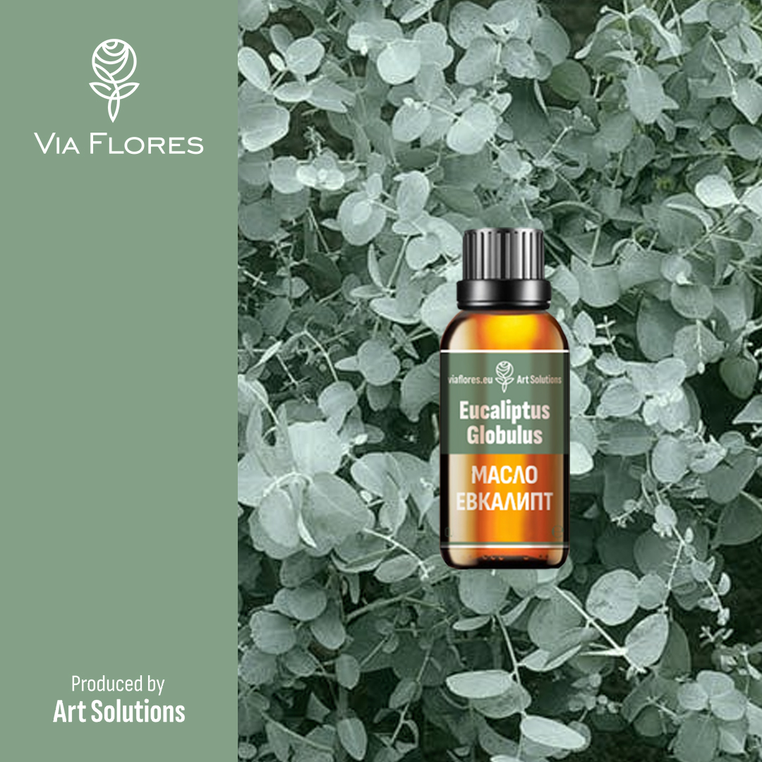
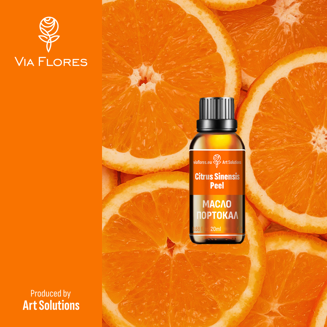
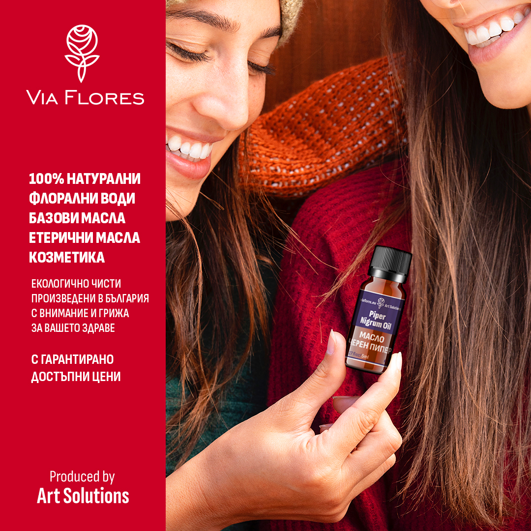
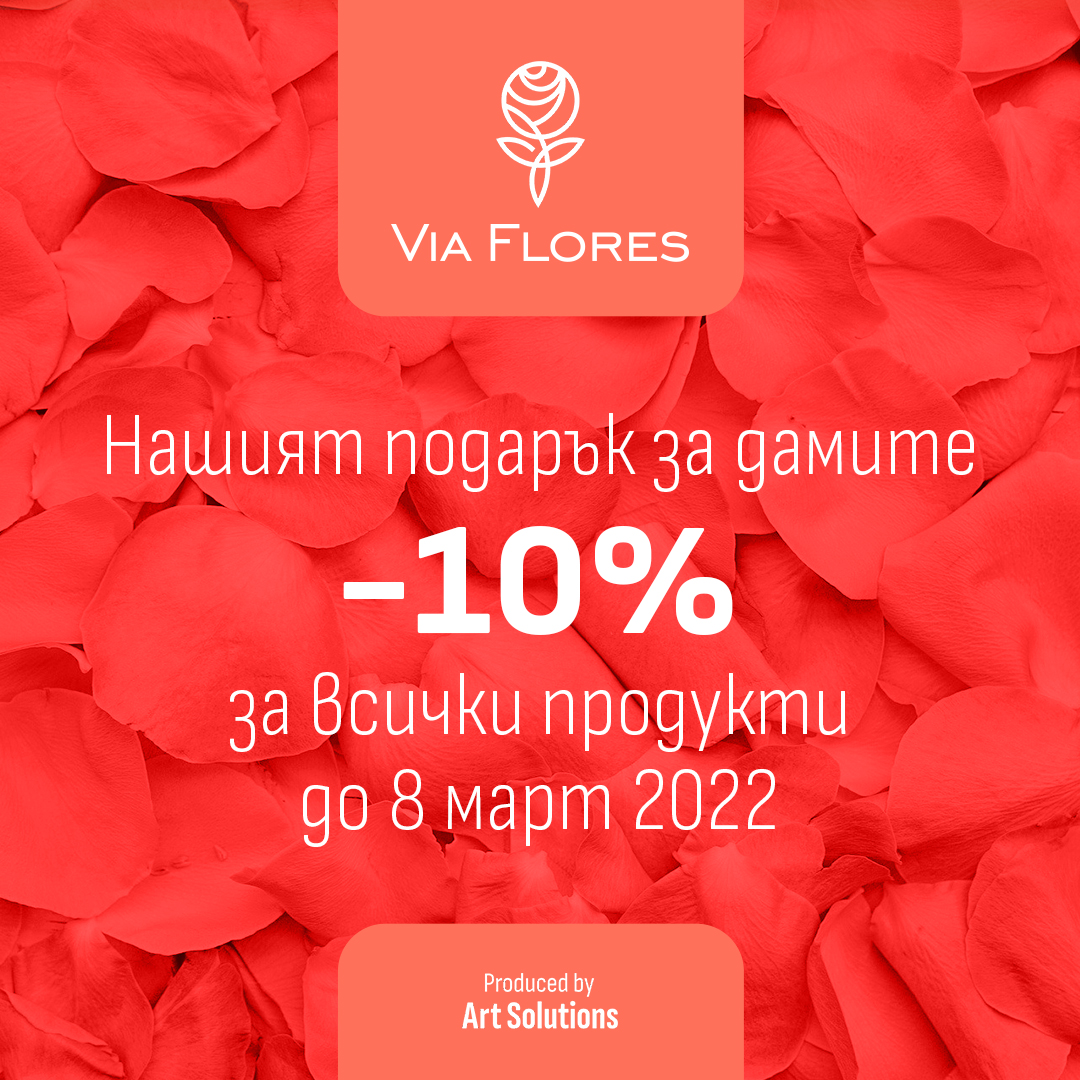
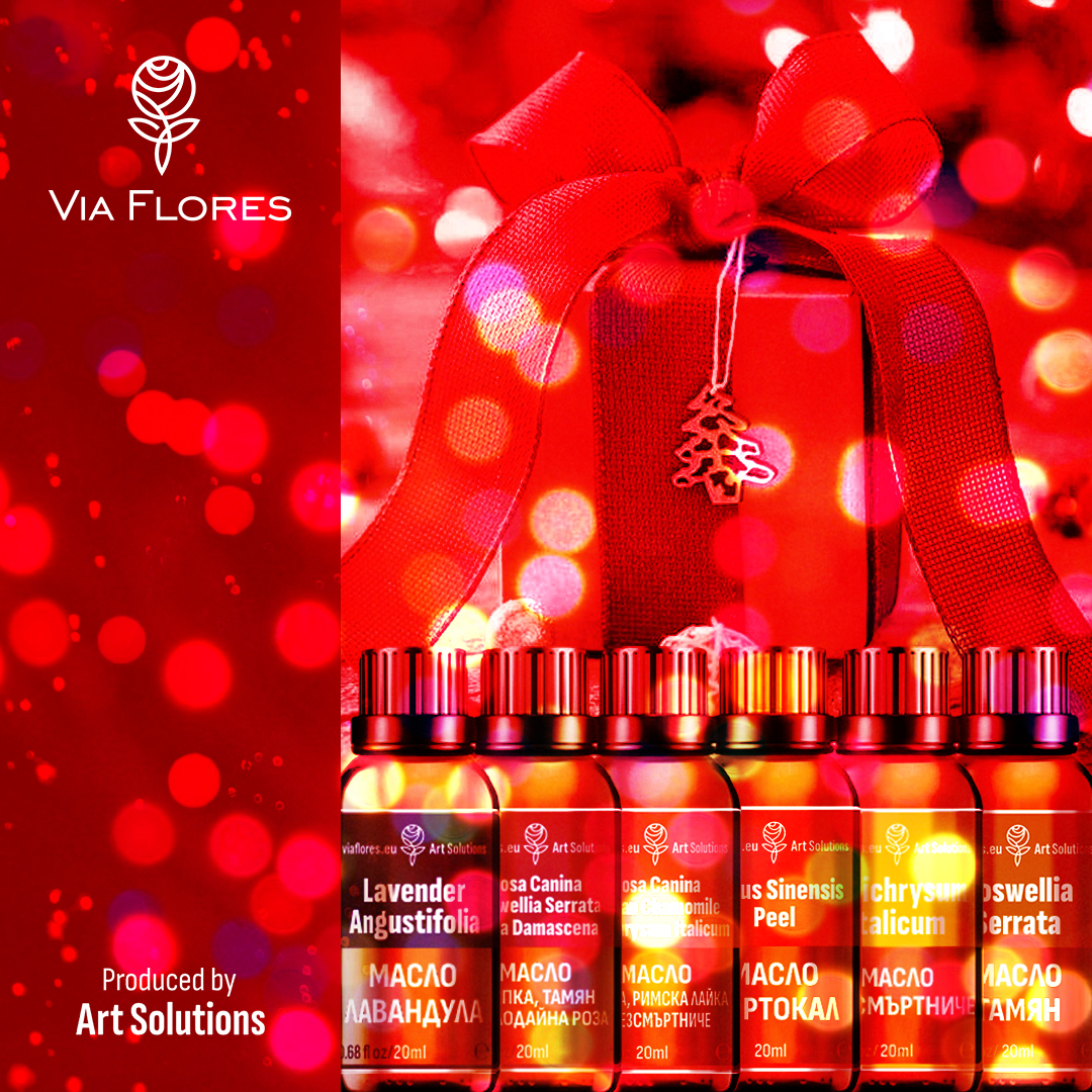
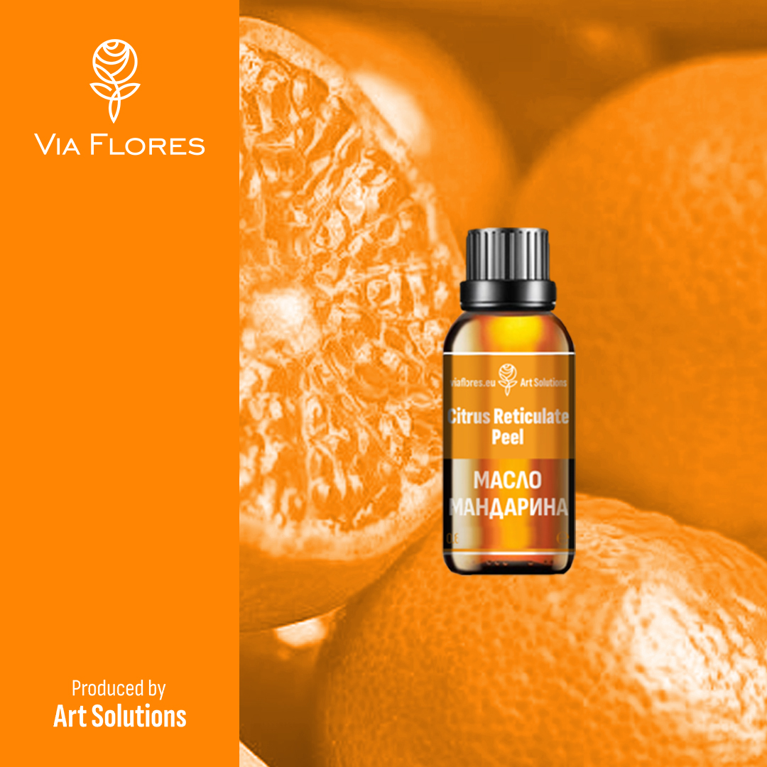
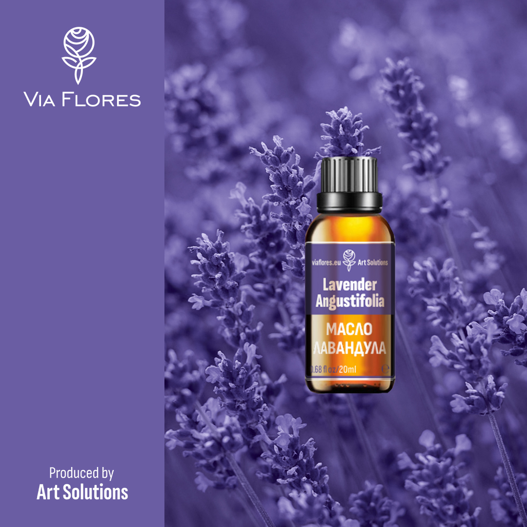
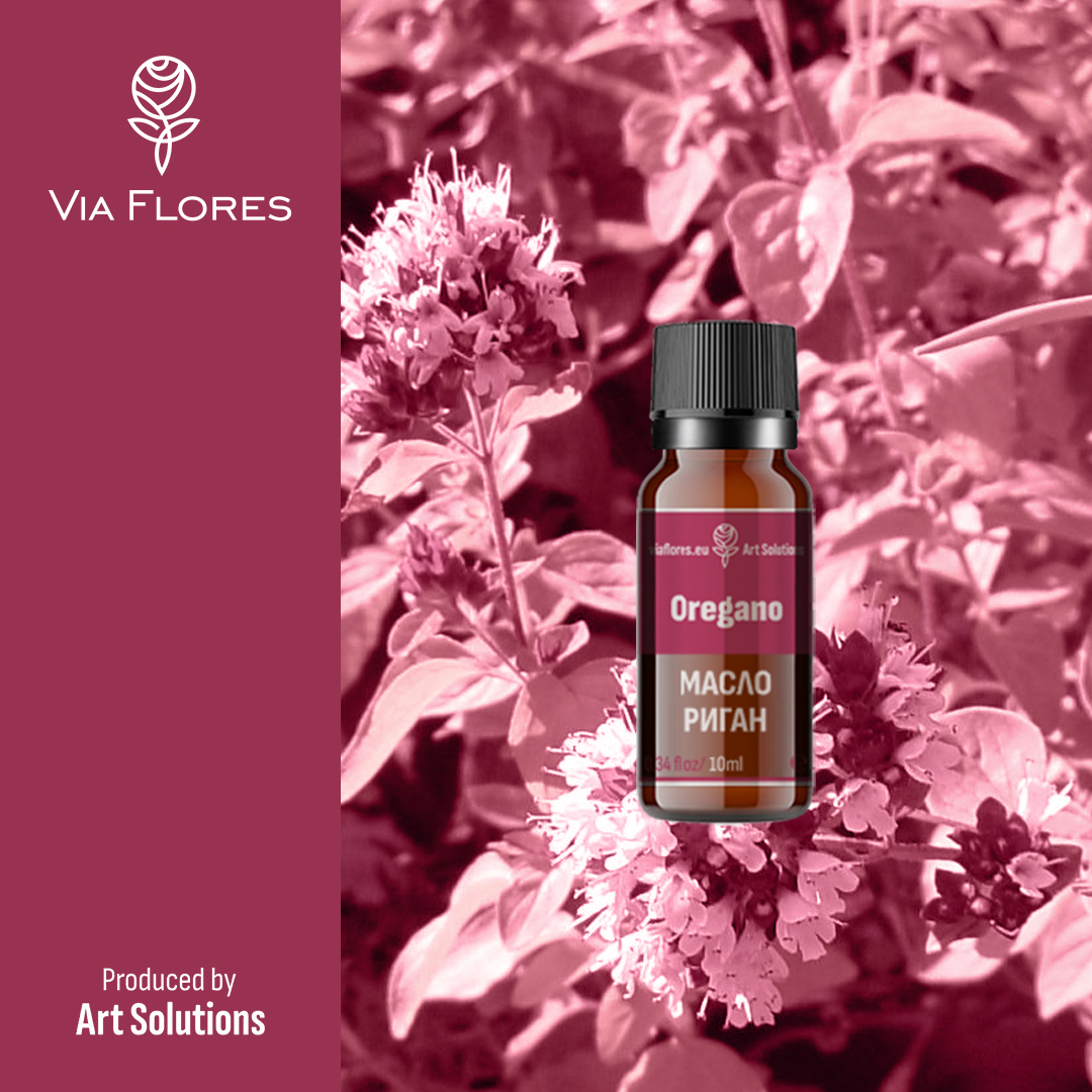
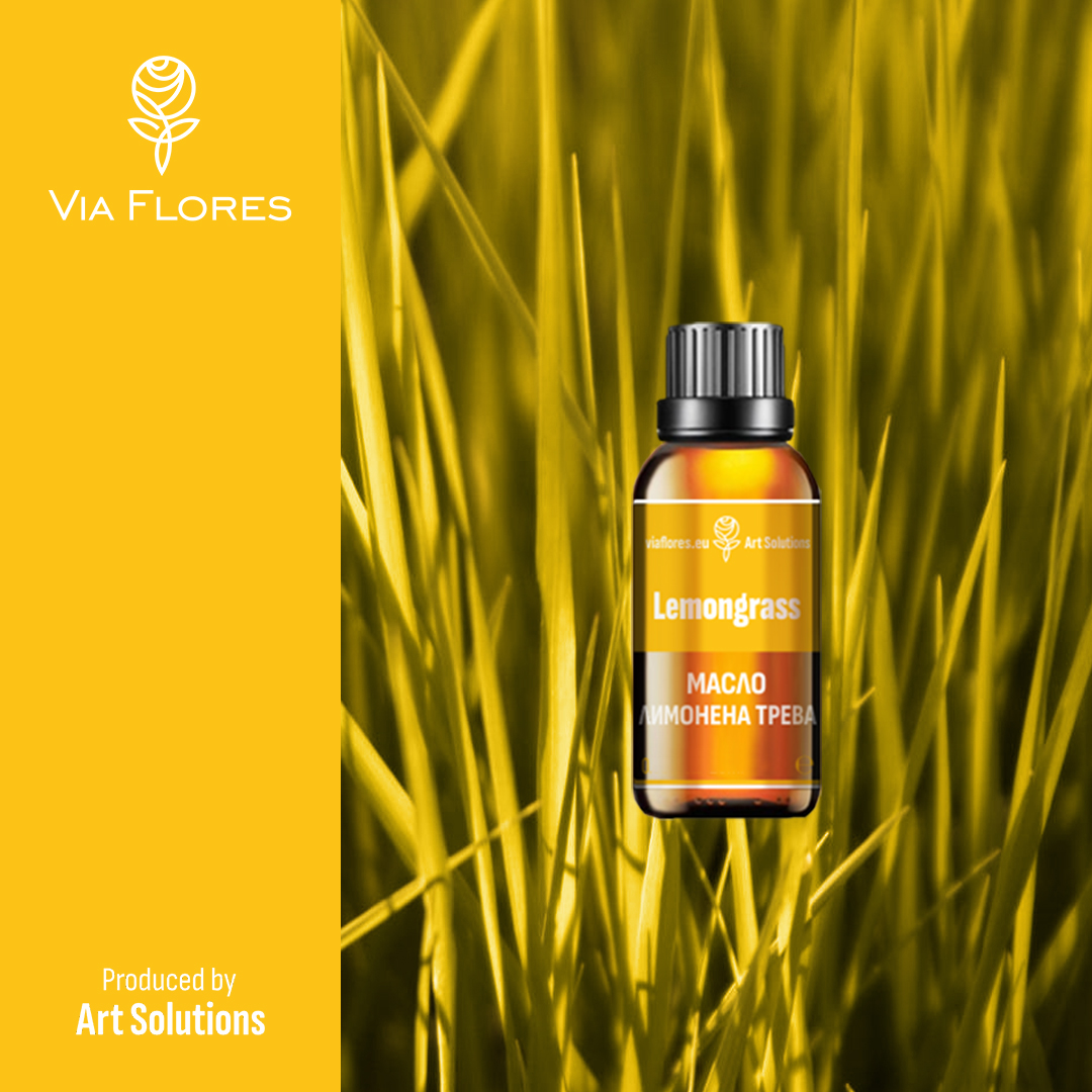
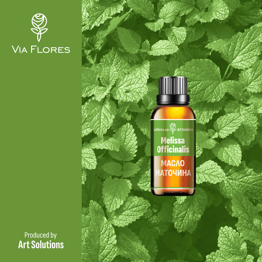
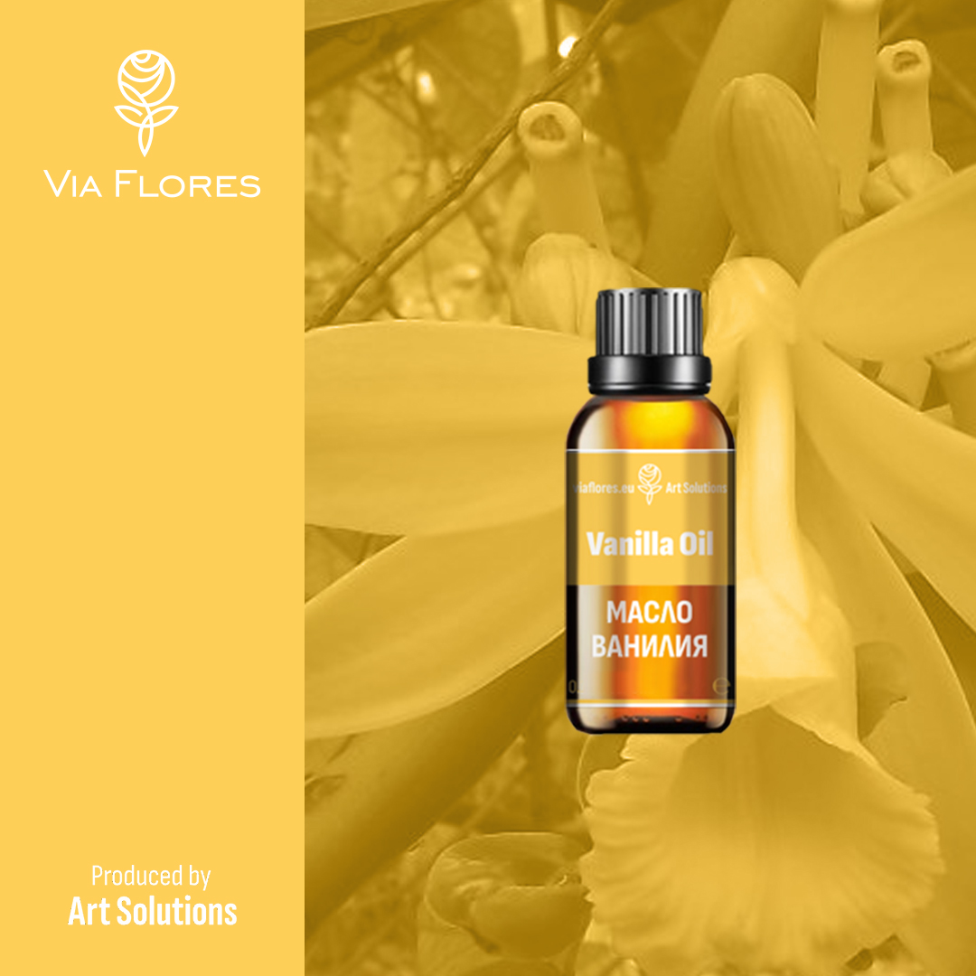
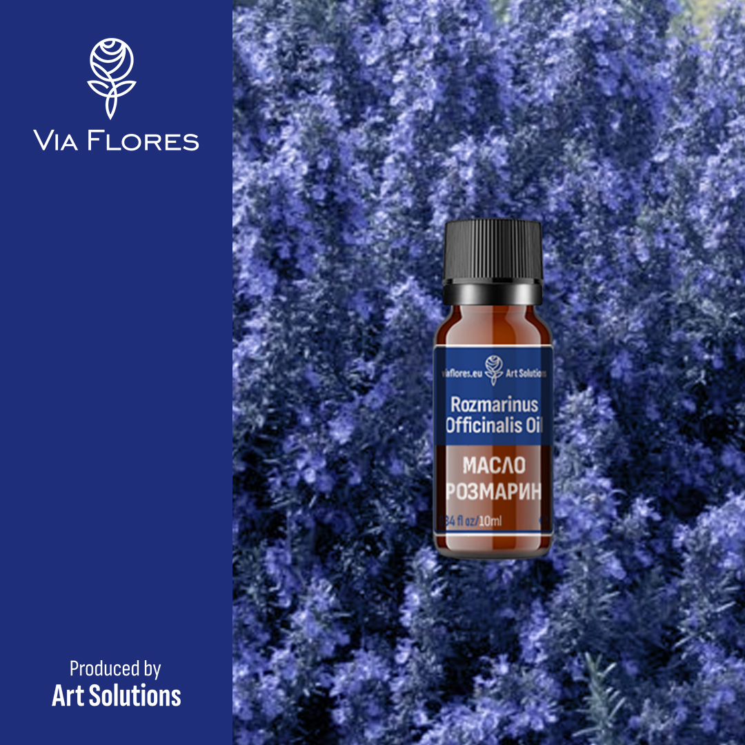
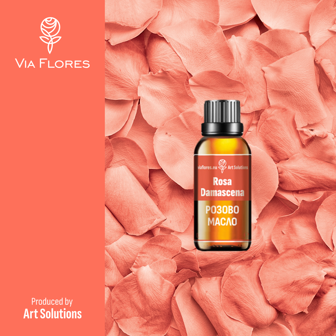
VIA FLORES NATURAL COSMETIC
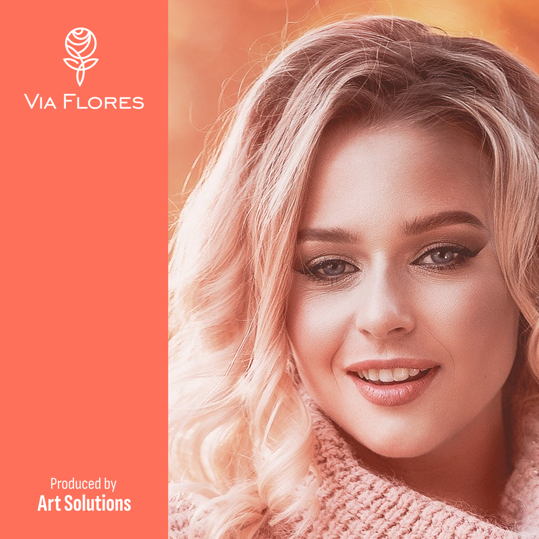
Via Flores is a Trade mark of Art Solutions Ltd. - a Bulgarian family company based in the heart of Rose Valey – Kazanlak, specializing in the production, supply and trade of natural cosmetics, organic floral waters, natural base and essential oils.
Behind ART SOLUTIONS is more than 10 years of experience and own agricultural production of most of the raw materials for the products. The company approaches the production with extreme attention and care for the health of customers - the quality of production and personal attitude to each customer is a top priority.
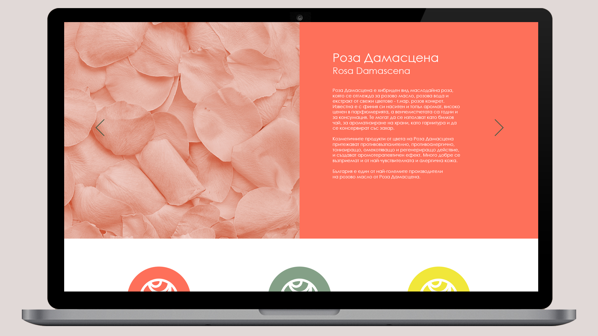
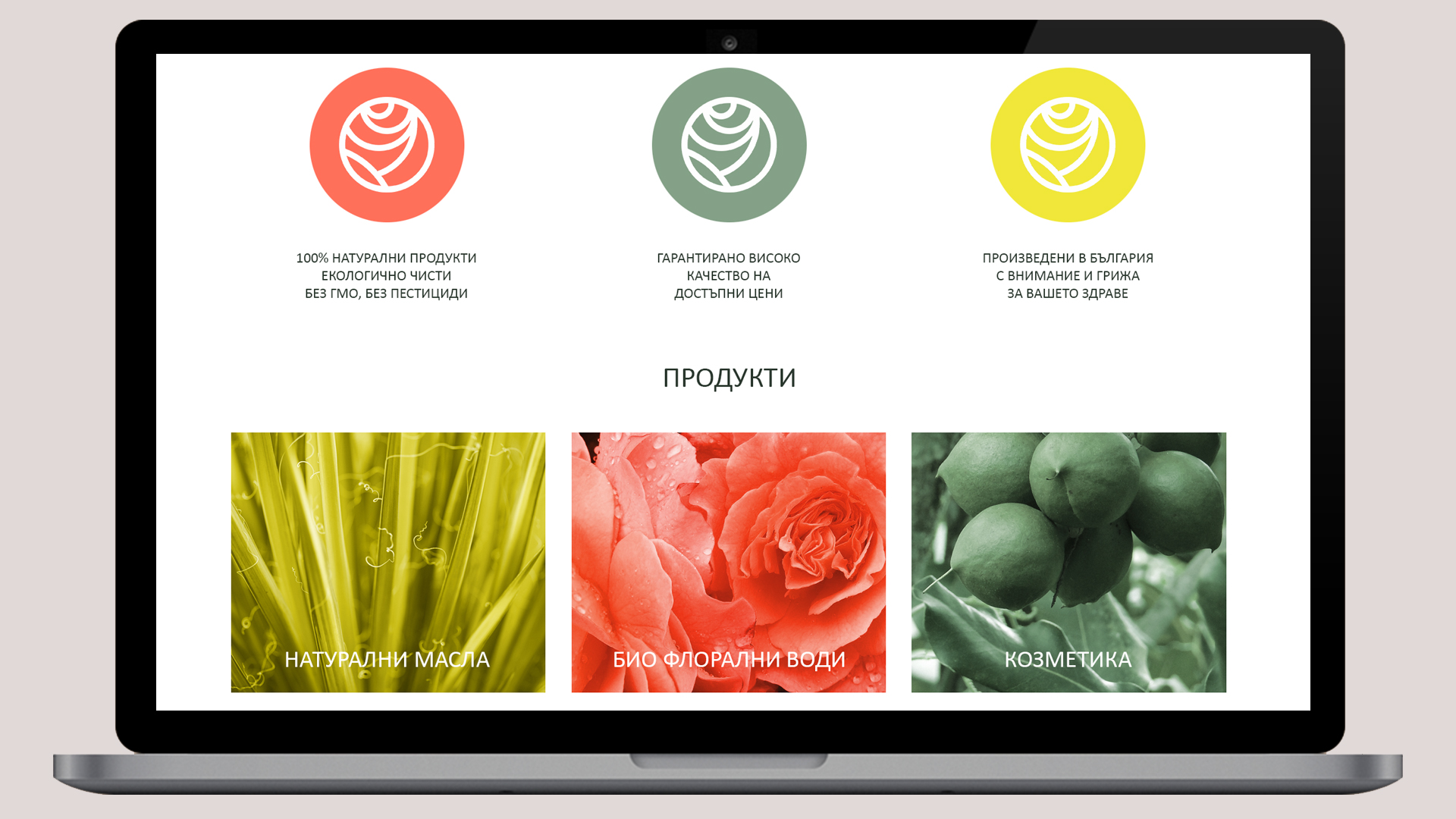
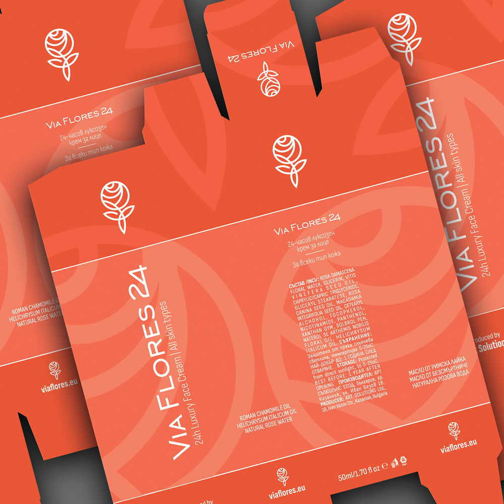
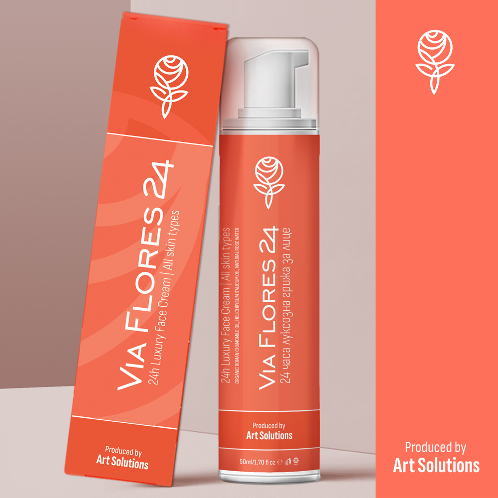
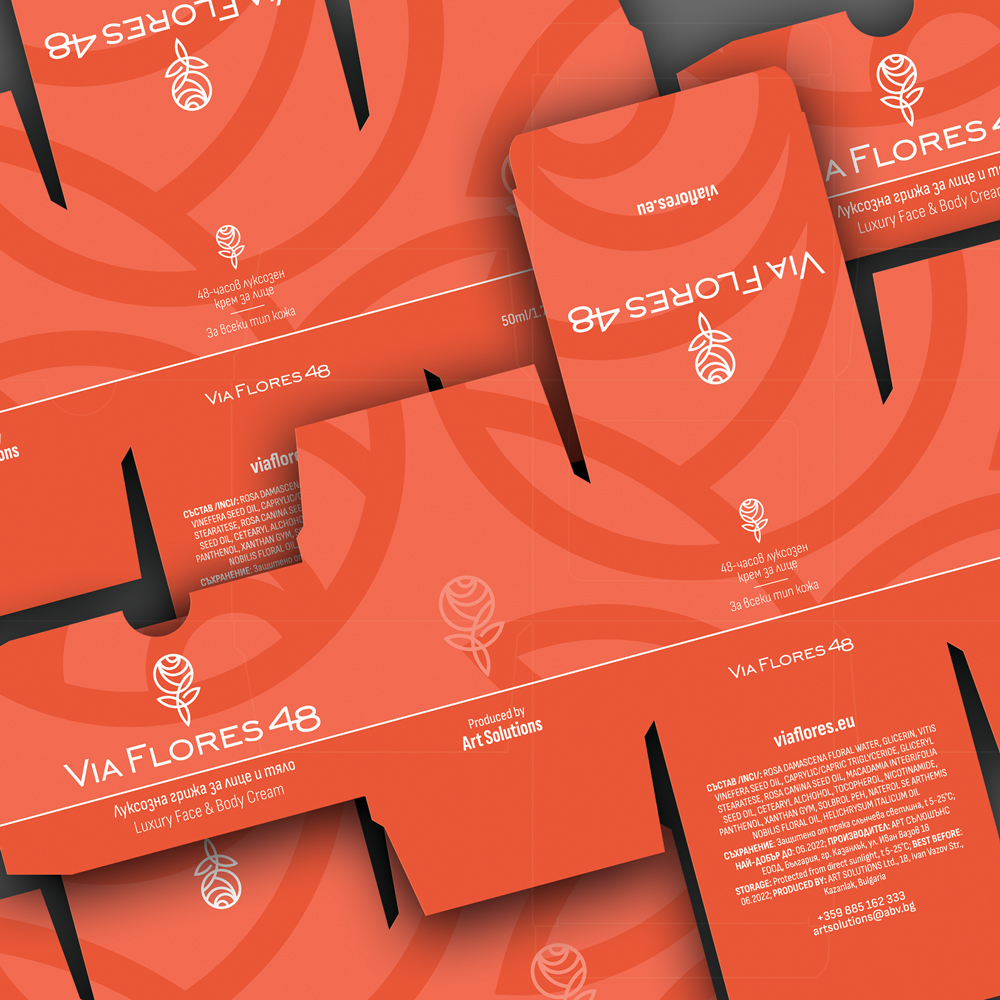
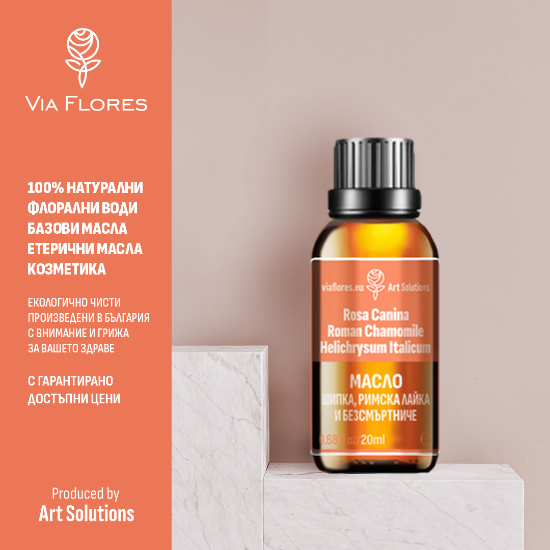
We created a complete brand identity - brand name, logo design, visual identity, labels and packaging, promotional materials, online presentation templates and website (viaflores.eu).
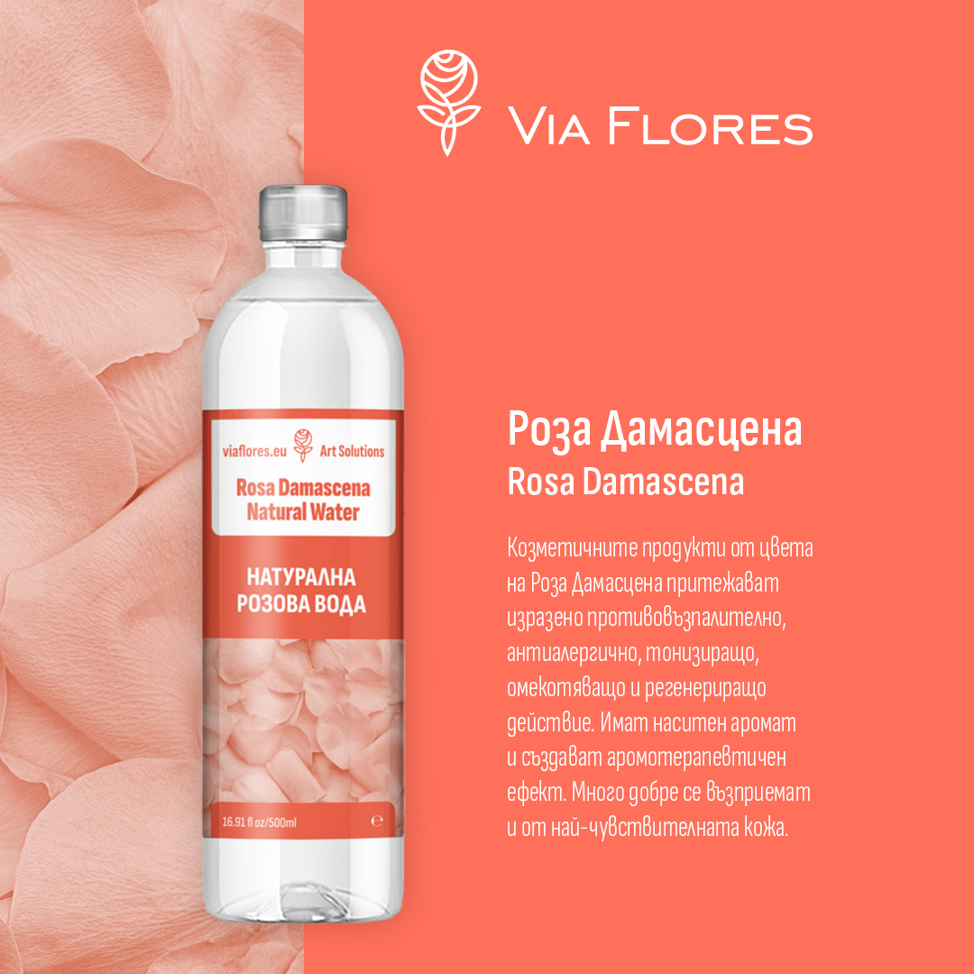
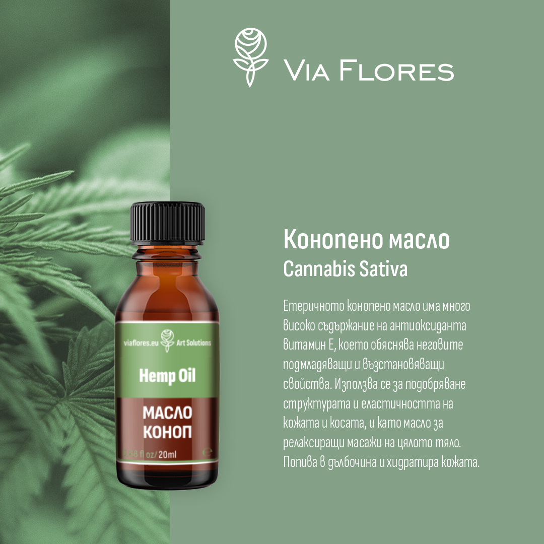
The name VIA FLORES – the path of flowers – is inspired by the brand’s location in the heart of the Rose Valley, the logo is a stylized graphic of the Bulgarian oil-bearing rose, which is the basis of the product line. The color scheme is soft and pastel, bringing a sense of harmony with nature, purity, femininity, beauty and vitality.
Our project is featured at The Best Beauty Product Packaging Designs by DesignRush in their Best Designs Trends


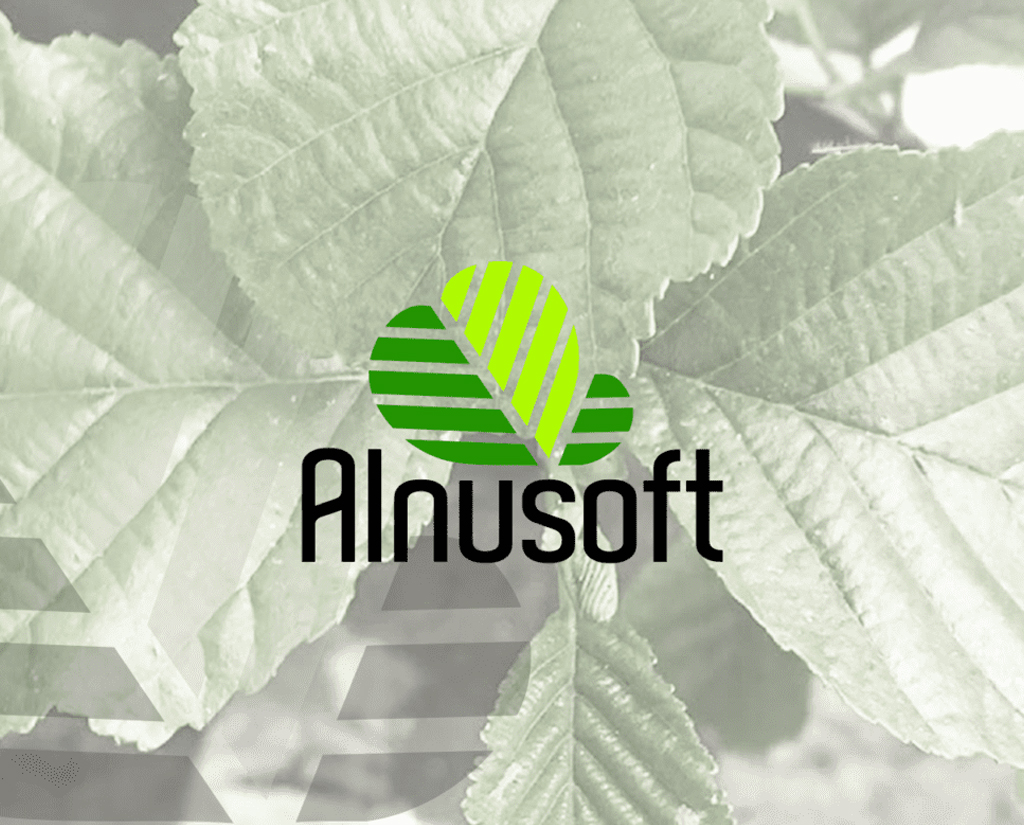
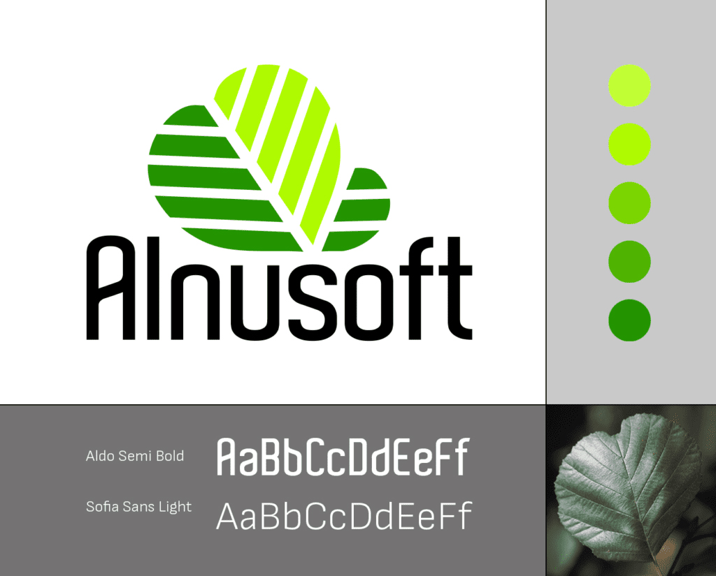
ALNUSOFT

Logo design for a company from the IT sector, which started its activity with inspiring Artificial Intelligence projects. The main areas in which Alnusoft will develop are artificial intelligence, big data, machine learning and deep learning, web scraping and data mining, as well as internet security.
The name of the company comes from the Latin name of the messenger of spring, the alder tree - Alnus. The rounded leaves of the alder have a pronounced heart shape, do not change colour during the season and remain fresh and green till winter.
The beautiful shape and the association with spring, durability and long-lasting freshness determine the desire of the owners to use the beautiful, stylized leaves of the alder as a basis for the graphic sign. We designed it in two shades of green, symbolizing the new beginning, combined with the elegant Aldo font, which grounds the graphics and gives stability and classic character to the logo.


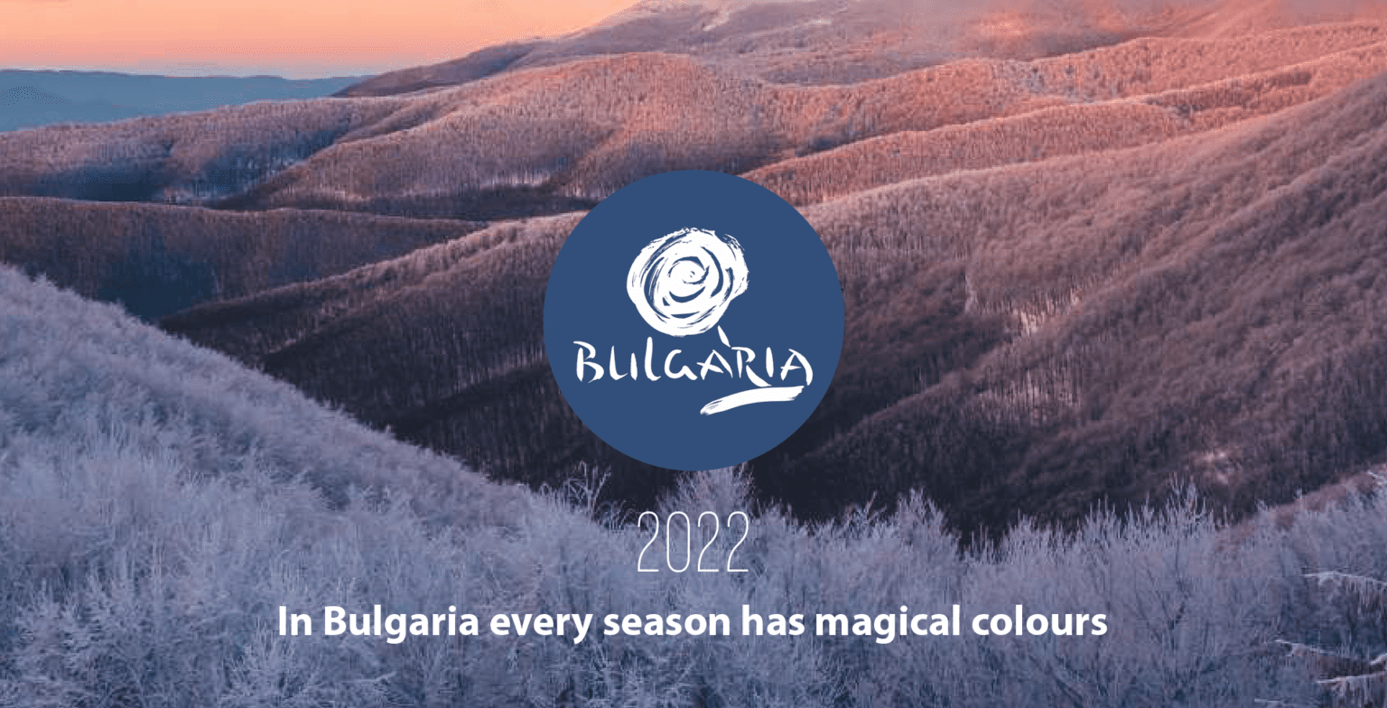
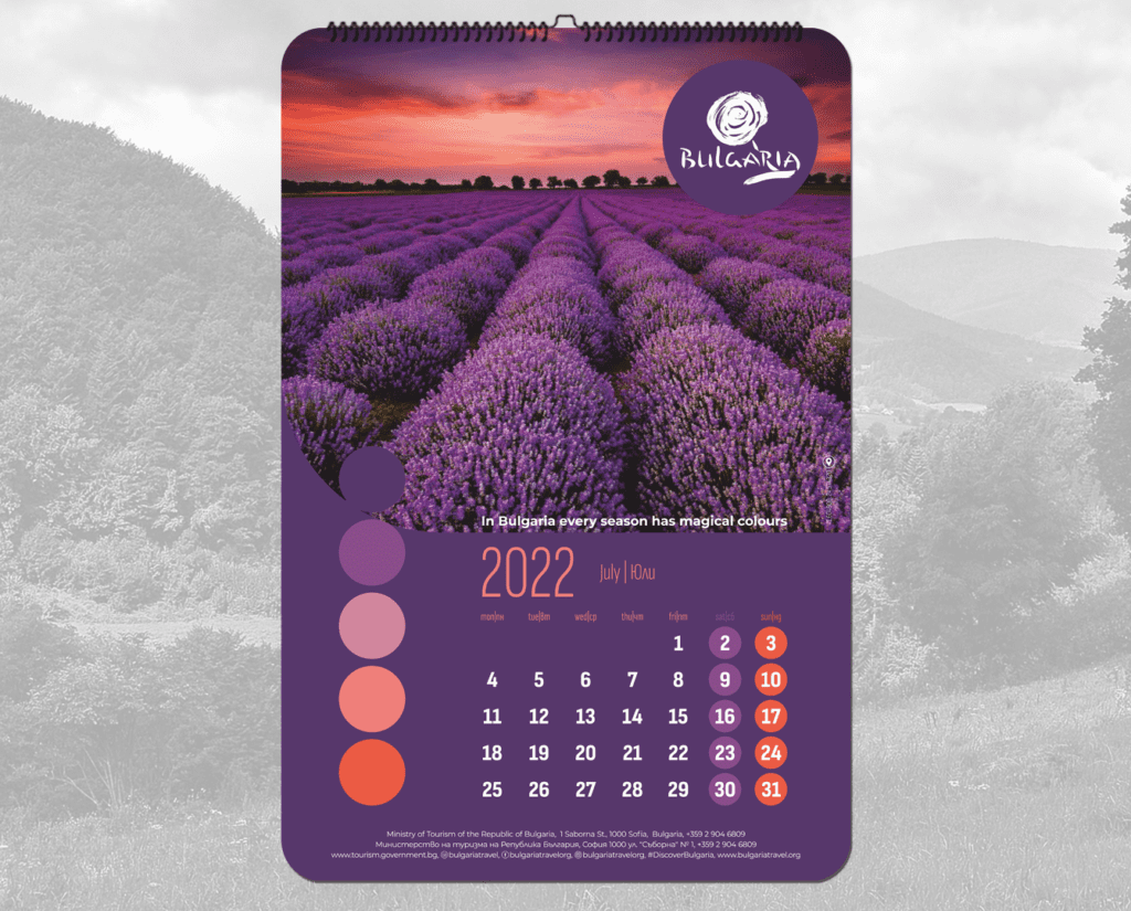
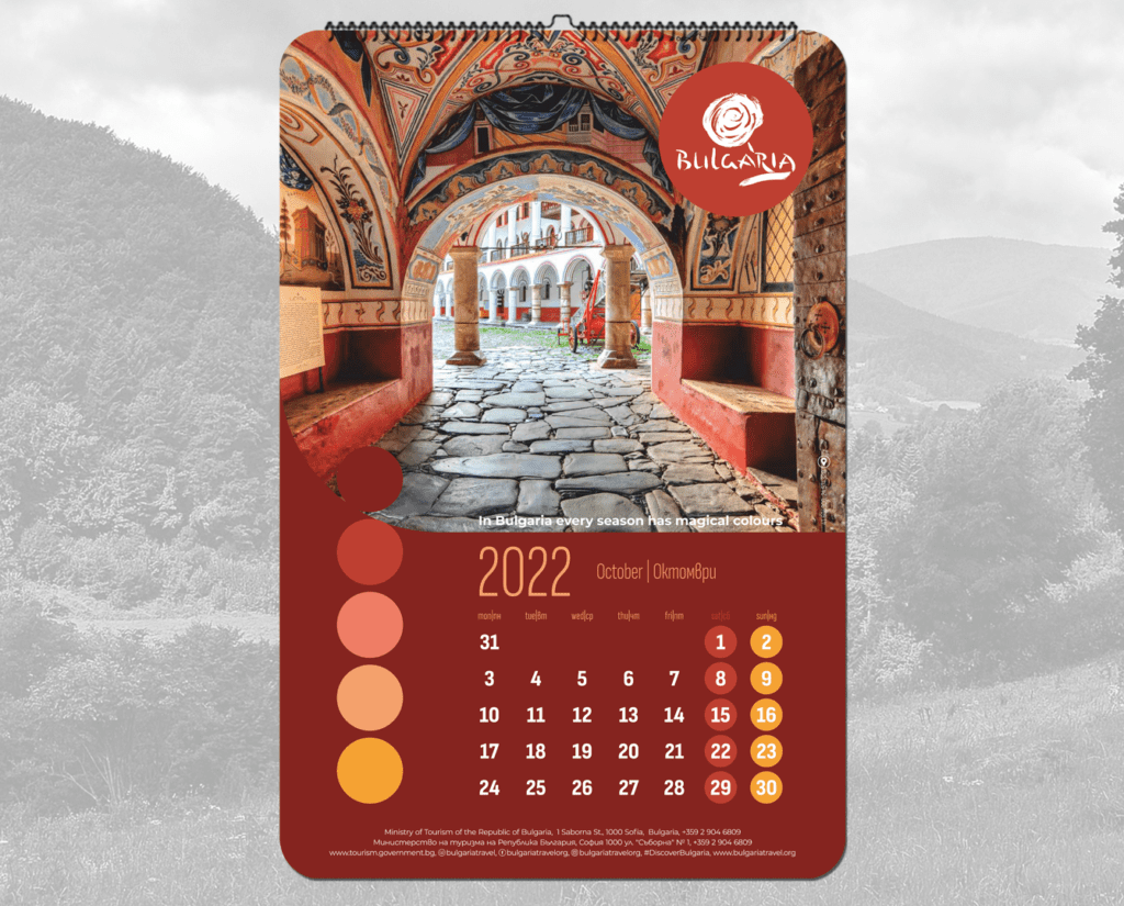
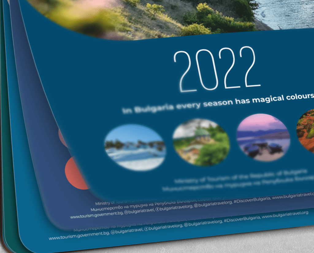
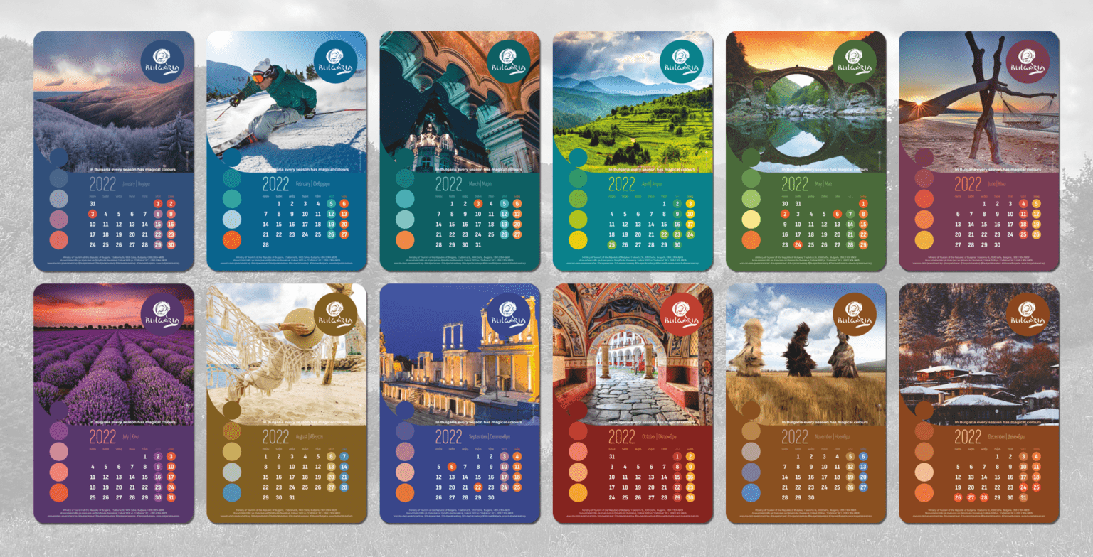
MINISTRY OF TOURISM CALENDAR 2022
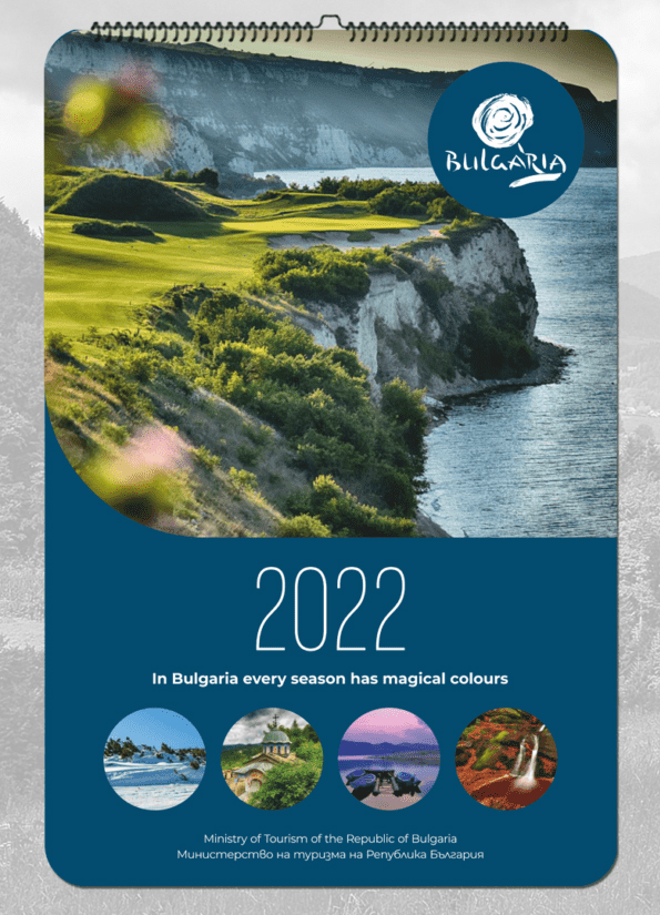
Our concept for this luxurious 14-page calendar, commissioned by the Ministry of Tourism, is based on the idea of the diversity of natural resources and opportunities for experiences in Bulgaria in each season.
Each month has its own palette, each colour we use in graphical elements or text, is derived from the main composition to immerse the page in its own harmonious space. The colours are inspired by nature – soft terracotta, deep turquoise, or green shades for a calm and comforting sensation, combined with fresher and richer colours for accents and playfulness. This softness continues logically in the rounded corners of the pages and images to give a finished look to the feeling of warmth and hospitality. The fonts in the calendar are elegant and legible, continuing the same style with their smooth lines.
We printed it on thick, matte paper with partial varnish on each page on the logo of Bulgaria, the cover photos symbolizing the four seasons, as well as on the coloured dots that define the palette. And since the main purpose of a calendar is to be functional, in addition to decorative, we included a calendar for next year – a useful addition for anyone who makes long-term plans for their business trip or vacation.

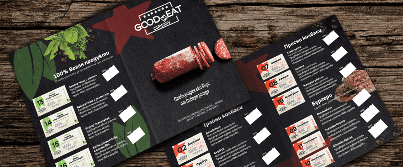
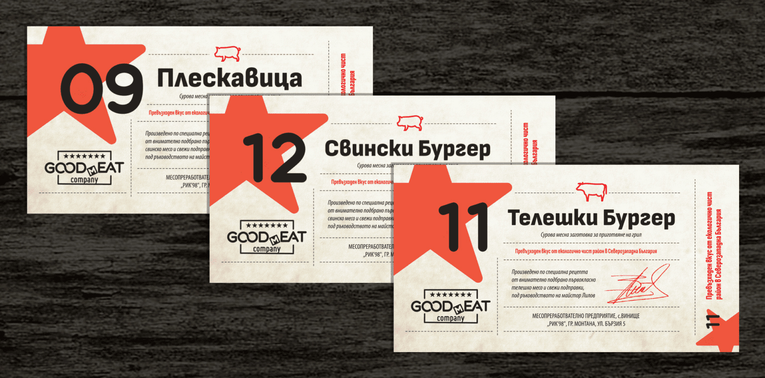
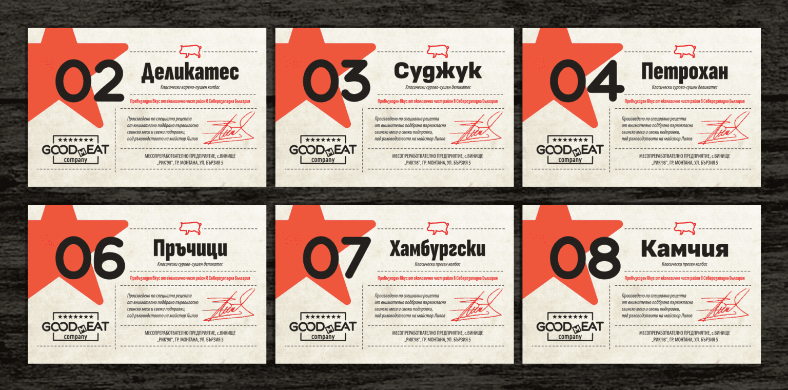
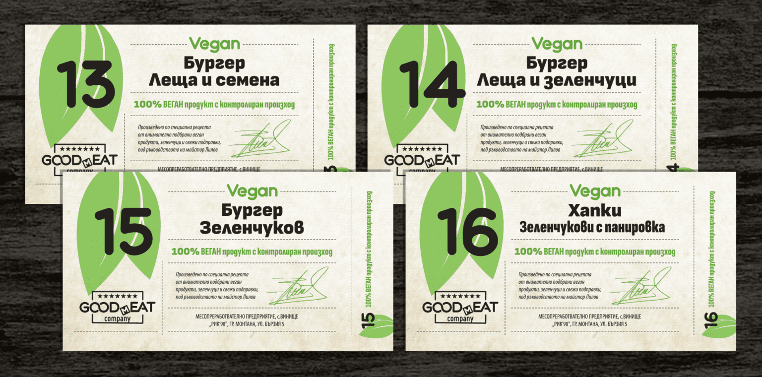
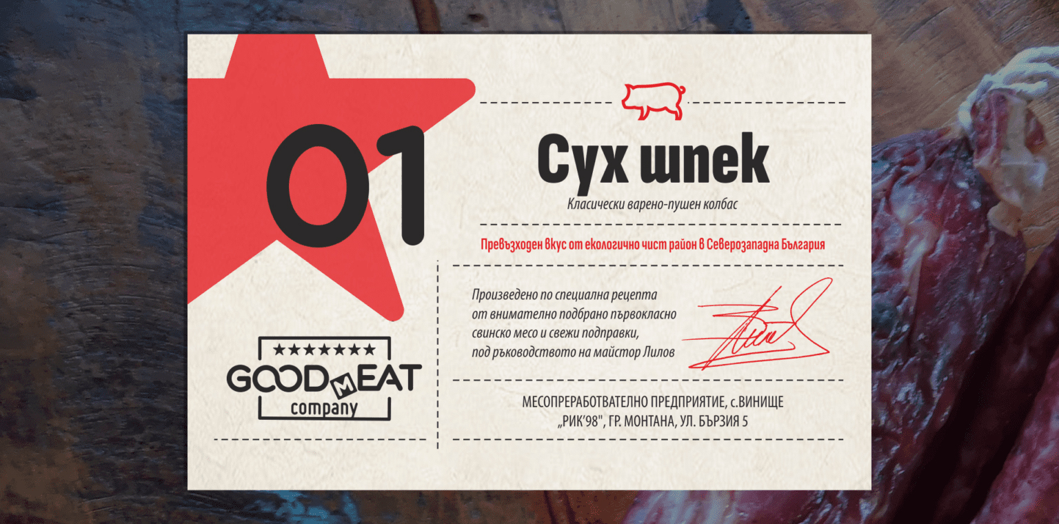
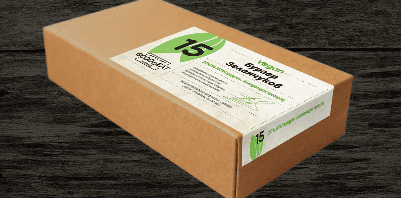
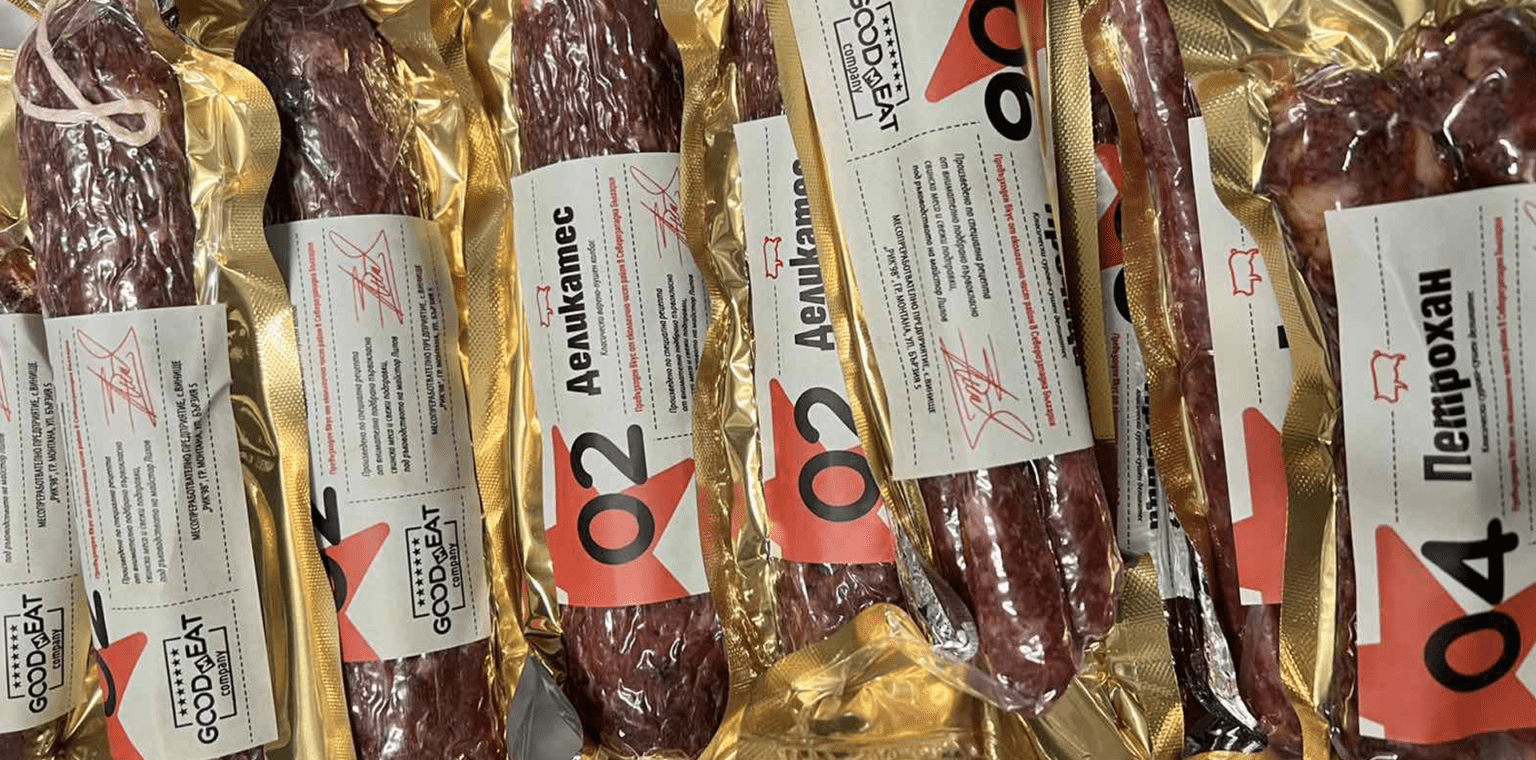
GOODmEAT

Visual identity of a meat processing company. The small family company has bet on a completely new brand for its boutique line for high quality, organic food, produced according to special recipes.
We have created a logo based on the play on words called "GOOD EAT - GOOD MEAT" and is designed to reflect the new path taken by the manufacturers in the name of good food. And no, the seven stars in the logo are no accident!
The idea of the owners to identify each product with a simple number led the design process of the labels. In addition to a clearly distinguishable number, a color-coded indication of meat and vegan products, text and pictograms indicating the type of meat and place of origin, we added a final accent - the signature of the artisan, proudly putting his name on a job well done.
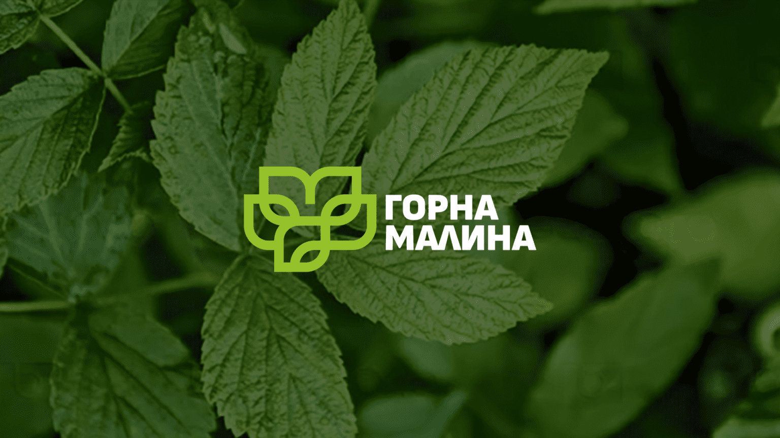
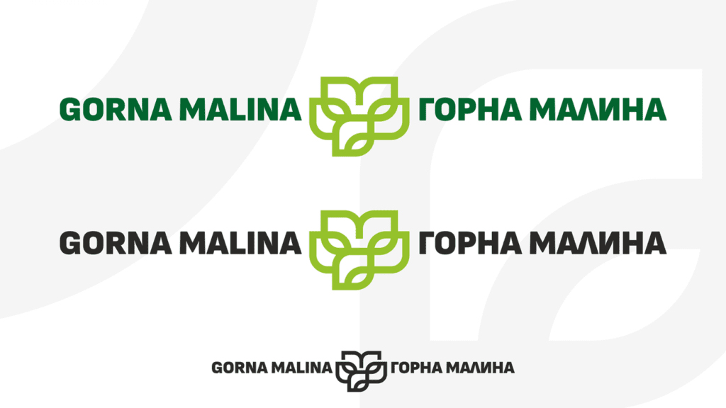
GORNA MALINA MUNICIPALITY
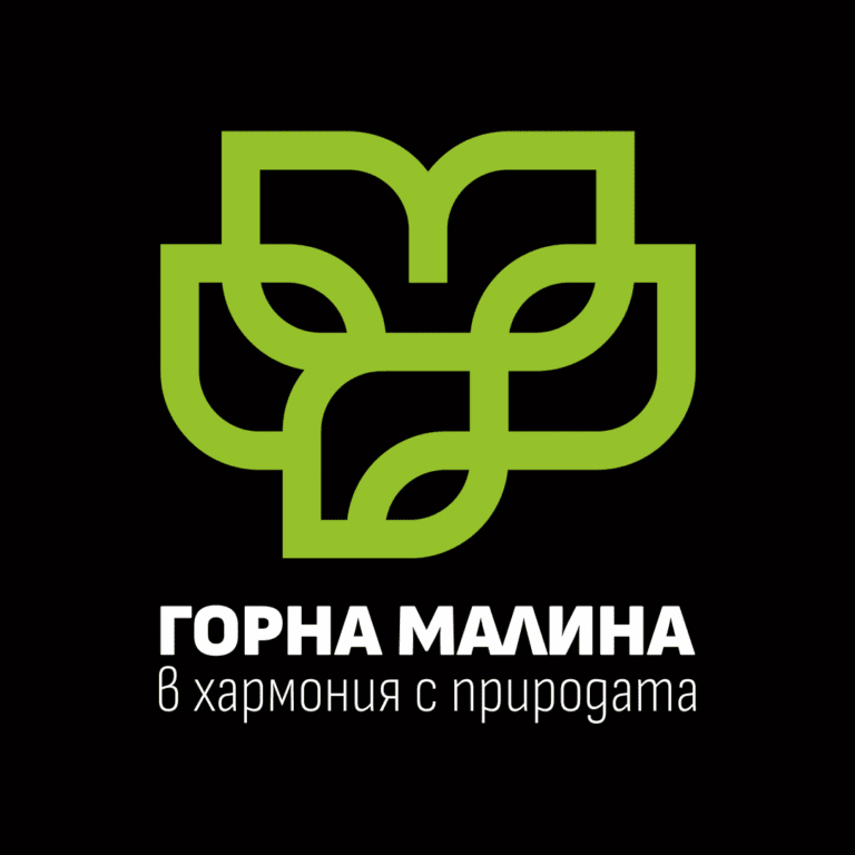
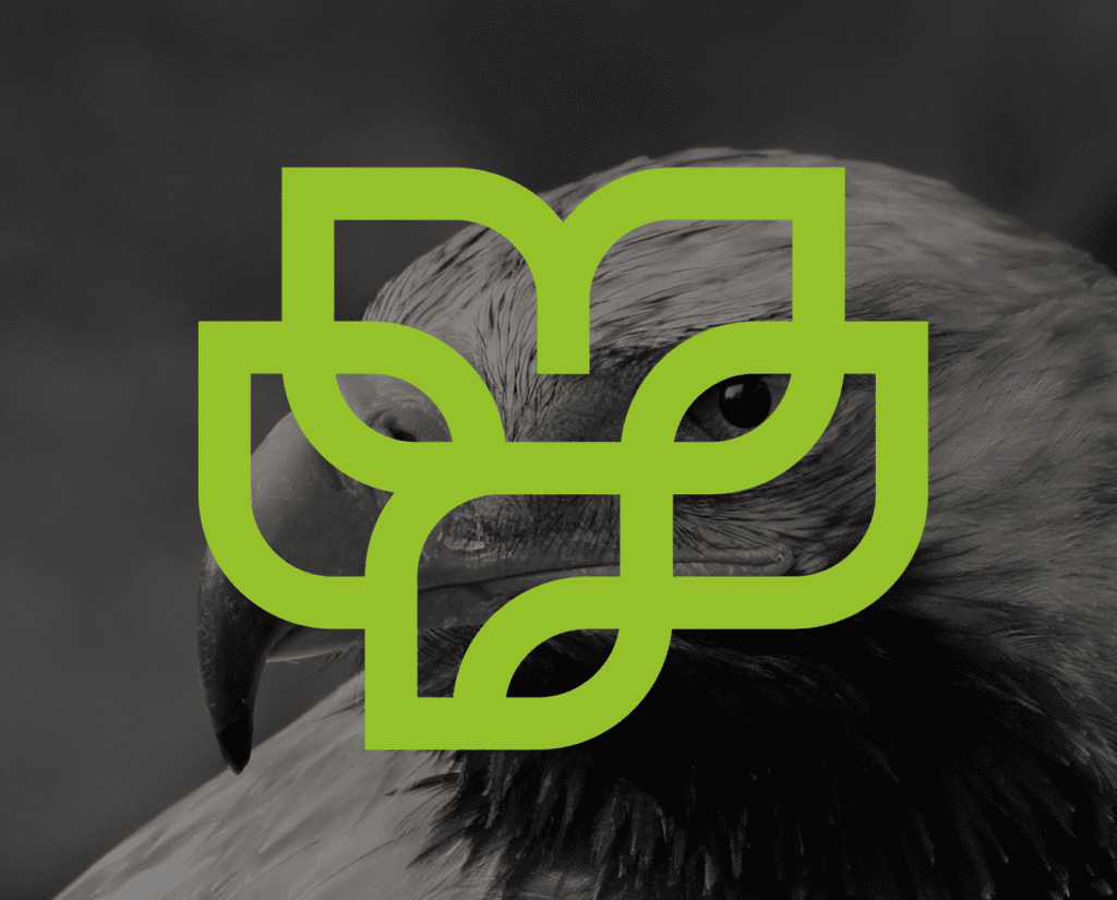
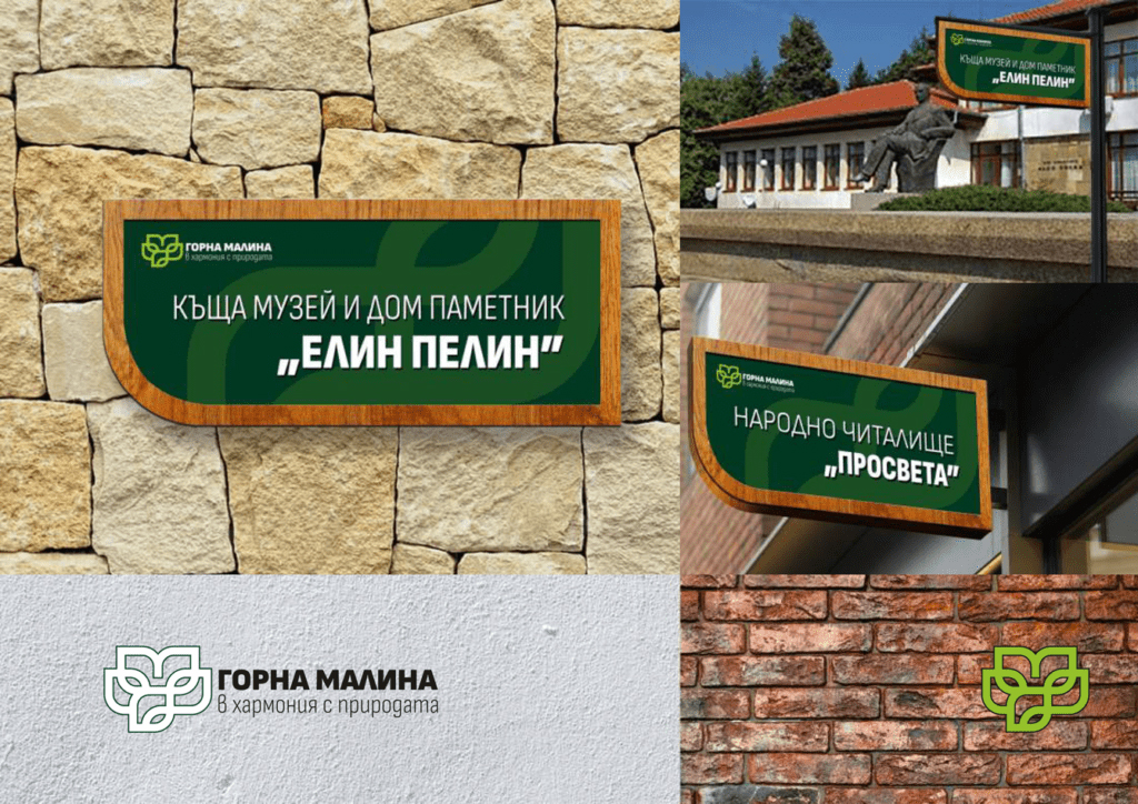
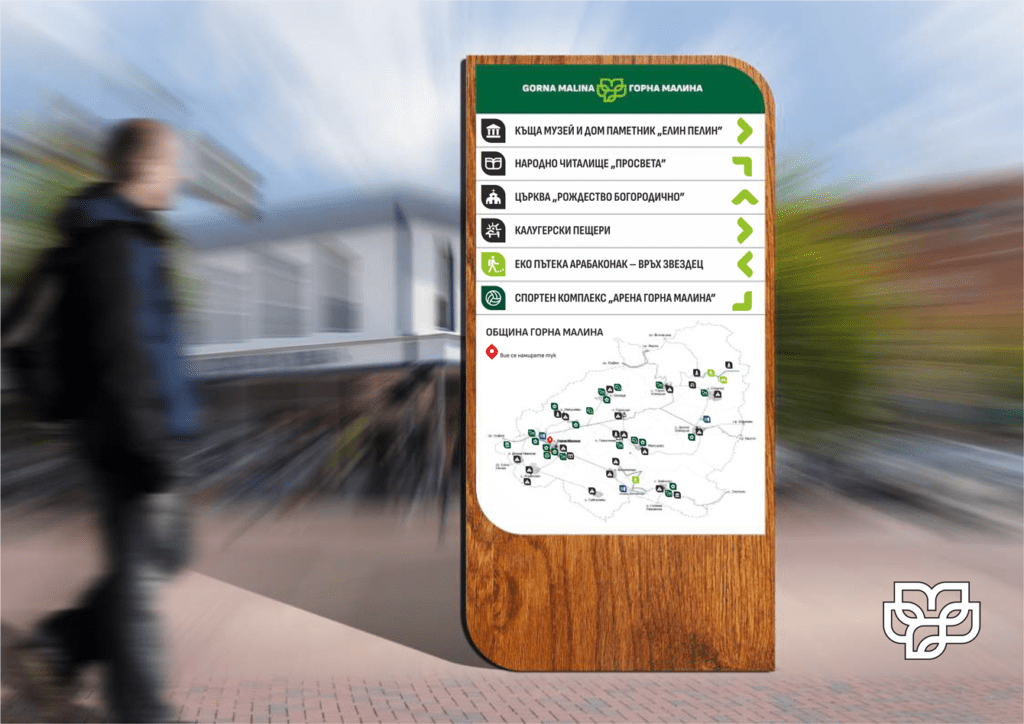
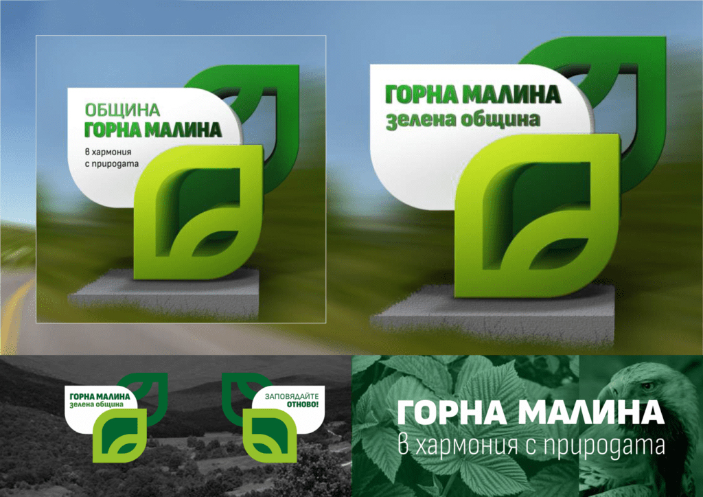
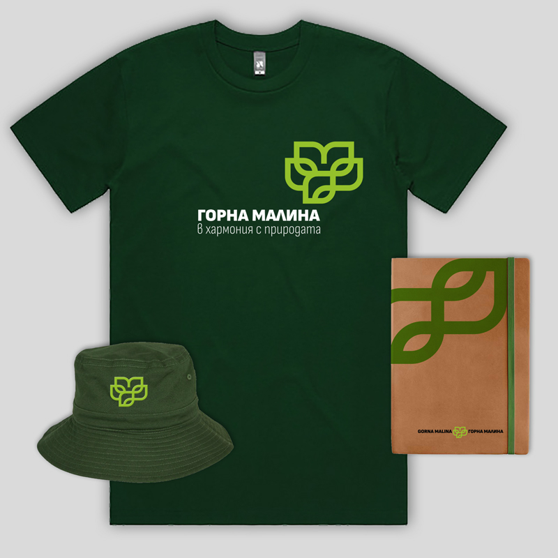
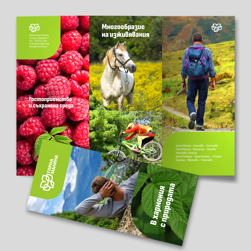
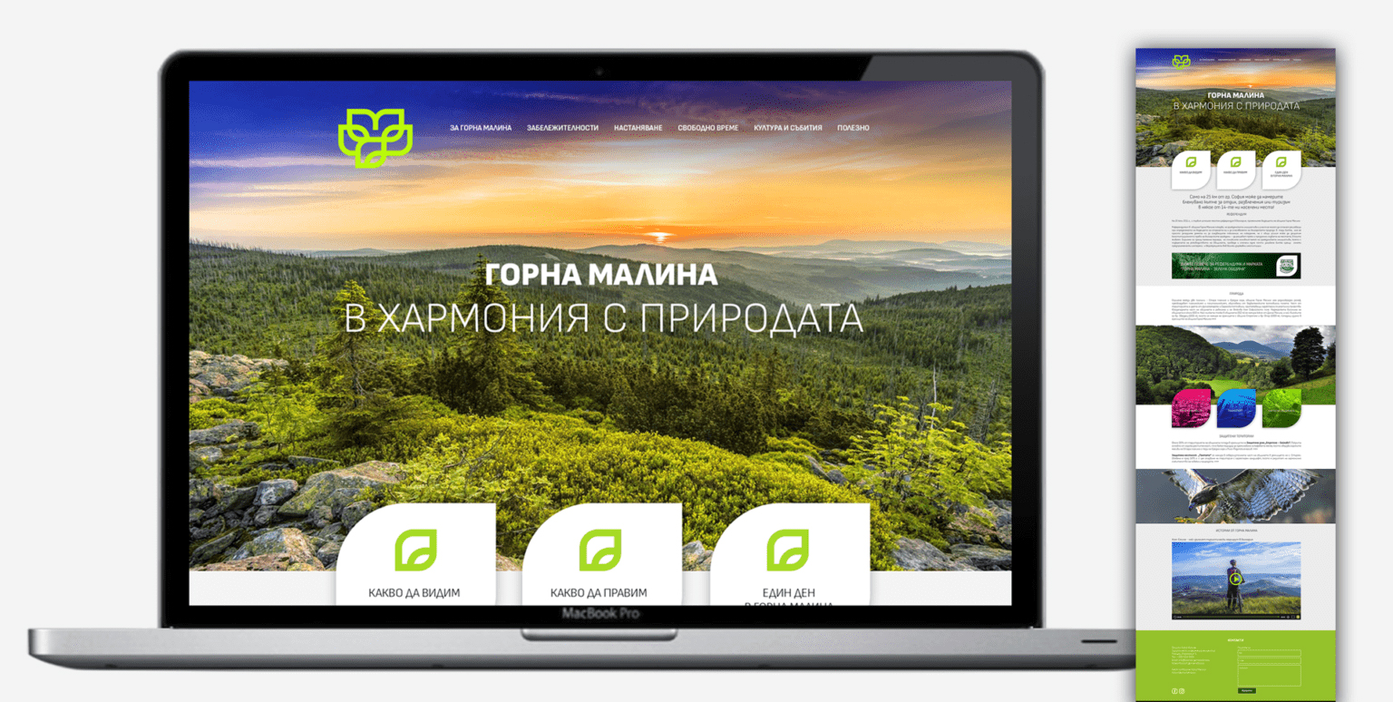
The proposed visual identity of the Gorna Malina Tourist Brand is based on the developed concept for promoting the municipality as a tourist destination. The graphic sign corresponds to the slogan "In harmony with nature" and represents stylized leaves, an absolute symbol of greenery, ecology, nature - all associations with the brand “Green Municipality”, which Gorna Malina is known for and with the opportunities for various activities in the region.
The continuous line of semicircles and corners, brings together the stylistics on a modern drawing, elements of folklore motifs, the idea of new artistic experiences, as well as cultural and historical walking routes. Apart from the green leaf, the symbol of the majestic Imperial Eagle can also be found in the graphic. The area of Sredna Gora around Gorna Malina is one of the habitats of this beautiful bird part of the worldwide endangered species list. The final shape at the top incorporates the first letter of the region’s name - Malina and helps visualise the region as the green gem huddled between two majestic mountains.
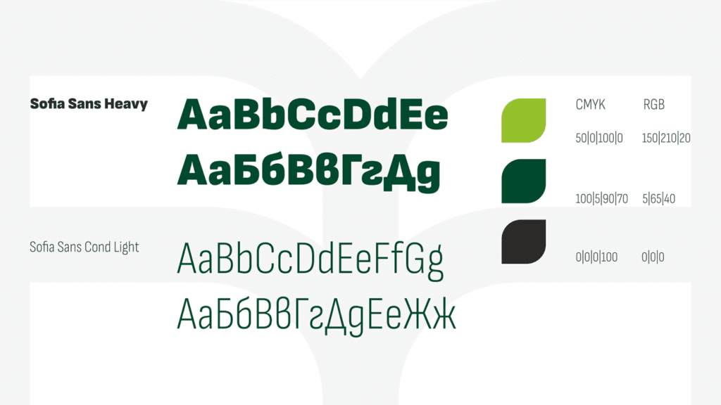
The incorporated fonts are from the Sofia Sans family, sporting a clean design in sync with the logo, Bulgarian form of Cyrillic and variations from Ultra light to Heavy, can be adapted for many different applications.
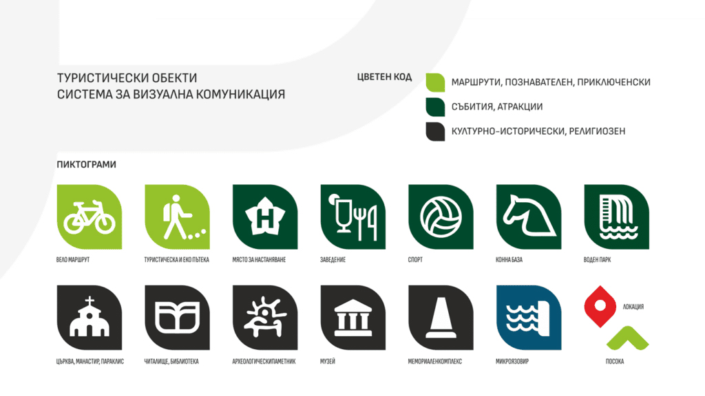
In addition to the trademark [logo], the project also includes a visual communication system, icons and pictograms developed in the style of the logo, templates for advertising materials, souvenirs, design of a tourist website and outdoor advertising.
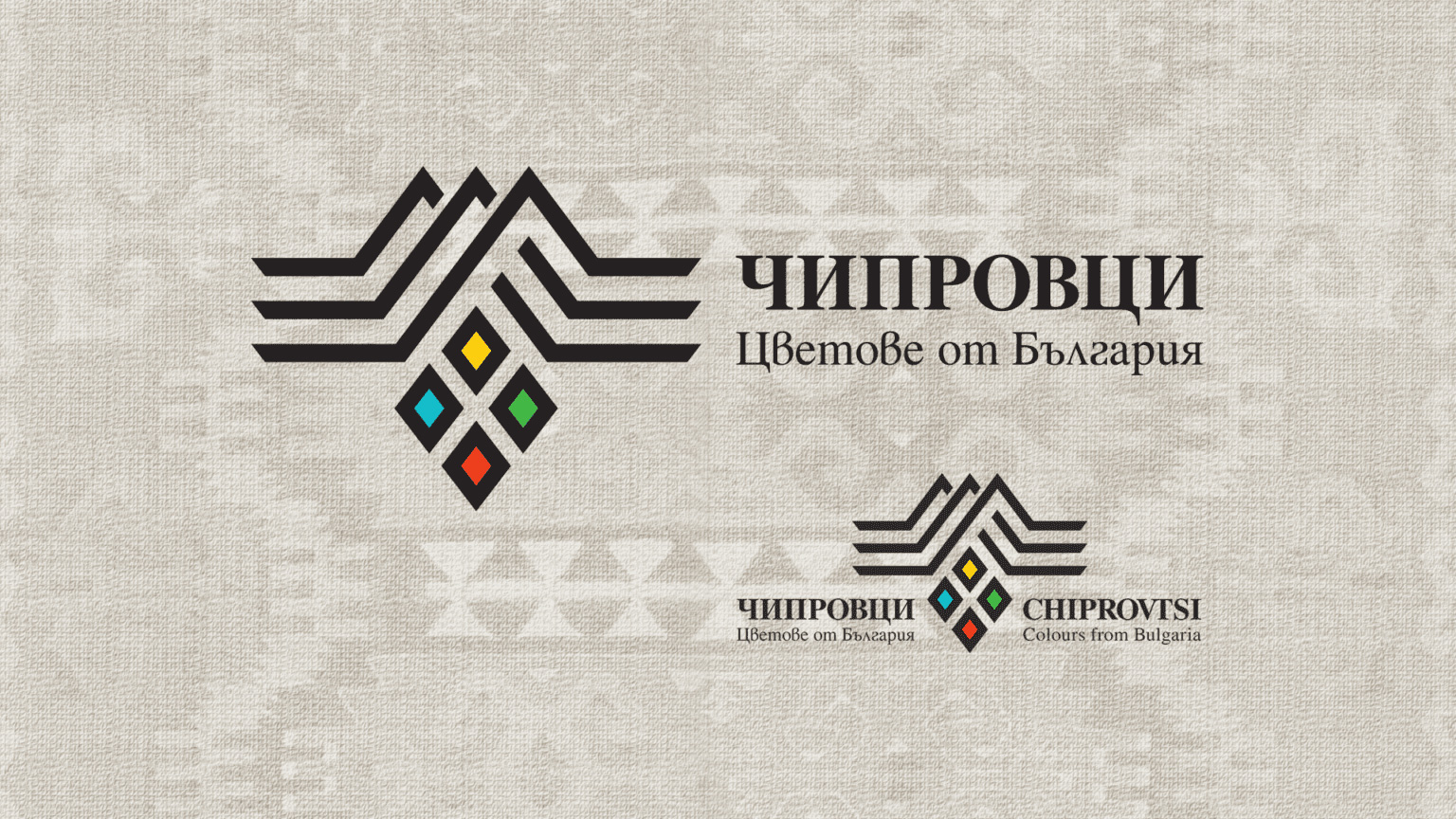
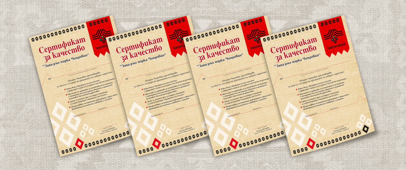
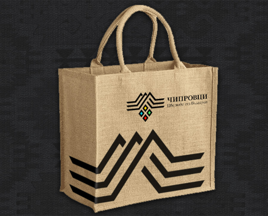
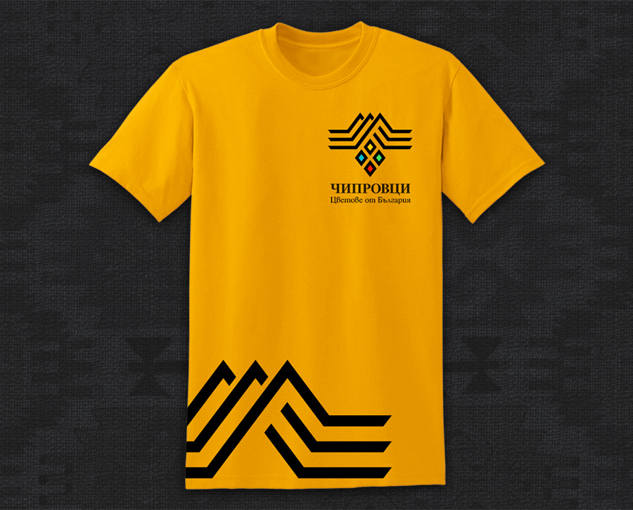
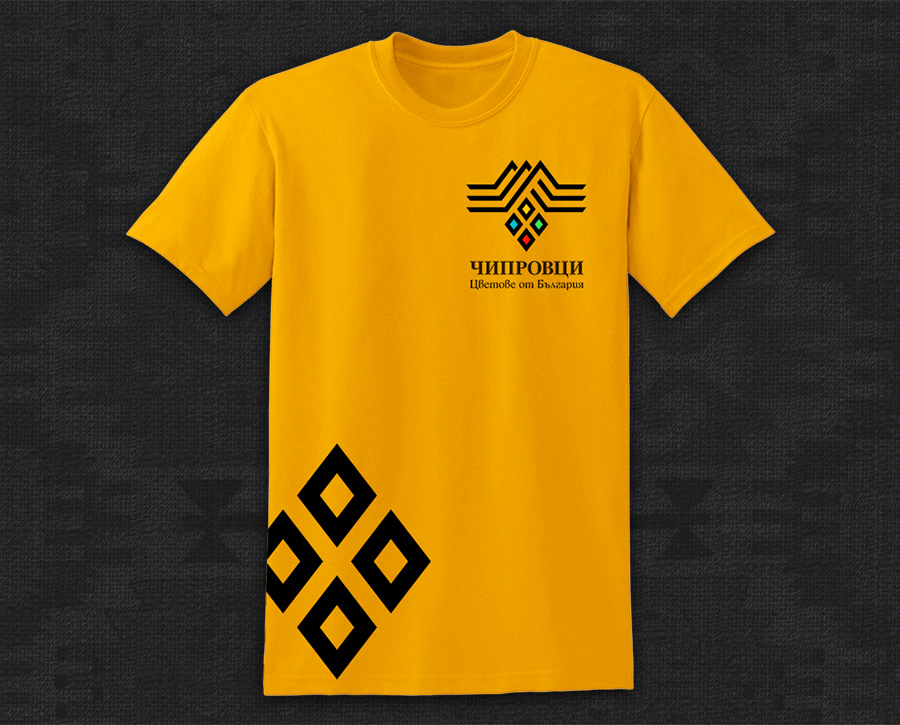
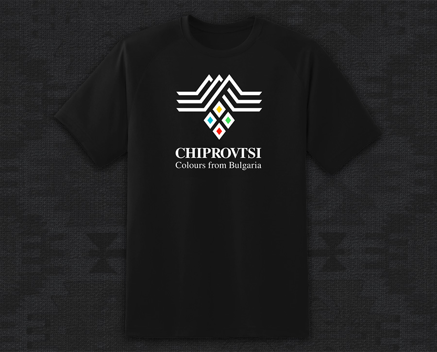
TOURIST BRAND CHIPROVTSI
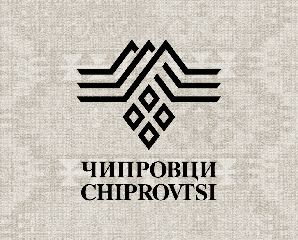
Chiprovtsi is a small town in north-western Bulgaria. Surrounded by the picturesque hills of the Western Balkan Mountains, the town retains an incredibly authentic atmosphere.
Our main objective for this project was to develop a common visual identity as a base for building a resilient brand for the tourist destination Chiprovtsi.
The cultural, historical, and natural heritage of the town is the basis of the brand and the graphic symbols in the logo:
- Chiprovtsi carpets – this is one of the symbols of the town of, the Chiprovtsi carpet tradition is recognised by the UNESCO World Heritage List.
- The Balkans with the Three Hammers – the surrounding mountain landscape with its three characteristic peaks.
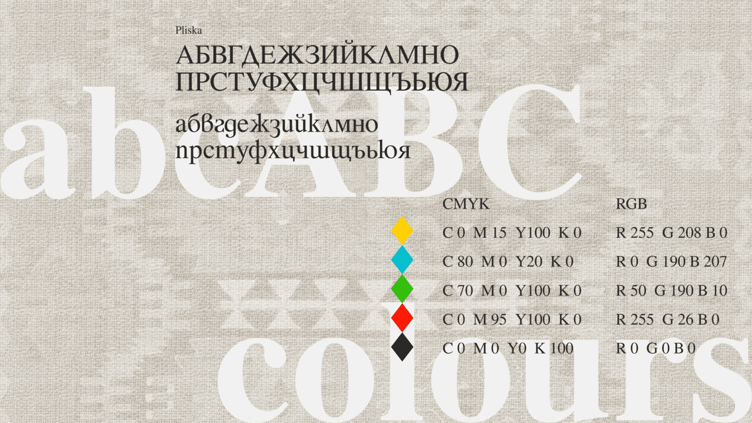
The colours used are drawn from the most popular motifs of the Chiprovtsi carpets, including a specific red that appears in the coat of arms of the municipality. The colour scheme incorporates perfectly with the slogan “Colours from Bulgaria”
The font used is Pliska – classic, serified, corresponding to the local artistic culture and traditions, while at the same time easy to read.
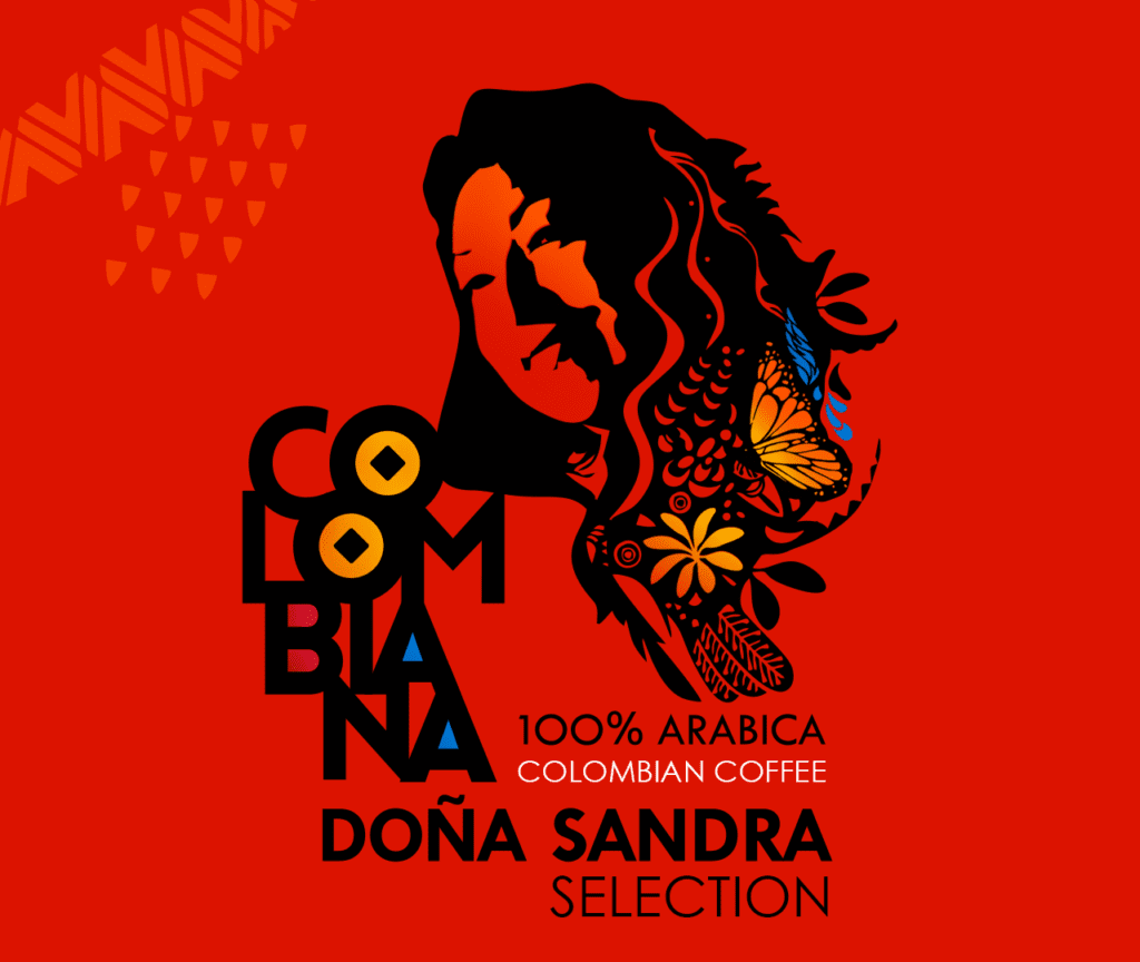
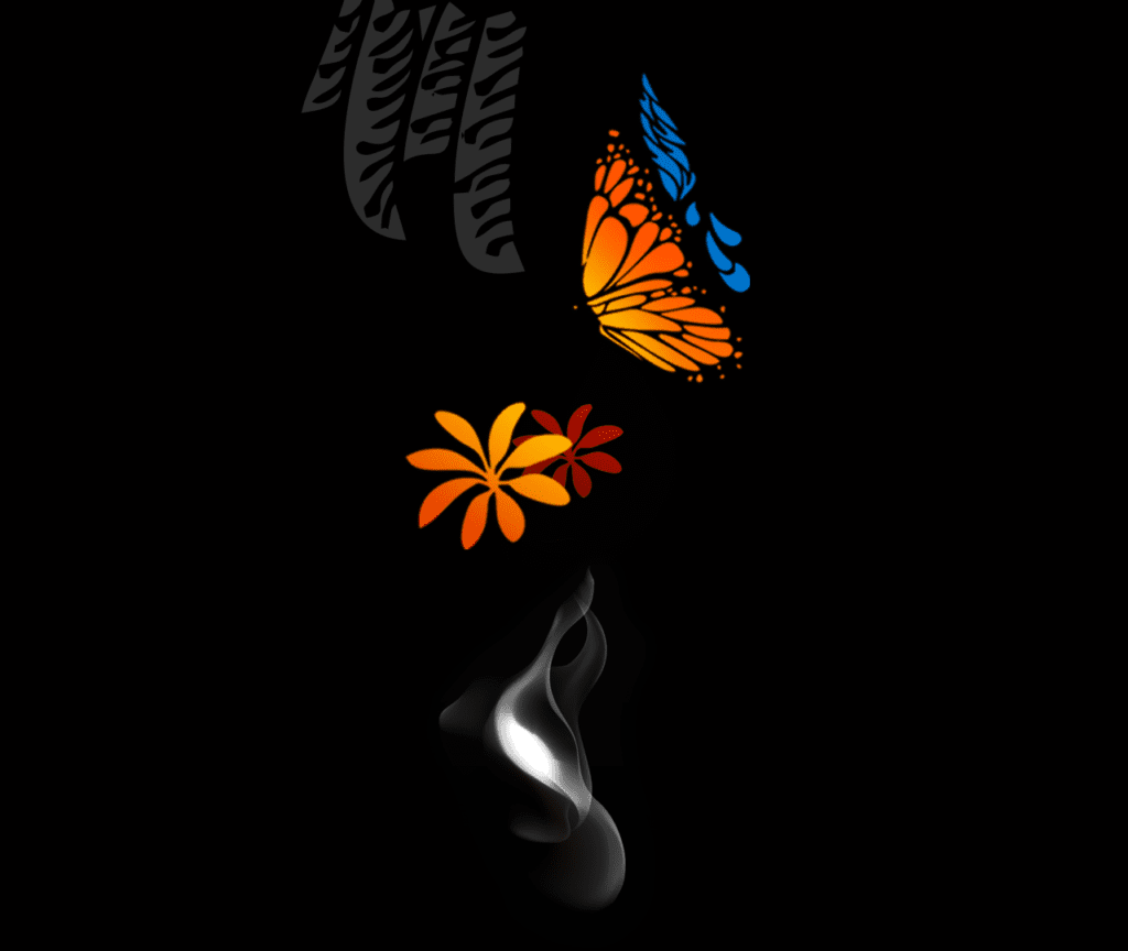
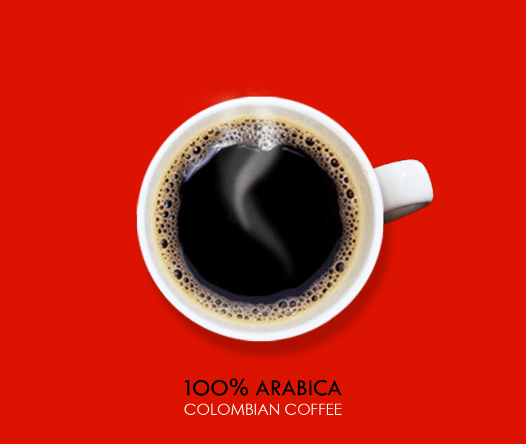
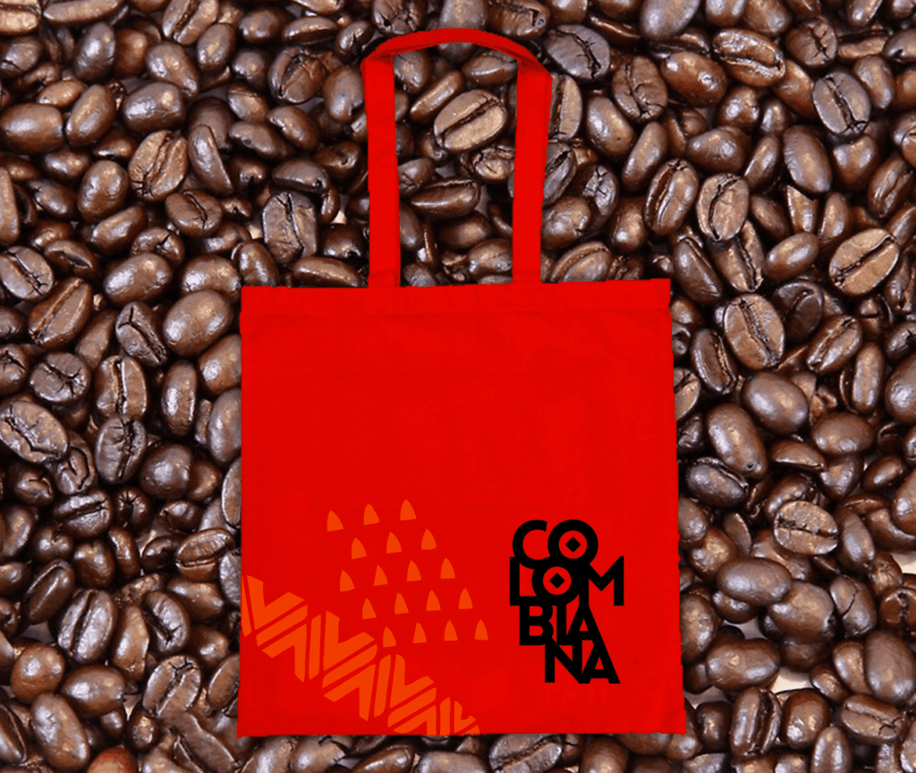
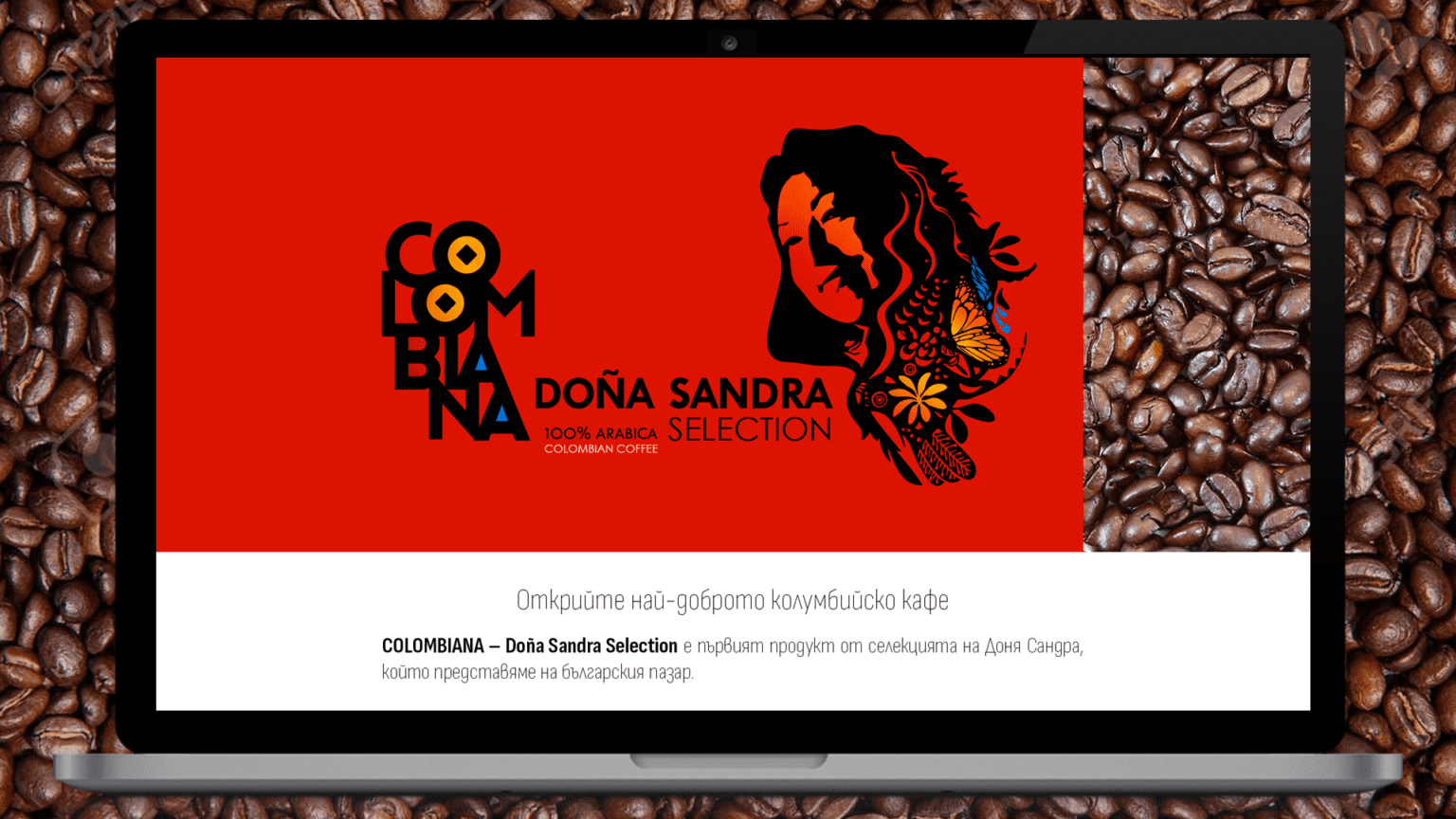
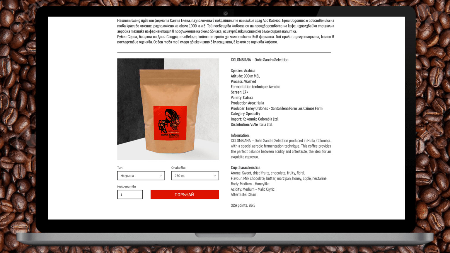
COLOMBIANA
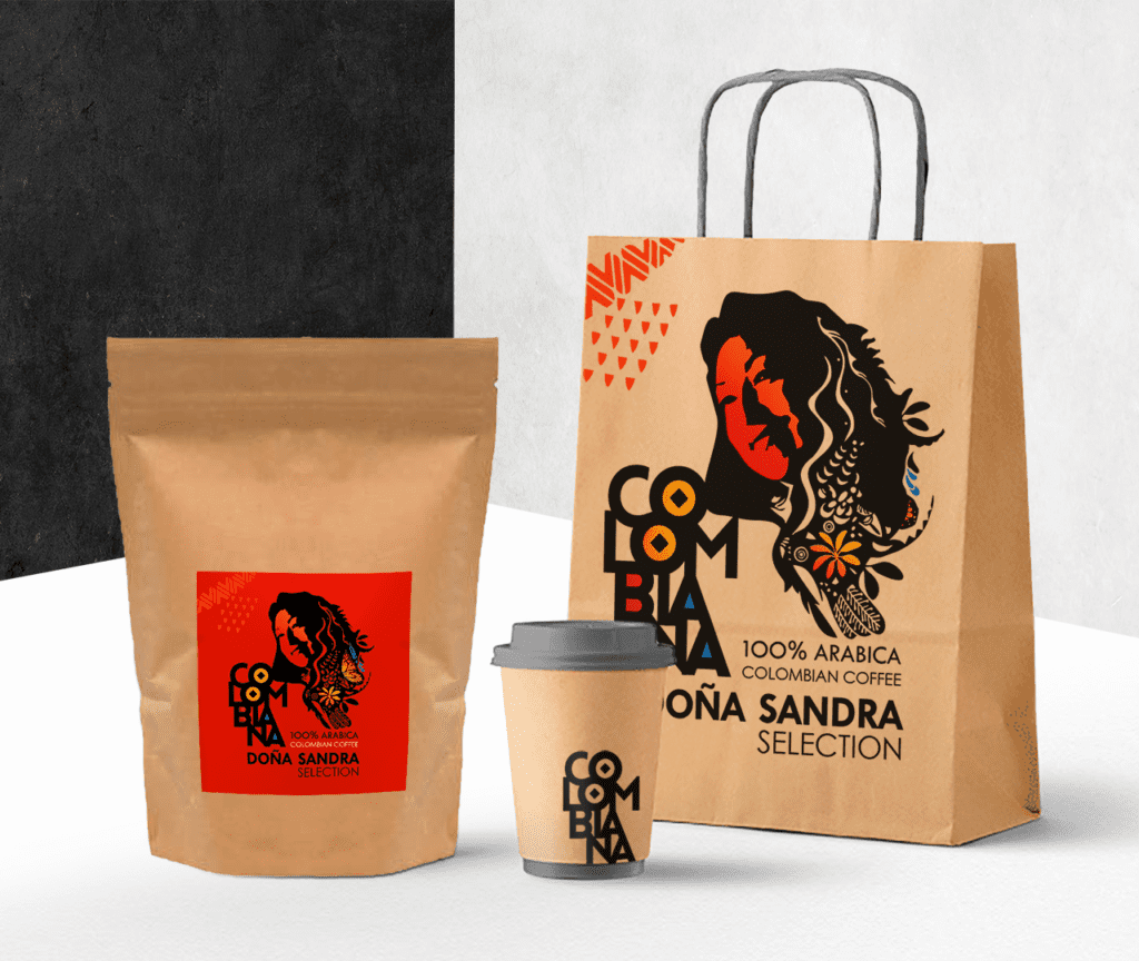
COLOMBIANA – Doña Sandra Selection is a completely new brand of high-end Colombian coffee, produced in Santa Elena Los Caimos Farm, which we are developing for the Bulgarian market.
Our work includes creating the brand – name, visual identity, as well as labels, packaging, promotional materials, digital marketing, promotional events.
Few countries are more famous for their coffee than Colombia. COLOMBIANA arrives from the Huila Department (Huila), a mountainous department located in the southwest of the country that produces 18% of Colombia’s coffee.
The real value of Huila is not only in the quantity of coffee, it lies primarily in its quality. In 2013, the Huila Department was granted the status of Designation of Origin for a product with unique characteristics specific to the location.Dominated by small producers who focus on quality rather than volume, Huila has much to offer coffee lovers. Huila coffees have a delicate profile, bright acidity, medium body, sweet, fruity and floral notes, and a caramel aroma.
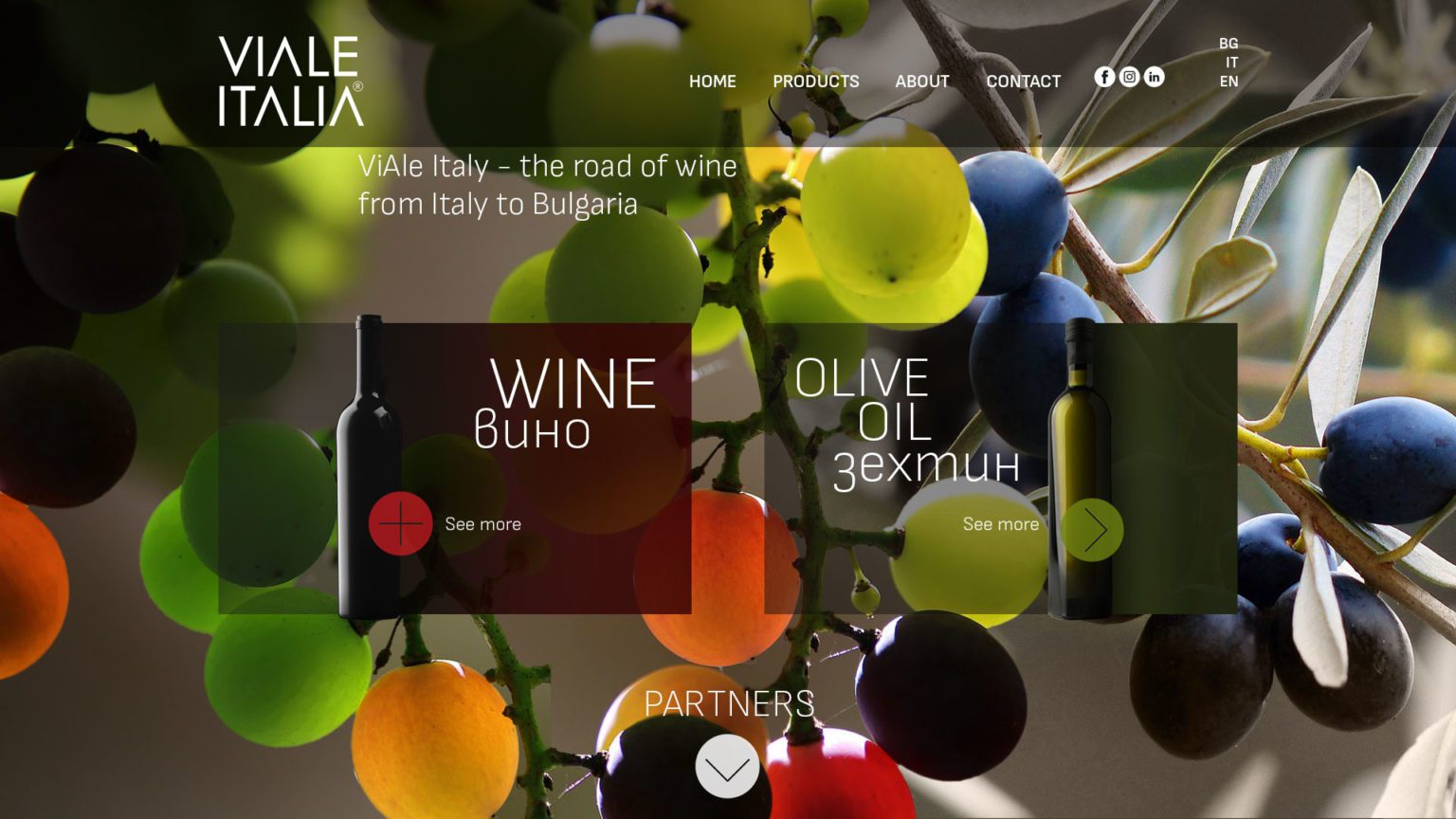
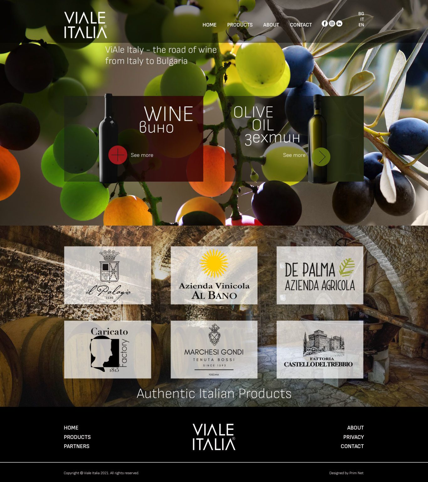
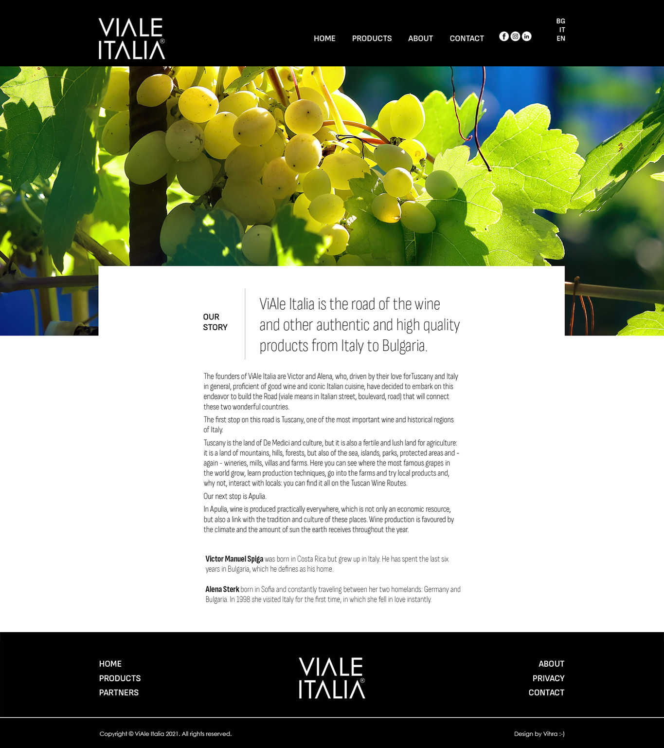
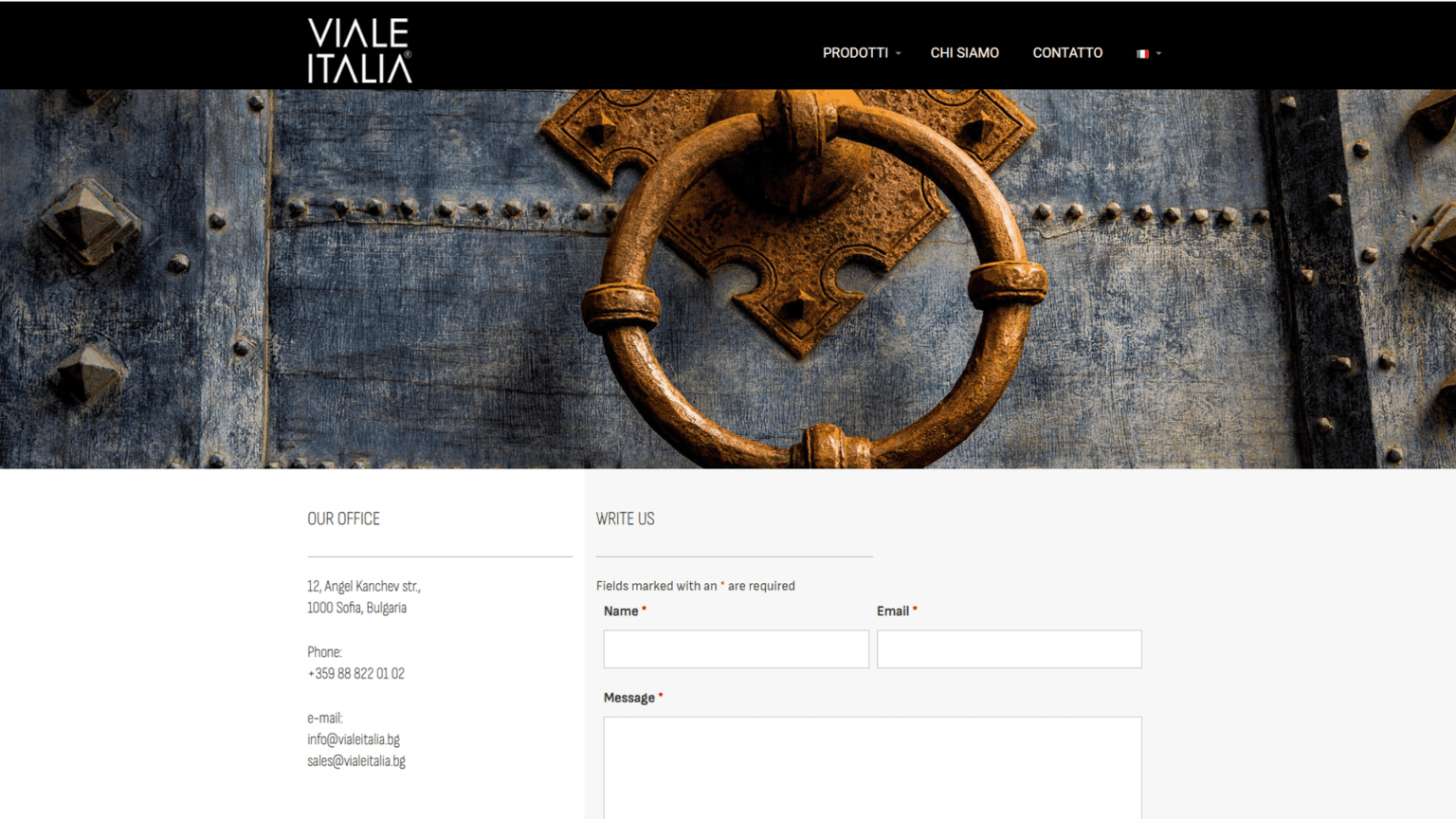
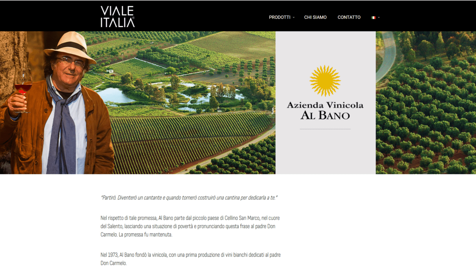
VIALE ITALIA
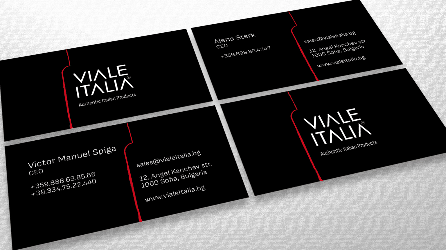
We started working on the website of a start-up company for importing authentic Italian products in Bulgaria. We have many challenges ahead of us, development of the full version of the website vialeitalia.bg, image materials and product catalogues…
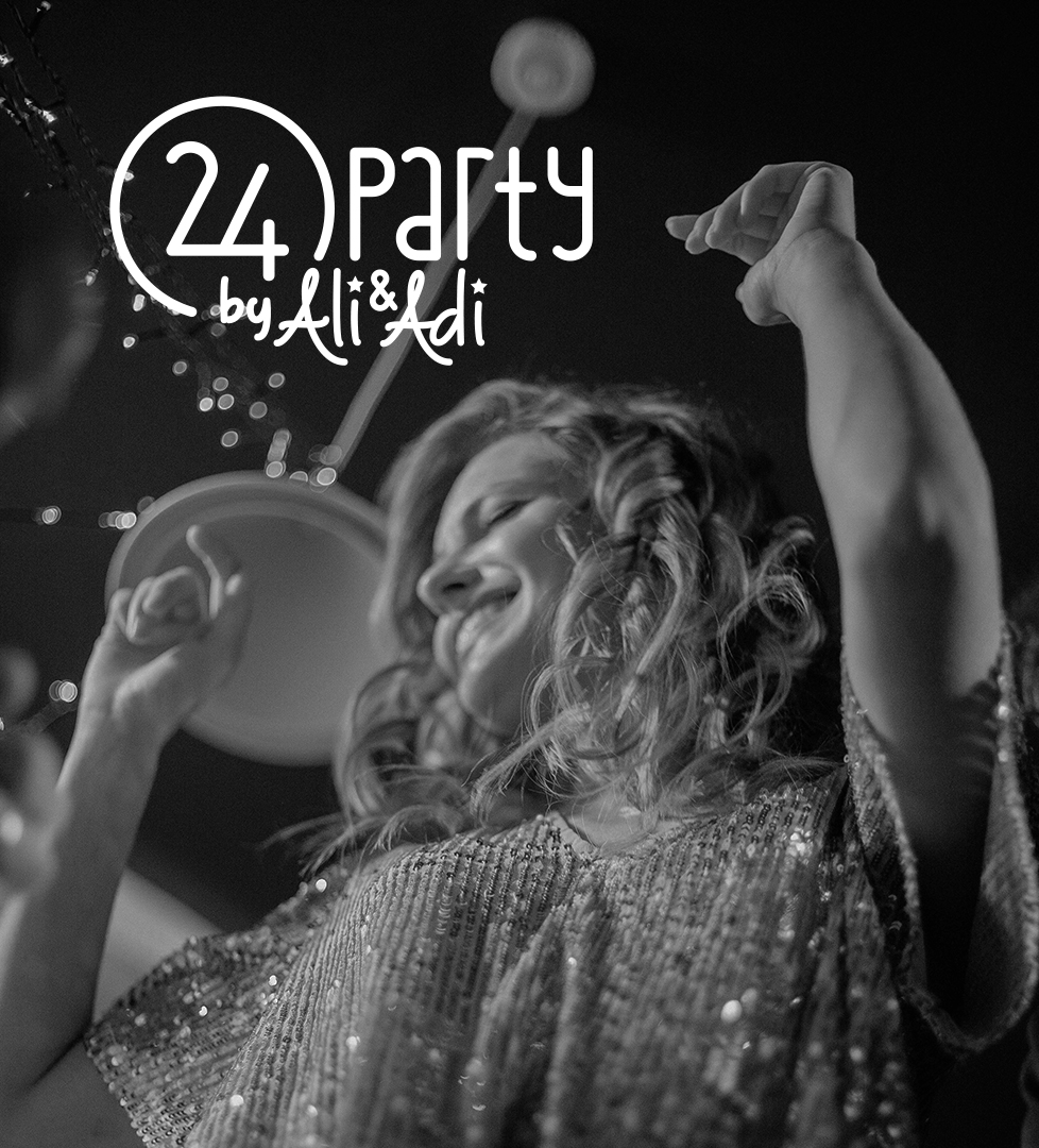
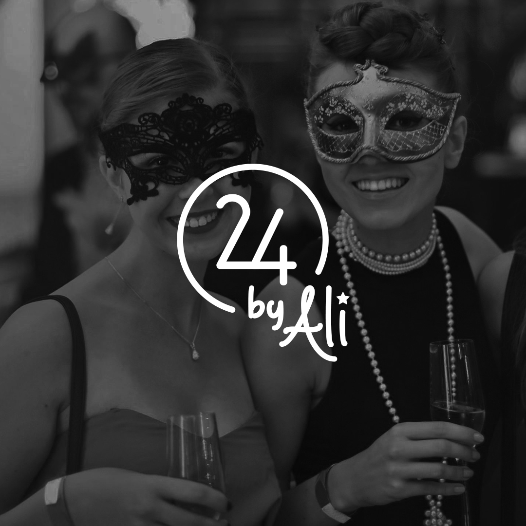
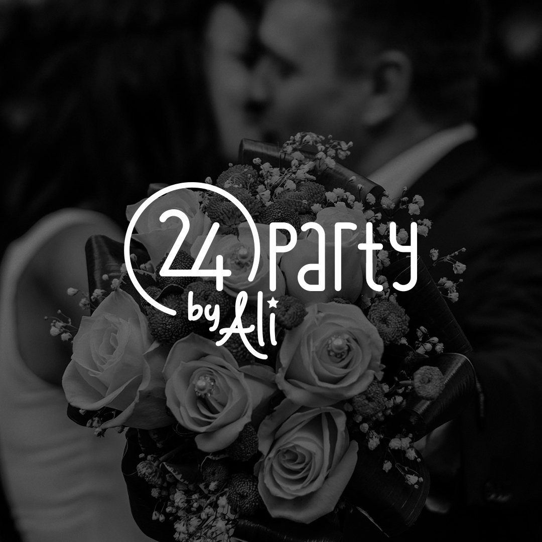
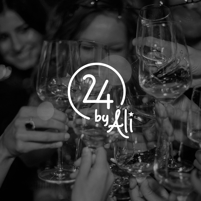
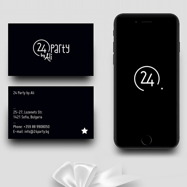
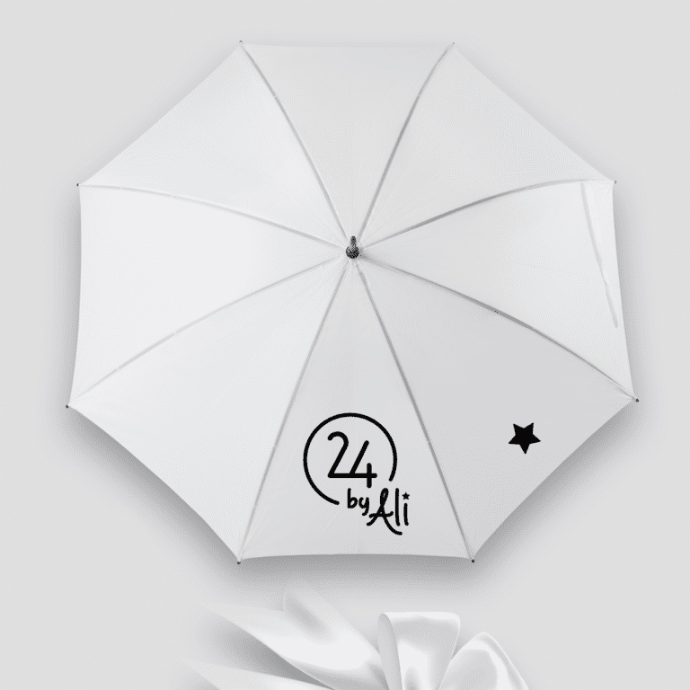
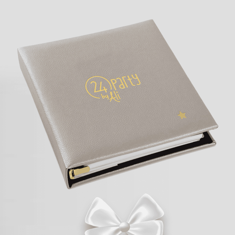
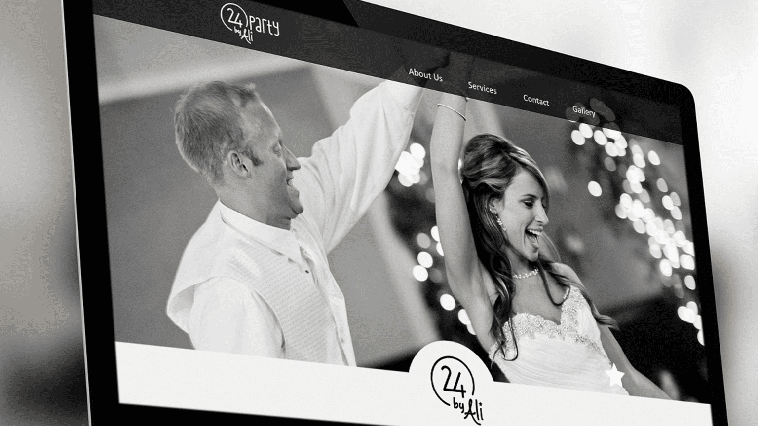
24 PARTY BY ALI
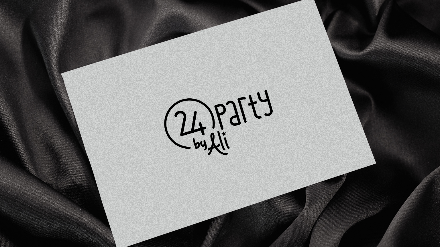
A fresh and youthful look was our goal when creating a logo for a new party agency. Simple and fun, the logo expresses the essence of the agency and its owners – young, successful professionals who organize your event with a smile while you focus on having fun.

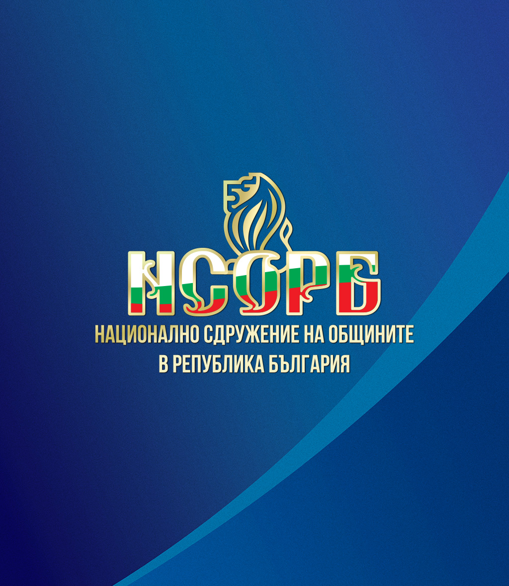
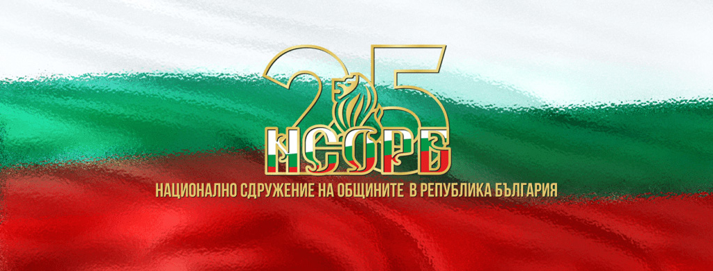
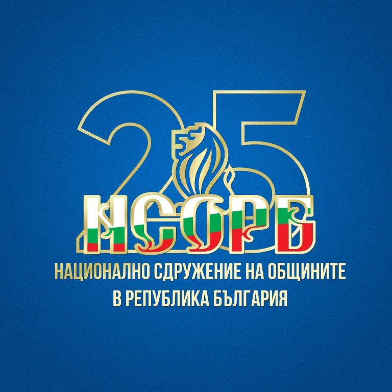
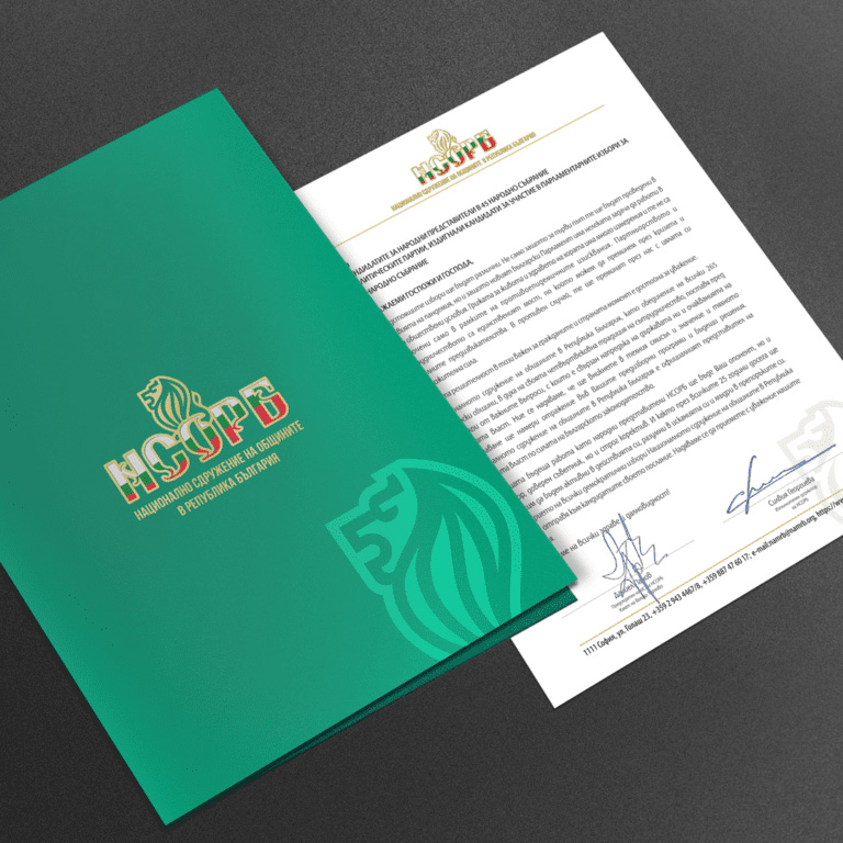
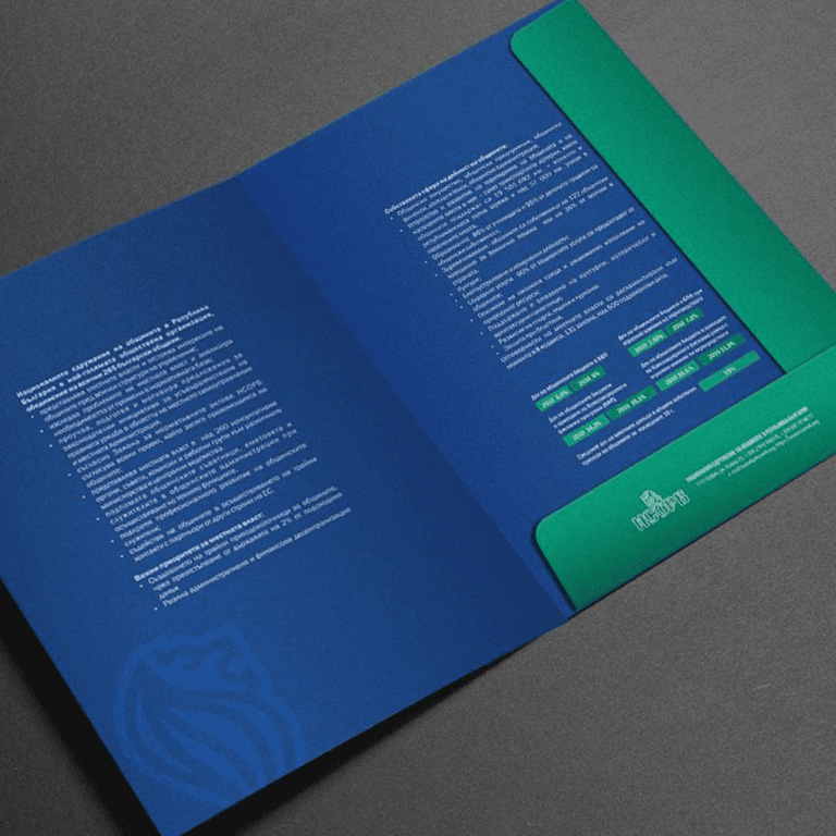
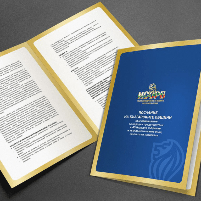
25 YEARS NAMRB
On the 25th anniversary of its founding, the National Association of Municipalities in the Republic of Bulgaria approached us for the design of all materials related to the celebration.
We made minimal changes to the logo, as well as a version with the number 25 to mark the anniversary. All the materials follow a common idea and color scheme - we combined the solemn gold in the logo with dark blue and turquoise green - calm, strong colors that symbolize success.