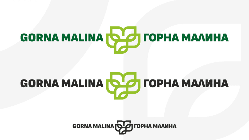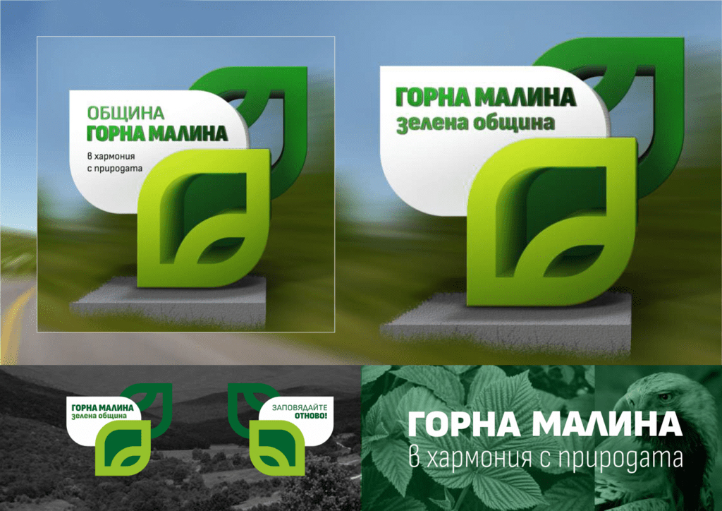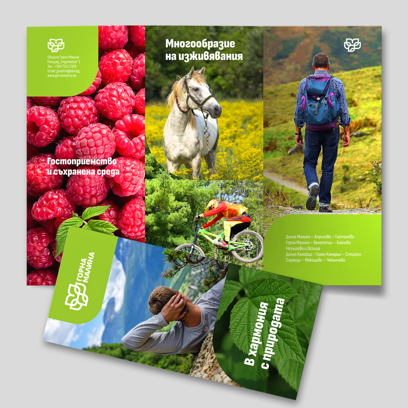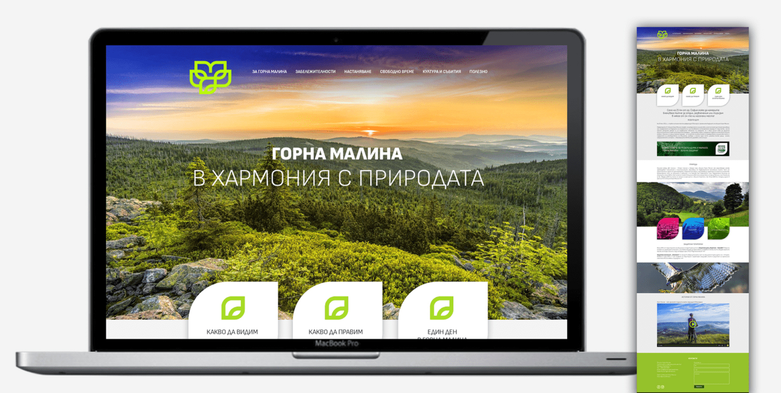
The proposed visual identity of the Gorna Malina Tourist Brand is based on the developed concept for promoting the municipality as a tourist destination. The graphic sign corresponds to the slogan "In harmony with nature" and represents stylized leaves, an absolute symbol of greenery, ecology, nature - all associations with the brand “Green Municipality”, which Gorna Malina is known for and with the opportunities for various activities in the region. The continuous line of semicircles and corners, brings together the stylistics on a modern drawing, elements of folklore motifs, the idea of new artistic experiences, as well as cultural and historical walking routes. Apart from the green leaf, the symbol of the majestic Imperial Eagle can also be found in the graphic. The area of Sredna Gora around Gorna Malina is one of the habitats of this beautiful bird part of the worldwide endangered species list. The final shape at the top incorporates the first letter of the region’s name - Malina and helps visualise the region as the green gem huddled between two majestic mountains.
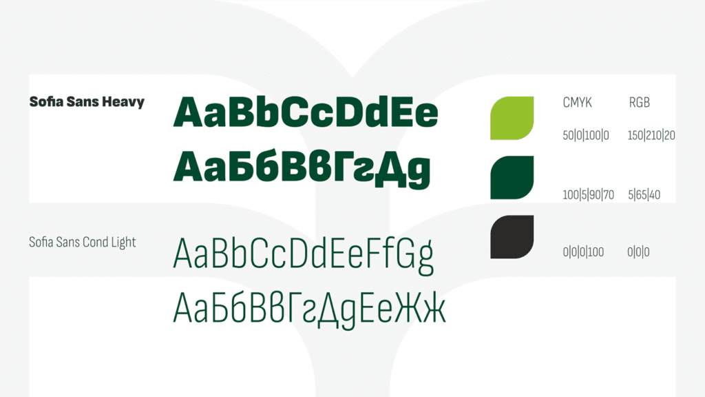
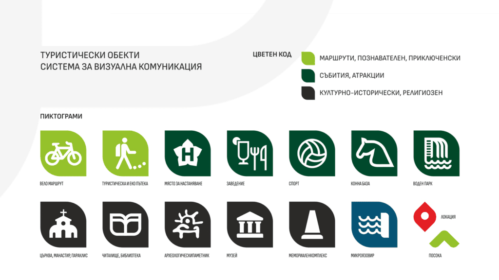
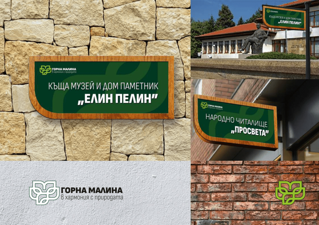
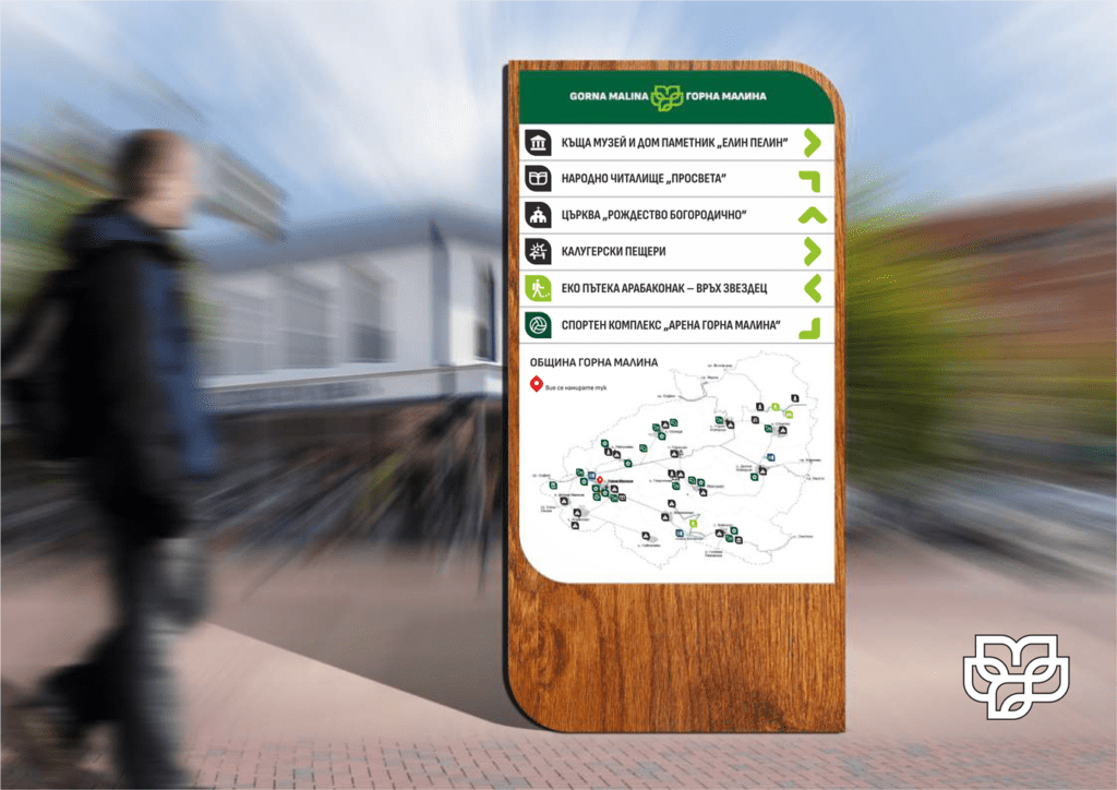
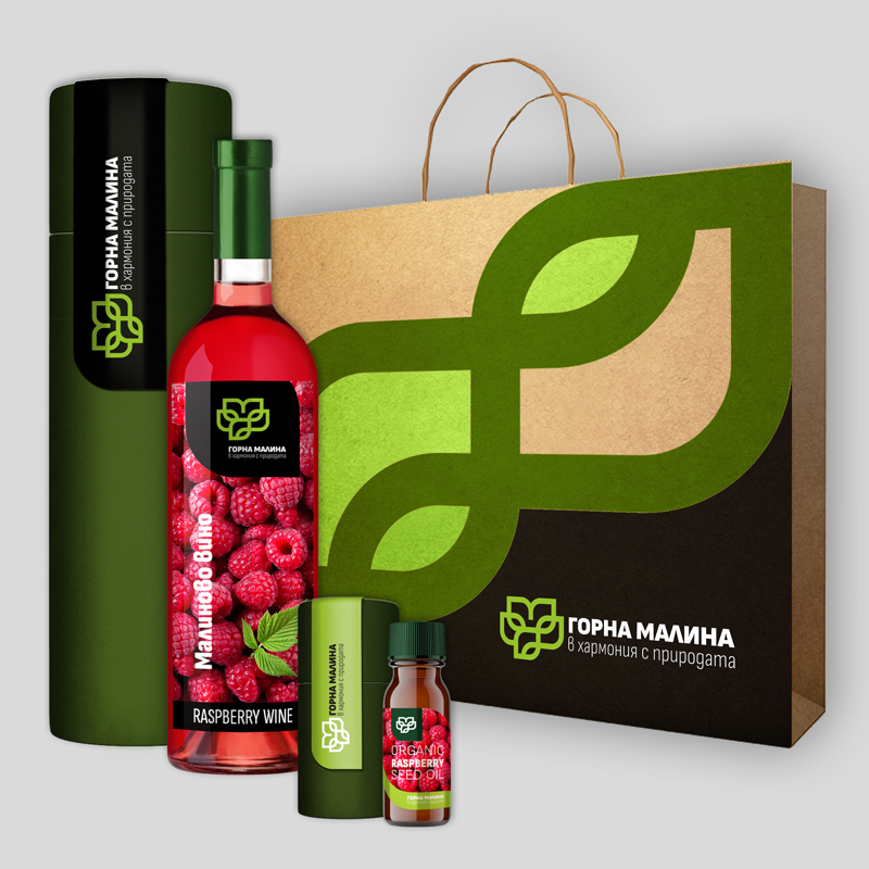
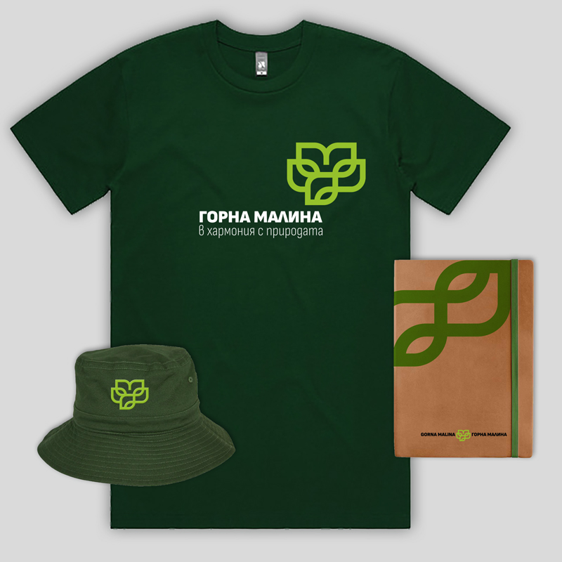
The incorporated fonts are from the Sofia Sans family, sporting a clean design in sync with the logo, Bulgarian form of Cyrillic and variations from Ultra light to Heavy, can be adapted for many different applications. In addition to the trademark [logo], the project also includes a visual communication system, icons and pictograms developed in the style of the logo, templates for advertising materials, souvenirs, design of a tourist website and outdoor advertising.