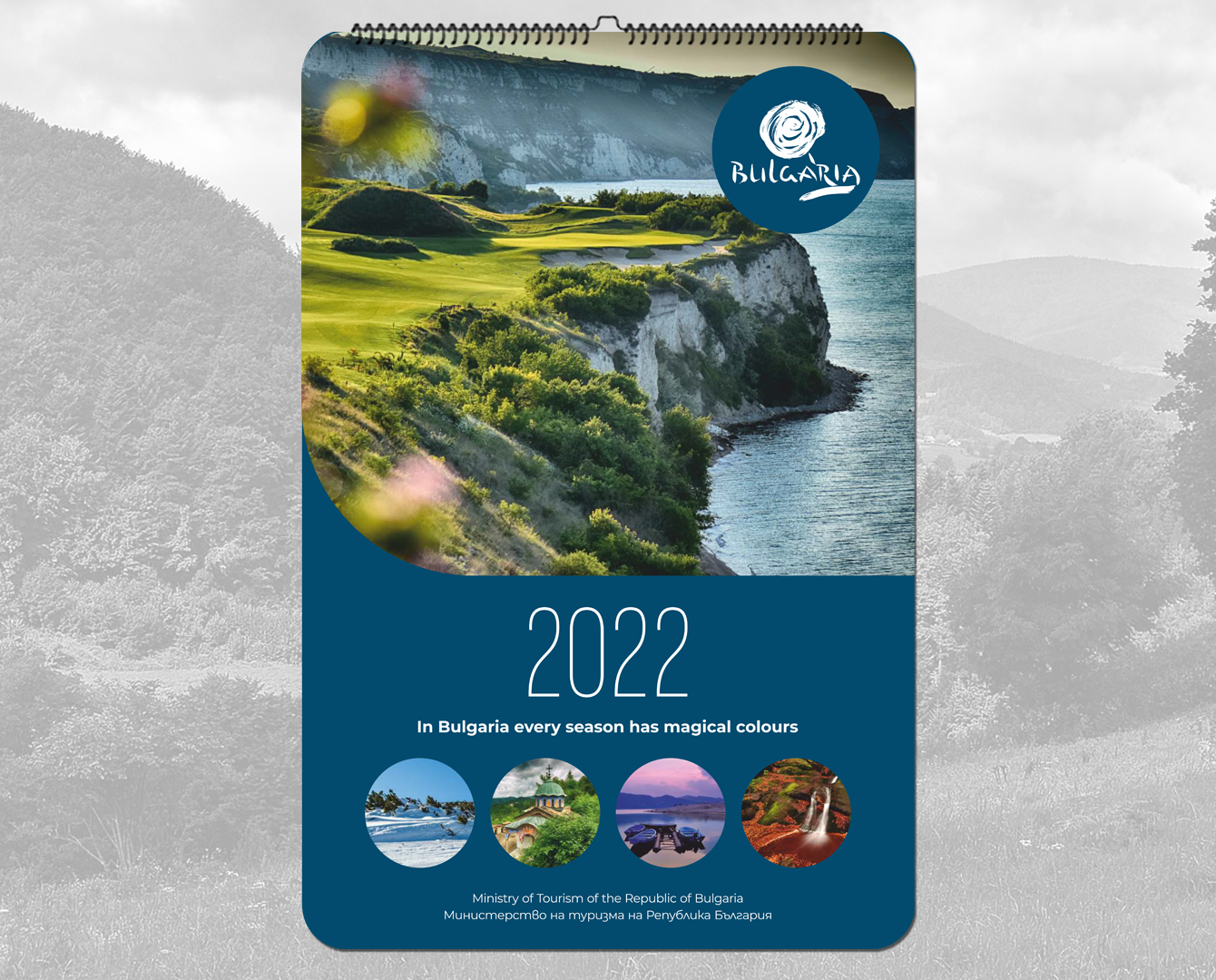
Luxury 14-page calendar for the Ministry of Tourism
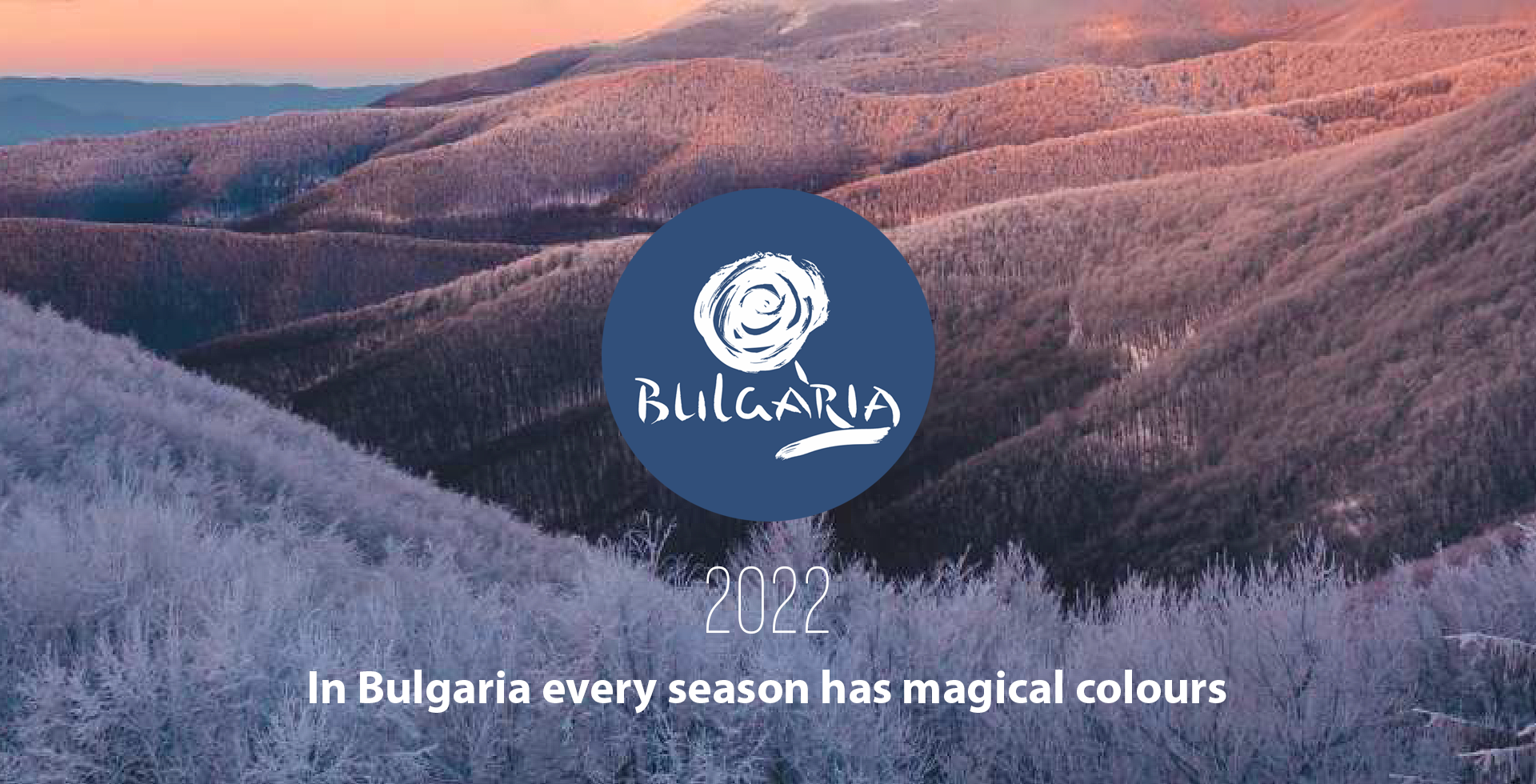
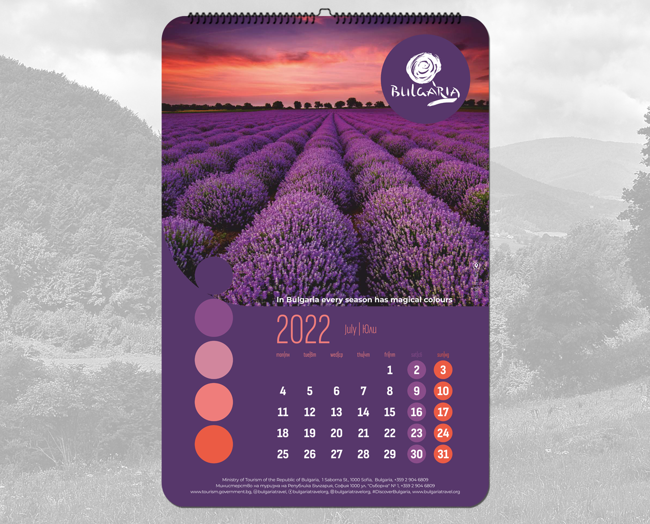
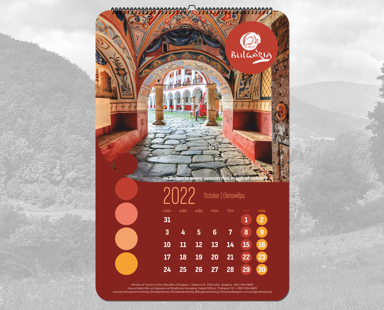
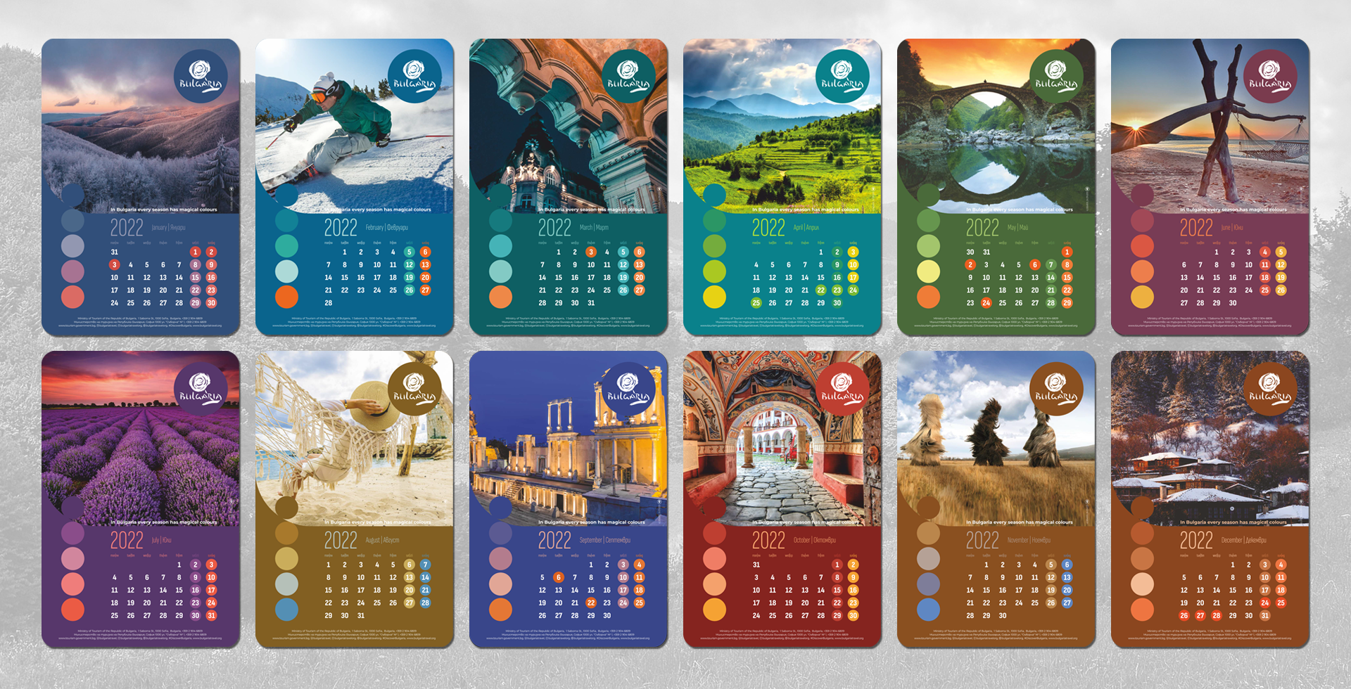
The concept of this project is based on the idea of the diversity of natural resources and opportunities for experiences in Bulgaria in each season.
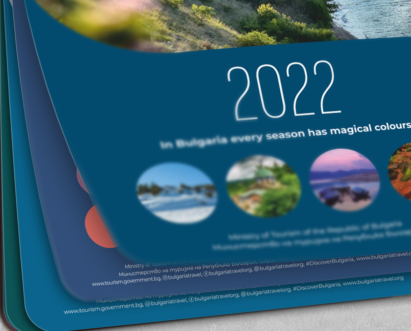
Each month has its own palette, each colour we use in graphical elements or text, is derived from the main composition to immerse the page in its own harmonious space. The colours are inspired by nature – soft terracotta, deep turquoise, or green shades for a calm and comforting sensation, combined with fresher and richer colours for accents and playfulness. This softness continues logically in the rounded corners of the pages and images to give a finished look to the feeling of warmth and hospitality. The fonts in the calendar are elegant and legible, continuing the same style with their smooth lines.
We envisage printing on thick, matte paper with partial varnish on each page on the logo of Bulgaria, the cover photos symbolizing the four seasons, as well as on the coloured dots that define the palette. And since the main purpose of a calendar is to be functional, in addition to decorative, we included a calendar for next year – a useful addition for anyone who makes long-term plans for their business trip or vacation. https://www.tourism.government.bg
