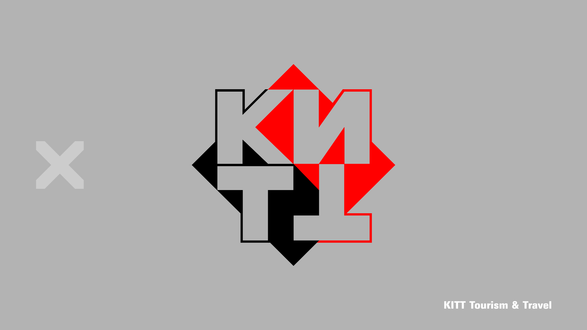
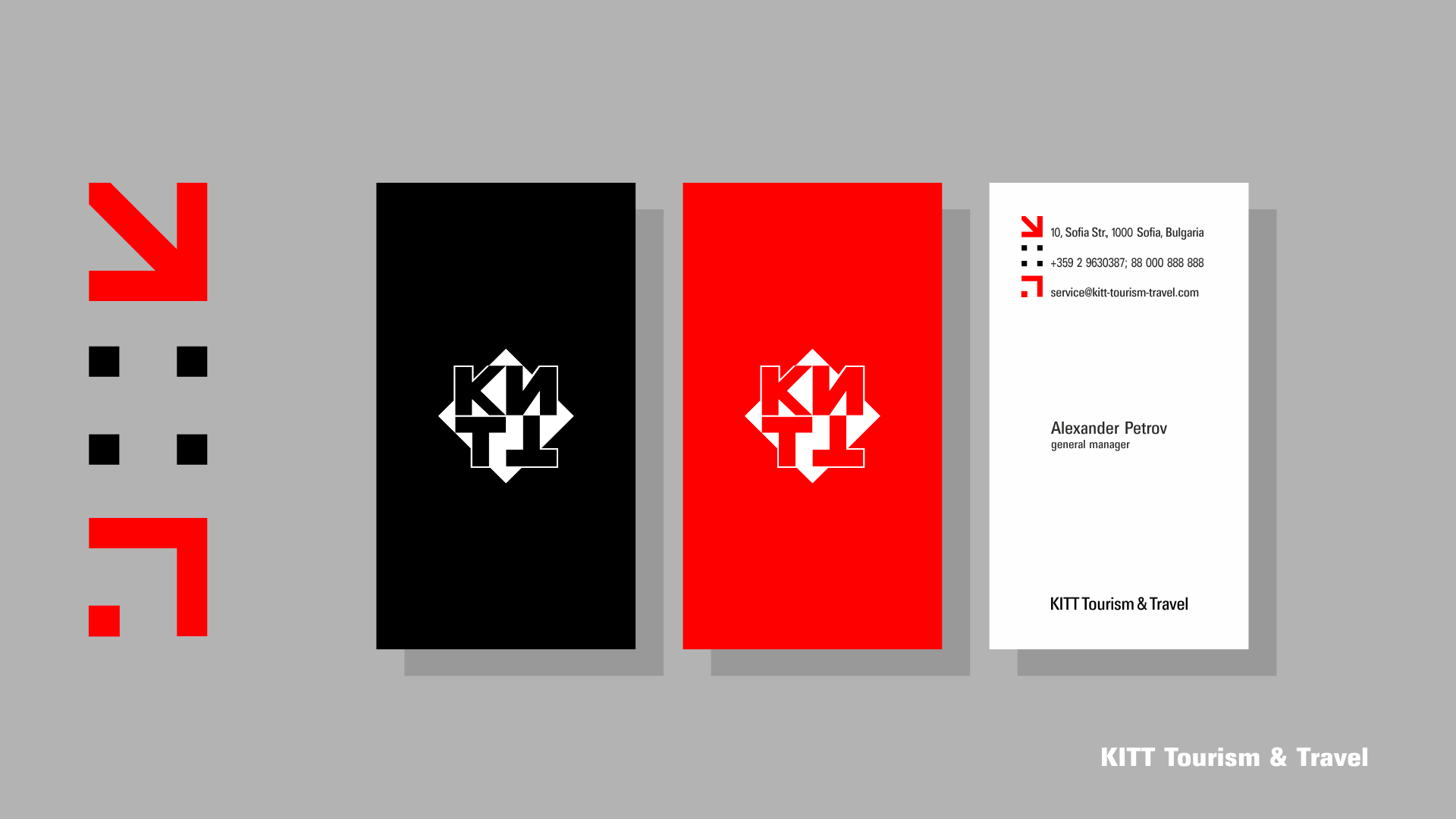
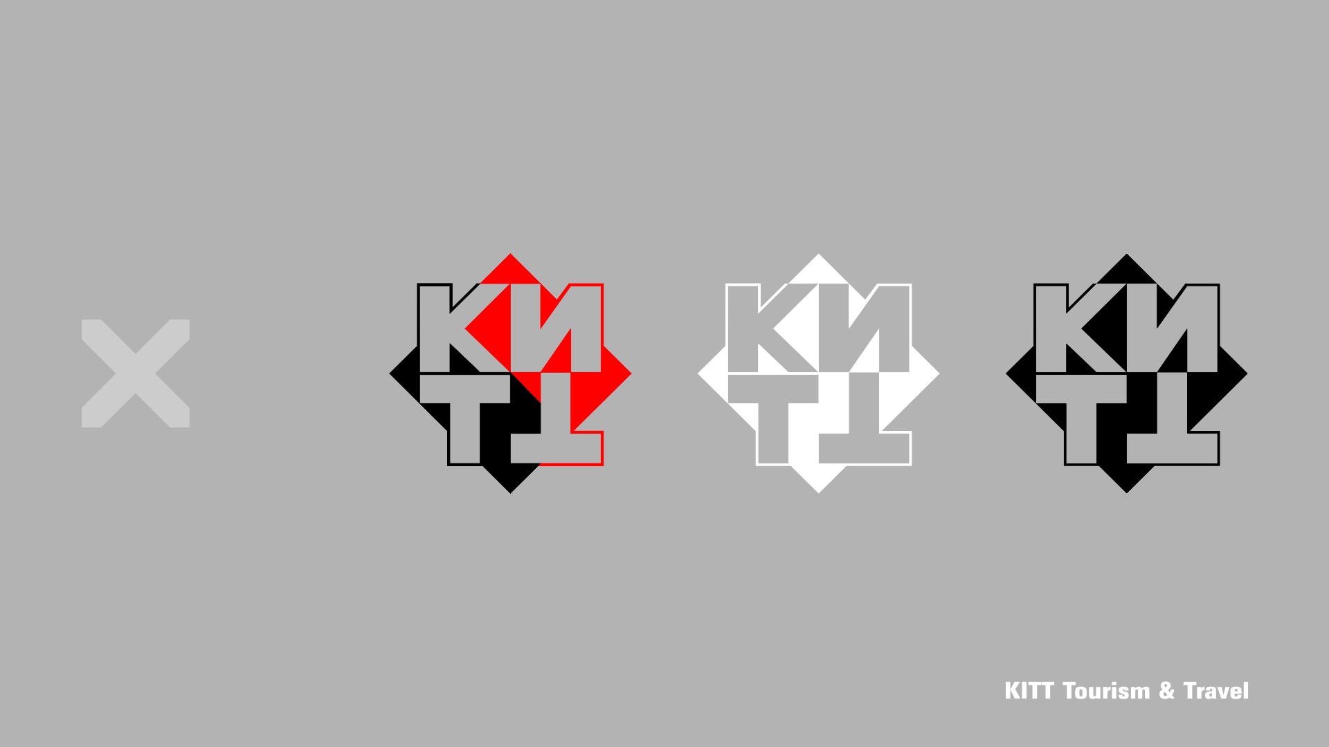
KITT - Tourism Consulting Agency Logo design


The company name/KITT/ challenged us to use a minimal design aesthetic and combine the right angles of the letters with the sharp angles of the rhombus, making the brand monolithic without feeling static.
The use of the primary colors red and black is rather conventional. The main idea is for a monochromatic sign, which besides a name carries a sense of stability and professionalism.
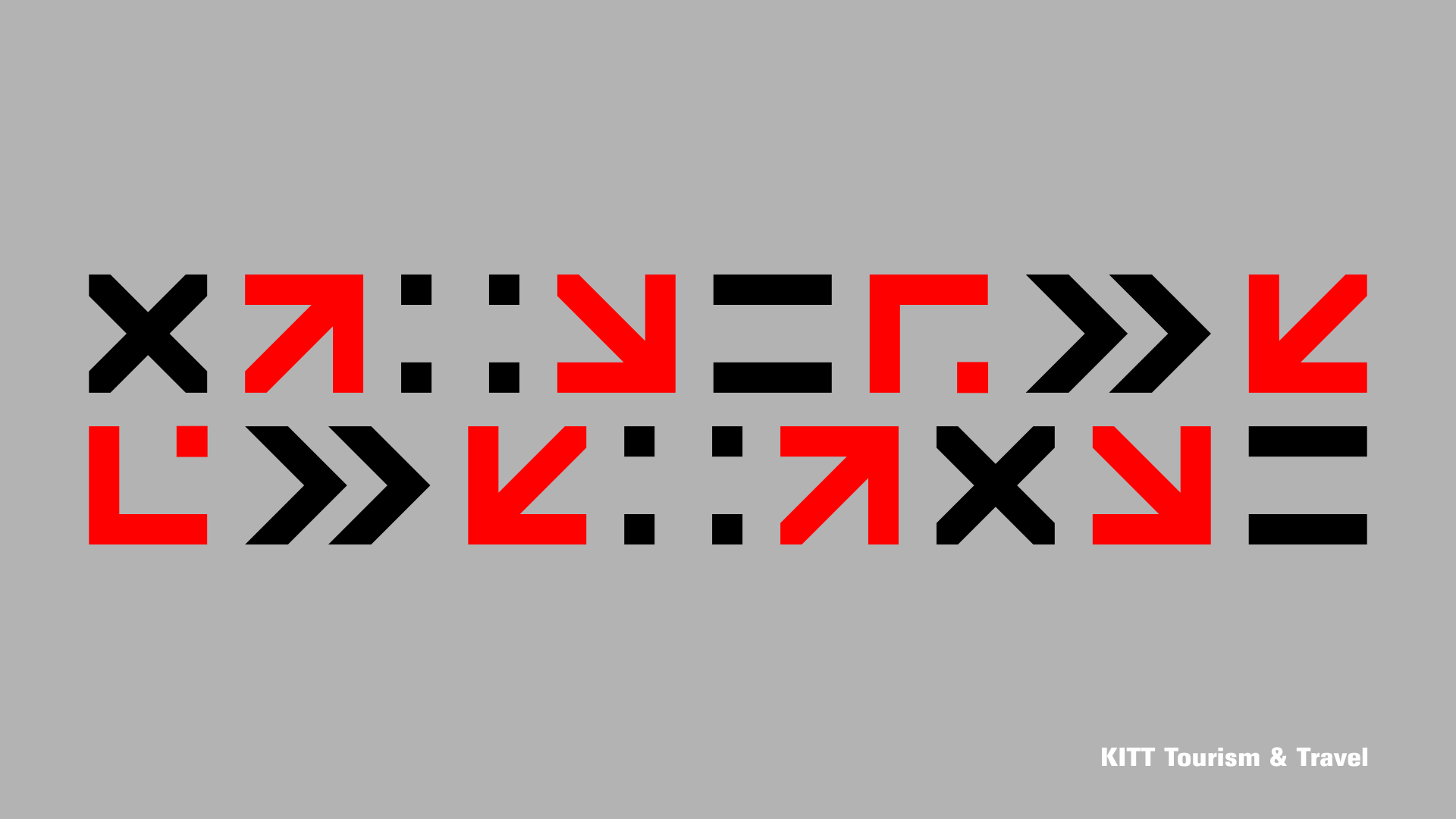
We have created a simple graphic system of geometric elements that allows evolution and can be used in the different company’s activities.


