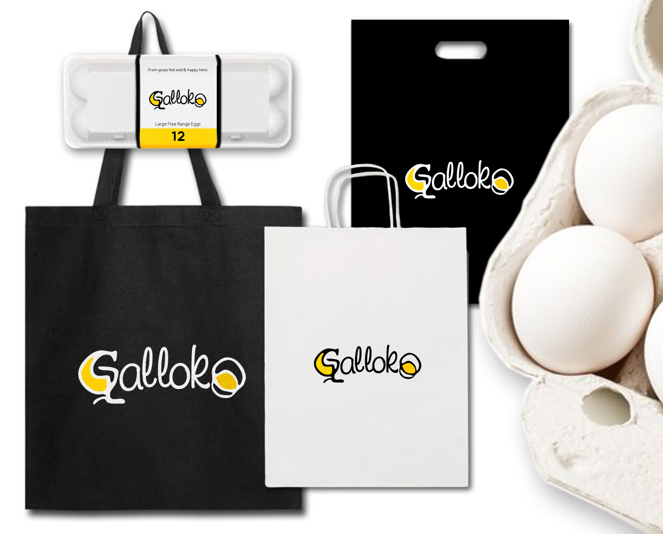
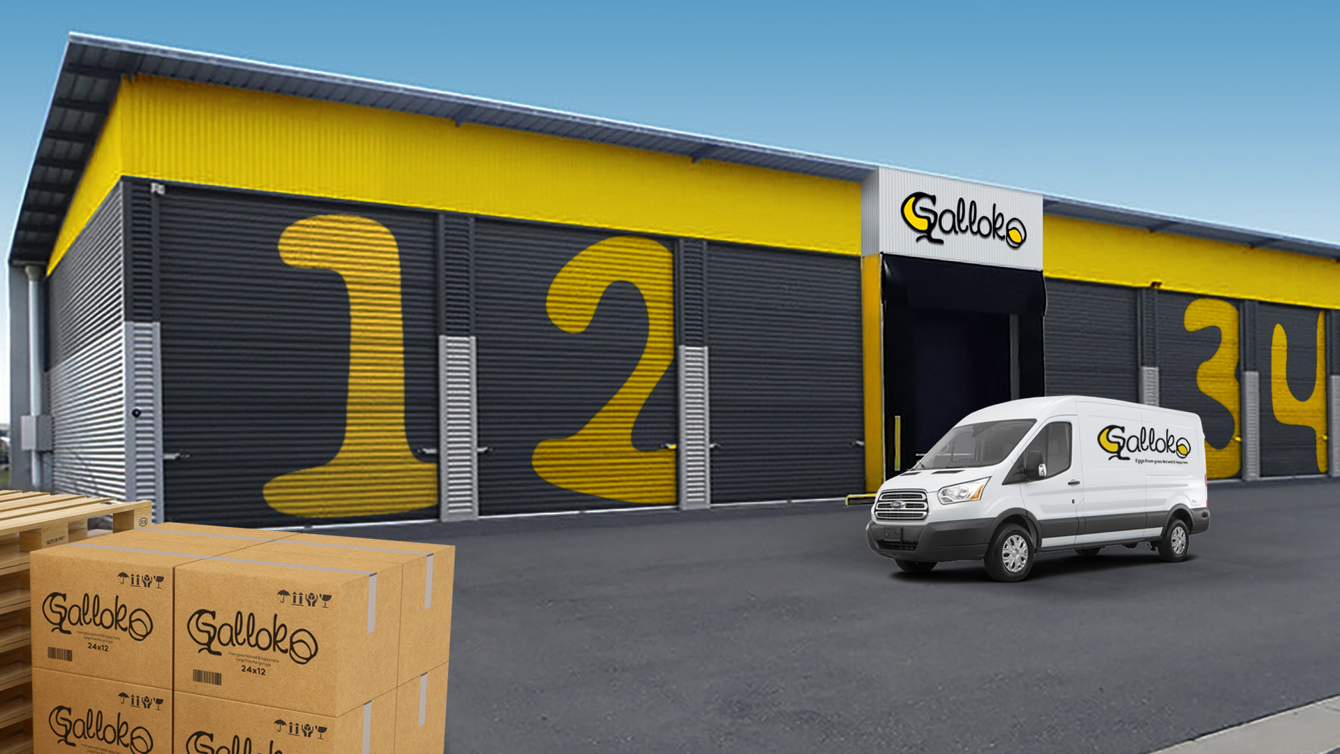
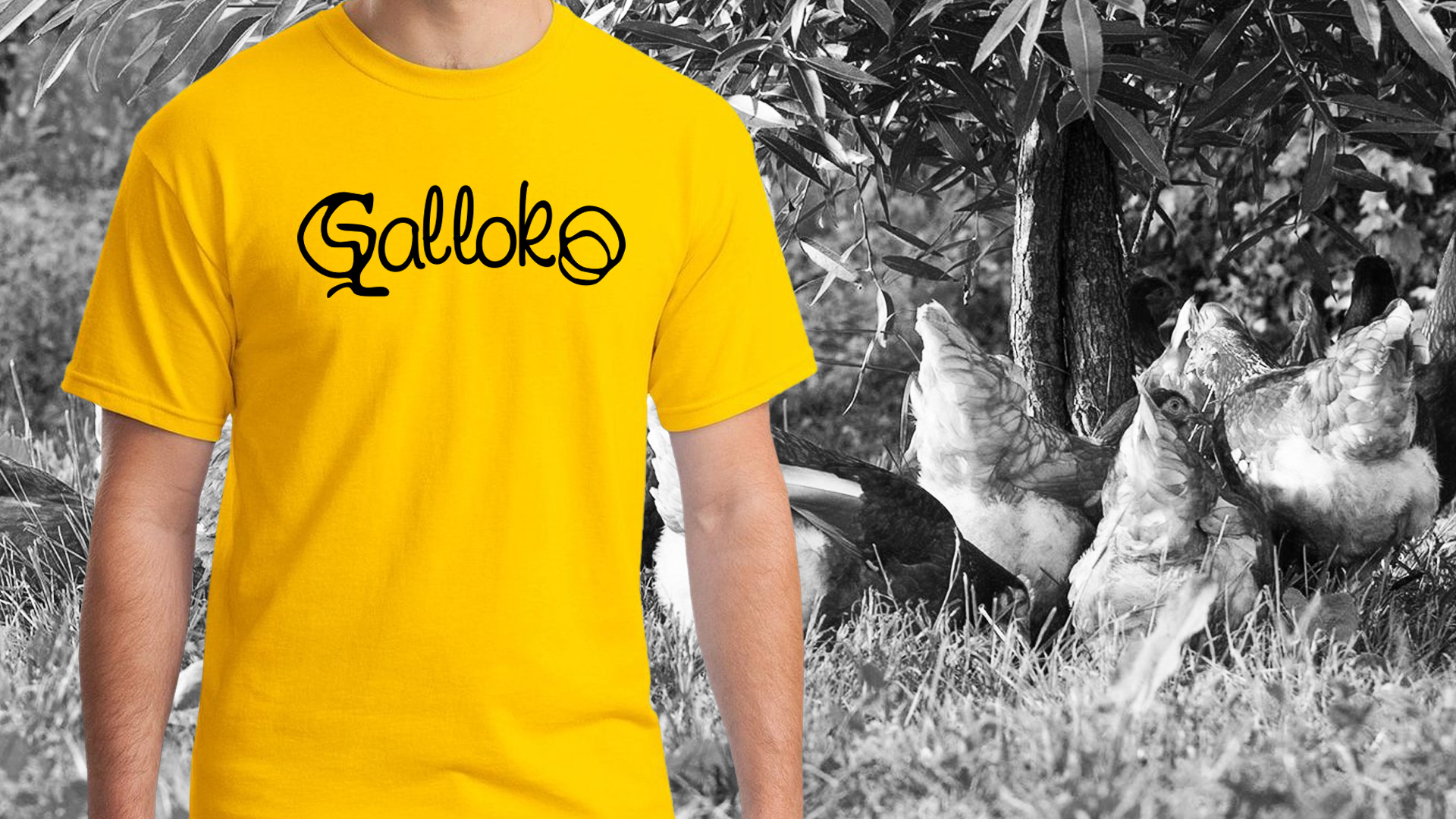
The Brand Identity project for this modern poultry farm started with the name – we proposed a word derived from the Latin name gallus (rooster) and the playful Bulgarian word “koko” used for egg or chicken. The name GALLOCO is a wordplay, simple, memorable, and appealing to the senses. This friendly, joking spirit spreads to the logo with the free, cartoonish lettering and the idea of a stylized bird in the first letter G. The colour scheme in black, white and yellow is vibrant and effective, with a direct association to the egg inside. The packaging series, the branding of the production facility and all the complementary materials maintain the clean design as a symbol of modern, sustainably produced clean and healthy food of GALLOCO.