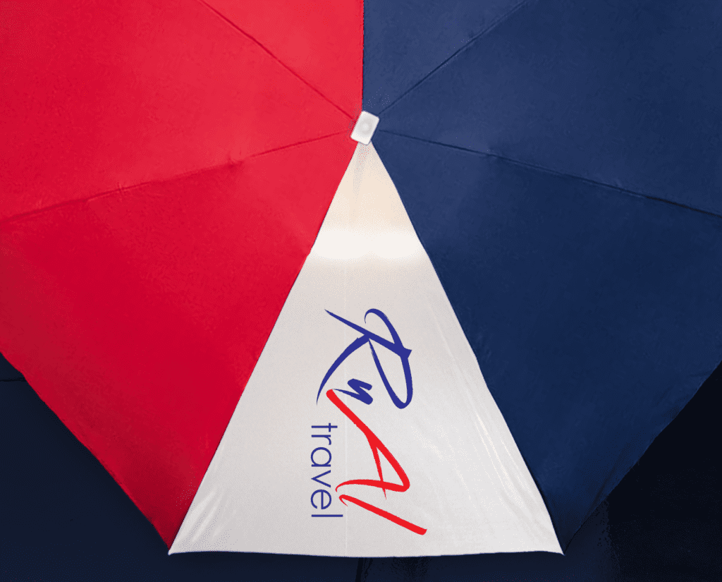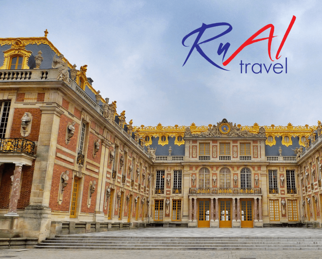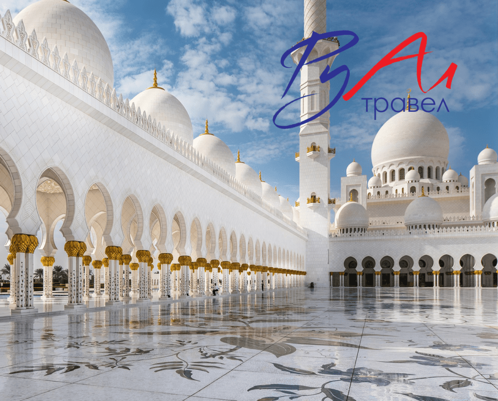
The challenges of the commercial world and the rising customers’ expectations were at the heart of the redesign of the visual identity of Rual Travel Agency. We created an elegant simple logo that appeals to a very wide range of people. A logo that helps clients to understand the company's core message - we are classic, yet contemporary. A logo that can be used across a wide range of media, whether it's a small icon on a mobile app, a large billboard, office branding or exhibition stands.We chose French Kiss as the main typeface because it reflects the spirit and philosophy of the agency - it's elegant, dynamic and communicates a sense of momentum and journey. The colors used of Rual travel agency are contrasting and emphasize the emotional connections the agency is looking to make with its clients.