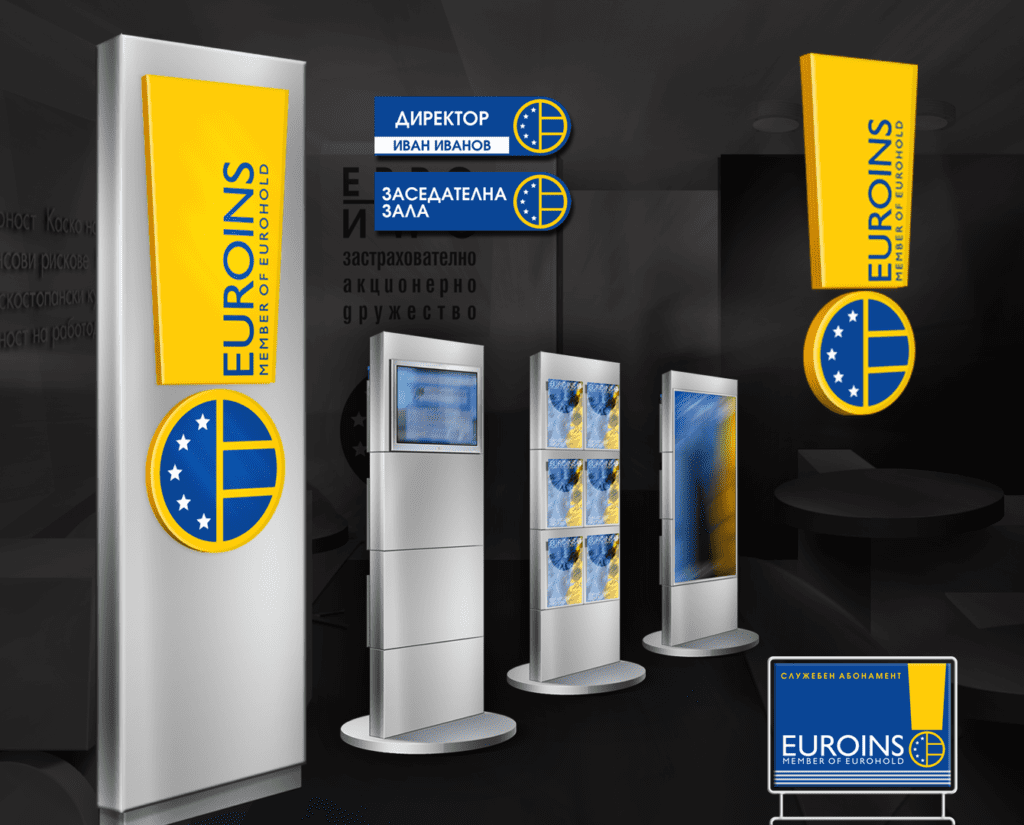
The new corporate branding of Euroins is based on a new graphic sign added to the company logo. This sign helps for creating a striking and highly distinctive new company image. "The Euroins 'medal' or 'exclamation mark' - depending on how your imagination reads it - has been designed to meet a few basic conditions:
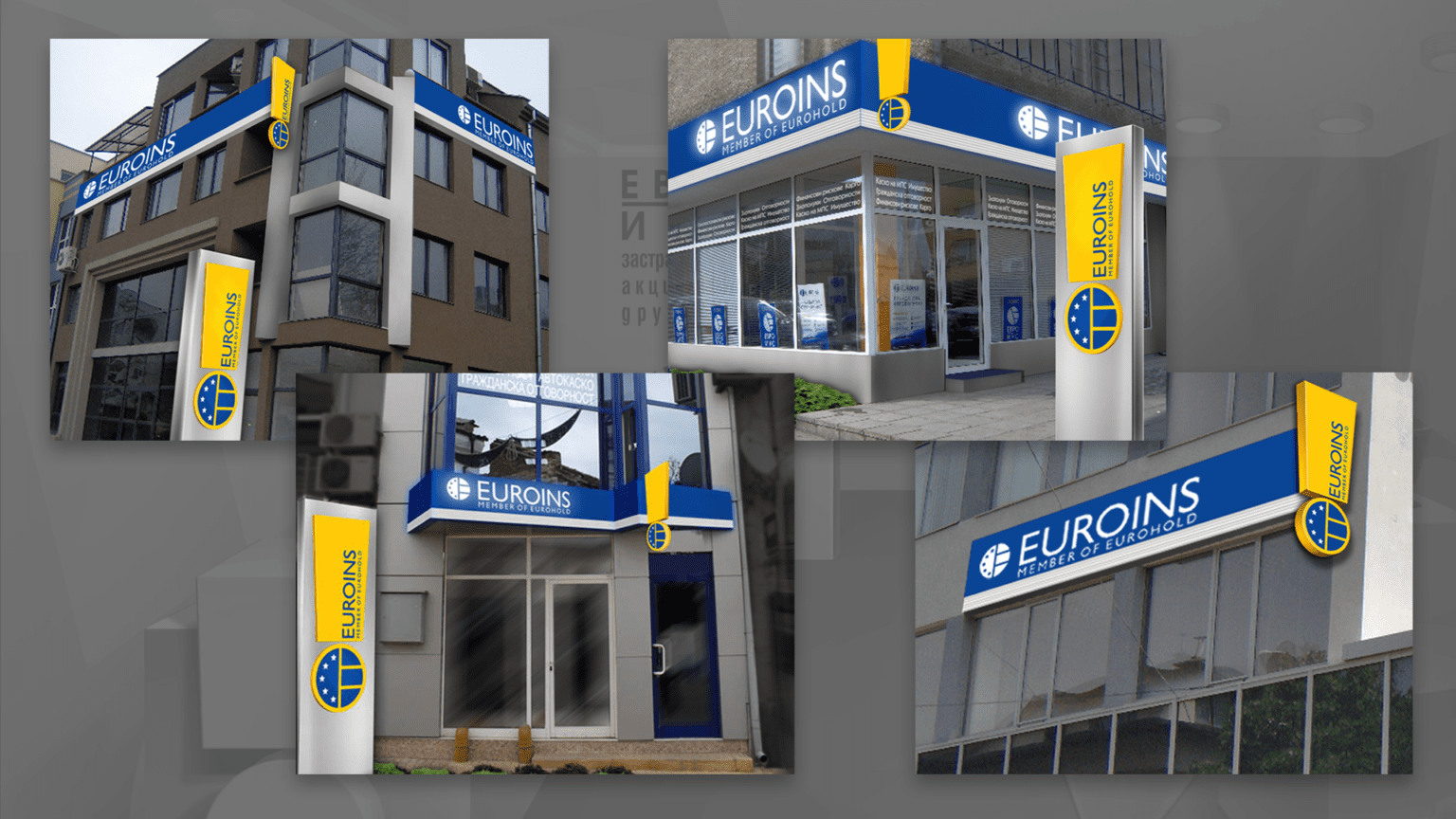
To be radically different from the signs of current and potential competition To be clearly visible even in the visually overloaded "noise" urban environment, among the many different signs, illuminated labels and all kinds of advertising boards To embody the modern and innovative approach of Euroins.
The design solution aims to make the Euroins offices easily recognisable and more attractive, to express the security and reliability of the company, without compromising the functionality and convenience of the offices.
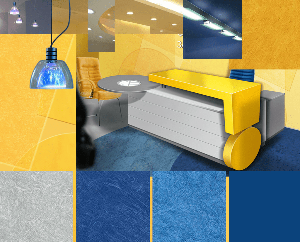
The individual design elements in combination with the corporate colours are repeated, in different compositions, in interior and exterior solutions, in advertising panels and displays, even in furniture and flooring. In this way, the offices are used as another way to say "Euroins is a reliable and secure company, modern, developing, secure about its future."