
Chiprovtsi is a small town in north-western Bulgaria. Surrounded by the picturesque hills of the Western Balkan Mountains, the town retains an incredibly authentic atmosphere. Our main objective for this project was to develop a common visual identity as a base for building a resilient brand for the tourist destination Chiprovtsi. The cultural, historical, and natural heritage of the town is the basis of the brand and the graphic symbols in the logo:- Chiprovtsi carpets – this is one of the symbols of the town of, the Chiprovtsi carpet tradition is recognised by the UNESCO World Heritage List.- The Balkans with the Three Hammers – the surrounding mountain landscape with its three characteristic peaks.
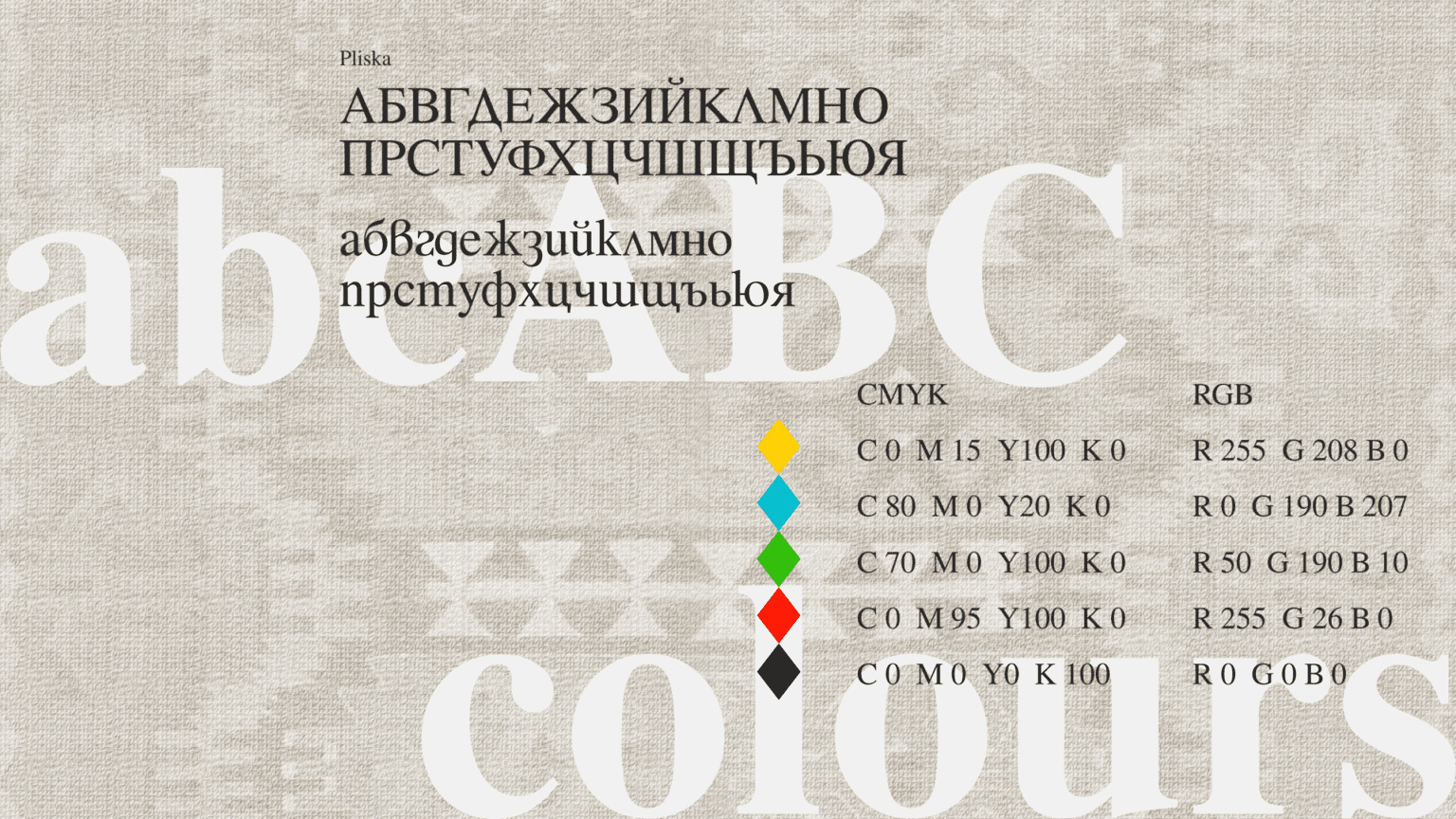
The colours used are drawn from the most popular motifs of the Chiprovtsi carpets, including a specific red that appears in the coat of arms of the municipality. The colour scheme incorporates perfectly with the slogan “Colours from Bulgaria” The font used is Pliska – classic, serified, corresponding to the local artistic culture and traditions, while at the same time easy to read.