Visual Identity Project of ppIANISSIMO International Festival of Contemporary Piano Music
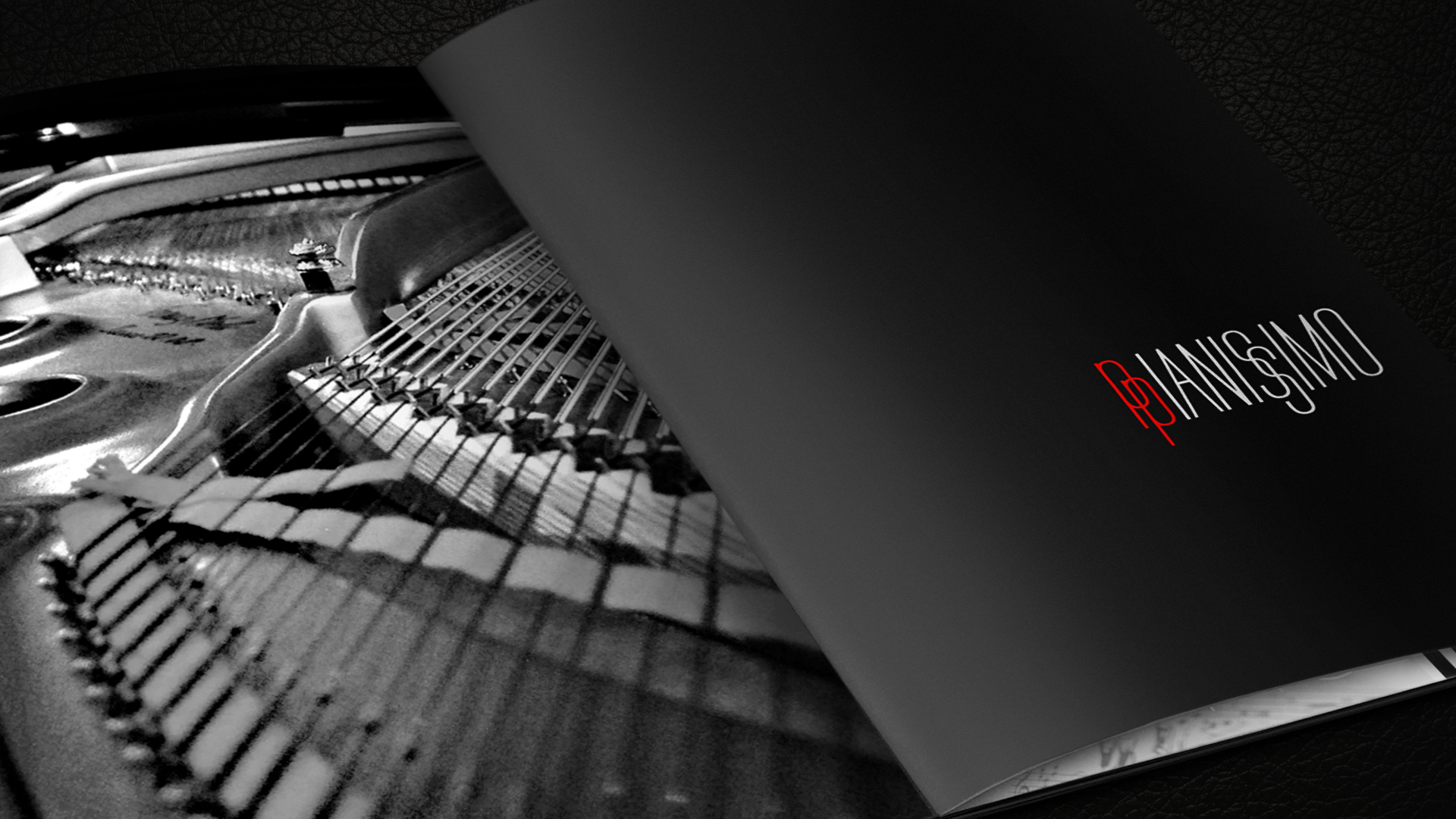
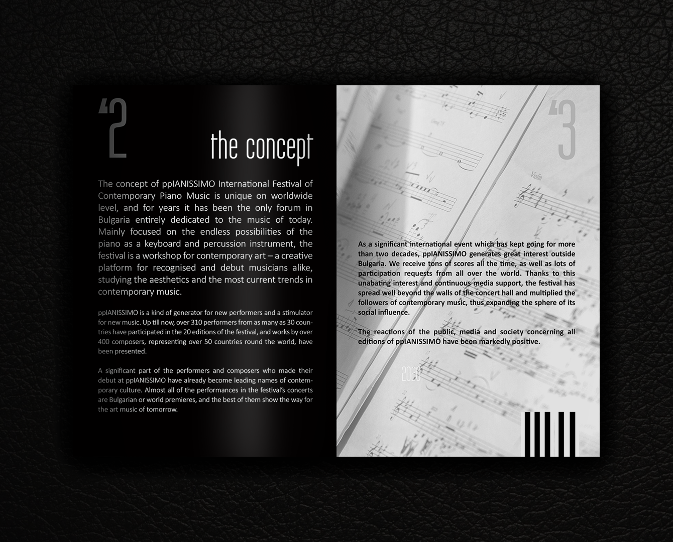
The ppIANISSIMO International Festival for Contemporary Piano Music is unique as a concept worldwide and for years has been the only forum in Bulgaria entirely dedicated to contemporary music. Focused mainly on the infinite possibilities of the piano not only as a keyboard instrument but also as a percussion instrument, the festival is a kind of laboratory for new art – a creative space for established and debuting interpreters exploring the complex processes of contemporary piano aesthetics.
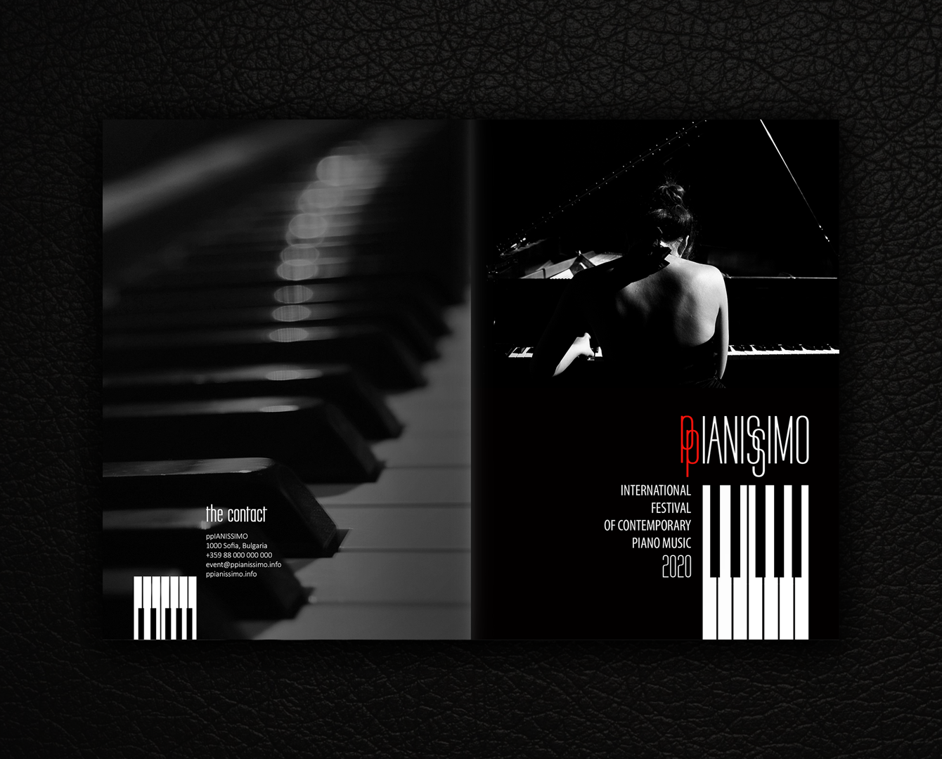
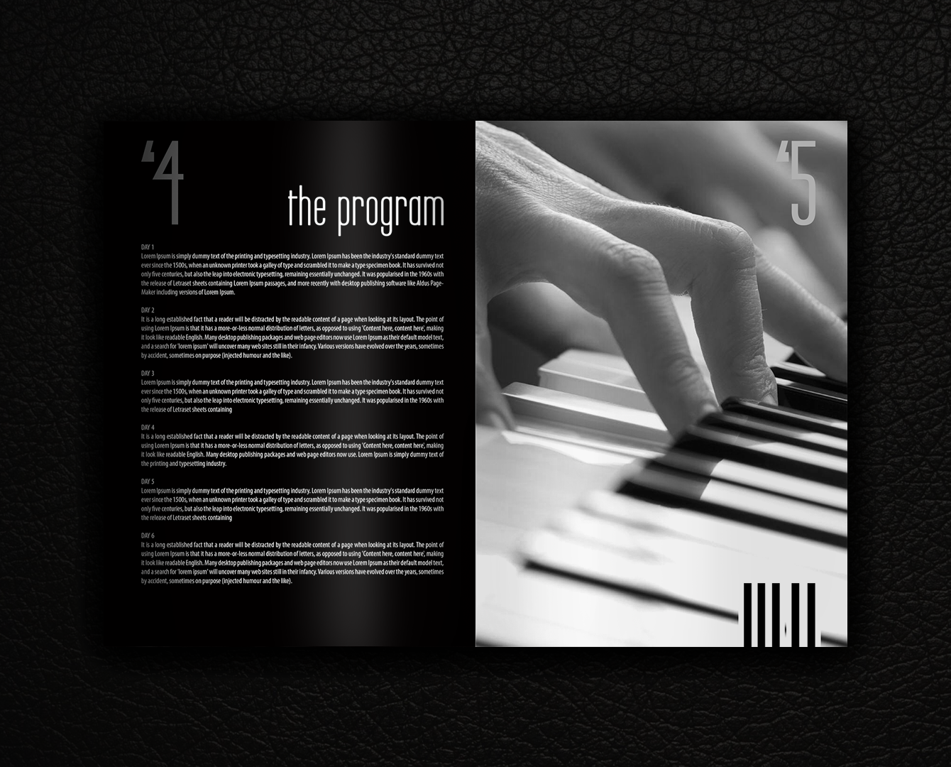
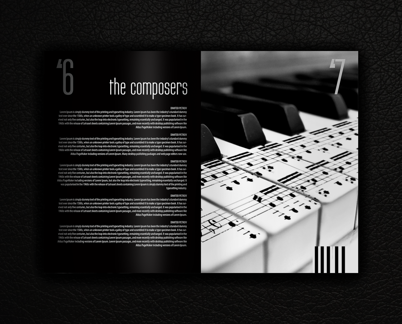
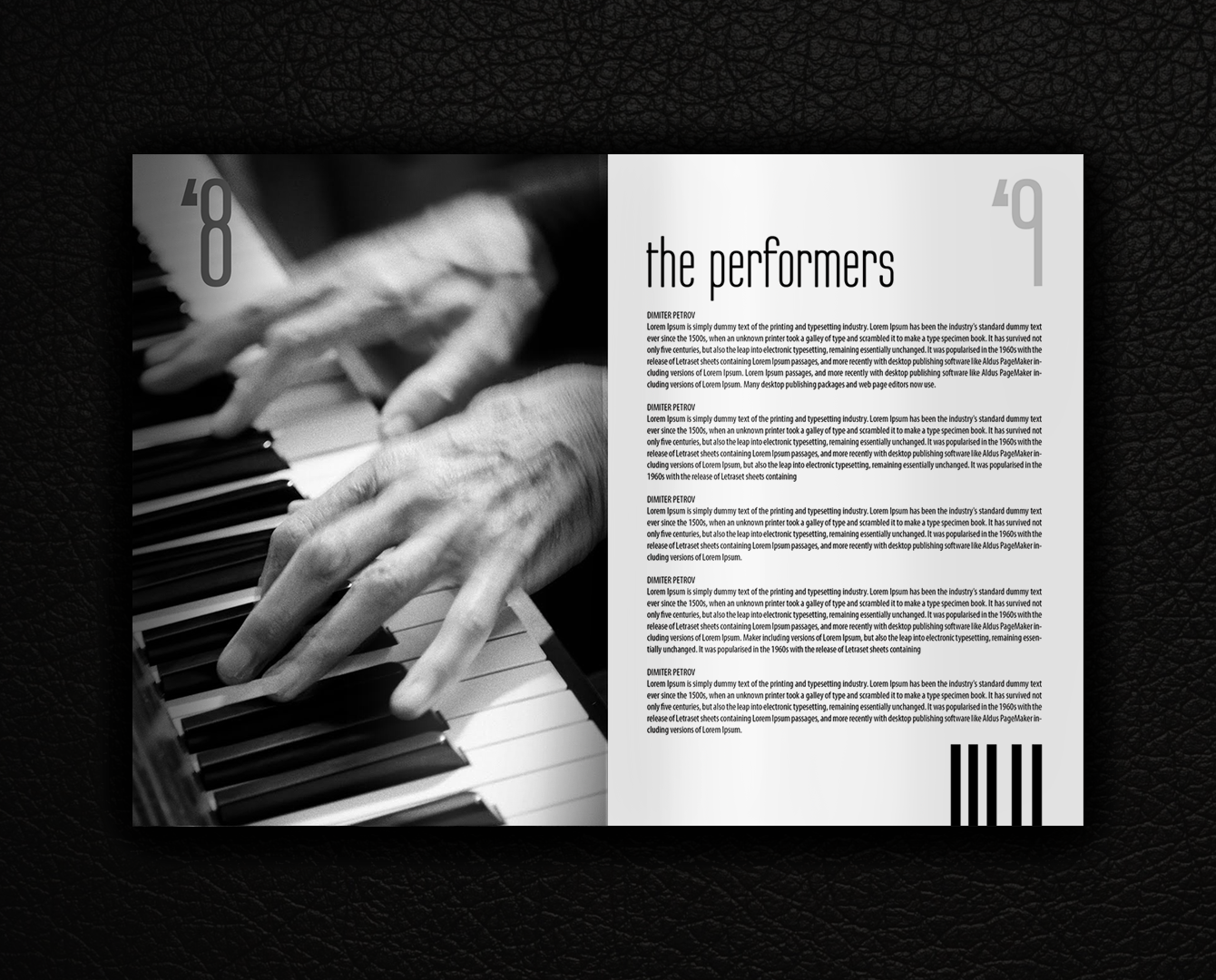
In creating a new design for this festival dedicated to innovative performance practices, we focused on a combination of a classical colour scheme and a contemporary minimalist solution.
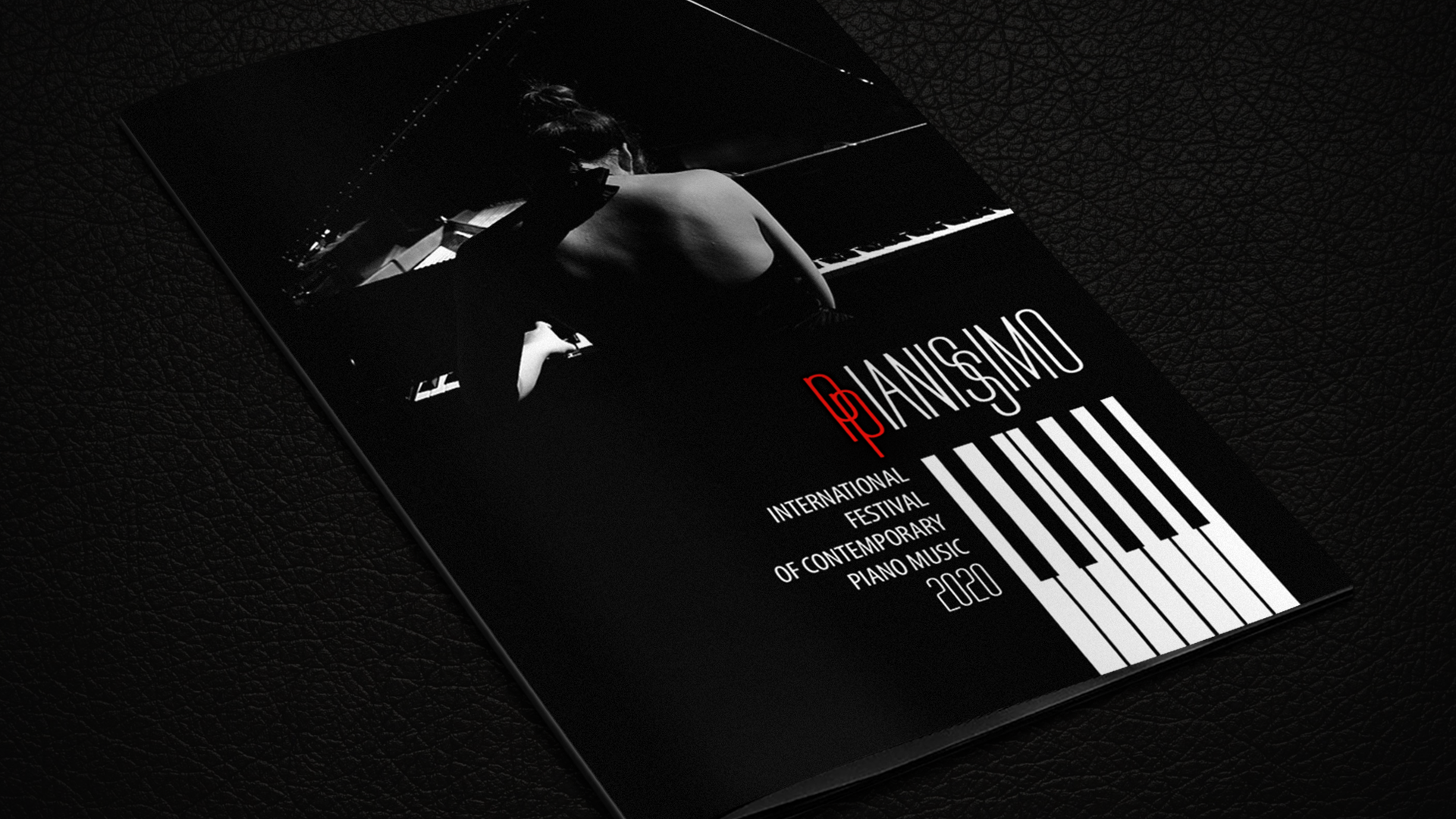
The main font of the logo is Labtop Secundo Regular, also used for the section headings in the catalogue. With its elegant extended proportions, it perfectly symbolizes the rhythm of the piano’s black and white keys – perhaps the most popular graphic element of the concert hall.
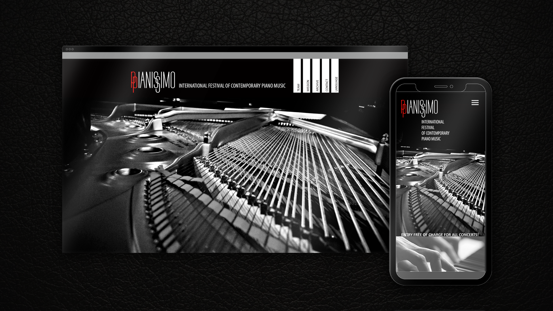
The monochrome design continues throughout the website and catalogue, as a counterpoint to the diverse spectrum of the festival. The single flame red accent in the logo highlights the dynamic intercultural dialogue and intense exchange of creative ideas and professional experience that ppIANISSIMO places in the hearts of contemporary music fans.
