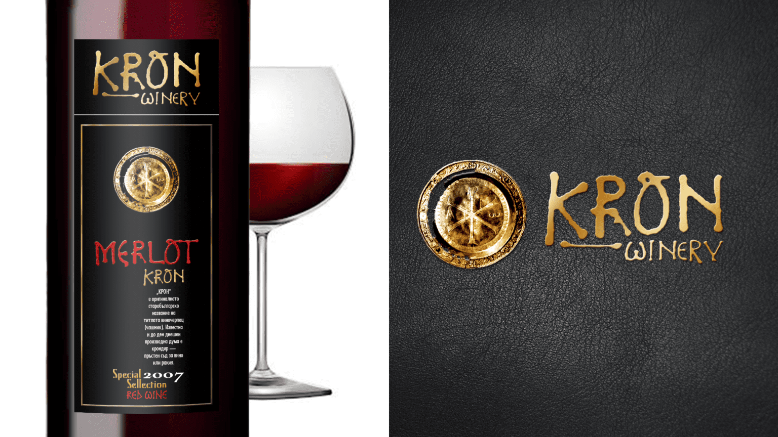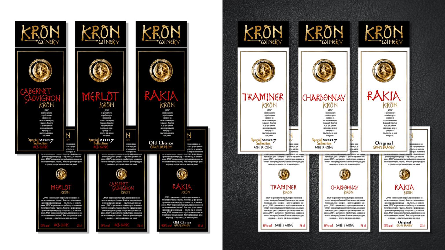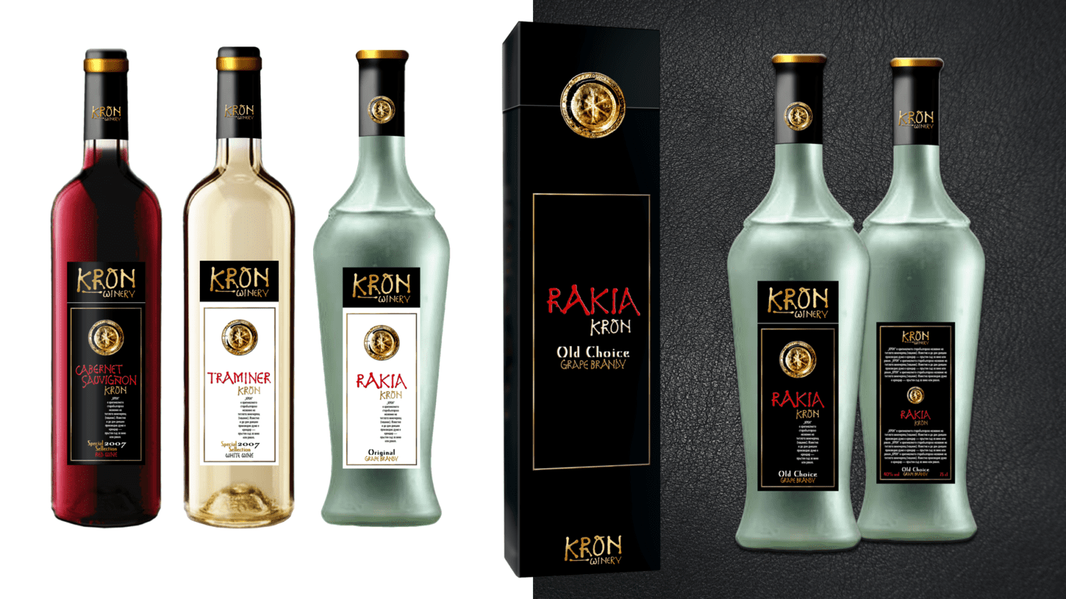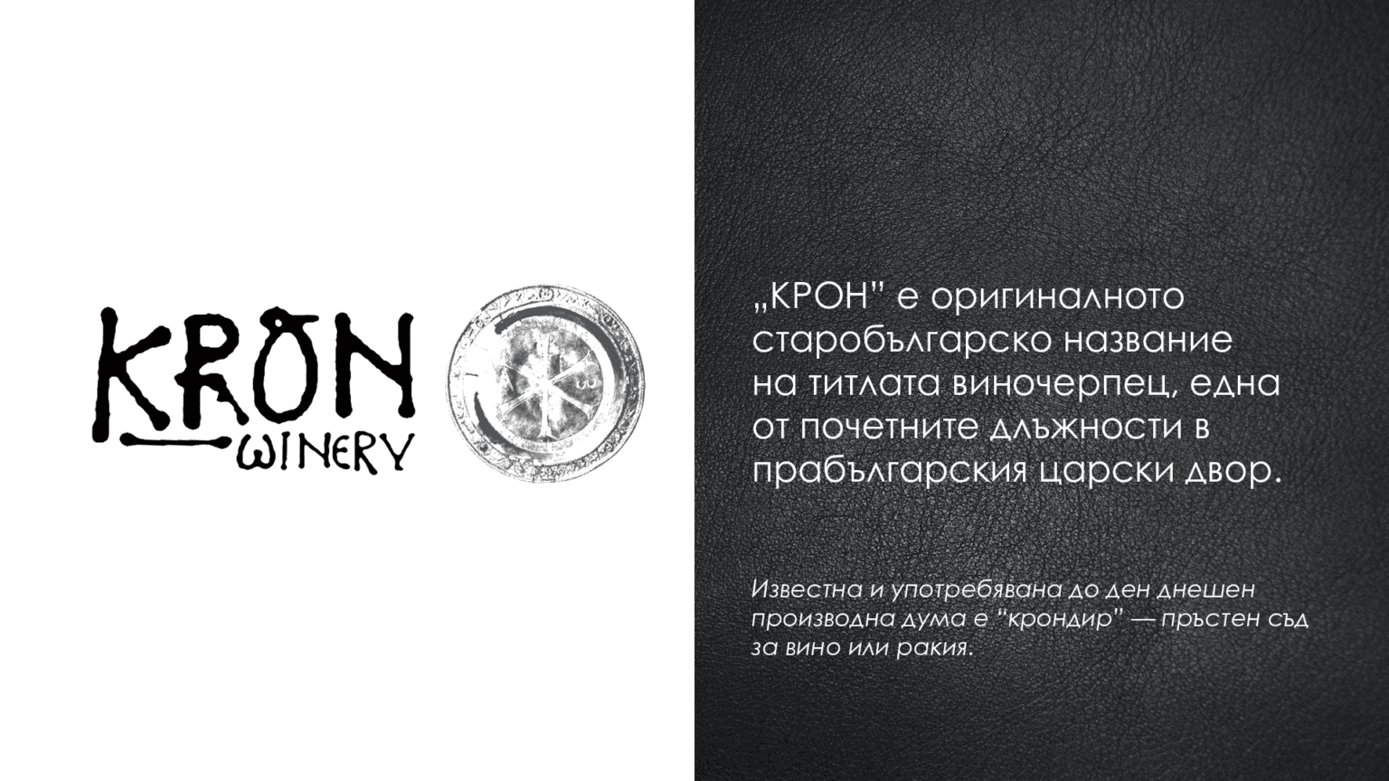
Brand identity for the KRON WINERYThe concept of the “KRON” series is pride. Bulgaria is the oldest European country that has existed for more than eighteen centuries under the same name. The name KRON is short, sonorous and has the typical for Bulgarian language firm sound. In its essence it is a title – a symbol of prestige. In the Proto-Bulgarian royal court there were various honorary positions, such as royal coachman, falconer, bedmaker, butler. KRON is the original Old Bulgarian name of the position cupbearer. The proposal for the same name for the winery and trademark is based on the relative ease of launching a new brand on the market and concentrating the whole process on building brand awareness, generating a message, creating interest and purchase.
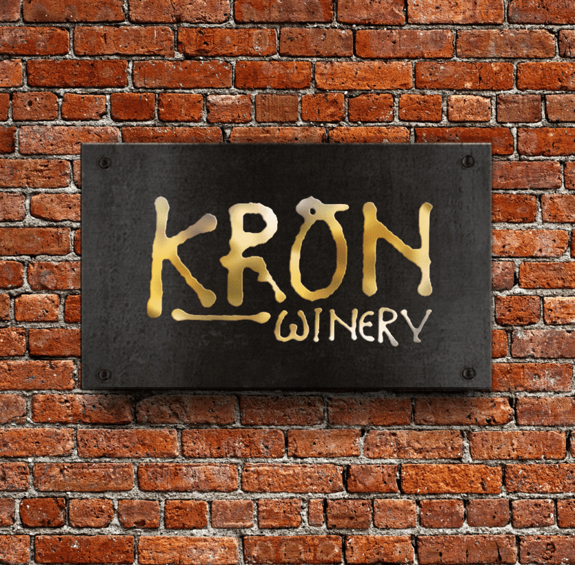
The individual products have a double identification – a proper name and a title: ‘Chardonnay KRON’; ‘Traminer KRON’; ‘Merlot KRON’; ‘Cabernet’; ‘Rakia ‘ and so on. The typical name ‘brandy’ is deliberately retained, clarified by the text ‘grape brandy’.For the design of the logo, we used symbols borrowed from samples of ancient Bulgarian script. The chosen colour combination of black and gold emphasizes the strength and richness of an ancient culture.The design of the label and packaging is as graphic and laconic as it is solemn, leaving a strong impression on anyone through its contrasts. As an additional element, an image of an ancient Bulgarian gold medallion was used.