Our client Agro Can Liquid Ltd. entrusted us with the creation of a brand identity for their flagship product – Can L, a liquid calcium ammonium nitrate fertilizer (CAN).
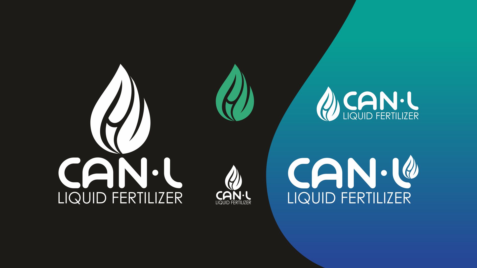
We designed a fresh and memorable logo featuring a graphic element in the shape of a drop with an embedded C symbol, rendered in a gradient transitioning from green to blue. The key characteristics of the product are further emphasized by the product name lettering, with its soft, rounded forms, while the supporting Century Gothic typeface is clean and strict, tightening and completing the overall composition.