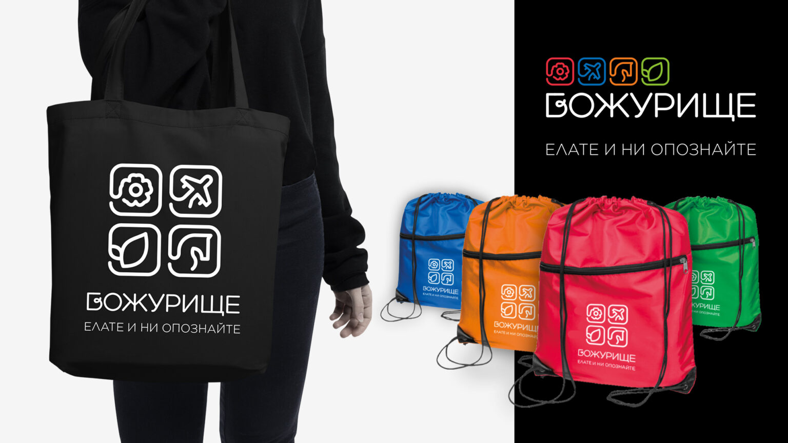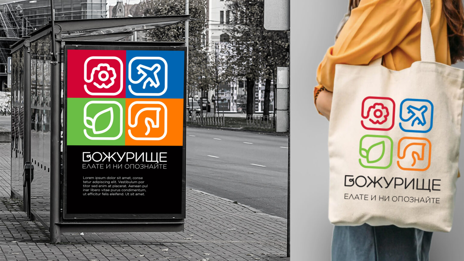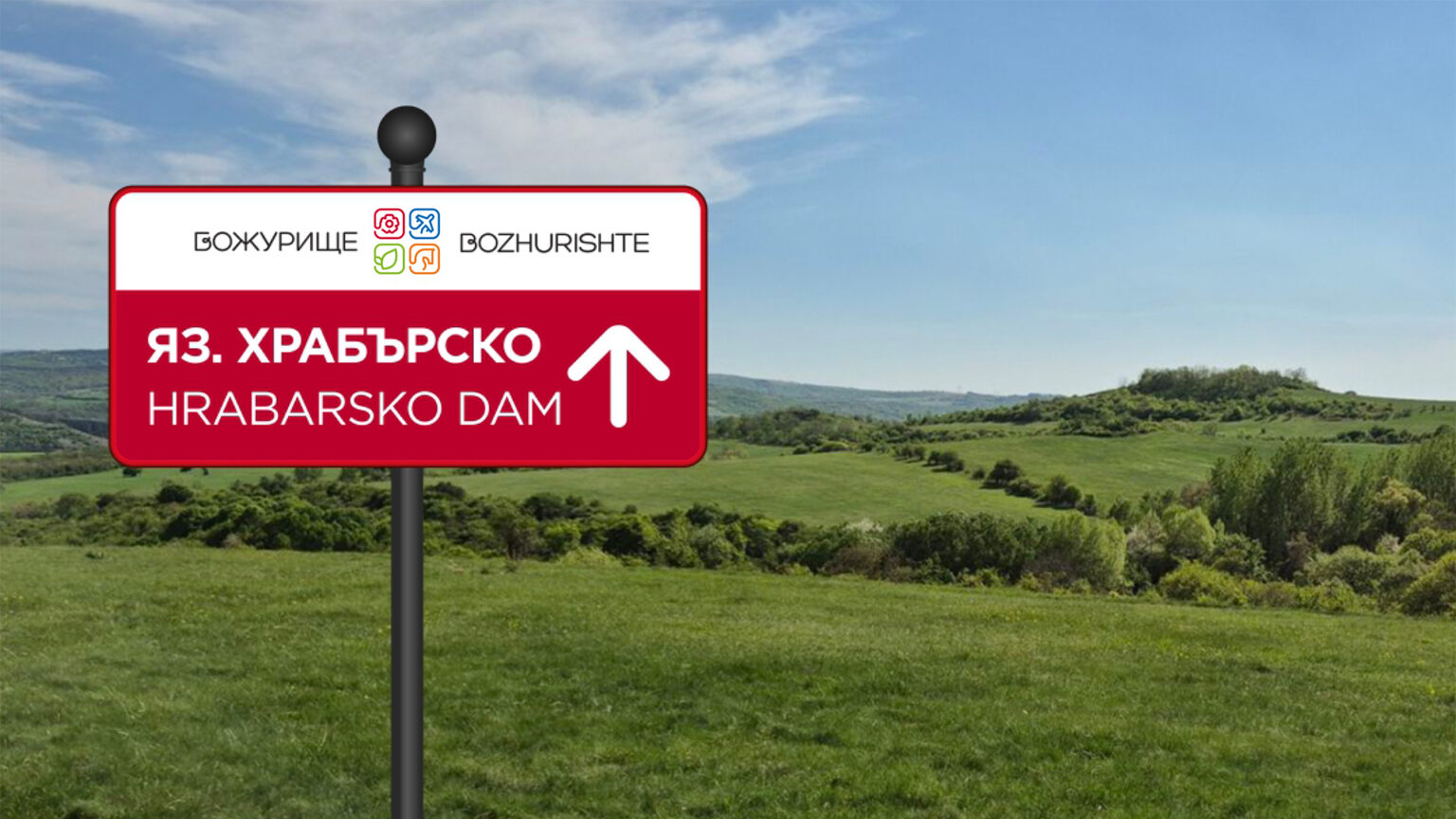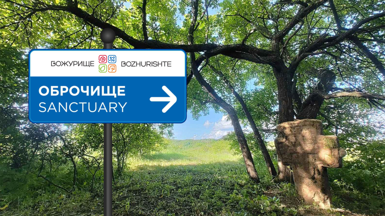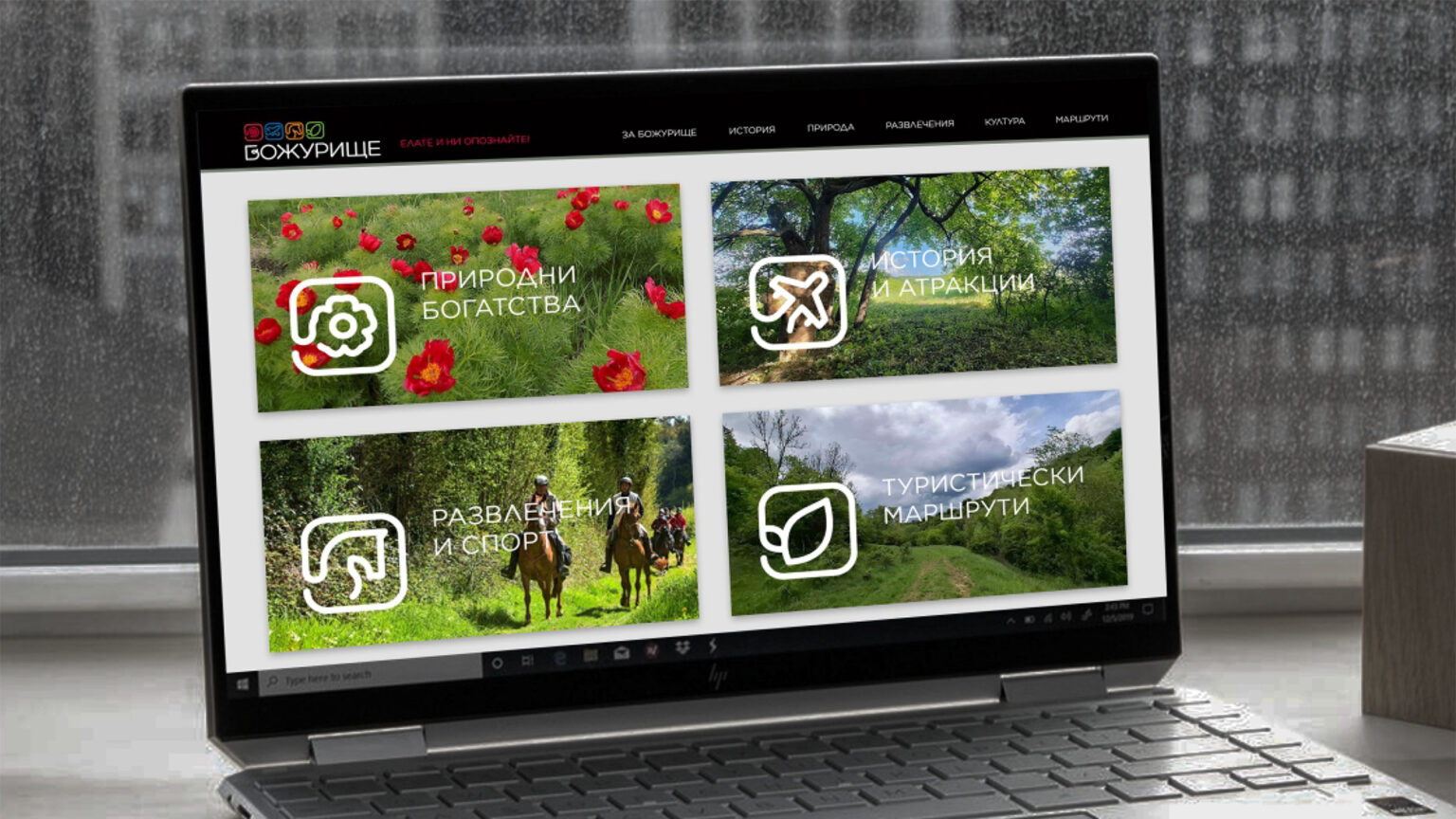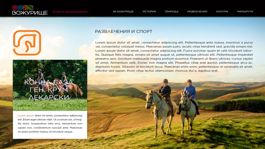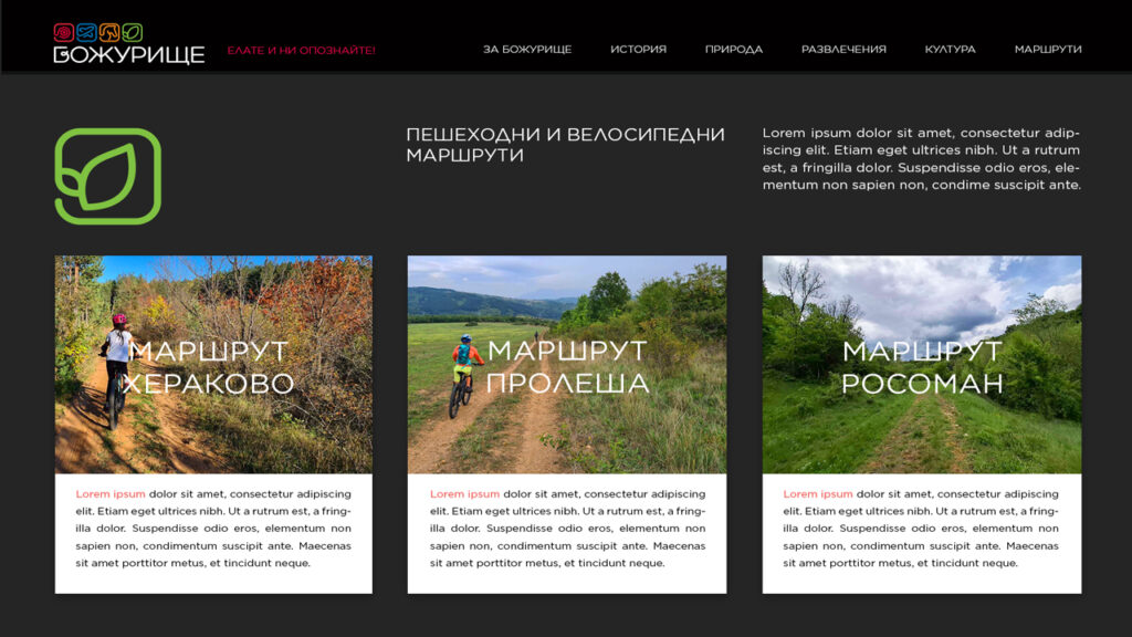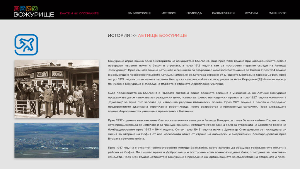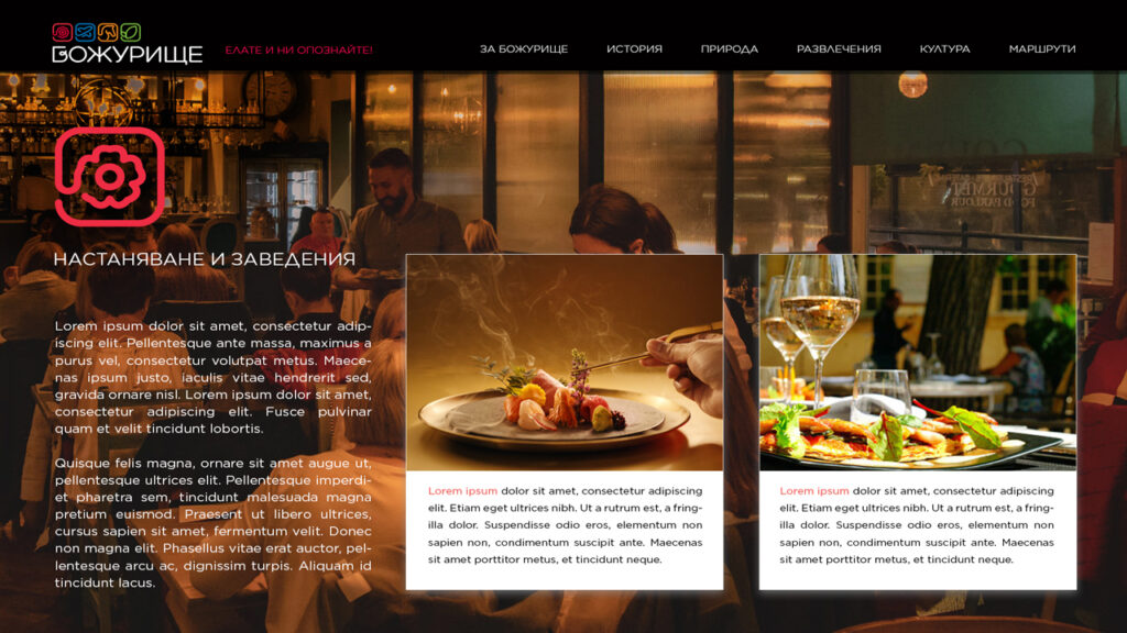
Bozhurishte Municipality has launched a tourism development project as one of the development directions of the region. The attractive tourist brand, which we developed on behalf of the municipality, is part of the implementation of this project and a key tool for achieving a competitive advantage for destinations, attracting tourists and providing strong support for local businesses.
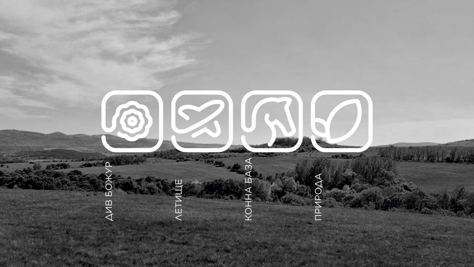
The brand is based on the logo - a synthesized sign that can easily become a recognizable symbol of the destination. The graphics are based on the most popular symbols in the region - the narrow-leaved peony, which also gives the name of the settlement, the first permanently operating airport in Bulgaria, the equestrian center and the pure nature. The four symbols build a compact logo. From a marketing point of view, they can be easily communicated, both as a single sign and as separate elements that emphasize the types of tourism and attractions in the region. and are the basis for developing additional illustrations /icons/.
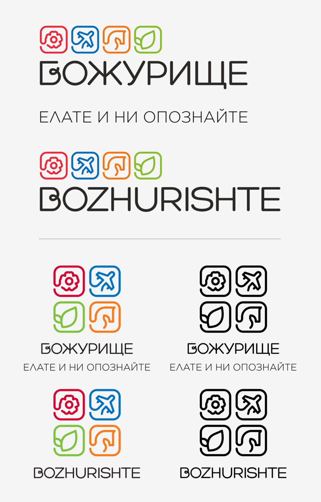
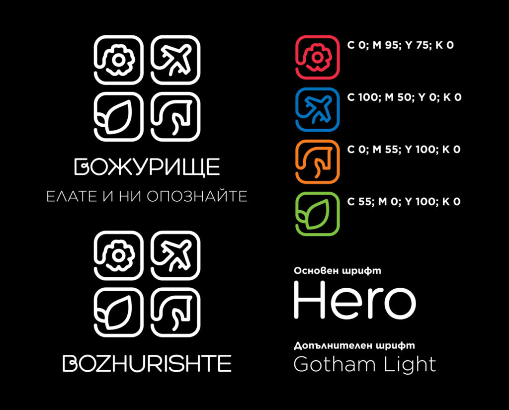
The main font is "Hero" supplemented with author's details. As additional fonts we use the "Gotham" series - a concise, elegant and legible font, with Bulgarian Cyrillic. The color scheme is an active combination of bright tones combined with black and white, which creates an effective contrast. The message "COME AND GET TO KNOW US" provokes interest, curiosity and an adventurous spirit in visitors, stimulating interest in exploring this little-known tourist destination.