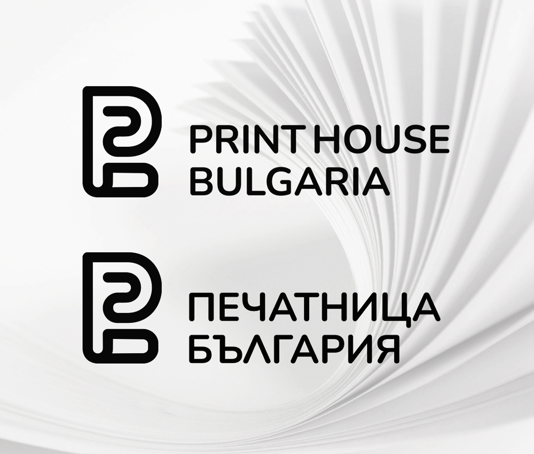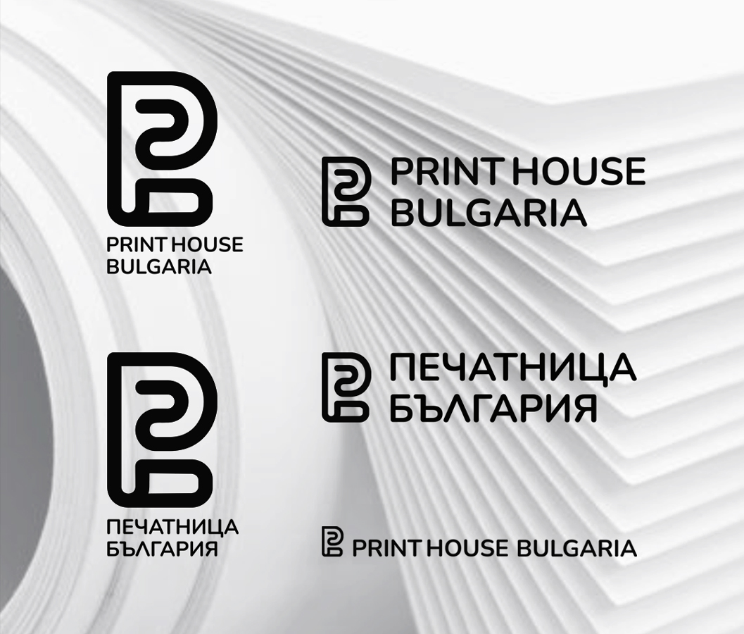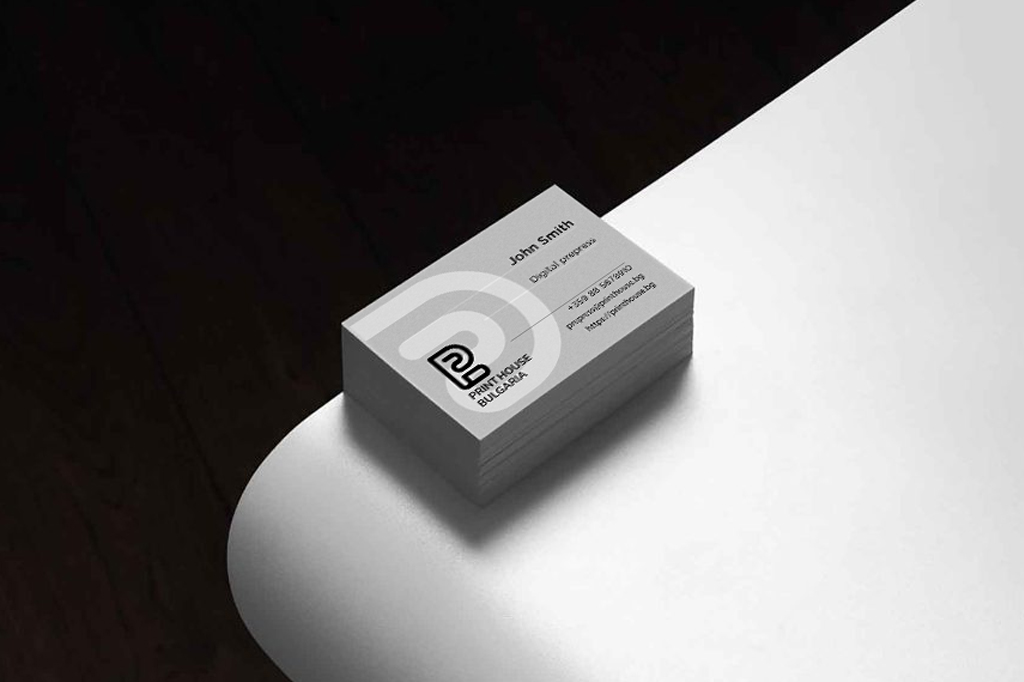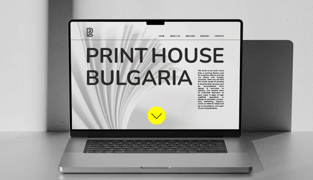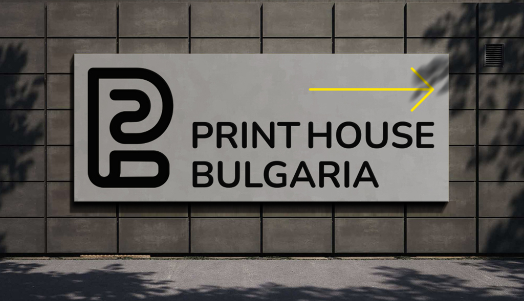

We designed the logo for the online printing services platform PRINT HOUSE BULGARIA with a simple and clean design that effectively shows what the company does.
The logo is based on the initial letter of the English spelling of the name of Print House Bulgaria – “P”, while the shapes suggest the idea of a roll of paper passing through a printing press.
In the printing industry, there is no color that is not used, and we wanted to escape from the too often used CMYK scheme, so we decided to develop the logo in black and white.