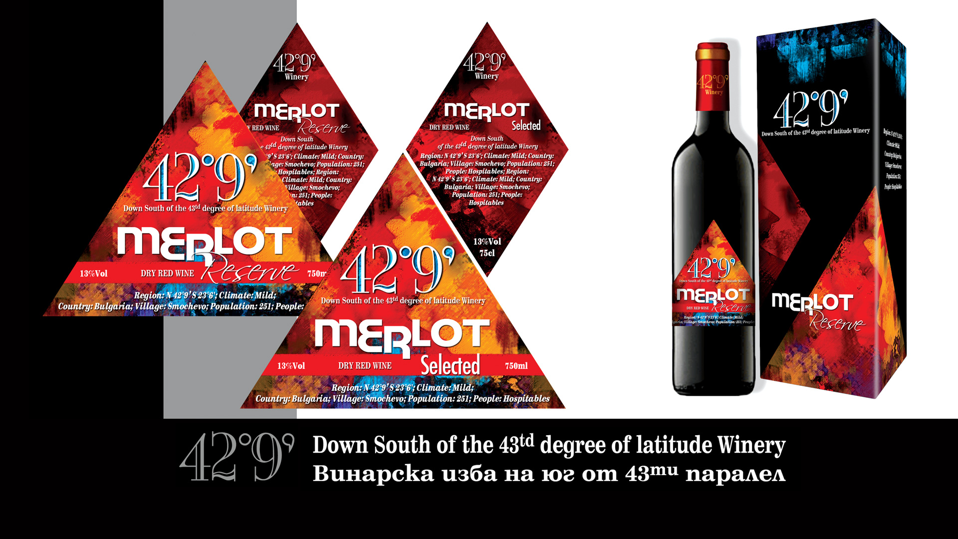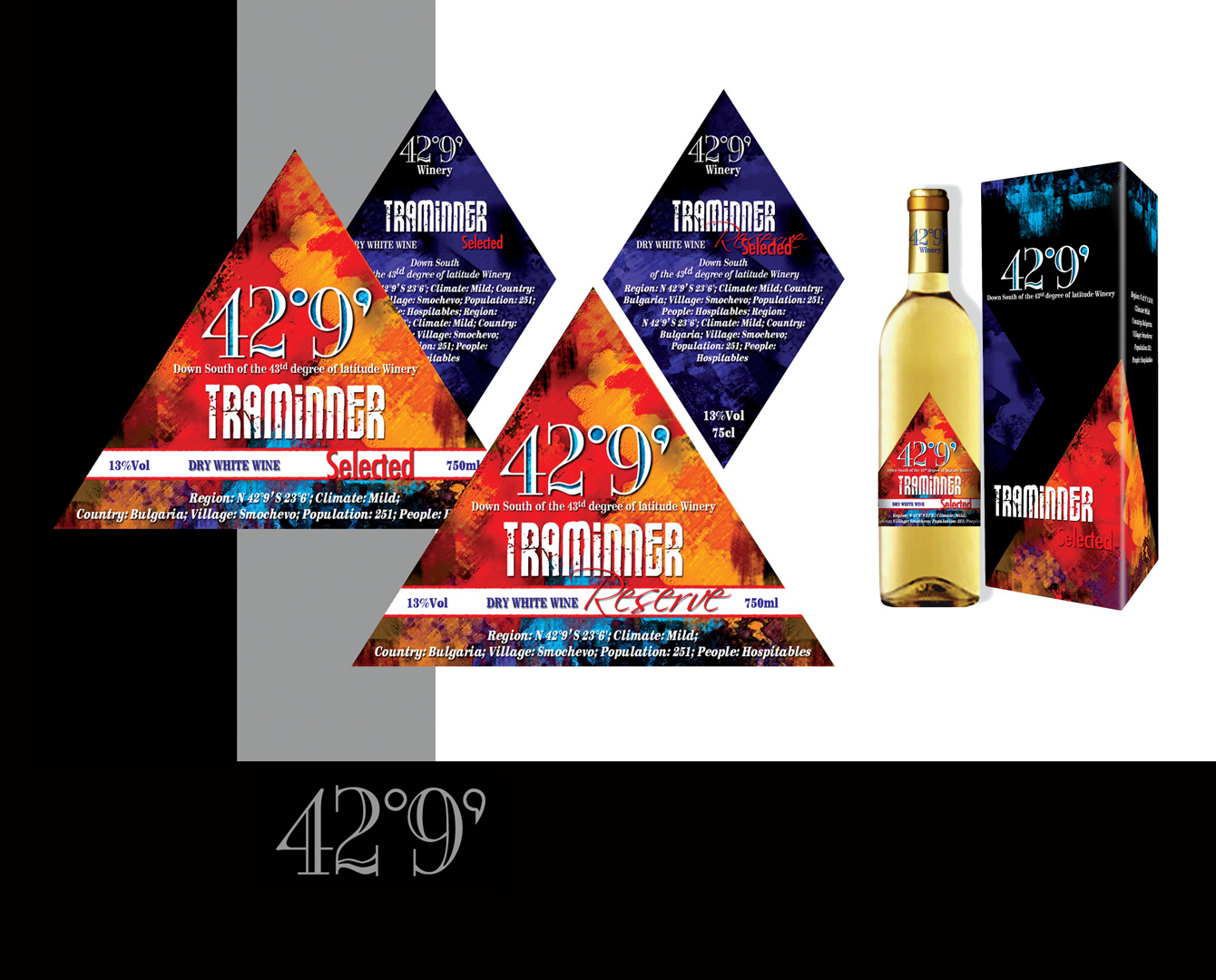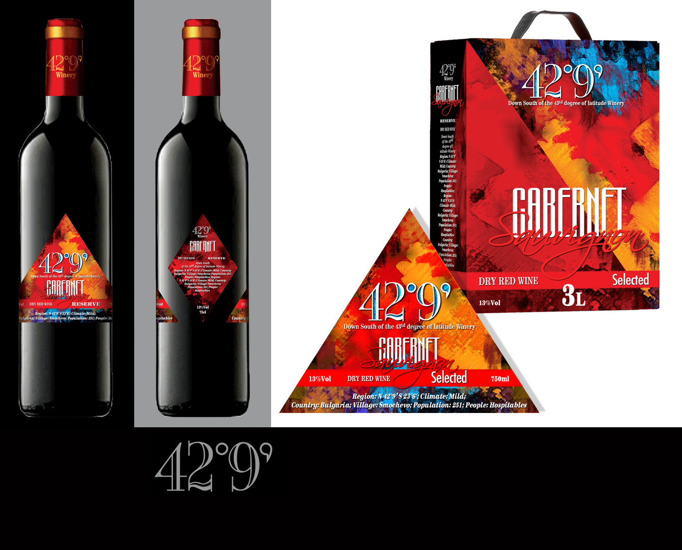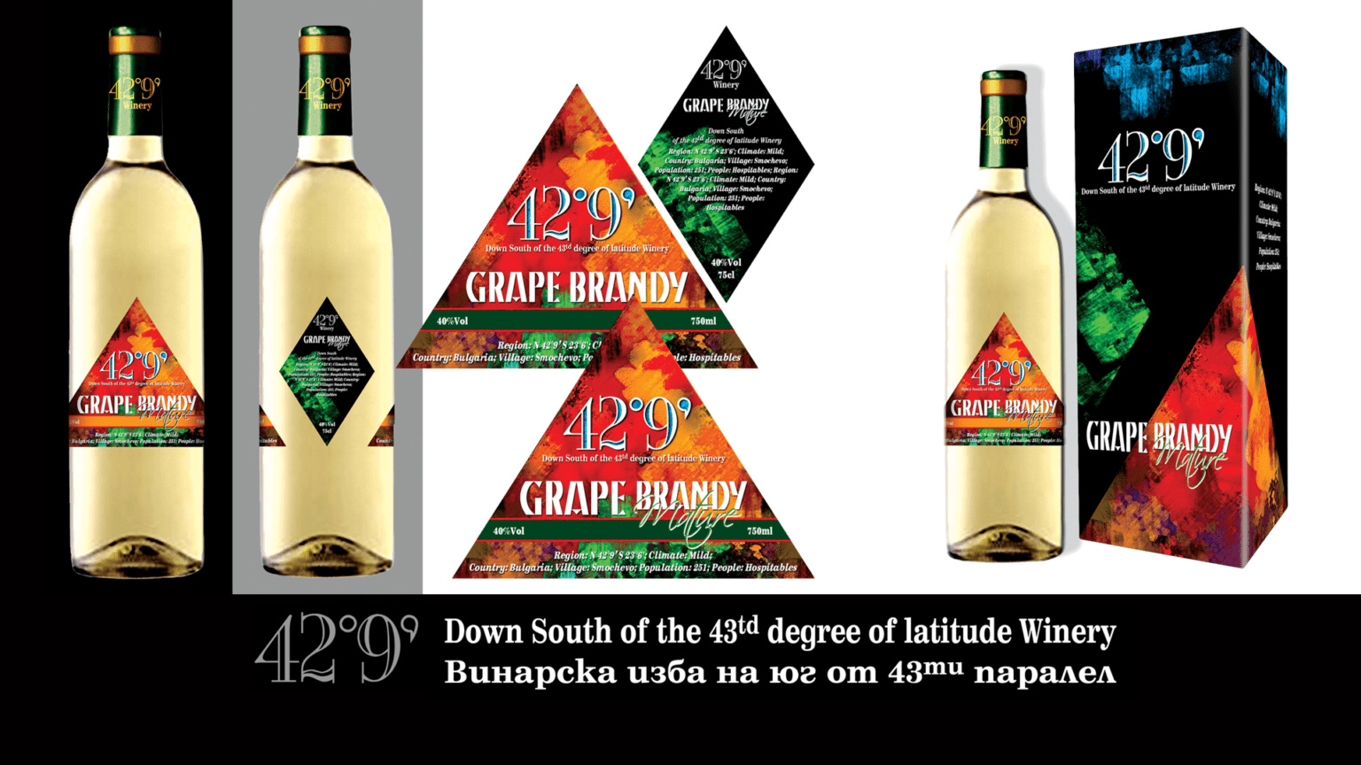
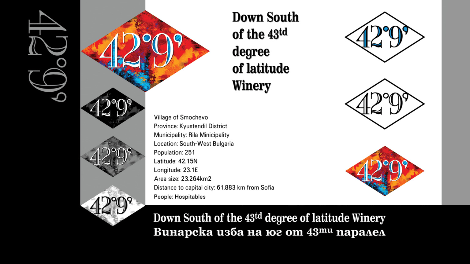
Naming and logo design of Wine cellar 42°9, trademark and labels for a newly built winery located on the north-western slope of Rila, an area with magnificent nature and excellent opportunities for wine development. The idea for the name is based on the exact geographical location of the winery – village of Smochevo, 42° 9′ north latitude, 23° 6′ east longitude. A cause for amusement in this project was the explanatory text at the bottom of the labels:Region: N 42°9′ S 23°6′; Climate: Mild; Country: Bulgaria;Village: Smochevo; Population: 251; People: Welcoming.
The logo of Wine cellar 42°9 is a visualisation of the N 42°9’ latitude. Upon initial glance it can appear as a playful nod to the alcohol percentage of the drink, drawing in the eye with its unconventional format. Its general form follows the shape of a compass to emphasise its theming.A broad colour palette captures the vibrant and diverse flora and fauna, seen through the lens of contemporary fine art.The form of the labels and packaging is triangular – the needle of a compass or silhouette of a mountain, complemented by an active colour palette of bright, clean colours.The provocative font, non-traditional shape and naming all serve to draw one’s attention even when placed along countless other bottles.