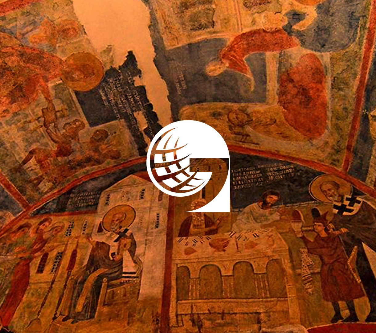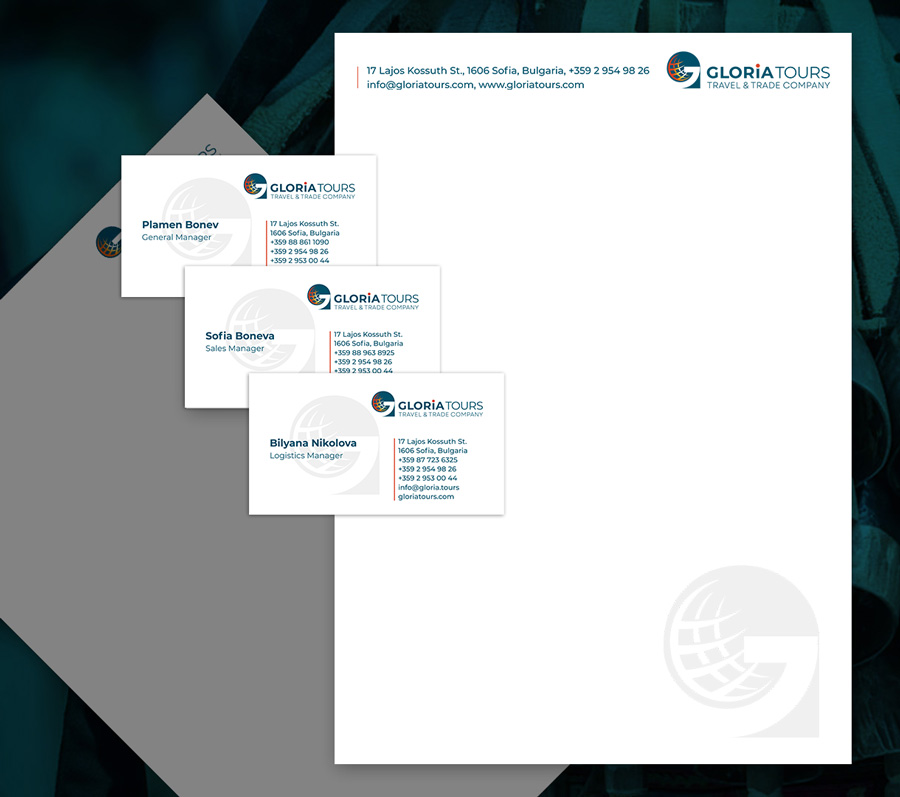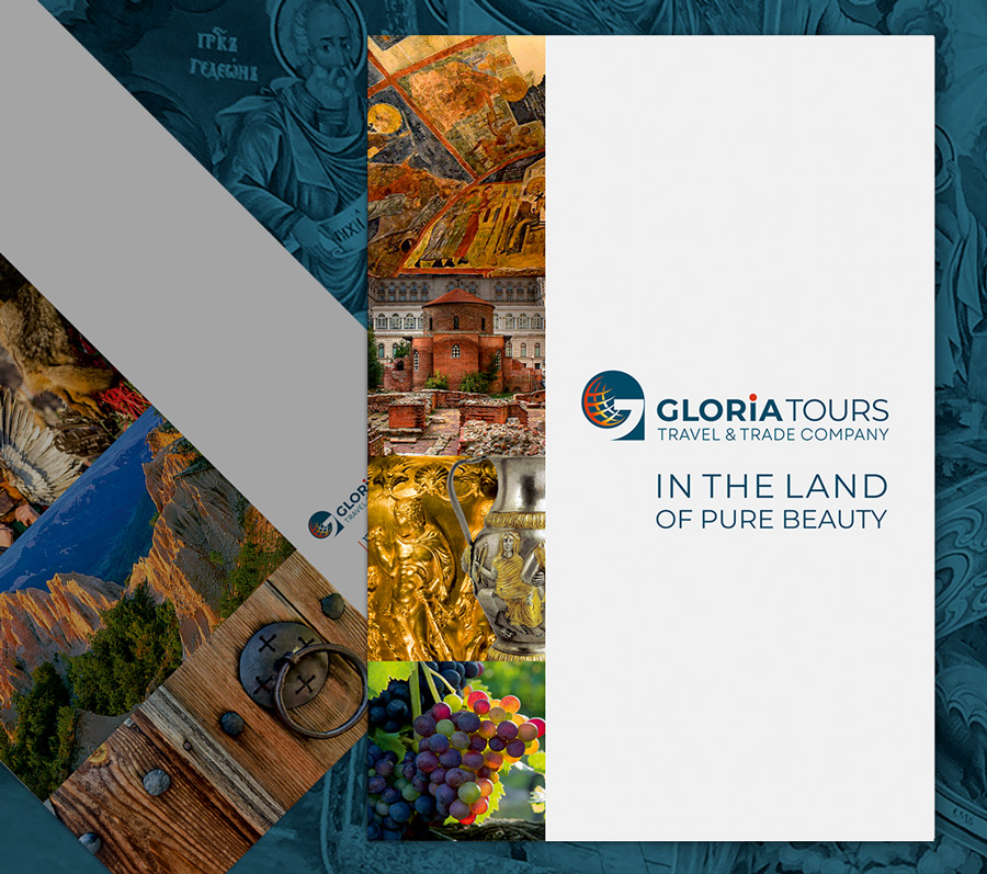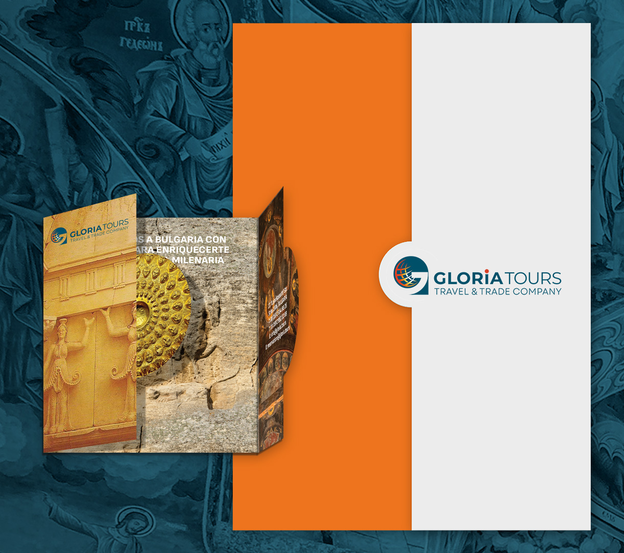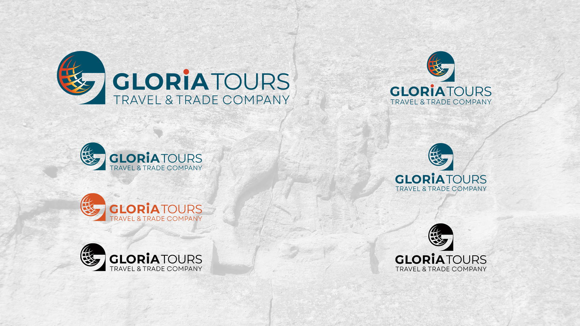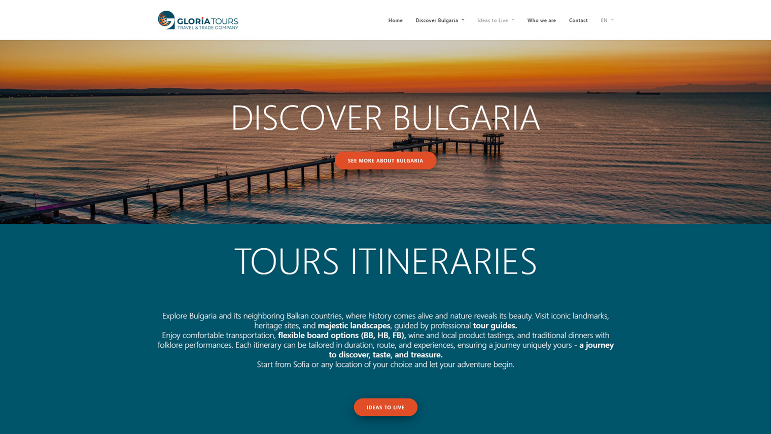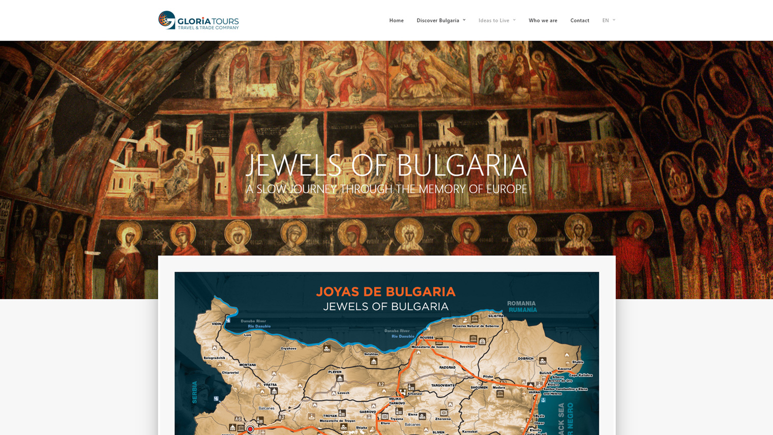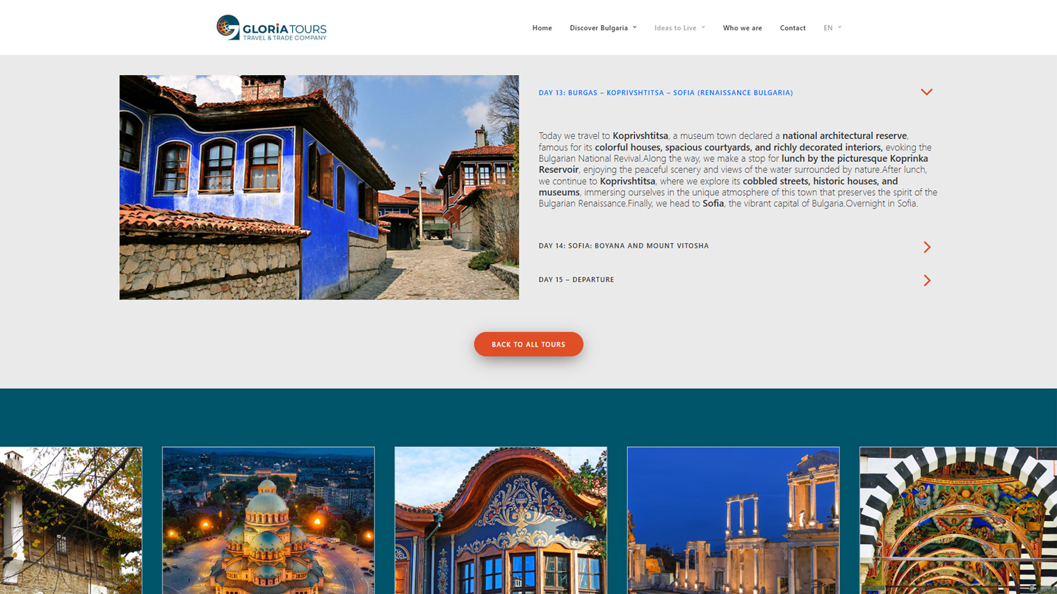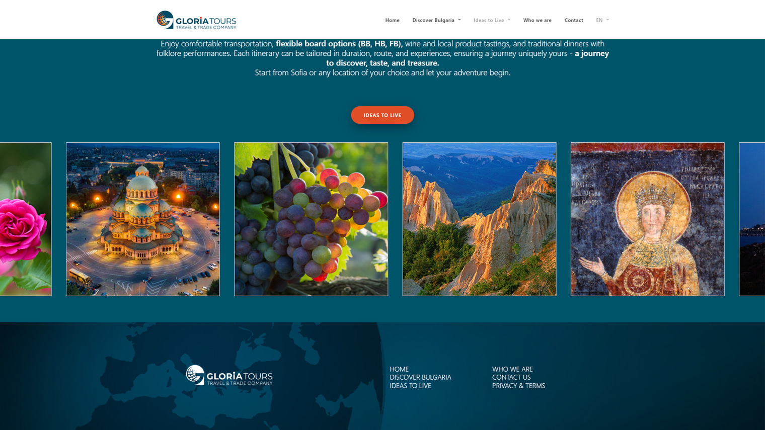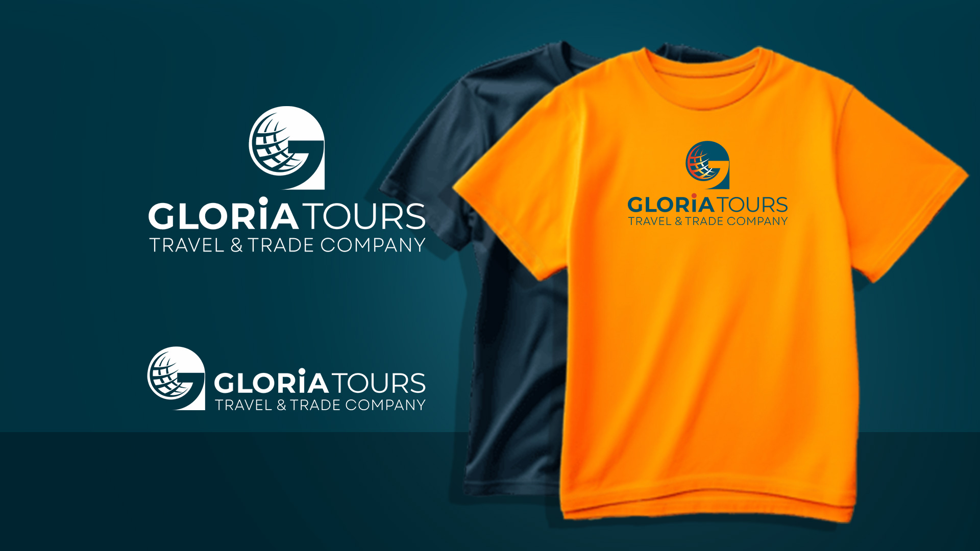
We created a new brand identity for the travel company "Gloria Tours", our long-standing clients. The distinctive sign with a symbol, which can be used separately from the word mark, illustrates the company's values - accuracy and creativity. We used geometric shapes as a symbol for accuracy and a color gradient to suggest creativity. The color scheme is based on a rich sea blue with a bright accent in saturated orange - a combination that is both serious and fun. The fonts work together for an elegant impact, combined with information clarity. The office and advertising materials, as well as the completely renovated website, continue this theme with carefully selected shots and details, with a welcoming and friendly atmosphere: https://gloria.tours/